Blog
Product Design
Product Design
Concept Testing in UX as a Part of Product Design
Concept testing is gathering opinions from people regarding a notion or idea. It allows you to validate a product, design, and marketing ideas earlier….
Product Design
Product Design vs. UX Design: What’s the Difference
Is product design similar to UX design? The short answer is no. The responsibilities of product and UX designers are not the same. Let’s…

Product Design
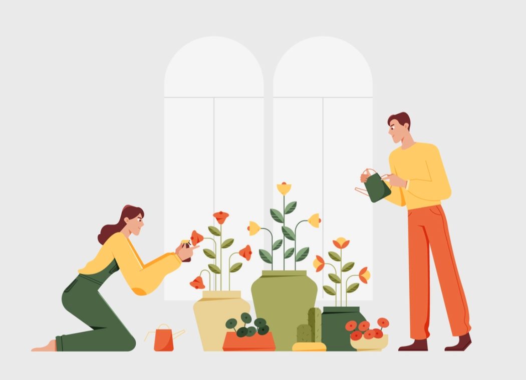
How to Create Innovative Product Design?
Innovative product design is all about turning hazy innovation goals into actual beneficial products. It lets a company evaluate a current user experience, identify…
Development
App Development
Android App Performance Optimization Techniques
The first time you use a new Android product, it may work perfectly. All the features are fully functional, and nothing slows down. However,…
App Development
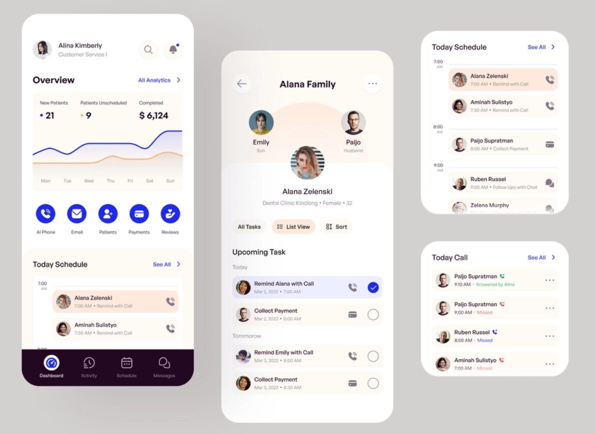
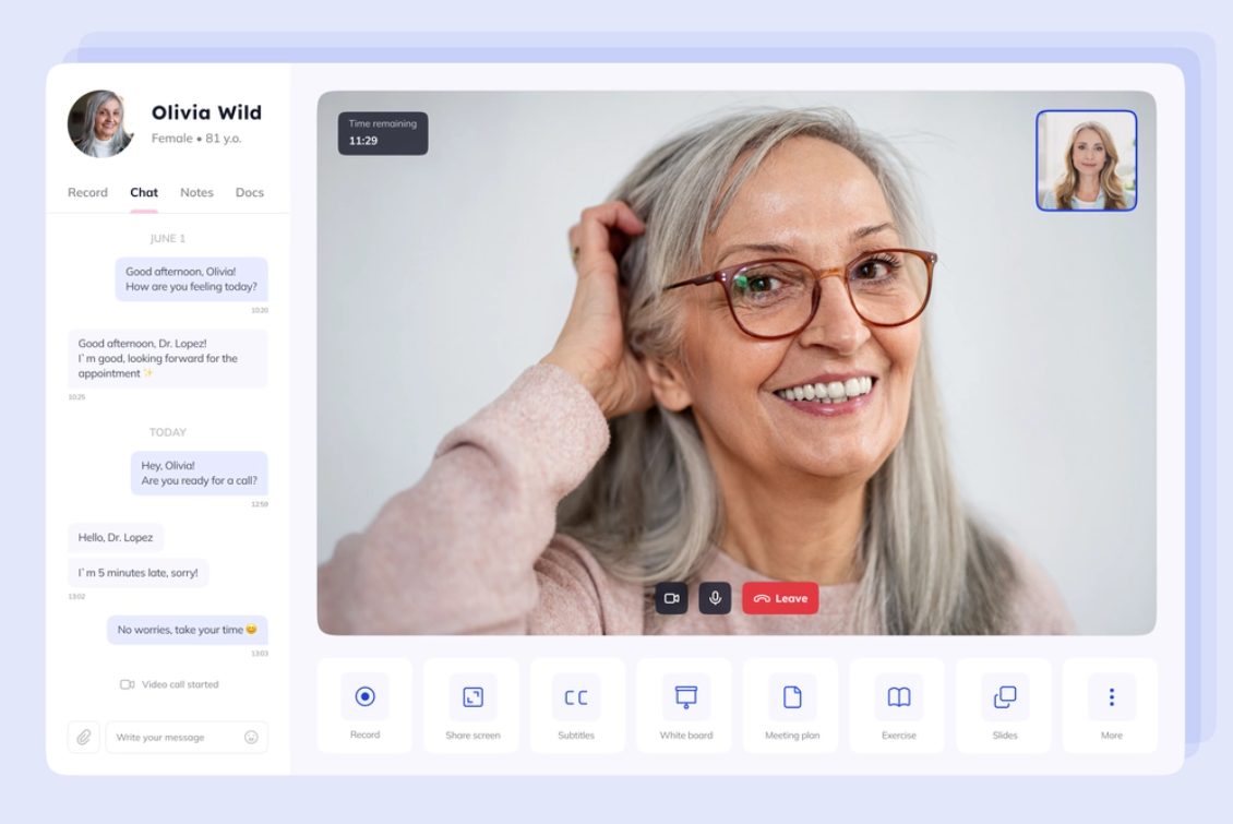
Medical App Development Process
Medical device software makes people’s lives better and more accessible. The apps change healthcare by making services easier and more efficient, improving patient health,…

Product Development
Top 5 Stages of the Product Development Life Cycle
The sustainable product business has two major components: product development and the product life cycle. A clear differentiation of activities is important for organizations…
App Design
By Elements
Elements of App Design: Full Guide
The mobile apps market is growing day by day. If you want your project to stand out from the crowd, you must ensure it…

Best Practices
10 Key Features of Successful Mobile Apps
In this article, our mobile app development team will share 10 characteristics of mobile application development that work for each type of business or…
Best Practices
How to Build a Mobile App for Startup
Want to launch a startup app? According to the statistics, the worldwide mobile app market was worth $228.98 billion last year. Despite the competition,…
Web Design
By Industries
9 Examples of Inspirational Radio Websites
Despite the popular belief that streaming platforms have taken over the music world, radio continues to maintain its timeless allure, captivating audiences with its…

Best Practices
Furniture Website Design: Examples & Tips
Have you ever felt like designing a website is more complicated than it seems? Well, you’re not alone! Especially in the world of e-commerce,…
By Industries
Top Product Website Designs: Examples & Expert Tips
Whether you’re about to launch the next big thing in eco-friendly gadgets or you’re looking to jazz up your current lineup with some serious…
Programming Languages

Top Coding Languages
Best Tech Stack For Web Development
Do you want to build a successful digital product? Picking the right tech stack is crucial. It’s not just about making an excellent interface;…

Comparisons
React Native vs Flutter: A 2024 Comparison
Are you facing this choice: Flutter or React Native? Discover the difference between these two and their pros and cons, before you hire a…

Node JS
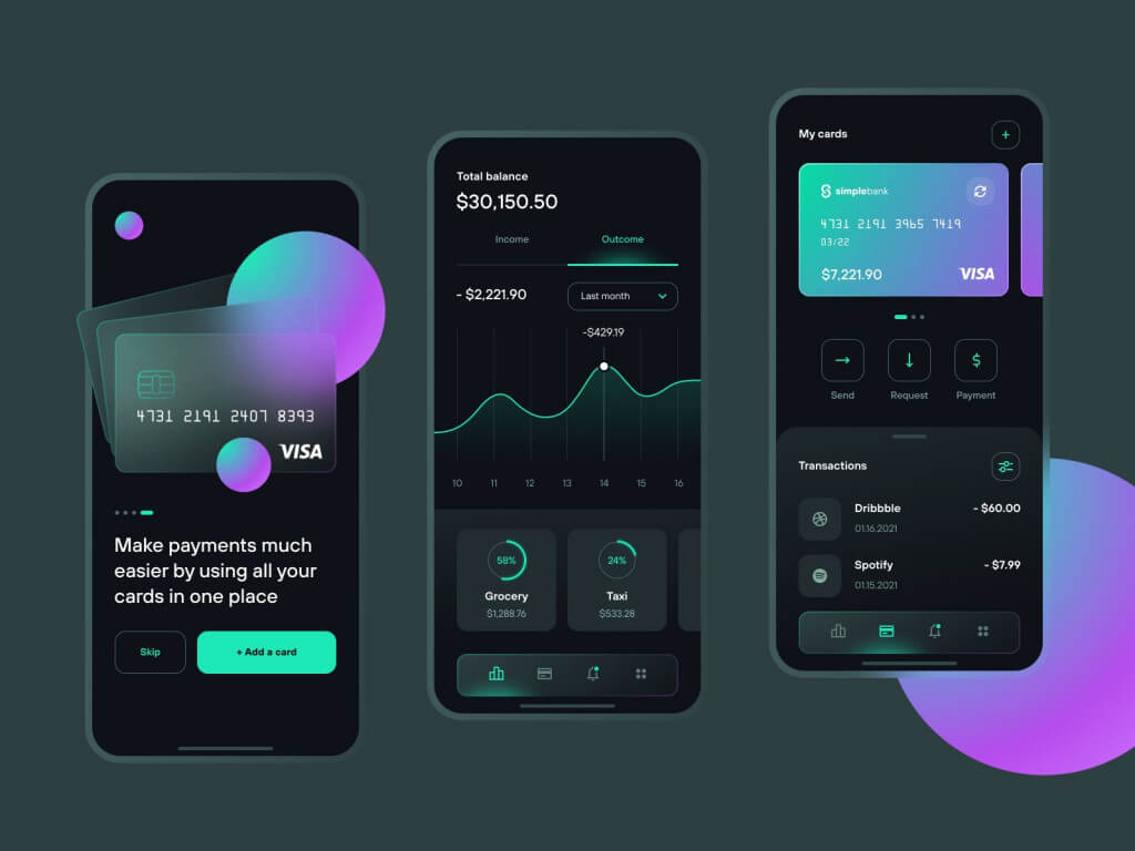
The Secret of Node.js Popularity for Startup Development
As new startup web app development company technologies emerge, many of the leading programming languages get out of use. Node.js popularity has been growing…
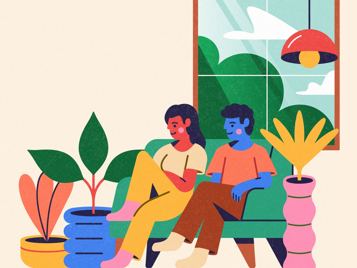
Value. Be the Voice of Change
Knowledge is like a good story — it's better when shared. Tune in for expert insights and innovation in product design.
Check our podcast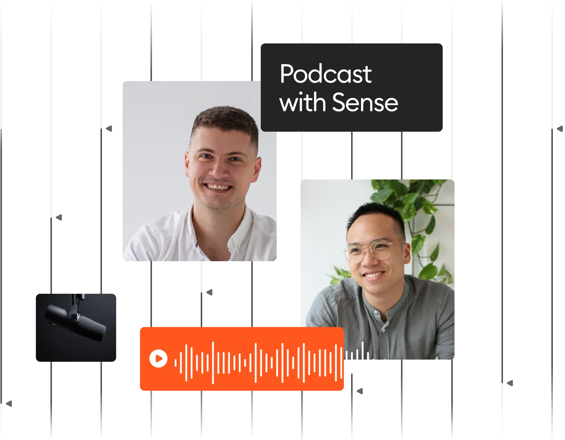
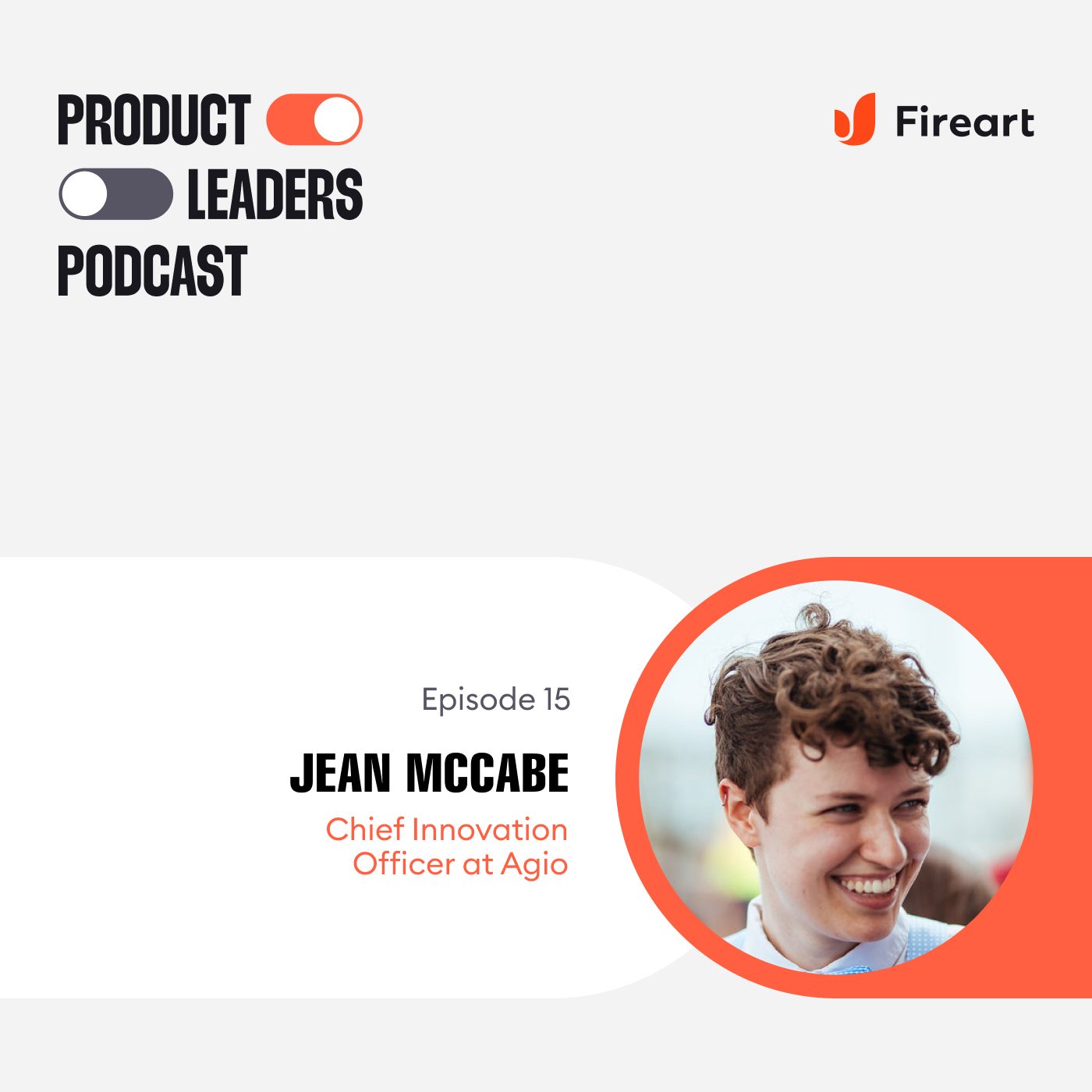
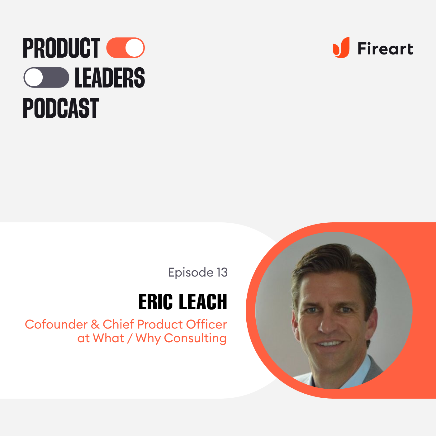
Our Latest Podcast Drops

Costs & Processes
Project Management
A Complete Guide to Website Project Management
Who is the one person that has the most significant impact on your website development? Is it the developer? The designer? The tester? All…
Project Management
12 KPIs for the Software Development Team
Setting KPIs for software development can be difficult and time-consuming. However, customer satisfaction and project compliance are major goals for development teams. And accomplishing…
Cost Guides
How to Calculate Web Design and Website Development Cost
Find here the ultimate guide for CEOs, Founders, and Project Managers that will help you find out how much does a website cost, estimate…
Knowledge Hub

Illustration
The Best Illustration Websites
When you were a little kid, did you like books with illustrations or books with photography more? Think of how you perceived this differently….

Tools
Android and iPhone users: differences in behavior
An average individual checks the phone 58 times each day, spending 3 hours and 15 minutes using it. iPhone users vs Android users’ personality…
UX/UI
The role of gamification in UX design
Millions of modern apps are there on the App Store or Google Play. Nowadays, making your app helpful and usable is not enough. You…
Fireart Life
Awards
Fireart Awards: Design and Development Accolades
Fireart Studio’s journey since its inception in 2013 is a testament to our commitment to excellence in digital design. Today, we’re happy to list…
Releases
Fireart Releases a B2B Platform Branding Case
Fireart Studio, the best renowned as an award-winning UX/UI design and product development company, releases its next case. This time the client is a…
Releases
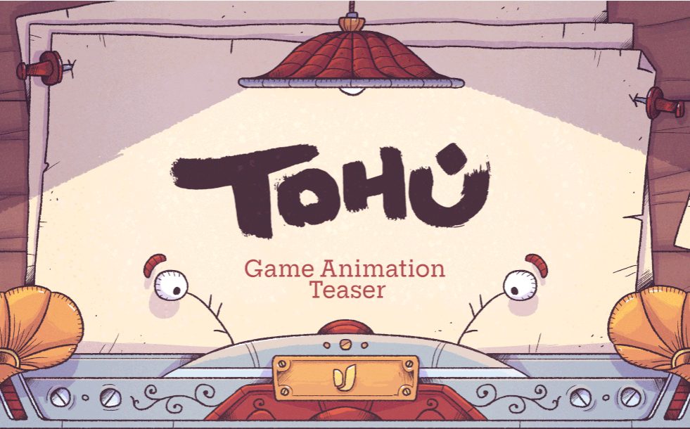
Tohu Animated Game Teaser Features in After Effects Gallery
After Effects Gallery features an animated cartoon teaser for the puzzle video game Tohu produced by Fireart Studio, It is not the first time…
Top Design & Dev Companies
USA
Top 20 Web Development Corporations in Pittsburgh
Web development corporations in Pittsburgh are making waves in the tech industry, establishing the city as a thriving hub for innovative digital solutions. At…

USA
Best Texas Website Development Organizations
Website development organizations in Texas spearhead digital innovation by crafting cutting-edge online experiences that propel businesses forward. These agencies deliver top-tier solutions, creating captivating…
USA
Top rated 13 Website Development Companies in Phoenix
Web development companies in Phoenix are at the forefront of transforming digital landscapes, providing innovative solutions that propel businesses into the future. In this…