How to Design the Best Call-To-Action (CTA) Button for Your Website
In sales, a call-to-action button plays the role of a so-called closure argument. Let’s see ✓why a CTA button is essential, ✓where you can take inspiration to create a good one for your project, ✓and review some great examples.
A Call-to-Action is basically a line of text or an image that is intended to motivate your potential customers to perform an action that you want them to do. It should be eye catching and inspire your website visitors. Usually, CTAs are created as buttons so that visitors get redirected to a landing page where he or she can turn into customer.
In any business, there is room for a CTA button, as you always want to convert your leads into customers. With increasing competition, you need to have the best call to action button design so that everybody seeing it wants to click and perform the action you need right away. This can include performing a purchase, filling out a form, downloading a file or creating an account. Also, your call to action message has to be personalized, it is a must. Stay away of using cliches that generate nothing but irritation from the customers.

You can locate CTAs anywhere, including articles, emails, product pages, contact pages, social media, and other distribution channels. The point is that they actually increase CTRs and move business forward, which is why you might want to know more on how to design a call to action button.
5 tips on how to create a great CTA button design
Before moving on to the design stage, it’s important to pay attention to the text on your call-to-action button. The central message should be well thought through and clear. It should also be in balance with all the other text on the page. Here, we have several tips on how to create an effective message for the button:
- Stress the scarcity: limited supplies often encourage people to make decisions faster
- Make it sound urgent: now or never is also a technique that speeds up the action taking process
- Keep your message direct: make it look like you are talking directly to your customer
- Make it short & simple: clarity is essential and there should be no double-decks
- Imagine starting a conversation: it makes sense to make people want to reply, and their reply should be expressed as an action
Basically, through the CTA button you do start a conversation with your potential customer, by suggesting that they interact with your business. Whatever the action is, it’s the call that counts. Good service starts with a good first impression. Now, when you know what’s going to be written on your button, let’s look through the next five tips on how to create a call to action button design.
1. It should look like you can click it

This is the number one rule. The CTA button should actually look like a button, not just a beautiful visual element. If not, users will look right through it and move on to the next website or elsewhere without realizing there was ever an option for action. Modern users are quite sophisticated without special guides so, most times, they don’t expect it to look like a physical button, though it never hurts to underline the fact that it’s an interactive tool, not a decoration.
For clickable effects, the shape should be taken into consideration. Most buttons are rectangular with rounded or sharp corners. Any other shape may also be perceived as a button, though it might be a bit more difficult for the designer to make it obvious enough so that no potential lead will ever be lost due to a misunderstanding. Shadows or highlights sometimes work well, but make sure the idea is clear.
2. Size matters

CTA is not something you want to be hidden among other elements on the page. If you want your potential customers to actually click that button, they should see it right away from first glance. Searching for it should never be a task. It should be large enough to not get lost between the decorative elements or secondary messages. On the other hand, it should not too big, otherwise the whole design will look unbalanced. The perfect size should definitely be balanced with everything else on the page.
To check if the size is appropriate, try to take a step back from the screen and squint a bit to see a blurry idea of what there is on that page. Your CTA should stand out and be visible under such circumstances. If it does, you’re good.
3. Color is another way of making it visible

There are many studies and speculations about color increasing conversion in the best possible way. Long story short, there is no such color that is a one-size fits all approach; however, different colors influence people differently. Not only does it depend on personal preferences, but also on a combination with the other colors on the page.
According to Hallock, 57% of males prefer blue; however, basing your approach on this factor may mean that you’re going to lose the other 43% of that group. So, when choosing your CTA button color, it’s safer to concentrate on the general scheme. Also, if making the button a bit smaller, you can use bright shades to improve visibility. Making it really large can be balanced with calmer tones.
4. Contrast may add some points

There are two ways to play with contrasts: between button and background or between button and text. You probably don’t want to try both options at the same time. Let’s look at them separately. Text contrasting the button is a good way to prevent people from missing the core message. Who cares about a button if it’s unclear what it’s meant for? It shouldn’t necessarily be done through particularly contrasting colors, though the main goal here is to increase readability. Once the message is readable, you’re good.
Contrast between the colors of buttons and backgrounds might also be a tool for increasing visibility. The CTA should really stand out and, at the same time, be in balance with the main color of the page. There are many colors that look great with each other, so designing this part might take some thinking. For example, check how well dark blue contrasts with yellow. Look for more options for contrasting colors to choose the right fit for your project.
5. Finally, position it properly
The perfect call to action button design doesn’t end with just designing the button itself. Half of the work is in the proper positioning. It mostly depends on the general layout of your page, position of photographs, titles and other elements. One of the best practices is to place something very important at the top, or as it’s called – “above the fold”. In a world of shortening attention spans, it might now be ever more meaningful.
You can truly benefit from placing your CTA in the right place. It should be surrounded with relevant information to stimulate the action you’re trying to impose. Again, keep a balance, and it’ll work fine. You may also want to do some testing. Find a focus group and see how they feel about the button. Additional opinions might be an asset.
Inspiration for the best designs for call to action buttons
Here are some web design call-to-action button examples that might provide you with a better understanding on how this or that technique looks. See how you feel about these options as they might help you find the most reasonable solution for your particular project.
Netflix

Great contrasts, persuasive surrounding copy, perfect visibility and readability – that’s what people actually want to click. The balance between the CTA button color and logo is also a big plus here. Everything looks balanced and stylish. In combination with the company reputation, this CTA leaves no room for double-thinking.
Spotify

Just look how Spotify underlines its core message, leaving any secondary options a couple of steps behind. Of course, there are lots of people who will still choose the free option and click the less prominent button. But, let’s agree that the “Go Premium” button does lure customers to actually click on it, just because it looks more like a CTA button that you want to click.
Humboldt County
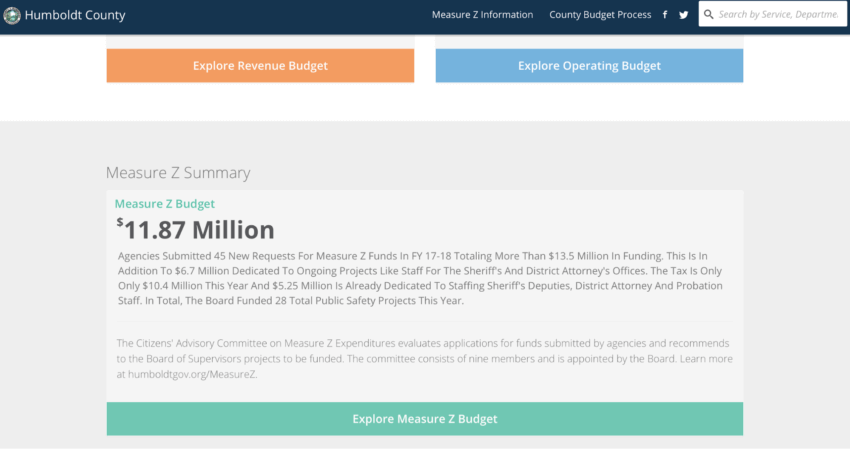
This one is a great example of a slightly non-conventional shape for a CTA button; however, it doesn’t stand in the way at all. The amazing design of the website itself makes you want to explore it even more. Thankfully, behind the first button there are more. Note how all of them are done in the same way.
Dropbox

Check the contrast between the background and button colors, and also the negative space around it. The CTA message is quite standard, though, thanks to the amazing visibility, there is no way you are going to miss at least considering the option of signing in for free or signing in with Google.
Barkbox

Here, you can see two CTAs next to each other with completely different messages. The designers recognized that getting a gift might sometimes be the primary goal of website visitors, so they matched this button with the general theme; however, the option of getting started is also important, thus it is shown in a contrasting color to harmonize with everything else.
If you need some additional call to action button design inspiration, you can contact us – we follow the trends and are willing to share our knowledge and provide top ui ux consulting. Also, let us know if you need that awesome CTA button to turn your visitors into leads, because we’d be happy to get one in place for you.