Microinteractions: designing with details
“The best products do two things well: features and details. Features are what draw people to your product; details are what keep them there” says Dan Saffer. The importance of details can’t be over-emphasized. Details make users love or hate an app or website. Microinteractions are those details. They might be easily overlooked in the global design scheme, but they actually hold the entire experience together.
In this article, I’ll explain what is a micro-interaction, why they are important and provide some great examples.
What is Micro-interaction?
Microinteractions are subtle moments centered around accomplishing a single task, by providing the users with helpful feedback and positive experience. They are used as effective tools for creating easy navigation through the app in a playful way, so that a person would be encouraged to repeat the same action, again and again. Almost all applications around us are filled in with micro-interactions.
The most well-known example of a micro-interaction has existed long before computers were ever invented. The on/off switch is often the first micro-interaction people encounter with a product.

Image credits: Vimeo
Some other examples of specific micro-interactions include:
- The vibration notification together with the silent mode icon on display when you switch an iPhone to mute.
- The pull-to-refresh UI pattern. By connecting the user’s desire to finding more content with the action of refreshing, the experience becomes more seamless.
- The ’like’ button on social networks which highlights changes by using interactive animations. Such feedback informs users that they are in the list of those who liked the post.
Therefore, a micro-interaction is a way that a person engages with an application, and is a bridge between technology and a user. The best practice for such a connection is by giving micro-interaction design an emotional appeal, making them a little more warm and human. A good example of this is Facebook, and how it designed its red heart emoji in mobile messenger. Once the heart appears in the dialog window, it explodes into dozens of floating hearts, covering the entire phone screen, and accompanied by sound effects. Anyone in the chat can repeat this action by tapping the heart emoji again. Such moments of pleasant surprise and joy create a warm feeling towards the app, making the overall experience more delightful and encouraging people to come back for more.
Though a micro-interaction should not necessarily be too obvious, it should still be fun and appealing. This includes the minor animations inside the app’s features whenever a person receives a message, mutes the phone or completes a task. They show users whether they do everything right or wrong.

Image credits: Chris Bannister
Why They Work
In short, micro-interactions improve the UX by making the user interface less machine and more human. A lot of times we think about the look & feel and how it relates to design. When we think about micro-interactions, they pretty much make up a balance on how users feel about the product, service or brand. Microinteractions fine-tune human-centered design by:
- Providing immediate feedback — Visual feedback appeals to the user’s natural desire for acknowledgment. The user instantly knows their action was accepted, and they want to be delighted by a visual reward.
- Acting as facilitators for interaction — Microinteractions have the power to encourage users to actually interact. They can guide users and demonstrate how to work with the app, by navigating them in an easy and playful way.
- Bringing delight — Microinteractions are the perfect chance for a little extra delight in the design without detracting from the main experience.
Micro interaction animation is also good for:
- Adjusting a setting;
- Drawing attention to a small element of content;
- Confirming accomplishment of a final or important task;
- Highlighting an ongoing process; and,
- Showing the on and off modes of each feature.
Additional benefits
Because micro-interactions are brief in nature, they must be designed for repeated use. Well-designed micro-interactions are able to create:
Overall, to explain the meaning of micro-interactions, I would need to break down their work into four parts, including the Trigger, Rules, Feedback, and Loops (or Modes). Their teamwork is what makes the whole process so effective. Here is how it works, step by step:
- A trigger is the beginning of any interaction. For instance, when a person taps an icon, that’s a trigger. Animation or vibration during the notification, about a new message, for example, is also a trigger.
- The rules are not visible, but they happen when conditions of communication between the user and the app are met and proceeded. They can be tracked during the third part.
- Feedback is an understanding and acceptance of the rules.
- Finally, Models/Loops are responsible for habit creation. They are the ultimate goal of any micro-interaction.
Below, I will include a short tutorial on how to create micro-interactions. In general, well-designed micro-interactions are creators of:
Habit loop
Microinteractions are the key components of habit loops. Habits are formed when people perform the same actions repeatedly. The typical habit loop consists of three elements:
- Cue — Trigger that initiates action
- Routine — In response to the cue, you perform an action
- Reward — A benefit you get from completing the routine, the reason for completing the action.
The stronger the reward, the stronger the habit becomes.
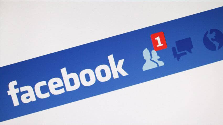
Facebook’s notification about new friend requests is a good example of a habit loop: red badge and whitened icon (cue) indicate there’s a new request, which makes the user click the icon (routine) to see information about the person (reward). After a while, users automatically click on the icon when they see the red badge.
Signature moments
If done well, micro-interactions can be signature moments that increase customer loyalty. Signature moments are micro-interactions that have been elevated to be part of the brand. Think about Facebook’s Like button. It becomes a natural part of the Facebook interface. If Facebook suddenly removes this feature, users will notice it and will think that the app is broken.

Identifying Opportunities
Part of the beauty of micro-interactions is that they can be inserted in a variety of places, around any potential action. Microinteractions are good for:
Highlight changes
Navigate through an app and direct user attention. In many cases, animations are used for attracting user’s attention to important details (i.e. notifications).

Image credits: Rajat Sudan
Minimize user effort
Autocomplete is a great example of micro-interaction. Typing has high interaction cost; it’s error-prone and time consuming even with a full keyboard (and even more so on a touch screen). Autocomplete helps the user to provide the right answer faster and without typographical errors. As you type each letter, the system will make its best guesses as to the words you’re trying to find.

Image credits: fancy.surge.sh
Provide feedback to show what’s been accomplished
Microinteractions can reinforce the actions a user is performing. By following the principle “show, don’t tell”, you can use animated feedback to show what’s been accomplished. In Stripe’s example below, when the user clicks “Pay”, a spinner briefly appears before the app shows the success state. Checkmark animation makes the user feel like they easily did the payment and users do appreciate such important details.

Image credits: Stripe via Michaël Villar
Provide status information
The first usability heuristic principle by Jakob Nielsen states: the system should always keep users informed about what is going on. Typing indicator in the chat is a great example of micro-interactions that provides status information. It appears on your buddy’s screen while you’re composing a message in chat.
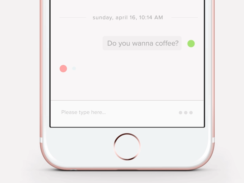
Image credits: Mariya Yukhimenko
Validate user data
One of the most important and often overlooked aspects parts of form design is error handling. It’s human nature to make mistakes though, and your form probably isn’t exempt to human error. Users dislike when they go through the process of filling out a form only to find out at submission, that they’ve made an error. This is where validation micro-interaction plays it’s part in a user-friendly form. Real-time inline validation immediately informs users about the correctness of the provided data. This approach allows users to correct the errors they make faster without having to wait until they press the submit button to see the errors. When done right, it can turn an ambiguous interaction into a clear one.

Image credits: Paul Macgregor
How to design details
In order to build the right element, there are some critical rules and principles to follow. Here are a few tips on designing details that are worth mentioning:
- Starting from zero won’t do you any good. Before you start, you must know everything about your audience, platform, and product. Find all the information and test it first. Prototyping the triggers and designing them are keys you shouldn’t neglect.
- Prevent, at all the costs, anything that can break the Loops.
- Don’t lose the human touch. Keep it real and emotional.
- Use Trigger to bring forward all the most interesting information. This way, it is seen from the start.
- Keep it simple. Don’t add or create too many things at once, don’t overload the screen. Use only the elements that are already there.
Conclusion
The design is in the details. Even minor details deserve close attention because all these little moments make up the feel, they come together to form a beautiful holistic product.
“The difference between the products we love and those we simply tolerate are often the micro-interactions we have with them.” — Dan Saffer
If you care about user experience, you must care about micro-interactions. Because your product is only as good as the least micro-interaction that people have with it.