In this article, we are considering the most popular and the most convenient alternatives to the hamburger menu.
In recent times, many designers treat hamburger menus as an inconvenient type of navigation, saying that it often harms product UX due to its poor discoverability and inefficiency. This is why more and more companies nowadays try to find more user-friendly hamburger menu alternatives.
Are you struggling to come up with an idea of your mobile app navigation? Don’t you want to use old classical hamburger menus and strive for something more innovative instead? You are in the right place! In this article, we’re providing a short overview of the most popular alternatives to hamburger menu. None of them is better than the previous one, and none is more convenient in use. Each of them suits different contexts, and much depends on the digital products.
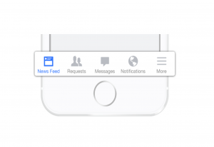
Simple Tab Bar
If you have several categories on your website or app, then tab bars can be a good option for you. It allows users to rapidly switch between the categories without having to search for the right one in a hamburger menu. The tab bar is thought of as one of the most straightforward navigation patterns. However, there are several things you need to keep in mind when designing it for your product. The first one is that you need to have more than five content categories to go with a tab bar. The second important rule is that one of the categories displayed in a tab bar should always be highlighted with the color and be active. The third one is that the common places to display tab bars are the top of the screen or at the bottom, depending on the digital product.

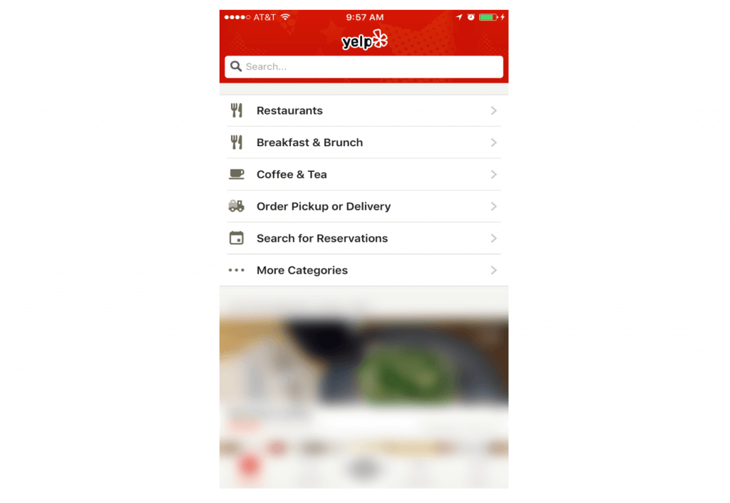
Tab Bar with a “More” Option
The tab bar with a “More” option may seem similar to the hamburger menu, and you may think that it doesn’t improve UX, but it actually does! This kind of navigation implies having more than five categories in the menu and displaying just the four most prioritized of them. The fifth icon in the tab bar should be left for the “More” option that hides other categories. When choosing this navigation pattern, you should carefully prioritize the first four labels to make sure that the average user will need these categories the most frequently and will go to the “More” button just in rare cases.
Progressively Collapsing Menu
The progressively collapsing menu is an excellent option for almost every device. This menu contains many categories and a “More” option, which looks pretty similar to the ordinary tab bar with the “More” button. However, the difference is that the progressively collapsing menu adjusts the number of displayed categories to the screen size, leaving all other categories in the “More” option. For example, it can show only three categories on a mobile device, five categories on a laptop, and ten categories on a widescreen PC monitor.

Scrollable Navigation
Scrollable navigation is the most frequently used for interfaces where the prioritization of categories is almost impossible as all of them have nearly the same value. It can be relevant for a news website, for example, where the user is expected to explore the content, and there is no necessity to prioritize the categories. They are just being scrolled in the carousel, and the user hovers on them or taps a special button to start scrolling. The downside of this navigation pattern is that there are only a few categories displayed at the same time, while you can access others only when scrolling the raw.
Full-Screen Navigation
While all other navigation methods are striving to minimize the size of the menu on the screen, this one is doing the opposite. Full-screen navigation is used on websites and mobile apps where the entire homepage is dedicated to the navigation since it occupies almost a whole screen. It enables easy and quick navigation and implies that there are many categories and subcategories facilitating the user search. Full-screen navigation is commonly incorporated into websites and mobile applications that are mainly used as search engines in specific areas.
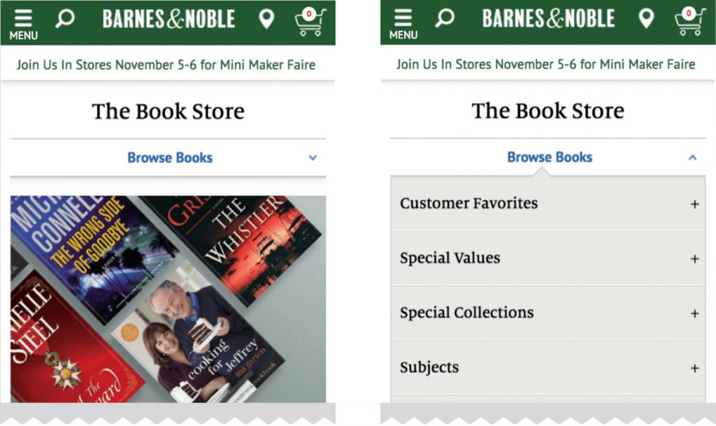
Dropdown Menus
Dropdown menus can be a good alternative to the hamburger menu if you have a set of categories that are siblings and should be necessarily prioritized in some way. This navigation pattern implies that the main label serves as the title of the page and the title of the group of similar categories simultaneously. For example, you enter the page and see the main word heading this page with a downward arrow. It makes you think that when clicking on it, you will access other categories that are similar in their type. You will suppose you will access the pages that are children of the one you just entered.
Conclusion
The hamburger menu can be a good option for some digital products. However, increasingly more modern interface designs include different alternatives to hamburger menu for web and mobile. Has this article brought some inspiration for you? We really hope that yes! Here we presented the simple tab bar, the tab bar with a “More” option, progressively collapsing menus, scrollable navigation, full-screen navigation, and dropdown menus. We should admit that these aren’t all alternatives to hamburger menus possible. But we see them as really the best ones.


