Website redesign
for Sweet Analytics.
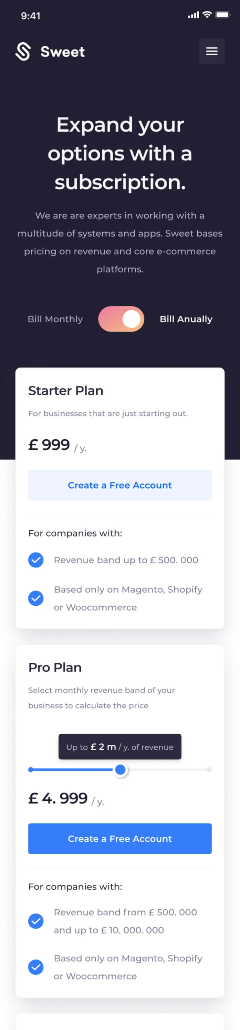
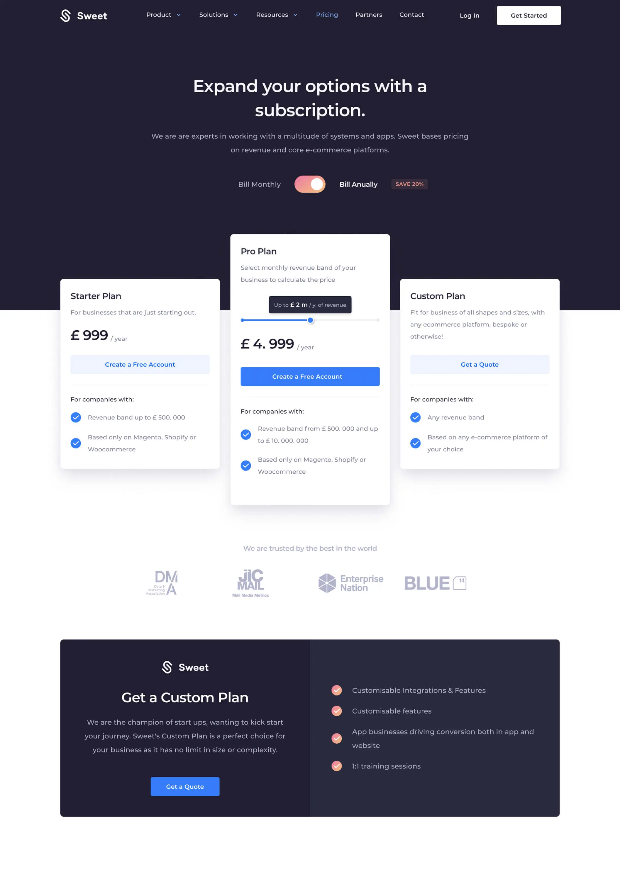
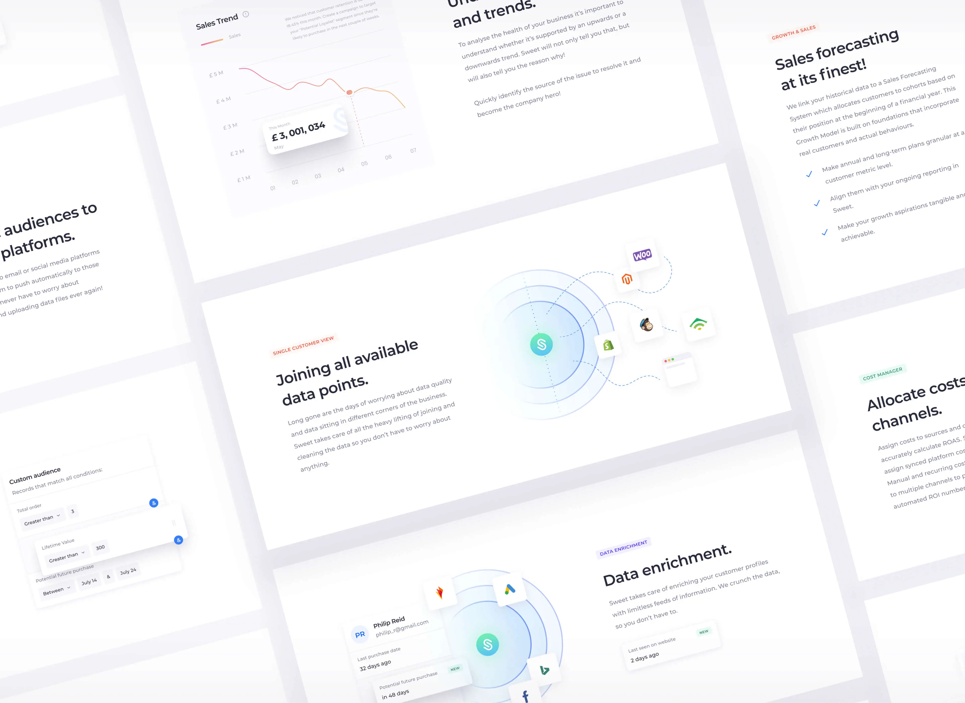
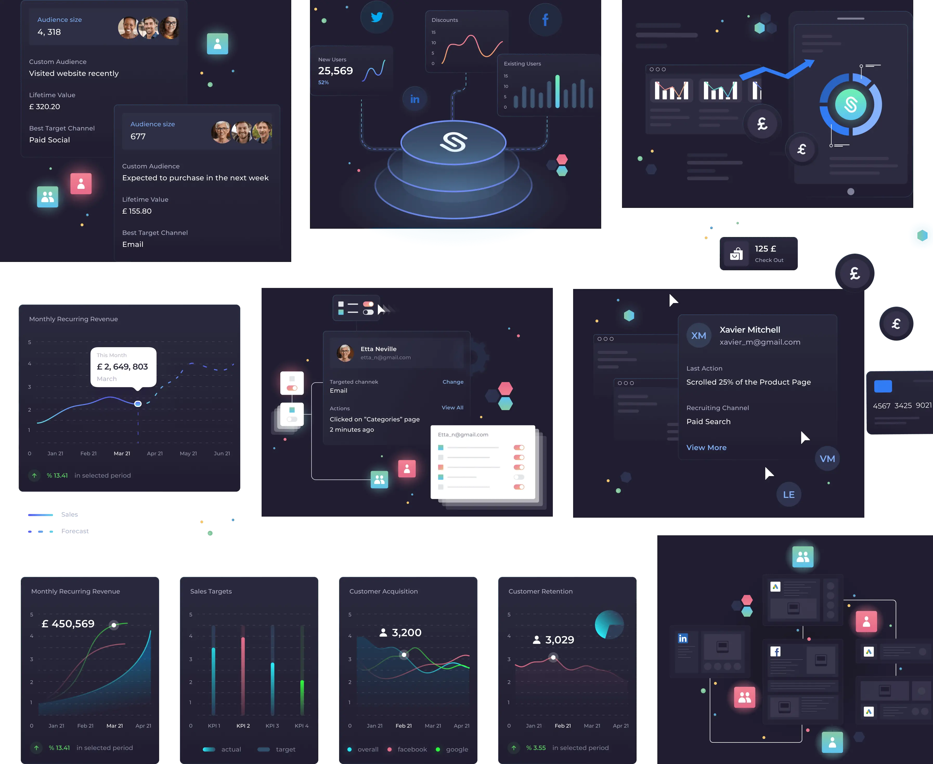
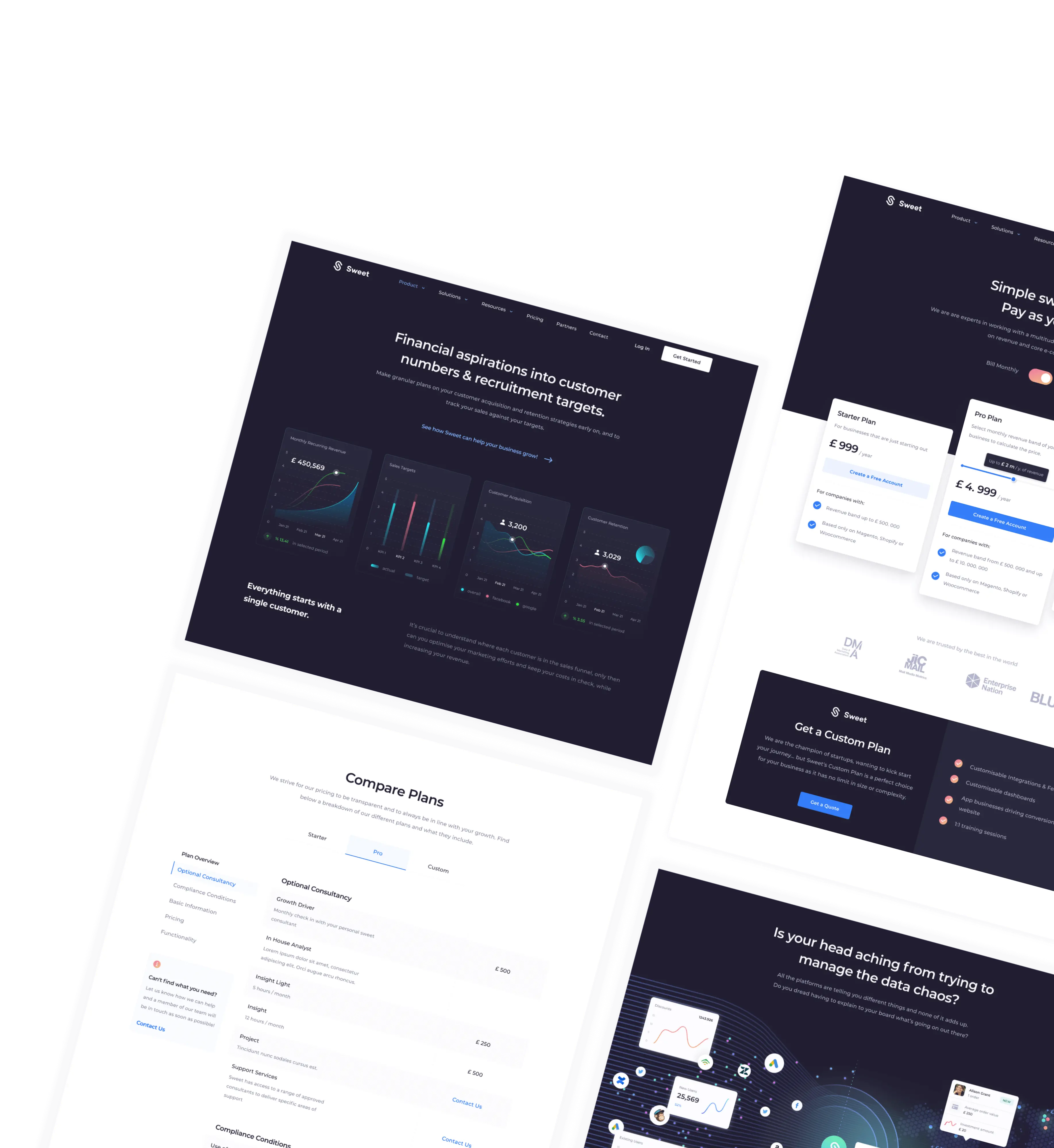
During the design process, our top priority was the user’s perception of the company. We focused on a simple and clean presentation of the platform, as well as graphics that clearly reflect its capabilities.

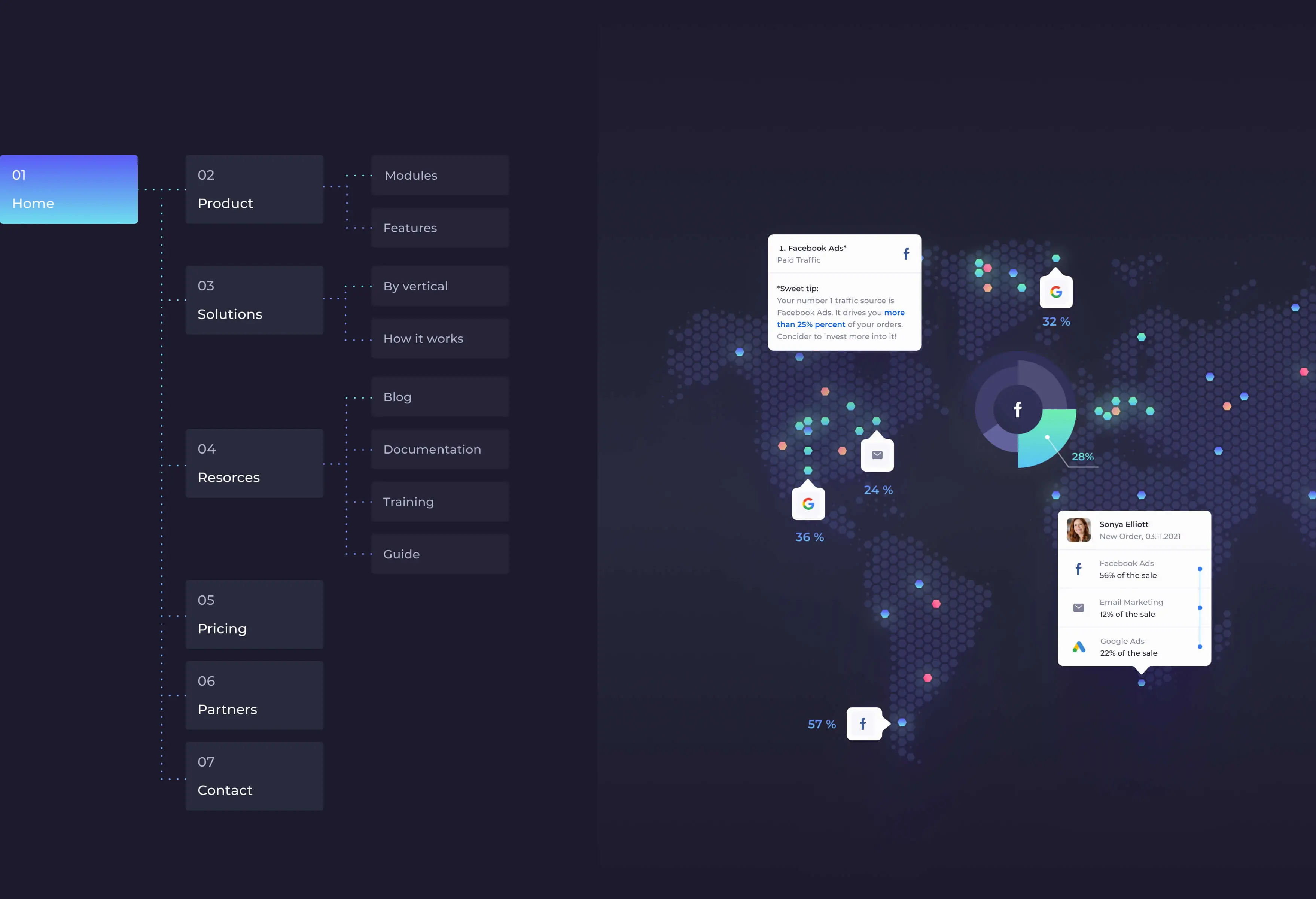
02 / Sitemap
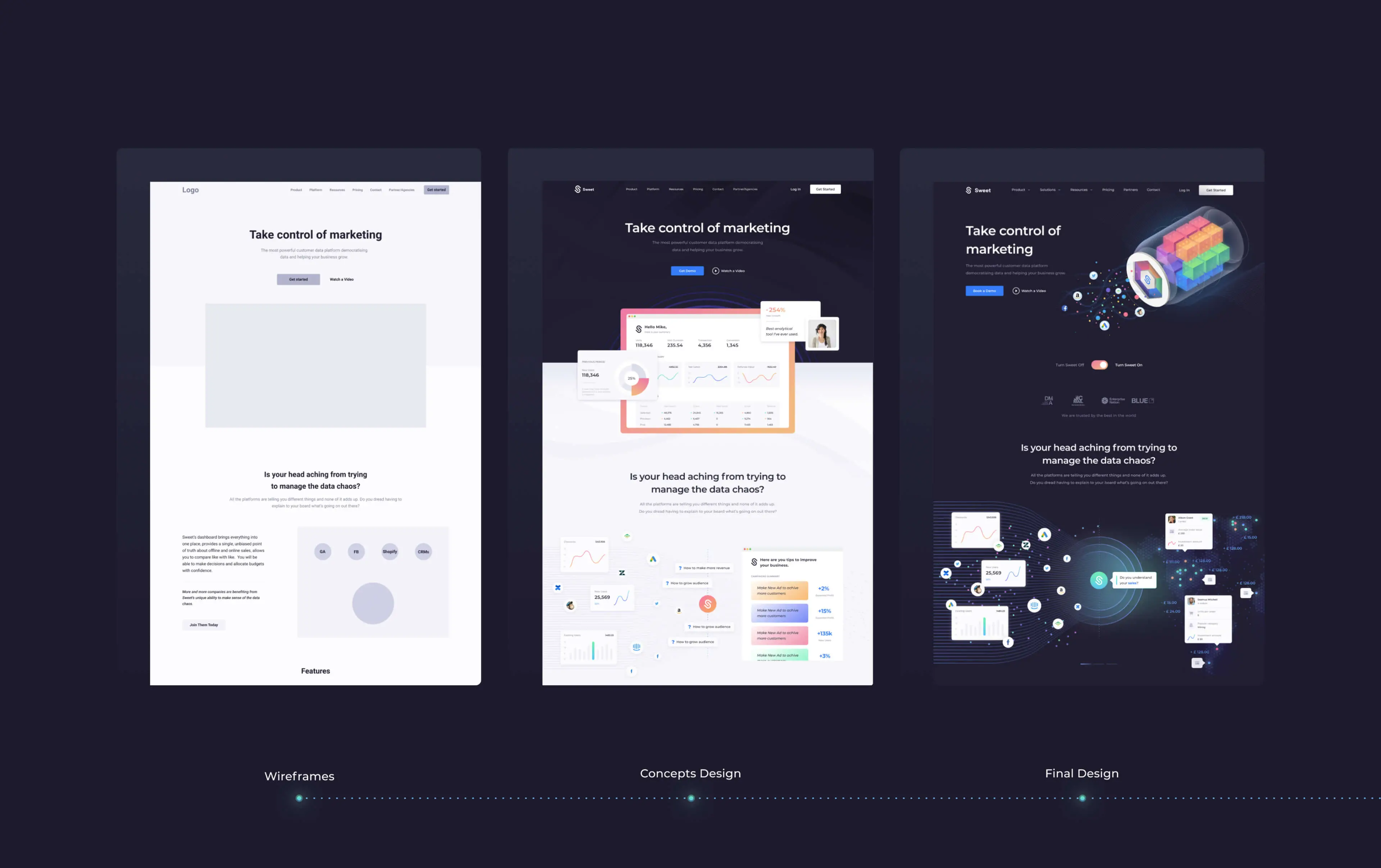
03 / Our Process
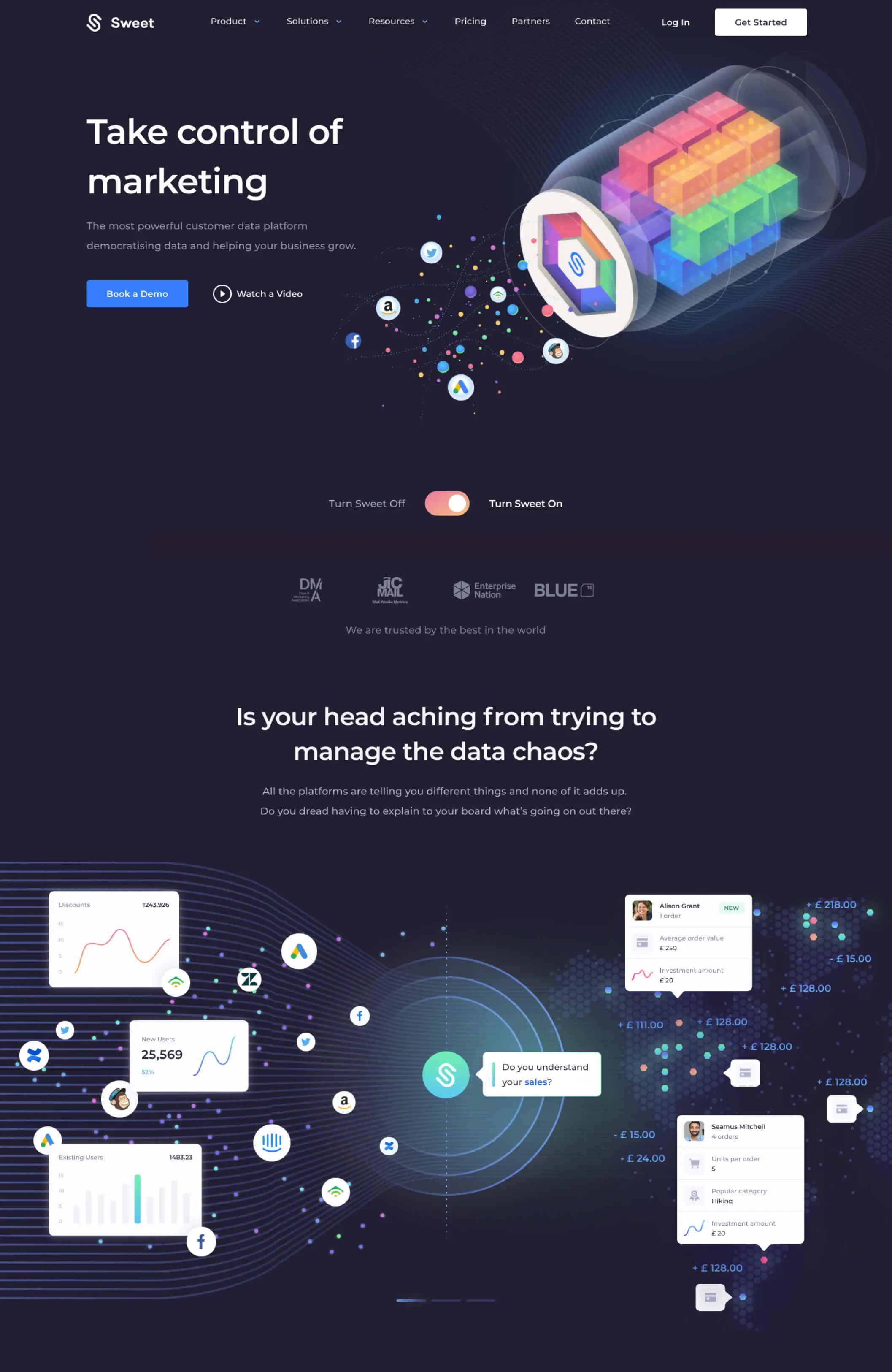
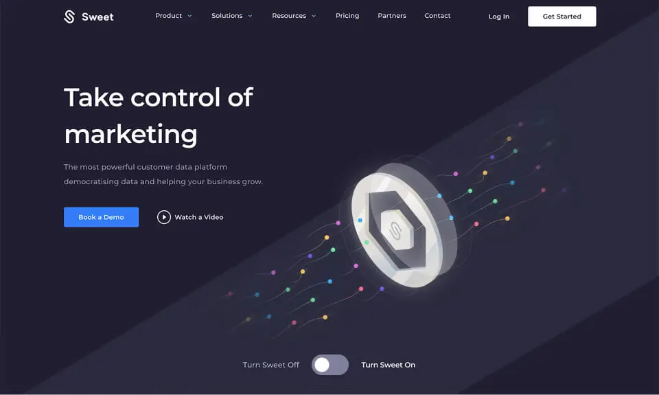
05 / Main Illustration Design & Ideation

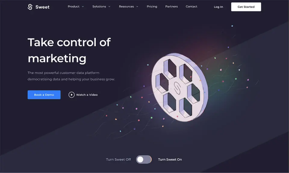
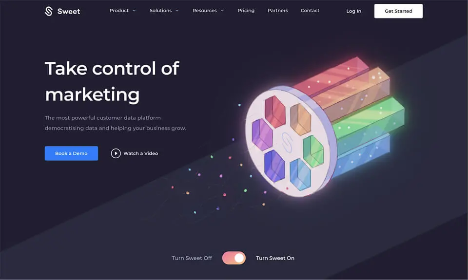
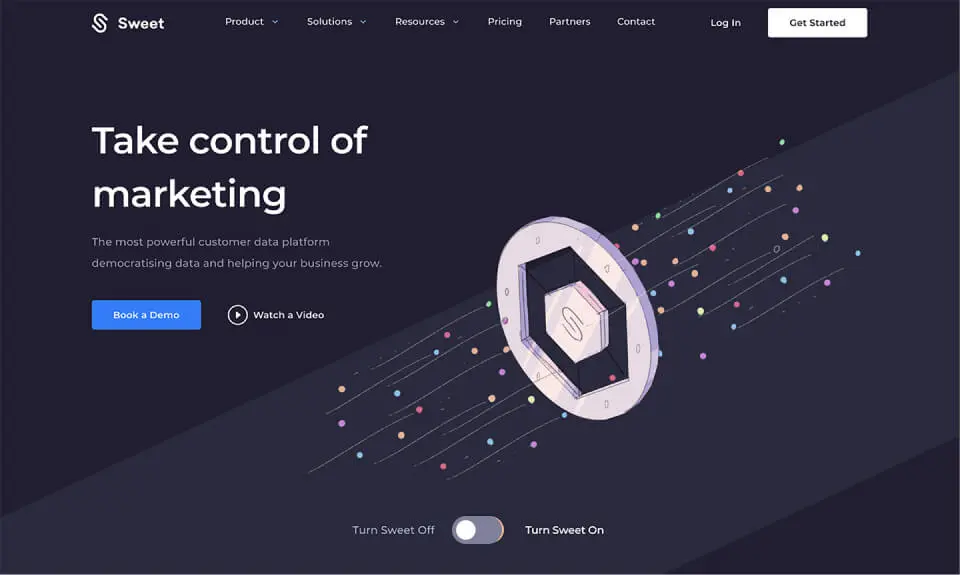
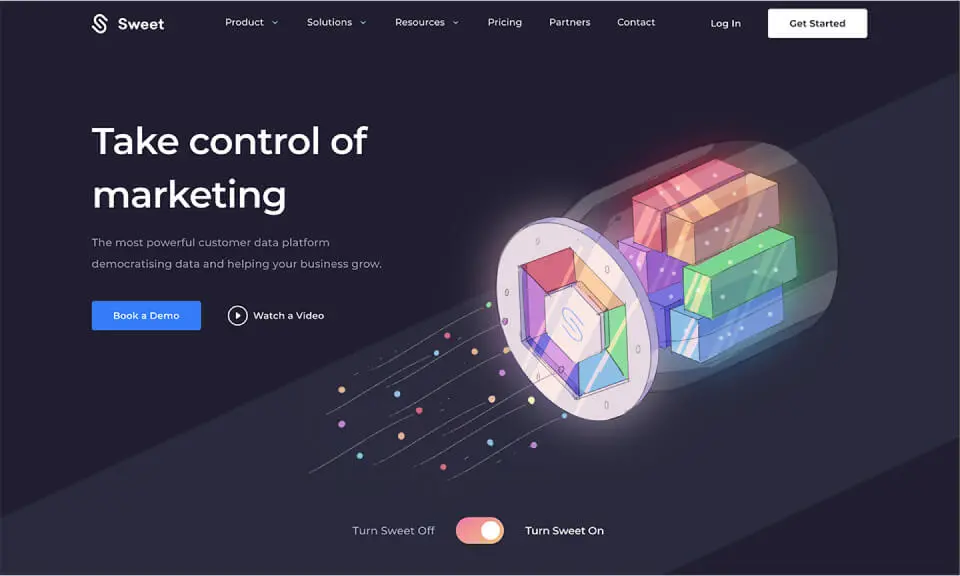
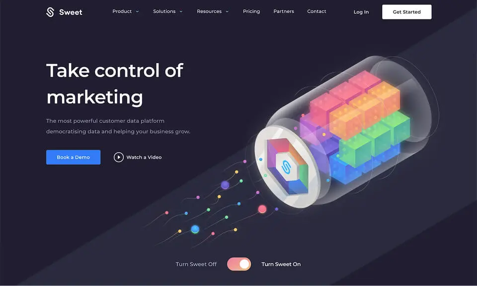
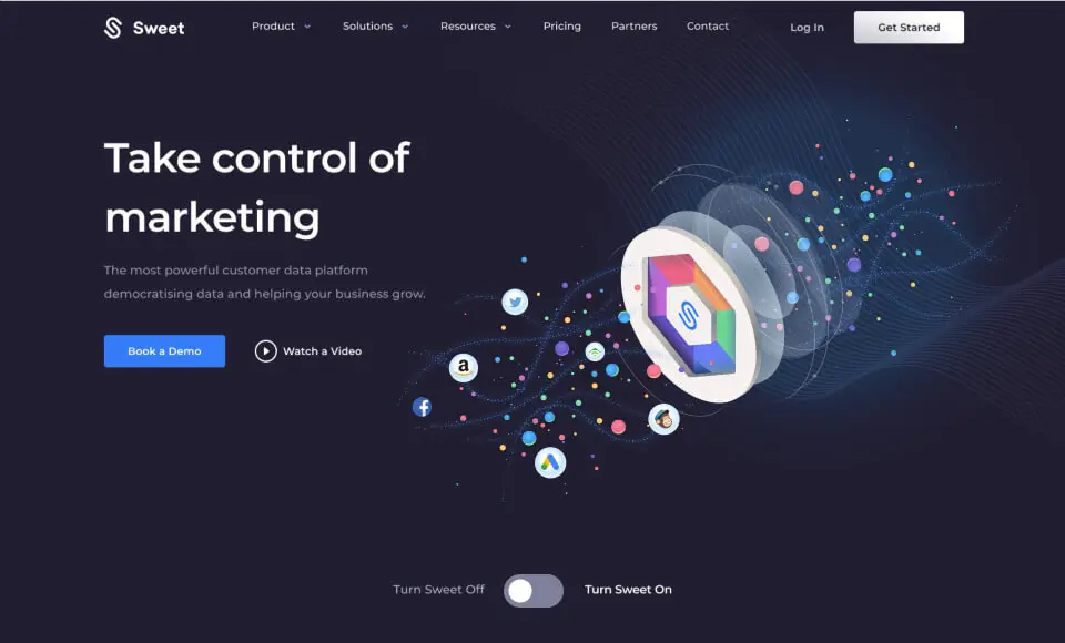
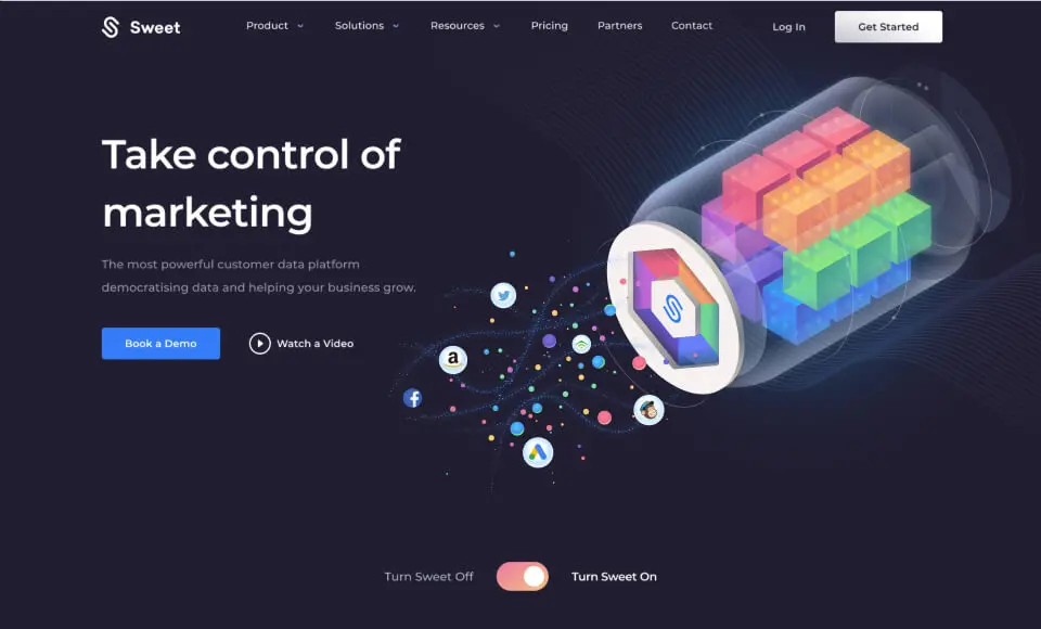
06 / Animation of the Main Illustration