


It is not that easy to develop a nice web design for a law firm. Working on such a project, you usually can’t simply unleash your creativity and overload your site with flashy colors, funny animations, and other interesting things which are usually used to make a website really special and unique. No, law firm web design should look serious… and memorable at the same time. How to do this? Keep reading to learn some tips!
Law Firm Website Design: 5 Useful Recommendations
We have collected the most useful recommendations for you to create a custom law firm website design. Here they are.
1. Let a website reflect your brand

There are more than enough law firms on the market, and we suspect that virtually all of them have websites. That’s why it is crucial to create a site that will reflect your brand and, therefore, build your brand’s recognition. So, here are a few things you have to keep in mind when working on the best law firm web design.
- Using your company’s logo is an absolute must! Otherwise, your potential clients won’t really distinguish your firm from that one that belongs to your competitor. Apart from this, make sure that your logo is noticeable.
- The same rule applies to your company’s name — it should be on your website, and it must be visible. Even the most amazing design won’t make sense if users won’t remember the name of your company. Don’t let this happen — place the name (complemented by the logo!) somewhere at the top of the starting page. Let users notice it from the first sight.
- Use your brand colors. This little trick will also help to increase your brand’s recognition, so don’t neglect it. You can use such colors when designing the website’s background, call-to-action-buttons, and so on.
2. Use reviews from your past clients
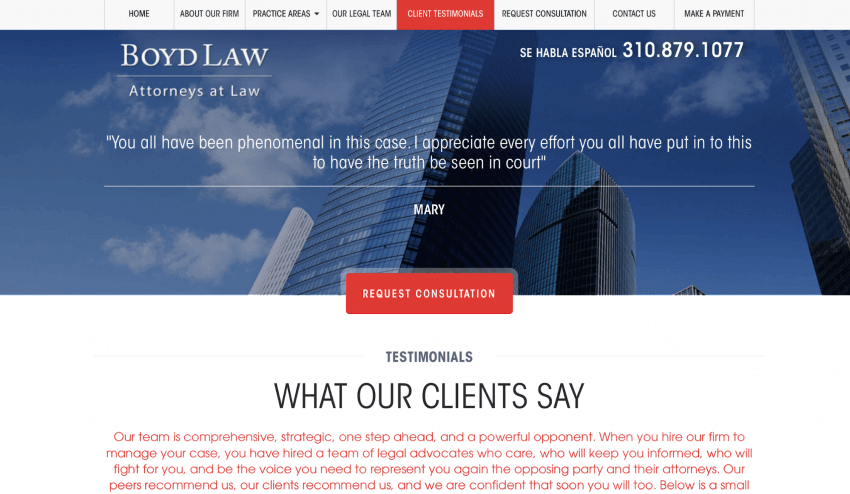
As we’ve already said, there are plenty of law firm websites on the Internet, and making a final choice can be difficult for a client. Testimonials from your clients can help to build trust and, therefore, motivate your users to get in touch with your company and schedule a consultation. It will be useful to share reviews on different cases to show that you have expertise in different spheres.
There are two ways to share reviews. The first option is to design a separate page specifically for them. You can even arrange the testimonials by the name of the attorney who dealt with the case. The second option is to locate them, for instance, at the bottom of the starting page.
3. Emphasize your advantages

Another way to motivate users to choose your law firm is by stressing the advantages of your company. We would recommend doing this right on the starting page, but they can also look good, for instance, on the About Us page. You can even use them for your tagline.
In any case, your advantages should be noticeable, as they are a great method to help your potential clients make a final decision and contact your firm. Here are several things you may want to mention as your advantages:
- Different practice areas (obviously, they should be listed)
- Case results in monetary terms
- The number of cases you solved (something like “over 300 cases won” sounds good, right?)
- The number of satisfied clients
- The number of patents registered (if applicable)
- Years of experience
4. Create several call-to-action buttons

Since the main purpose of your website is to encourage visitors to cooperate with you, it is extremely important to use call-to-action buttons. You can place them on the starting page and sidebar, at the profile pages of attorneys and lawyers, under the blog posts in case you have a blog section… It would also be great to create buttons of different kinds. Here are several variants of what you can write on your buttons:
- Request a consultation
- Contact *here should be the attorney’s name*
- Get in touch
- View practice areas
There are plenty of potential locations and inscriptions, but we still recommend you be moderate. Don’t place numerous buttons here and there — such a design will only distract and irritate, while users will get the impression that you care only about money, but not of them.
5. Make sure that the website is easy to use

No one likes complicated websites, and, obviously, law firm sites are not an exception. Everything should be simple. Otherwise, your potential clients will start looking for another company instead of trying to figure out, for instance, how to get in touch with you. So, here are several things you should pay attention to when working on your law firm web design:
- Make sure that all the content is easy to read. Avoid overloading the text with links and building complicated sentences full of legal terms. Your clients may not know them, so you will only make them feel uncomfortable.
- Keep the navigation as simple and as clear as possible. If your users get lost, they will simply leave and never come back.
- Animations, audio components, and video content should be used carefully. In some cases, they don’t really suit law firm websites, and if you use them, your site may look out of context.
- The contact form should also be simple — don’t make your users fill plenty of fields only to get in touch with you. Ask only for contact details and a brief message — this will be more than enough. Other details you can discover during the consultation.
Best Law Firm Website Design: 5 Awesome Examples
Check out the examples we prepared for you. They will give you a visual understanding of how a really great law firm website should look.
Lash & Goldberg LLP

The website of Lash & Goldberg LLP looks just amazing. First of all, unlike most law firm sites, it is pretty bright and, what is even better, it still looks serious and professional. Secondly, the brand is easy to recognize, as you can see the company’s name right in the top left corner of the website. Thirdly, the navigation is extremely simple — it is just impossible to get lost there.
The website offers more than enough information about practice areas and featured cases, and the call-to-action buttons are located everywhere you expect them to be. The content is readable and clear. In general, this site is a great example of moderate, but stylish design, and this is exactly how a site of a law firm should look.
Kleinberg Lerner

The website of Kleinberg Lerner illustrates several of our recommendations. The logo and title are noticeable, while the advantages of the company can be found right on the starting page. They are pretty impressive, by the way. There are different call-to-action buttons, and the contact form is very simple. Apart from this, all the links can be found without any problems.
Marks Gray

The starting page of Marks Gray looks pretty laconic, but that’s not a problem. On the contrary, the website looks stylish and professional, which is exceptionally important for a law firm. The navigation is very convenient. The logo and company’s name are noticeable at first sight, and all the company’s practices are listed. Another good thing is that this firm has accounts on several social networks. However, if you follow the same strategy, don’t abandon your accounts — post something on a regular basis.
Lyons Dougherty

The main advantages of Lyons Dougherty are specified right on the starting page (in the form of animation), so you will be able to check them while choosing which button to click. All the essential information about practice areas and attorneys is here, and it is very easy to find. The contact form asks only for several details, so you won’t spend half an hour trying to fill it.
Jordan Lewis P.A.

Here is our last example regarding law firm web design — Jordan Lewis P.A. Here you find not only a stylish logo but also the clients’ testimonials. They have a separate page, but you also check them on the starting one. Additionally, you can also find information about case results. The provided contact form is as simple as possible — it has only 4 fields. The navigation is more than convenient, and a few social network accounts are available as well.
Website Design For Law Firm: You Are Ready to Start Your Project!
You already know a lot of things about creating a really cool website for your company, but you are welcome to get in touch with us in case you want to make a law firm web design order or discover more about potential law firm website design costs. Additionally, we recommend considering how to design a profile page, as it can significantly enhance your website’s user engagement. We are always glad to offer you our professional law firm web design service and help your project to succeed and conquer the market. Additionally, for broader design inspiration, consider exploring examples of well-designed fishing websites


