


Nobody wants to create bad design, and yet it happens all the time. And while the cause of bad design varies, the final result is the same—bad user experience.
Bad user experience frustrates users and often leads to abandoning the product. In this article, I’ll focus on one particular aspect of bad design—using UI techniques that lead to bad UX.
1. Pop-Ups
If I ask you to name the single most irritating thing on the web, the odds are that you’ll reply, “Pop-ups.” According to the NN Group pop-ups are the most hated web experience ever.
We all know that feeling. You visit a new website, the content on the page seems to be interesting. You begin to read it and just when you are halfway through the text, you are suddenly interrupted by a huge overlay asking you to either subscribe to a newsletter or offer you something. In most cases, your immediate reaction will be either to close the overlay or to close the entire page, the overlay along with it.
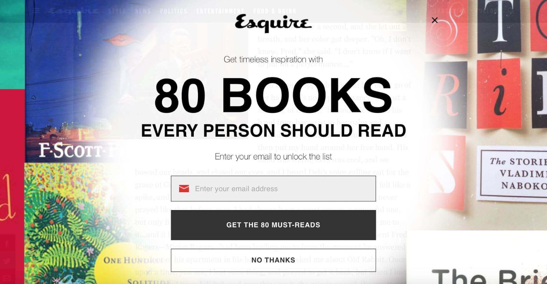
An overlay used on the Esquire website.
It’s obvious why so many sites use this technique: Advertisers pay them to. However, the pop-up technique is too disruptive, and it has a huge negative effect on visitors. Every time you show a pop-up you ask users to stop doing what they want to do (what’s important for them) and focus their attention on what you want them to do (what’s important to you). It’s not surprising that such behavior often increases bounce rate.
It’s possible to use pop-ups without annoying your visitors. Just follow a simple rule—trigger a pop-up at the right time. For example, it’s much better to allow users to finish the current activity (e.g., reach the end of the page) before showing a pop-up. Once users have had a little more time to learn about you (your brand and your offerings), the chance that they will be willing to do what you want them to do increases.
Another important component is the actual message you have in your pop-up. You need to write a great copy. The copy shouldn’t be insulting, tricking, or confusing. Waitbutwhy go even further and incorporate humor in their text:

When visitors read the copy from Waitbutwhy, it makes them smile.
It’s worth saying that there are many less-obtrusive tools such as slide-in bars that don’t cover the whole page and produce similar results in terms of conversion.
2. Infinite Scrolling
Infinite scrolling is a technique that allows users to scroll through a massive amount of information with no finishing line in sight. The page simply keeps refreshing while users scroll down. The technique became popular in the era of mobile devices (scrolling is much more comfortable than clicking on a tiny screen). At first glance, this technique is a perfect solution for many problems—it requires less effort and makes content comprehension as easy as possible (all users need to do is to scroll). However, it’s not a one-size-fits-all solution for every site or app.
The main downside of the technique is also its primary advantage: there’s no finishing line in sight. When users get to a certain point in the stream, they can’t bookmark their location and come back to it later (notice, I mean position, not certain item). So if they leave the site (eg, move from one device to another), they’ll lose all their progress and will have to scroll down again to get back to the same spot. The inability to determine the scrolling position often annoys users and hurts the overall user experience.
In 2012 Etsy, an e-commerce website focused on handmade or vintage items, experimented with layouts for their product page. They implemented an infinite scroll interface and found that the new interface just didn’t perform as well as a previous version with pagination. Although a number of purchases stayed the same, user engagement went down.
What does Etsy’s example tells us? It tells us that with every design decision we should weigh the pros and cons before incorporating it into our designs. Speaking of infinite scroll, it works well for something like Twitter/Instagram where users are happy to scan an endless stream of data without looking for anything in particular.
3. Push Notifications
Have you ever paid attention to the number of notifications you receive on a daily basis from various apps? How many of those notifications do you actually care about? Not too many, I guess.
Everyday, we are bombarded with useless notifications that distract us from what we do. They annoy us.

The streaming service sends every user a notification every time a new episode of any show is released.
In fact, annoying notifications are the number one reason people uninstall mobile apps (according to 71% of survey respondents).
Push notification is a powerful tool, but as with any other tool, it can be used for good or evil. When users start using your app, they don’t mind getting notifications as long as notifications deliver real value. It’s essential to design notifications to be useful, relevant and timely for your users. Personalized content is a key to the excellent user experience. When you deliver the right message to the right person at the right time, your push notification becomes a powerful trigger that motives the person to take action.

Netflix does a great job of personalizing their messages to the individual receiving them.
4. Scroll Hijack
Hijacked scrolling is one of the most annoying things for many users since it takes control away from them and makes the scrolling behavior completely unpredictable. When designing a website, in most cases it’s better to avoid scroll hijacking and let the user control their browsing and movement through the site. But in some rare cases scroll hijacking might work fine for your users. For example, Tumblr uses this technique on their homepage to present information in chunks.

Tumblr use scroll hijacking to provide content in chunks.
Conclusion
It’s worth saying that all techniques mentioned in this article aren’t bad per se. Users hate them only when designers blindly incorporate them. Each technique or pattern on your website or in your app should be used intelligently and with some moderation.


