


One screen divided in two.
The split screen technique has long been known in the film industry, with early examples dating back to the silent movies days of the early 20th century, and it is still a popular device in film and TV today.

A split-screen layout is in use when full-screen elements are divided into two or more vertical parts. A scene from the film “Scott Pilgrim vs the World”
However, this is a relatively new technique for the web design industry. Split screen website designs became popular around mid-2016 and now can see more and more split screen website examples. There are a few reasons why this design pattern became so popular:
- It has a nice aesthetic quality. When executed correctly it can offer users a wonderful viewing experience.
- It’s a good choice for responsive frameworks. Split-screen design can be adapted for a variety of screens, even small ones. When it comes to smaller screens, such as mobile displays, the panels can be stacked.
- A split screen landing page helps guide navigation. Using simple design techniques, you can draw the user’s attention to a specific part of the screen or encourage them to click.
When a split screen works the best
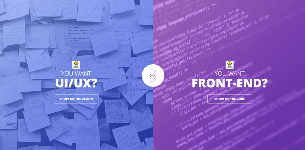
Split screen websites are especially good when you have two things to promote. For example, when a site offers two entirely opposite variations. This approach allows designers to give prominence to both things and allow the user to quickly select between them.
The trend of a split screen has become particularly popular among brands that provide a comparison of several products or services. It allows them to promote both options simultaneously. Thus, you can impress a website visitor with your different product designs and functionality even more. Also, split-screen designs work the best for travel agencies, as they can show the tempting views of different luxurious resorts and beautiful places for sight sighting located worldwide at the same time.

One screen, two messages in Dropbox Guides
When you should avoid a split screen design
After considering the best split screen use cases, it’s also crucial to mention the worst of them. Here we provide a short description of cases when it’s better to avoid using a split screen design. These several tips and practices will give you the right direction in web design and help understand what suits your brand best.
Split-screen designs don’t expand well as the content grows, therefore it is not recommended to apply them to content-heavy layouts. It’s important to keep the screens simple because complex split screens make the UI look overloaded with information. Therefore, they won’t do much good if you have a lot of content to display.
That’s why a split screen layout would be a perfect fit for minimalist website designs. After all, the whole technique’s purpose is to create a simple look that is easy to perceive. When you overload the design with unnecessary information, you completely erase the benefits of split-screen layouts altogether.
How to decide if a split screen is good for you
Before you start designing a split screen website design, you must be sure that this technique corresponds to the goals of your digital business, meets the customer needs, and provides what people really want. There are many situations when it appears that a split screen design is a beautiful trend, which, however, doesn’t satisfy the brand’s requirements. Here we provide quick advice on the issue.
If you’re considering a split-screen technique for your website, I advise you to ask yourself a few questions:
- Is it suitable for your content?
- Will there be enough negative space to make the layout work?
- Will your users appreciate the layout or it will confuse them?
- Will it be OK to split your users’ attention in half?
The most important thing to keep in mind that content is king and split-screen should be a simple way to deliver your message to people.
Therefore, the main advantages of split-screen layouts are to provide clarity and simplicity, by restricting the split-screen component comprehensive. This is easy to achieve when you know your goals and have a clear message to showcase. Thus, by following your special program, you can navigate users through the website without the danger to confuse or lose them.
Landing pages are a good example of split screen advantages. Split-screens are most commonly used for creating effective and stylish landing pages, which are incredibly useful for marketing purposes. This technique is great when it comes to controlling the visitor’s focus and targeting it to specific components.
This is also very helpful for improving the overall user experience. For instance, you can place some themed products on one side, while the other will depict their main features, or provide comparisons, etc.
Key points for proper technique implementation
Before moving on to the design, there are a few key points for proper technique implementation, such as:
- Always scaling viewable content to different sizes and densities, in order to have a compatible design with mobile devices.
- Adopting primary control to a new mode; for example, in a split design, make a menu instead of navigation bars.
- Keeping UI adapted for a new layout. For instance, if there is a video displaying on one of two sections in a landscape mode, it should remain only in its half, even if the user rotates the device to a portrait mode.
Design techniques for split screens
So, are you sure that a split screen design is what your website needs? Perfect! Then, it’s high time to learn how to design it appropriately. Further, we suggest the best, proven, and widely-used practices for designing an outstanding split screen website.
Pair vibrant colors and dramatic typography
Thanks to Flat and Material Design, vibrant colors and dramatic typography are big trends now. Vibrant colors are visually stimulating and dramatic typography enhances the text content. Simply combine the two and you will create a visually interesting design. Baesman has done this masterfully. They gave equal importance to both elements while, at the same time, allowing the user to choose between them quickly.

Bright colors and interesting typography pairs can add interest
Draw the user attention to the CTA button
Much more than a simple graphic trend, splitting the screen into two distinct parts provides an original way to guide the user through your site. It’s a great option when you want to create a bigger focal point for calls to action. The benefit from such a layout is that you can have a visual impact on one side, while also having interactive elements on the other.
The template split screen helps to increase the clicks through animation and different side effects. The result: you have more active and engaged visitors. In the example below, you can see how negative space creates a vertical divide to give equal weighting to two different options.

Vertical divide allows emphasis on two different CTAs without favoring either
Create a visual flow between screens
When a split screen template represents a single object, it’s important to establish a connection between content containers. One possible way to do that is by using a color. Simply duplicate a distinct color to establish a visual flow between two screens. This works particularly well with a brand color or hue with a lot of contrast. Using color it’s possible to communicate a stronger connection between two pieces of content.
Another possible way to create a strong connection is layering a single element such as text copy across screens:
Overlapping text connects two screens
Last but not least you can use a colored overlay for this purpose:
Consider the left part of the screens
Use animation to encourage users to act
Fine animation and interactive effects encourage users to click. Look at the split screen website template used for the “Chekhov is Alive” site below. The web design split screen begs you to click to find your character.

Also…
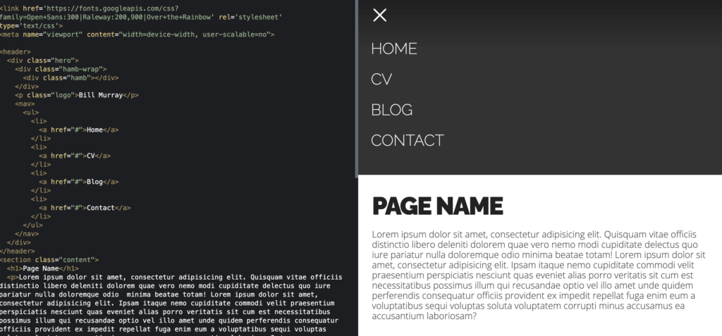
Use a static sidebar layout
Nowadays, due to HD quality and 4k, one of the popular split-screen examples is a layout with a static sidebar and a quite bright image in the background. What’s great about this option is the compatibility with smaller screen sizes, where the sidebar turns into a header. Therefore, it not only has this modern and fresh look but can also be quite functional.
In this example on CodePen, you can see how to create and design a static sidebar layout.
Provide a choice
One of the most traditional ways to design split-screen layouts is to provide visitors with two options to choose from. This pattern can create a clear separation of two sections with different information you would like to highlight, while a brand feature – a logo, for instance – will connect those sections together.
Here you can check an example that demonstrates how you can implement it.
Magazine layout
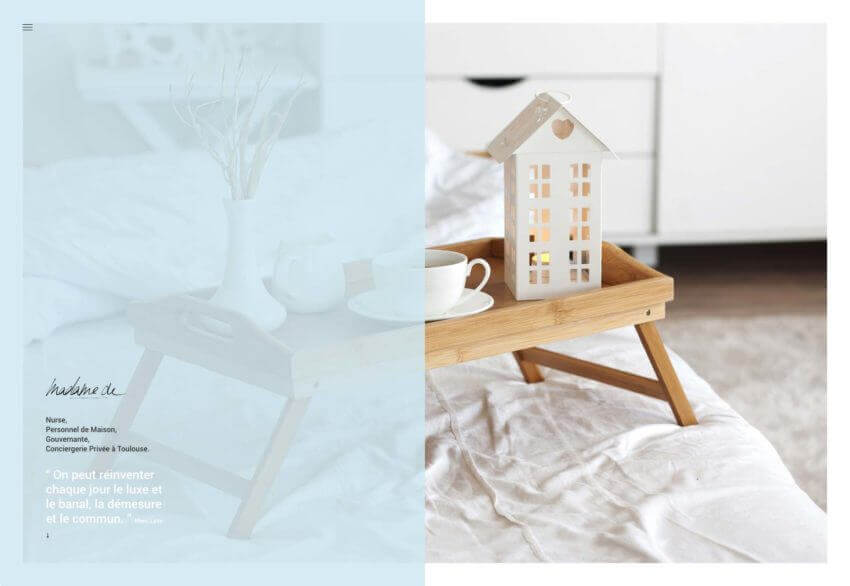
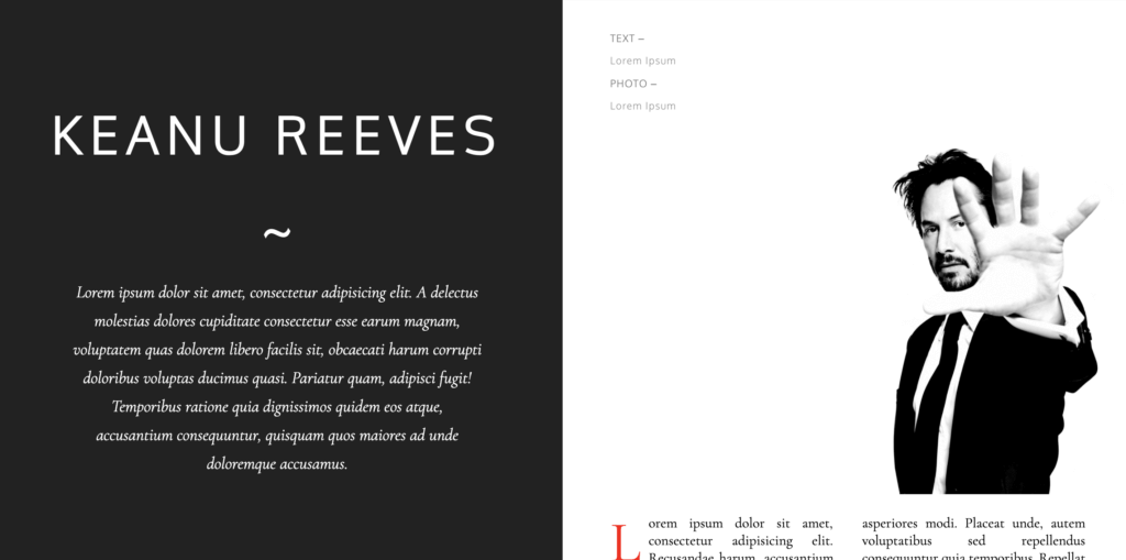
This heading speaks for itself. Such a split screen website design imitates the look of a print magazine. Here, a visitor will see text in a large title on the right side, with images and multi-columns on the left. Surprisingly, such contrasts create a nice overall balance and give the site a professional and posh look.
Below you can see an example of a magazine layout.
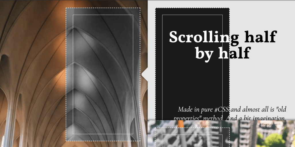
Gallery
This is a “half by half” scrolling effect that creates the impression of a stack of cards, which opens up to a user as he or she proceeds further into the site. While a user scrolls down, the images keep lining up with each other.
Here you can discover an excellent instance powered by CodePen that shows how to develop and design a gallery for split screens.
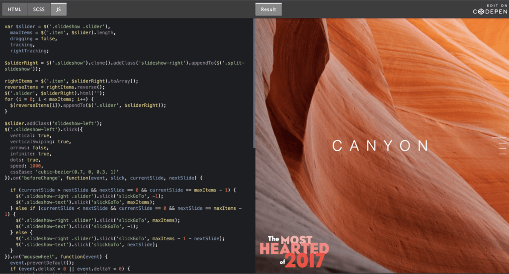
Splitting slider
This split screen web design offers an interesting transitional effect that splits the images as if you are watching a slide show. The split-screen starts to happen only when a visitor begins to scroll down, having imagines slowly queuing one after another. This guarantees a very smooth and beautiful transition.
Here is a nice example of a splitting slider and how to code it.
Conclusion
It takes approximately three seconds for a visitor to make a decision regarding your website. Consequently, your layouts should always be visitor-friendly if you want to reduce bounce rates. The split-screen technique can help you with that. The split website design is a fun, functional, and responsive way to create an engaging design.
Here we have overviewed proven practices on creating a prominent split screen website design, considered how it can contribute to the user’s first impression, and how to implement it. Our team has also considered the best examples of split screen designs.
If you have more questions about this technique or want to design a website with a split screen, don’t hesitate to reach out to us at [email protected].


