


Color is one of the most powerful tools in the designer’s toolkit. It can draw attention, set a mood, influence users’ emotions, perceptions and actions. With the lingering presence of Flat and Material Design, color holds even more prominence in UI design today. Bright colors are equally well suited for both playfully cartoonish designs focussed on entertainment and for the elegantly minimalist styles focussed on business solutions. This versatility makes vibrant colors one of the biggest UI design trends of 2017.
The appeal of the vibrant color trend is that it can be applied in many different ways and styles to design. In this article we are going to look further into four color scheme trends and discuss some inspiring examples which implement them highly effective.
1. Monotone
One of the most popular ways to use vibrant colors in your design is a technique called monotone. Monotone palettes include a single color with a mixture of shades and tints. Monotone is fairly easy to create: Think about the color that best works with your message and consider the amount of variance you want between tones.
Improve Readability
Monotone helps establish a solid foundation for foreground content, taking care of readability. Paired with dramatic typography, monotone color schemes are able to create a truly memorable experience.

Sydneystockhom uses bold color to create a memorable look in a very simple way
2. Duotone
As the name suggests, duotone is an image made up of two colors. This can be two shades of the same color or two contrasting colors. The technique that was once a print staple has found new life online. Thanks to Spotify, duotone is growing in popularity almost every day.
Create an atmosphere
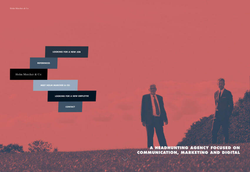
Duotones allows you to inject an image with the emotional attributes of any color. Remember, that different colors evoke different emotions. A soft and modest combination of colors is able to create a serious atmosphere. For example, in Holm Marcher & Co example every detail tries to contribute to the businesslike atmosphere, and background images are no exception.
While a combination of bright colors is able to create a sense of happiness. The main visual for New Deal Design is striking thanks to a bold color choice. They create a friendly atmosphere and set a positive mood.

Increase Readability
Duotone is able to give the text plenty of contrast. It adjusts color variations in an image so that text can be placed using a single color almost anywhere on the image.
3. Gradients
Gradients have made their way back into GUIs, this time using high-contrast complementary colors. Modern gradients might include multiple colors, radiate from the center, come from a corner or fall horizontally.
Create a Modern Look
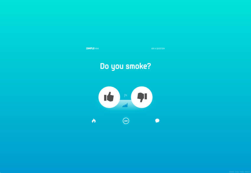
Gradients made a comeback and breathe new life into the bright color trend. Paired with a flat color palette they can evoke feelings of modernism. With only one color, Zample uses a gradient effect on its background without falling into dull tones.
By using one of the bright, saturated colors associated with Material Design, you can evoke feelings of modernism.
Make Layout Easy On The Eyes
Gradients can improve visual communication. The transition from orange to pink in Symodd’s example below gives depth and contrast to the interface and creates some eye-catching visual effects. The shift from light to dark follows natural human eye scanning patterns that move from the top left of the page to the bottom right.

Symodd’s homepage features a full gradient background from orange to pink. It’s a subtle gradient as the two hues aren’t too different from each other making this easy on the eyes.
Use It As an Accent
While gradient is often used as backgrounds for pages, they can work in smaller places as well. Consider using gradients as an accent in the navigation, for secondary images or for specific types of content. What’s nice about smaller areas of the gradient is that you have more freedom to play with this technique. And when used in smaller spaces, it can be visually interesting to play with multiple color pairs, just like Bloomberg did in the example below.

Bloomberg uses gradient for the ticker Latest News.
4. Overlays
Overlaying is filtering an image through a colored “lens”. Images with color overlays have been a popular design choice for a long time because it’s fairly easy to create this effect: you simply cover an image or video with a semi-transparent colored box.
Focus User Attention
Overlaying effects can help focus users on certain design elements. However, when using a single color as an overlay, think about the degree of saturation and transparency of the color. Heavy color combinations (less transparency and more saturation) put more focus on the color itself:
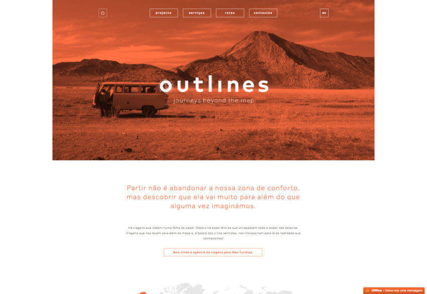
Color overlay used by Outlines puts more focus on the image.
Conclusion
It’s hard to find a design technique that’s more fun to play with than color. Color effects can be dramatic, impressive and even serene. Don’t be afraid to go outside your comfort zone when it comes to working with colors. Whether you are a fan of bright, bold hues or prefer a more minimalist black and white, the one thing you need to remember: there are no wrong colors, what matters most is how you use them.


