


A Floating Action Button (FAB) is a circled icon floating above the user interface. Its shape, position, and color ensure it stands out from the rest of a UI. FAB was popularized by the release of Google’s Material Design principles in 2014. Since this release, the FAB user interface element has been widely adopted in web and mobile design.
Although the FAB may be seen as a small, seemly insignificant UI component, its effects can be important. Given that the pattern is used correctly, it’s meant to be instantly identifiable and accessible.

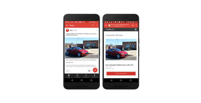
Floating Action Button in Android app
1. Represent a Hallmark Action
Ideally, FAB should highlight the most relevant or frequently used actions, it should be used for the actions that are the primary characteristics of your app. If you’re going to use FAB in your app, the design of the app must be carefully considered and the user’s possible actions must be boiled down to a single prominent feature. For example, a music app may have FAB that represents ‘Play/Stop’. An Instagram-like app might have a FAB that represents ‘Take a Photo’.

A floating action button represents the primary action in an application. Pausing or resuming playback on this screen tells users that it’s a music app.
According to research by Steve Jones, FAB demonstrates a slight negative usability impact when users first use the button. However, once users successfully complete a task using the FAB, they are able to use it more efficiently than a traditional action button.
2. Be a Way-Finding Tool
FAB is a natural cue for telling users what to do next. Research by Google shows that when faced with unfamiliar screens many users rely on FAB to navigate. Thus, FAB is very useful as a signpost of what to do next.

The use of a Floating Action Button in Twitter encourages you to post content
3. Provide a Set of Actions
In some cases, it is appropriate for the button to spin out and expose a few other options as can be seen in the Evernote example below. The FAB can replace itself with a sequence of more specific actions and you can design them to be contextual to your users. As a rule of thumb, provide at least three options upon press but not more than six (including the original floating action button target).

Also keep in mind that these actions must be related to the primary action the FAB itself expresses, and be related to each other: do not treat these revealed actions as independent as they could be if positioned on a toolbar.

Don’t: ‘Where I am’ action isn’t relevant to create content actions.
4. Be Context-Aware
Context plays an important role in user interaction. Sometimes users want to consume content, sometimes they want to perform actions. It all depends on the context. Using some contextual behavior could bring the best of FAB to the UX of any app. Let’s consider Google+ as an example. Google+ shows the button when the user is engaging with the stream, and hiding it when that engagement is reversed. These two states rely on context : when users are engaging with a social stream, primary action is to scroll, hence there’s no need for FAB, and when users stop scrolling, they might want to post something.
5. Connect Two States Together
FAB is not just a round button, it has some transformative properties that you can use to help ease your users from screen to screen. When morphing the floating action button, make the transition between two states in a logical way. The animation in the examples below maintains the user’s sense of orientation and helps the user comprehend the change that has just happened in the view’s layout, what has triggered the change, and how to initiate the change again later on if needed.
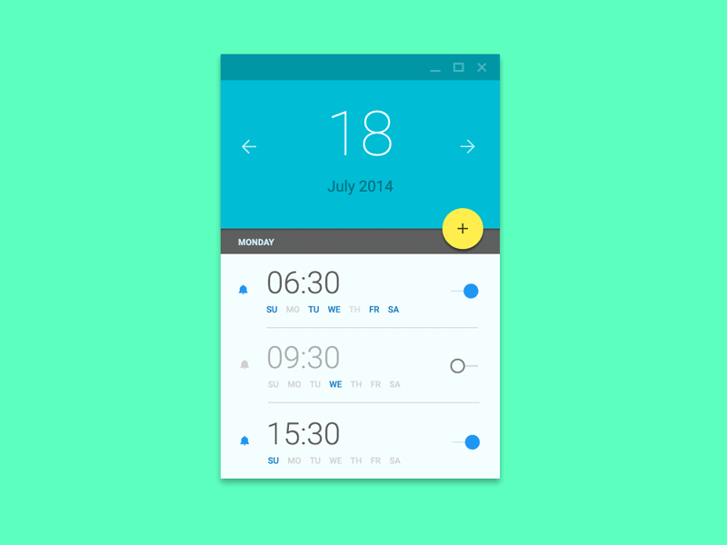
Image credit: Ehsan Rahimi
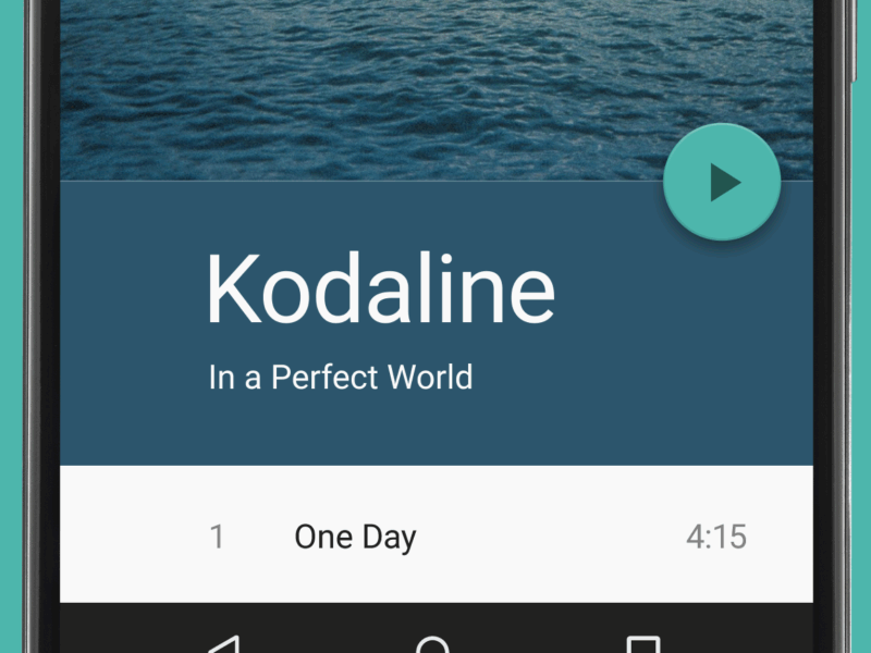
Image credit: Dribbble
Conclusion
Some might say that FAB is bad UX. It’s tempting to say that because users and designers aren’t used to it. We are used to familiar toolbars and the concept of FAB is still fairly new to us. We all know how that new thing are hard, but at the same time, they encourage a more carefully designed user experience. Used correctly, FAB can be an astoundingly helpful pattern for the end-user.


