
 Kotlin
  C++
C++  C#
C#  Ruby on Rails
  Java
Java  Firebase
  Python
  Vue.js
  HTML5
HTML5  CSS3
CSS3  Azure
Azure 


With all the mobile devices around us, responsive website development is a must today. To obtain it, you should be aware of the responsive web design process. In this article, you will find:
- the steps required,
- the workflow you need to follow, and
- the tips that might be handy.
Though following the process might sometimes seem tedious, it doesn’t mean that you should be discouraged by this necessity. On the contrary, a detailed guideline might be convenient when it comes to the development of a website for your project.
How to make a responsive website? You can hire a team of developers or do it yourself if you have the required experience and expertise. In any case, some things just cannot be excluded from the picture.
The responsive web design development process is quite logical and predictable. To start, you need to have a clear idea of what you want to receive at the end. In between, there will be a number of steps we are going to concentrate on here.
What is a responsive website development process?
A responsive web design process implies creating a website or web app design that is compatible with different devices and performs excellently on various screens in terms of appearance and functioning. Below, we consider all the peculiarities and primary stages of this creative process.
Step-by-step responsive website development process
Here is the sequence of steps projecting the effective responsive web design workflow. The recommendations are based on the best practices, but feel free to make changes to adapt to your circumstances. You can use them as a guide. The steps are:
- Make sure you understand the basics of responsive web design
- Do an extensive search of great responsive web design examples
- Make the web images responsive
- Consider responsive typed content
- Use media queries
- Define all your breakpoints
- Test your prototype
Keeping in mind this sequence, you will have a smooth responsive web designing process and a great result.
Step 1: Make sure you understand the basics of responsive web design

The first step in designing a responsive website is to understand what it is. This is by far the most critical step that will be the determining factor of your successful implementation of responsive website development.
A profound understanding of the adaptive website design process will make planning further steps and creating the complete guide easier. Here are some of the most essential facts about responsive web design:
- Any website can adapt to the size of the user’s device.
- This adjustable visual website layout design has a constant URL, and the content source does not change.
- The device on which a page is accessed does not matter; it keeps a constant HTML code.
- You should always develop a solid wireframe before proceeding with the adaptive website design process.
By using the first step as a roadmap, you will be able to proceed to the other website design steps.
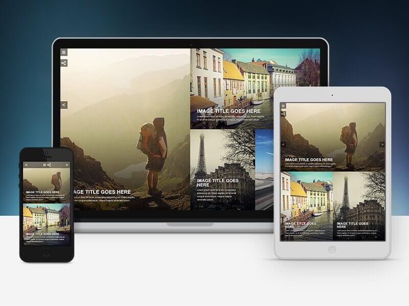
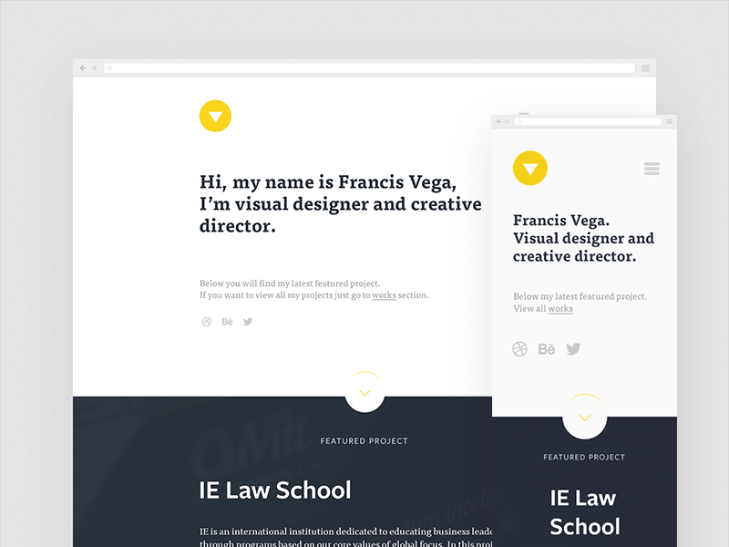
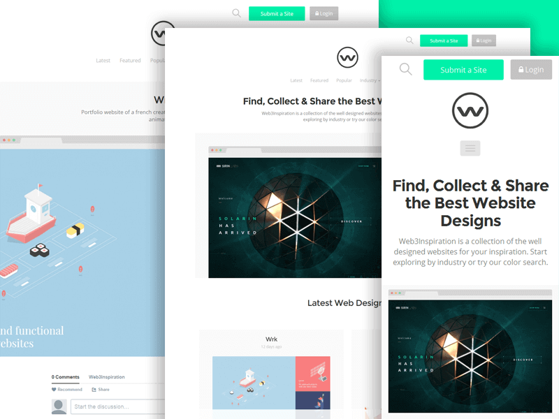
Step 2: Do an extensive search of great responsive web design examples

The next step in responsive website development is to look at some of the best examples out there. It would be best to do extensive research to understand the best practices in web designing.
Remember, your goal may be to improve your web design process for clients or use better skills for your own website. Looking at other people’s work is a good idea. Here are a few responsive websites to draw inspiration from:
The examples above are some of the best spots to check responsive web design.
Step 3: Make the web images responsive
The next thing web designers have to learn is how to make images more responsive. You can’t develop a responsive website without making sure images don’t get cropped or misshaped. This means the image is supposed to scale and adequately fit any screen size. Here are a few points to help you understand it better:
- The width of the image: when using the width property in an HTML responsive design, a CSS width percentage of 100 means the image can scale up and down.
- Maximum width: another feature worth pointing out is the maximum width property of an image. If an image has a maximum width of 100%, it means it can scale down if necessary, but it will never scale up.
- Different images appear on different screen sizes, which is one of the most suitable tools in responsive web design. It enables the designer to select a specific image for a particular screen size. The images are already customized to a particular screen size, requiring no more editing to make them fit for the website.
Step 4: Consider responsive typed content
The next step of designing a responsive website is taking care of the text.
Because of the variety of screen sizes, making typed content look good is a bit tricky. For a designer, it is imperative to ensure that the lines of any typed document are not too long and can be comfortably read on all devices. HTML responsive text size is usually set with the viewport width (VW) that helps the text adapt to the size of any browser window.
The term viewport is used to refer to the size of the browser window. Compared to the viewport size that is currently used, CSS has some smaller values that help web designers size typed content. A good example is VW. For this value, one unit represents one percent of the viewport axis. This means that for a 60 cm viewport, the VW will be 0.6 cm.
In typed content, that value represents the size of one letter. However, it is possible to make further modifications until you are satisfied with the final look of any typed content.
Step 5: Use media queries
After tackling the images and text content of the website, the next step would be to define your media queries. Responsive website design and development allow the creation of a different web design for every screen size. For example, you can make certain content appear in a vertical arrangement on smaller screens and in a horizontal display on larger ones.
Web visitors will still be seeing the same content because its HTML remains constant. However, the graphical changes depend on the applied CSS media queries. With media queries, the various parts of the CSS, specific for screen size, are applied to the website. To be used appropriately, a media query requires specific breakpoints, which we will discuss in the next step.
Step 6: Define all your breakpoints

How does the web content change or automatically rearrange on specific screen sizes? Breakpoints are responsible for this job. They have been developed to represent the most popular screen sizes of current devices and are commonly used now.
Every web designer understands that there are so many screen sizes that creating a web-responsive experience on all of them is impossible. The most popular screen sizes include smartphones, desktops, laptops, large tablets, and small tablets. It is essential to prioritize designing your website for mobile devices as they are the primary method of accessing websites for many business clients.
Some designers target specific devices. Defining your breakpoints in this way is not recommended. It is hard to predict what devices will be introduced in the future. Focusing on only one device ignores the progress of the mobile device industry in terms of design.
It is now possible to set breakpoints for ultra-wide resolutions, making website content look better than ever on widescreen televisions.
Step 7: Test your prototype

After prototyping, you arrive at the last website design process step. To see if your responsive web design is proper and will not disappoint your users, you need to test the final product on multiple devices.
When designing a responsive website, it is advisable to start with one’s own devices to test the responsiveness first. This means using developer tools is totally out of the question. As a designer, you are more likely to understand the responsiveness of the website from the image to the text on various devices. This will enable you to understand what web visitors on different devices are looking for.
When working with clients, it’s essential to identify the devices that their customers commonly use to access their preferred channels. This crucial information helps to prioritize the development process, keeping the designer focused. To test the website’s responsiveness, you need to start with the most popular device. However, remember that the popular devices may vary depending on the website.
How does responsive design impact user experience?
Responsive web design ensures seamless adaptation of websites to various screen sizes and devices. The impact of responsive website development on user experience is profound, with a positive influence on several key aspects:
Consistent user experience
Responsive design maintains consistency in user interface elements and content across devices. Users can easily navigate a website whether they’re on a desktop, tablet, or smartphone.
Improved accessibility
Accessibility is enhanced as responsive design accommodates users with different abilities and devices. It ensures that everyone, regardless of the device they use, can access and interact with the content effortlessly.
Higher SEO performance
Search engines like Yahoo, Google, and Bing prioritize mobile-friendly websites. Responsive design contributes to better SEO rankings, as it provides a consistent URL structure and eliminates the necessity for different mobile and desktop versions.
Optimized page load times
Responsive web design often leads to faster page load times as it eliminates the need to load different versions of the website for various devices. This impacts user experience positively by reducing waiting times.
Adaptation to changing device landscape
Responsive design ensures that websites can adapt to new devices with varying screen sizes and resolutions without requiring extensive redesign efforts.
Increased user engagement
Users tend to stay and engage with content on a site that provides a seamless experience across devices. Responsive website design and development contributes to higher engagement metrics, including lower bounce rates and increased time on site.
Cost and maintenance efficiency
Responsive design eliminates the need for maintaining separate website versions for different devices. This results in cost savings and makes ongoing maintenance more efficient.
What kinds of websites require responsive design?
Responsive website development is crucial for a wide range of industries, but it is particularly vital for:
E-commerce websites
With the increasing prevalence of mobile shopping, e-commerce websites must provide a seamless and enjoyable experience on various devices to maximize conversions.
Content publishing platforms
News websites, blogs, and other content-heavy platforms benefit significantly from responsive design, ensuring that users can consume content comfortably regardless of their chosen device.
Business and corporate websites
Corporate websites need to present a professional and consistent image across all devices. Responsive design ensures that business information, services, and contact details are easily accessible.
Portfolio and creative websites
Designers, artists, and creatives showcase their work through online portfolios. Responsive design ensures that the visual appeal and impact of their works remain consistent across devices.
Service-oriented websites
Websites offering services, such as booking platforms, reservation systems, or online tools, benefit from responsive design by making it easy for users to access and use the services on any device.
Educational platforms
Responsive design for educational websites and learning management systems ensures that students can access course materials and resources seamlessly on laptops, tablets, or smartphones.
Your website’s adaptability to diverse devices ensures that users receive a consistent, accessible, and engaging experience.
14 shortcuts to making responsive website design
How to make a responsive website with the least effort? While there’s no substitute for a thoughtful and well-executed responsive design process, there are several tools and frameworks that can streamline responsive website development and testing. Here are some shortcuts and resources to make the responsive web design process more efficient:
1. CSS frameworks
Utilize responsive CSS frameworks like Bootstrap or Foundation. These frameworks provide pre-built components and styles that are inherently responsive, saving development time.
2. CSS grid and Flexbox
Leverage CSS Grid and Flexbox for efficient layout design. These modern CSS features simplify the creation of responsive and complex layouts with less code.
3. Media queries
Master the use of media queries in CSS. Media queries activate different styles based on the device characteristics, such as resolution, screen size, or orientation.
4. Viewport units
Use viewport units (vw, vh, vmin, vmax) to size elements based on the viewport dimensions. This can simplify responsive design by eliminating the need for fixed pixel values.
5. Responsive images
Implement responsive images with the srcset attribute. Then browsers can choose the most suitable image file based on the user’s device, screen size, and resolution.
6. Responsive typography
Explore responsive typography techniques, such as using relative units (em, rem) and adjusting font sizes with media queries for optimal readability on various devices.
7. Browser developer tools
Take advantage of browser developer tools to test and debug responsive designs. Features like device emulation help visualize how your site appears on different devices.
8. Responsive design testing tools
Use online tools like Responsinator, BrowserStack, or Am I Responsive? to quickly preview and test your website’s responsiveness across various devices.
9. Viewport meta tag
Ensure you include the viewport meta tag in the website HTML head to control the width and scaling of the viewport, improving the consistency of your site across devices.
html
<meta name=“viewport” content=“width=device-width, initial-scale=1.0”>
10. CSS preprocessors
Employ CSS preprocessors like Sass or Less to write more maintainable and organized stylesheets. They offer features such as variables and mixins, which can facilitate responsive design.
11. Templates and themes
Start with responsive templates or themes. Platforms like WordPress, Joomla, and others offer pre-built themes that are responsive by default. Customize these templates to fit your needs.
12. Automated testing
Implement automated testing tools such as Percy or BrowserStack Automate to systematically test your site’s responsiveness across multiple browsers and devices.
13. CMS and website builders
Consider using content management systems (CMS) or website builders that inherently support responsive design. Platforms like WordPress, Wix, or Squarespace provide responsive templates and design tools.
14. Mobile-first approach
Adopt a mobile-first design approach. As you start designing and developing your product, consider mobile devices first, then progressively enhance the layout for larger screens using media queries.
Haven’t found what you are looking for? Find out even more in our post about responsive design best practices.
Responsive web design process in 2024: what’s new
It’s not like everything is different after the calendar changes one figure in a year. Changes happen all the time. One designer has a great idea; others want to do something similar. Boom! There is a new trend, and you need to take it into account. The creativity process cannot be stopped; neither can people’s desire to see something new and unusual.
For example, in 2024, people are using so many touchscreens that it has already impacted the approach to web design, and responsive websites have to take it into account.
Another trend is mobile-first design. Nowadays, 57% of internet users access the web via smartphones, and mobile has indeed become the first in the digital world. This is why a professional web development company will advise its clients to go with the smartphone and tablet-centered web design right from the get-go when developing new websites.
Before you start the responsive web design process, you have to be aware of what’s going on in the world and what trends are considered to be beneficial for business. Luckily, there are many ways to ensure it and create a site that will win over millions of hearts. If you are curious about the responsive website creation cost, contact us immediately.
Even knowing the web design process steps and understanding their importance, it is pretty easy to get distracted. So, if you want to make sure you don’t miss anything while developing a responsive website or have any other questions, let us know. At Fireart Studio, we know a lot about the responsive design process, and we love to share this knowledge with you.


