


Starting a mobile UI design from a blank canvas in 2026 is an architectural mistake. The era of drawing custom input fields and drop-shadows from scratch has passed, yet legacy advice on how to create a mobile app UI design still pushes founders and developers through tedious wireframing exercises.
For the modern builder, UI design is an exercise in component assembly and systems architecture.
At Fireart, we audit applications suffering from Franken-UI (is what we call a chaotic mix of code snippets and disjointed layouts.) The solution is to leverage pre-built systems, platform guidelines, and AI scaffolding to generate production-ready interfaces instantly.
This guide is your operational cheat sheet. We bypass empathy mapping to focus on execution.
Article highlights
- The component strategy. Use UI kits (like Untitled UI) and platform guidelines (Apple HIG, Material 3) to guarantee professionalism without formal training.
- Pattern reconnaissance. Applying Jakob’s Law by using libraries like Mobbin to replicate the proven transaction flows of enterprise applications.
- AI scaffolding. Use generative tools (UX Pilot, Figma AI) to map wireframes and validate visual hierarchy with predictive heatmaps in seconds.
- The code handoff. Integrate tools like v0 by Vercel to turn concepts into React Native or Tailwind code.
Stop pixel-pushing and start building. Fireart creates high-conversion interfaces engineered for immediate development.
Explore our Mobile App Development ServicesEscape tutorial hell, embrace assembly mindset
Four-hour video masterclasses trap developers in tutorial hell — a state of passive consumption where you mimic keystrokes but freeze on your own projects.
To learn how to create a mobile app UI design efficiently, embrace the mindset of a systems architect.
A common pitfall is Dribbble Syndrome. This occurs when creators obsess over concept art that is impossible to code or broken for users. But these interfaces fail in production.
A professional app is a collection of boxes, buttons, and text fields arranged logically. Apply established user interface design principles to solve your user’s specific problem as quickly as possible. No shame in repeating what was there before — high-performing apps rely on standardized elements.
Phase 1: Pattern reconnaissance
Don't reinvent the wheel. If you lack an eye for design, start with pattern reconnaissance.In UX, Jakob’s Law dictates that users spend most of their time on other apps. They expect your app to function like the ones they already know. Straying from norms creates friction.
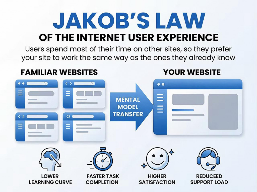
For instance, if you need a biometric login screen, look up how top-tier fintech apps structure that specific flow. Study their typography scales, the spacing between input fields, and the placement of their primary call-to-action (CTA) buttons.
Instead of guessing how to design an app without design skills, the modern workflow relies on reference libraries.
| Element | Resource | Action |
|---|---|---|
| User Flows | Mobbin | Study how top fintech or retail apps (like Uber, Spotify, or Airbnb) handle login and checkout. |
| Structure | Apple HIG / Material 3 | Follow platform-specific spacing and typography rules. |
| Icons | Lucide / Phosphor | Use established symbols for navigation to avoid confusion. |
Replicating proven mobile UX patterns elevates quality and guarantees usability.
Learn how we designed a mobile app to eliminate creative barriers, helping the platform scale to over 10 million active creators.
Read the Rapchat StoryPhase 2: AI scaffolding
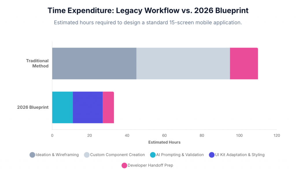
Starting with paper sketches became inefficient in agile environments. AI allows builders to go from ideation to layout instantly.
Use AI tools as a rapid scaffolding engine for mobile app wireframing instead of manually dragging gray boxes onto a canvas.
- Generative layouts. Tools like UX Pilot or Figma AI generate wireflows from natural language prompts (e.g., "Generate a profile settings screen with a toggle for dark mode and a logout button"). This snaps you out of blank canvas paralysis.
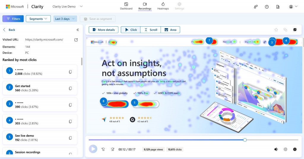
- Instant validation. Advanced AI plugins like Microsoft Clarity now offer predictive heatmaps. Before committing to a color scheme or a specific button placement, you can run an algorithmic analysis to instantly see where a user's eye will naturally fall.
Knowing how to use AI for UI design effectively means using these tools as structural co-pilots.
Phase 3: The component integration
The ultimate hack for developers tackling mobile app design for beginners is absolute reliance on premium, pre-built component systems. You should never manually design a dropdown menu or a navigation bar. Manual adjustments result in a janky interface with inconsistent padding.
Instead, the modern workflow shifts from designing to assembling. Download UI kits like Untitled UI, or open-source libraries like Flowbite. These kits provide hundreds of mathematically perfect, responsive components right out of the box.
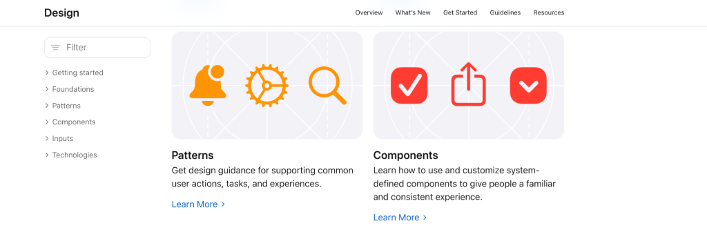
The Rulebooks: Adhere to official platform guidelines. Utilize official Apple Human Interface Guidelines (HIG) kits for iOS projects, or Google Material Design 3 kits for Android.
Treating these mobile app UI design templates as unbreakable rules eliminates decision fatigue. The typography scales, the active/inactive button states, and the touch-target sizes (minimum 44x44pt on iOS) are already configured, guaranteeing precision.
Phase 4: The developer handoff
The gap between a static visual file and a frontend engineer’s codebase is a source of friction. Handing off an unstructured file practically guarantees delays.
If you are investigating how to design an app if you are a developer, focus on an optimized handoff pipeline.
"Design via code" methodology ensures that visual assets translate perfectly into frontend logic.
- Design tokens. Before finalizing any design in Figma, save colors, grids, and typography as design tokens and variables. A change in Figma then propagates programmatically across the app.
- Dev mode execution. Use Figma’s native Dev Mode to extract production-ready code snippets (SwiftUI, Jetpack Compose, or CSS).

- AI code scaffolding. To bypass manual translation entirely, the 2026 stack uses autonomous coding agents like v0 vercel mobile UI generator. With it you can upload an image of your completed wireframe and prompt the AI to generate a fully functional React Native or Next.js component, styled perfectly with Tailwind CSS.
This moves you from visual concept to functional code without the lag of manual frontend recreation.
Translating complex data into a mobile experience requires discipline. Learn how we turned live IoT sensor data into an intuitive user journey for Pure Plank.
See How We Built Pure PlankThe rookie mistakes to avoid
Non-designers often make critical assembly errors. Let’s top off our UI design guide for software engineers with fundamental anti-patterns that make an app feel amateurish:
Franken-UIs
Do not mix design languages. Combining iOS tab bars with Android floating action buttons creates an untrustworthy interface. Pick one library and stick to it.
Mystery meat navigation
Do not rely on abstract icons without text labels. If a user has to guess or click an icon just to discover its function, your interface has failed. Pair icons with text to remove ambiguity.
Ignoring the thumb zone
Place critical actions, like a purchase button, in the bottom third of the screen. Forcing users to stretch over screen to the top corners creates physical discomfort.
Conclusion
When learning how to create a mobile app UI design, first you need to acknowledge that a beautiful interface cannot fix a broken user flow. Putting a gradient on confusing navigation is just putting lipstick on a pig.
Success requires clarity and speed. Use pattern libraries, rely on UI kits, and utilize an AI mobile app UI generator to scaffold your code. Focus on solving the user’s problem and ship the product.
Stop guessing, start shipping. Fireart delivers sophisticated design on strong software architecture, accelerating your time to market.
Get MVP Development ServicesFAQ: The Pragmatic Builder’s Guide
Do I need to draw custom icons or vector graphics?
No. Rely on premium, open-source icon libraries (like Lucide or Phosphor Icons). Your task is layout and assembly, not illustration.
Which design software should I use? Is Sketch still relevant?
Figma is the undisputed industry standard for interface design and Figma developer handoff best practices. It handles auto-layout and design variables natively.
I don't have an eye for design. How do I know if my UI looks good?
Follow compliance. If you strictly follow platform guidelines (Apple HIG or Material 3) and use their exact recommended padding and font sizes, your app will look professional.
Are UI kits considered "cheating"?
No, using best Figma UI kits for mobile apps is engineering efficiency. Just as you wouldn’t write your own database framework from scratch, you shouldn’t manually draw a date picker.
Can an AI mobile app UI generator build the whole app?
Even the best AI tools for mobile app design in 2026 are still co-pilots. They generate boilerplate layouts and overcome the blank canvas phase, but you need human oversight to manage multi-screen navigation and brand consistency.
This content is licensed under a Creative Commons Attribution 4.0 International License.


