
 Kotlin
  C++
C++  C#
C#  Ruby on Rails
  Java
Java  Firebase
  Python
  Vue.js
  HTML5
HTML5  CSS3
CSS3  Azure
Azure 


Taking into account the fact that the number of unique mobile users grows year by year, it becomes clear why web designers increasingly turn to plan the mobile adaptation of a site design right from the start.
Mobile-First web design is a concept quite unusual for someone whose work is not related to web design (it was first used by Luke Wroblewski back in 2009). Nevertheless, web developers very often mention such concepts as adaptive and responsive web design along with mobile-first. The first two concepts are time-tested, and thus known to the much wider audience.
In this article, we will discuss seven tips for hire responsive web developers creating a mobile-first responsive web design. Additionally, we’ll provide some examples of sites that clearly demonstrate the basic mobile-first design principles.
What are the Differences between Responsive, Adaptive, and Mobile First Web Design Concepts?

Currently, there are three leading approaches to the adaptation of websites to the screens of mobile devices:
- responsive;
- adaptive;
- mobile-first.
To provide a better understanding of the differences, let’s define them.
What is a mobile-first design? This is a web design built with a focus on mobiles from the beginning (that is, its interface is arranged in such a way that it would be convenient to use even on the smallest smartphone display) and only then adapted to larger viewports (tablets, laptops, PCs).
In turn, adaptive and responsive web designs are somewhat different.
When building responsive platforms, hire dedicated android app developer who base their efforts on the fluid grid – a special kind of layout in which, instead of fixed block sizes and distances between them, all the parameters are set in relative values. Thus, the site is automatically scaled depending on the size and resolution of the display. Among the disadvantages of such a strategy is the inability to accurately guess how the site will behave on devices with non-standard screens.
The principles of adaptive web design are almost identical to the responsive.; However, in this case, developers create several sets of fluid grid wireframes with different markups, one of which will be chosen depending on the user device screen format as soon as its characteristics are established. This approach allows achieving a much more positive user experience (UX) compared to the one offered by the responsive web design.
Among these three, the most universal, and the least resource-consuming, is the subject of our article – mobile-first web design.
Seven Tips for Creating the Mobile-First Web Design
So, how to design for mobile from ground up? Below we offer a brief tutorial containing some basic, but nevertheless important, recommendations for creating a mobile-first design.
1. Start engineering with the smallest mobiles in mind

The first thing you need to do to start creating your version of the mobile-first responsive design is to drop all ideas about how your solution would look on desktops. Focus on trying to fit everything into the small screen of a typical smartphone to make the user interface elements visible and accessible without zooming and scrolling.
If you start by creating templates oriented to the smallest mobile display, further scaling for larger formats would be much easier. Moreover, this technique will allow getting rid of unnecessary excess optional components of web pages, as well as develop a universal approach to using free space on the page.
To implement this, we recommend using an HTML/CSS framework, suitable for creating mobile-first adapted web pages. Preferably, in a development environment using templates that are compatible with mobile devices. Examples include Bootstrap, Foundation, Skeleton, SemanticUI, Pure, UIkit, etc.
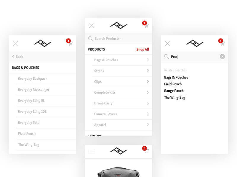
2. Aim for the simple intuitive navigation

Currently, the most convenient navigation format in mobile development is a drop-down list with menu items located vertically. Make sure that the user does not have to strain their eyes trying to read the text indicating the specific menu item. Also, using interactive buttons instead of the usual text strings will further simplify the navigation on your website.
3. Leave as much free space as possible between the interface elements
As the web design sphere developed, the popularity of the layouts, which involve a maximum of free space, steadily increased. The latest trends include informative minimalistic icons, which reveal their function when clicked (or tapped). Due to this, all the interactive elements are represented compactly and the template itself is not overloaded with unnecessary details. Generally speaking, this approach usually applies to the desktop version of the website also, thus requiring minimal effort from the designer.
On the other hand, blind adherence to the principles of clean layouts can create obstacles for the conversion of your website. After all, excessive infatuation with icons and neglect of textual button labels may not be as effective for your visitors as it would be in the case of more traditional menu types. Therefore, before “cleaning” the design to the maximum, consider how rational it will be from the point of view of internet marketing.
4. Ensure fast page loading

When you develop a design adapted for use on mobile devices, it is very important to make sure that the pages of your website load quickly. Here are a few bites of universal advice that will help you in this:
- Reduce the overall size of the images. Reducing the file size of images on the page is an obvious way to make it load faster. This does not mean that you must sacrifice the quality of media content. Currently, there are numerous image compression formats as well as lazy load features, which allow for the fast loading of images, while not inhibiting the display of the rest of the page content. We also recommend using large-scale graphics for your website, but fewer than originally intended. As the saying goes, the fewer the better.
- Use HTTPS. Web development experts strongly recommend conducting all transfers through the HTTPS protocol. Not only will it have a positive impact on the safety of visitors, but also speed-up the operation.
- Order the CDN services. Today, absolutely free content delivery networks (CDNs) exist that distribute sensitive data over a network of geographically dispersed servers. The visitor receives the content from a CDN server that is closest to them. This has a very positive effect on page loading time.
5. Use the correct media content scaling

One of the main problems in designing for mobile-first is forgetting the exact setting of video and picture aspect ratios. If these characteristics are not preset (4:3, 16:9, 16:10, etc.) or no mechanics to recalculate them is provided, the system of a particular device can change them independently. Potentially, this can result in broken layouts on some devices.
6. Carefully plan the adaptation to larger devices

When the basics of your design are ready, you can start thinking of how the markup of your mobile-first website will look when seen on larger screens. In spite of the fact that the overwhelming majority of the elements will retain their original, mobile-centered appearance, there will be a couple that you will have to change. Otherwise, you risk getting a half-empty page with offset blocks.
7. Conduct extensive testing

Try to test how your solution looks on as many mobile devices as possible; especially Android-based, as there are a lot of manufacturers and screen formats. This will help you make your solution accessible to most users (for example, even for those who still use Internet Explorer).
Five Most Successful Examples of Mobile-First Web Design
We now present the top five most successful, and in our opinion most famous, examples of websites in which you can trace at first glance the main principles of mobile-first web design.
Mpierceroofing

Despite quite a conservative general design of the website, it’s noticeable how its desktop and mobile versions differ. All the necessary elements – menu, contacts – are available immediately without scrolling.

All in all, the resource has everything to enable a user to conveniently make a targeted action and intuitively come to clicking the CTA button.
Esquire

The world-renowned men’s magazine, Esquire, has quite an efficiently constructed website, especially in terms of navigation. It doesn’t matter how you launch it – from PC or smartphone – you won’t have to click too much to find the desired article.
The menu has a convenient minimalistic format, and the search field is located right in the menu bar.
Philip House

Philip House is a website dedicated to elite accommodation rentals. It’s a very aesthetically pleasing resource from the get-go. All media content is top-notch and web designers did an amazing job with UX both for desktop and mobile users.

You get sufficient access to all the navigation elements on any screen dimensions without even having to scroll or swipe!
Smashing Magazine

The builders of the mobile Smashing Magazine site also did a great job: as you can see, despite the fairly large text blocks, space was used extremely well.

After all, both the header and the menu are seen right after the website is loaded. That is, there is no need to scroll down the page in order to access the critical information and functionality.
Typeform

Typeform has a great visually minimalistic but element-rich user interface. It isn’t shy to use animations and high-def video alongside simple unobtrusive text filling. It’s a great black-on-white (or grey) solution that gets more interesting as you scroll down.

In this case, we were attracted by the ultimately mobile-friendly, optimized appearance of the resource that fits every desktop element on a mobile screen in just the right way. It is safe to say that it isn’t inferior to the desktop version in any way, which is a great UI design achievement.
Design for Mobile-First: Summary
As you can see, creating a mobile-first web design is quite difficult, especially if you have no previous experience in the development of mobile solutions. As a simpler and more rational alternative, we propose you turn to the professionals. Fireart.studio for instance, has years of experience designing unique, unconventional solutions, which pleasantly surprise even the most demanding customers!


