


Content is king, but it’s also important not to forget about its structure. With pagination, you can make your site’s content more user-friendly. How to do it? Let examples of famous brands inspire!
You can use limitless scrolling, like Facebook or YouTube, for example. But what if pagination is more appropriate for your site?
This post will look at such an important design element and see how popular sites have organized pagination design on their pages.
What is limitless scrolling, and how can you use it?
When you scroll through a newsfeed on a popular news aggregator, you’re unlikely to get to the bottom of the site (that is, to the end of the page). It is called endless scrolling. In this way, according to some designers, the site owner can hold the user’s attention for as long as possible. Use the way of scrolling for entertainment portals, social networks, and other places, which are designed for fun and relaxation.
But is the limitless scrolling method always useful?
Think of online shopping. You scroll the page searching for the ideal product, but it’s quite difficult to find it in a stream of other options if you lost an interesting product. In this case, this pagination UI design is suitable for usage.
What is pagination in web design, and where to put it to use?
The opposite way to show content to the user is to use this element. Breaking down a large amount of content or product cards into pages is called pagination. And this way of structuring content has many more benefits. It is good for most sites. You’re not overloading the user with content.
You give your customers a convenient way to browse the content on the site and easily return to the products they’re interested in.
Whether it’s a mobile page or a desktop version, pagination web design will work well for the user in either case. Not only does this element make it easy to navigate through a large stream of content, but it’s also great for moving between product groups.
Parts of the page are usually marked with ordinal numbers. You can control the amount of content on one page or let the user choose how many product cards to display on one page.
Top 10 pagination design examples
There’s a lot to say about the benefits of pagination, but let’s look at some specific examples. We’re going to show you eight examples of how big brands use it effectively on their sites. You’ll be surprised at how versatile it is for structuring content.
Well, let’s move on to practice and see pagination design examples!
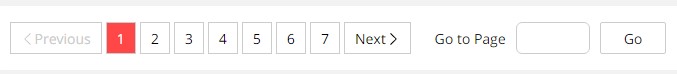
1. AliExpress.com
The popular online cheapskate store uses a number of pages to make it easy for users to find a convenient product. You can go to a specific page or simply go between pages in order. That way, you don’t have to endlessly flip down the page looking for the option you want.
It is what it looks like on the site of the online store:
2. iHerb
Continuing the theme of online stores, look at how the structuring of products on the iHerb site is organized. Thousands, indeed millions, of products require detailed structuring and ordering. Thanks to pagination, the user does not have to constantly scroll down the page in search of the right product.
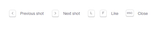
3. Dribbble
That’s where a lot of content comes from sites where designers can share their work. Here it’s really important to find the content you want quickly, and paging design is a useful tool in this task.
4. Amazon
And here’s how the kings of Amazon sales organized the best pagination design. Nothing extra, the user can move conveniently between pages or go directly to the page of interest.
5. FARFETCH
Another example of simple and clear pages is from the fashion site FARFETCH. It’s very easy to understand and not to get lost in the multitude of products.

6. Envato
This structural element is not only for online stores and catalogs. It is how this method of structuring content is used on the Envato blog.

7. The Financial Times
A simplified example of UX pagination best practices on a news site. Possibility to go to the next or previous page.
Minimalism as it is.

8. Adidas
The original page numbers are organized on the Adidas site. Here, the page
numbers are not arranged horizontally but vertically. It’s creative and works, considering that such a big company decided to implement this solution.
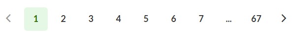
9. Google
Next & Previous links may be useful for the users if they’re used. Google tends to use it both with styling that’s different from the just number elements and placed far away from the numbers so as to avoid confusion.

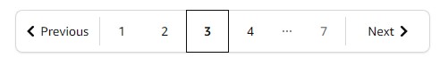
10. Shopify
Here you will find a great example of the e-commerce pagination design:
Best practices for designing pagination in web
And finally, we’ve prepared some simple tips to help you get this element correct and make it easy for clients. We hope these tips will help you!
Creative Solutions Can Be User-Friendly
Even if you hold a brilliant idea for introducing pagination UX design, you can check how convenient it is. Normally the tried-and-true options work best. It does not negate the fact that you can create a super convenient functionality.
Before you implement something new, it’s worth testing and consulting with experts. Make sure that the creative solution will be useful and convenient for your users.
Simple Enumeration
Use ordinal numerals or letters of the alphabet if you structure your posts like this. Keep the design pagination process easy so as not to confuse users.
Choose the right place
Customarily, this element is located at the bottom of the page. It is more common to users. But if you believe that customers of your site will be more useful to see the number of pages before the list of products, then it is worth experimenting with this format!
Enable controls
Clients will appreciate this functionality if you add the ability to go to a specific page to the pagination. Especially if we’re talking about a large online store with millions of products, just leave a field where the customer can enter the page of interest.
Place clickable elements correctly
The element placement plays an essential role in ensuring the best usability. In the case the pagination position is not selected wisely, users may miss it. For the longest pages, the best practice is to add this feature at the bottom & the top in order to eliminate the need of scrolling up and down and offer flexibility in accessing other pages easily.
Mind spacing
Spacing between the elements is also very important. So it’s recommended to make it big enough too. Don’t commit a mistake similar to many websites that squeeze everything with no space for navigation.usa replica rolex datejust rolex calibre 2836 2813 116238 mens automatic read full article nothing phone hülle https://www.sreiseguide.de/das-galaxy-s22-ultra-wird-einen-integrierten-s-pen-haben case with battery for iphone 7 plus view publisher site https://www.cbdbybritishcannabis.co.uk/product/cbd-by-british-cannabis-300mg-cbd-oral-capsules-30-caps-heart-001524 https://www.drvapesvapejuice.co.uk/product/10mg-the-panther-series-desserts-by-dr-vapes-10ml-nic-salt-50vg-50pg-000236/ web link
Identify the current page
Finally, don’t forget to tell your site visitors where they are at the moment by indicating the current page. You may simply highlight it, or you may go further by choosing some other style to let your users differentiate the page number from other figures/buttons or numbers.
Want to create your website design? — Feel free to contact us
If you need help creating a user-friendly website structure and best pagination UX, then Fireart provides web design services of high quality. We will make sure that your users find important content on your site without any problems!
Conclusion
In this article, we talked about how pages numbers can be useful for your site, look at pagination UX best practices, and why it’s better to use this method of structuring than scrolling. Get inspired by great site examples to create an excellent structure for a website!


