


Most searches for top product websites design lead to lists of pages with animated graphics implemented without technical discipline, which kill conversions before the site finishes loading.
Product website success relies on user experience architecture. It is widely cited that investing in user experience architecture yields financial returns – specifically, generating a 9,900% ROI.
At Fireart, we view web platforms as high-performance engines. We bridge the gap between visual design and the browser realities that dictate user retention. This guide exposes the flaws of typical design compilations and dissects the vanguard websites driving the industry forward.
Article highlights
- Copying tech giants without their backend budget leads to websites that repel users.
- The best modern websites use frontend execution to bridge the sensory gap, making digital products feel physical and tangible.
- Core Web Vitals are a non-negotiable metric. Heavy 3D assets must load asynchronously to avoid the three-second bounce rule.
- Giving in to stakeholders who demand everything be placed above the fold destroys narrative pacing and spikes cognitive load.
Why emulating Apple and Stripe is a dangerous trap
Generic design lists offer the same advice that boils down to copying Apple’s scrolling animations or mimicking Stripe’s gradients. For mid-market companies and startups, this is professional sabotage.
Apple operates with an unlimited budget. Its sites rely on custom WebGL rendering pipelines, proprietary video formats, and hardware-accelerated code built specifically to shine within its Safari ecosystem. When a development team copies Apple's signature scroll-jacking using standard JavaScript libraries, the result is disastrous. It causes mobile latency, breaks accessibility features, and creates a laptop melter – a site that forces the computer fan to maximum speed and guarantees an immediate exit.
Stripe presents a similar trap. Its design language is the culmination of a decade of engineering. Product teams trying to clone Stripe’s animated interfaces build bloated Document Object Model (DOM) structures. This code slows down the site and ruins conversion potential.
Agile teams need resilient, performant architecture that serves the user.
7 vanguard champions of modern product website design
To find the best product website design, we must analyze the modern vanguard. These award-winners bridge the gap between visual aesthetics and browser reality, solving user problems without compromising on technical performance.
Linear: The science of SaaS pacing
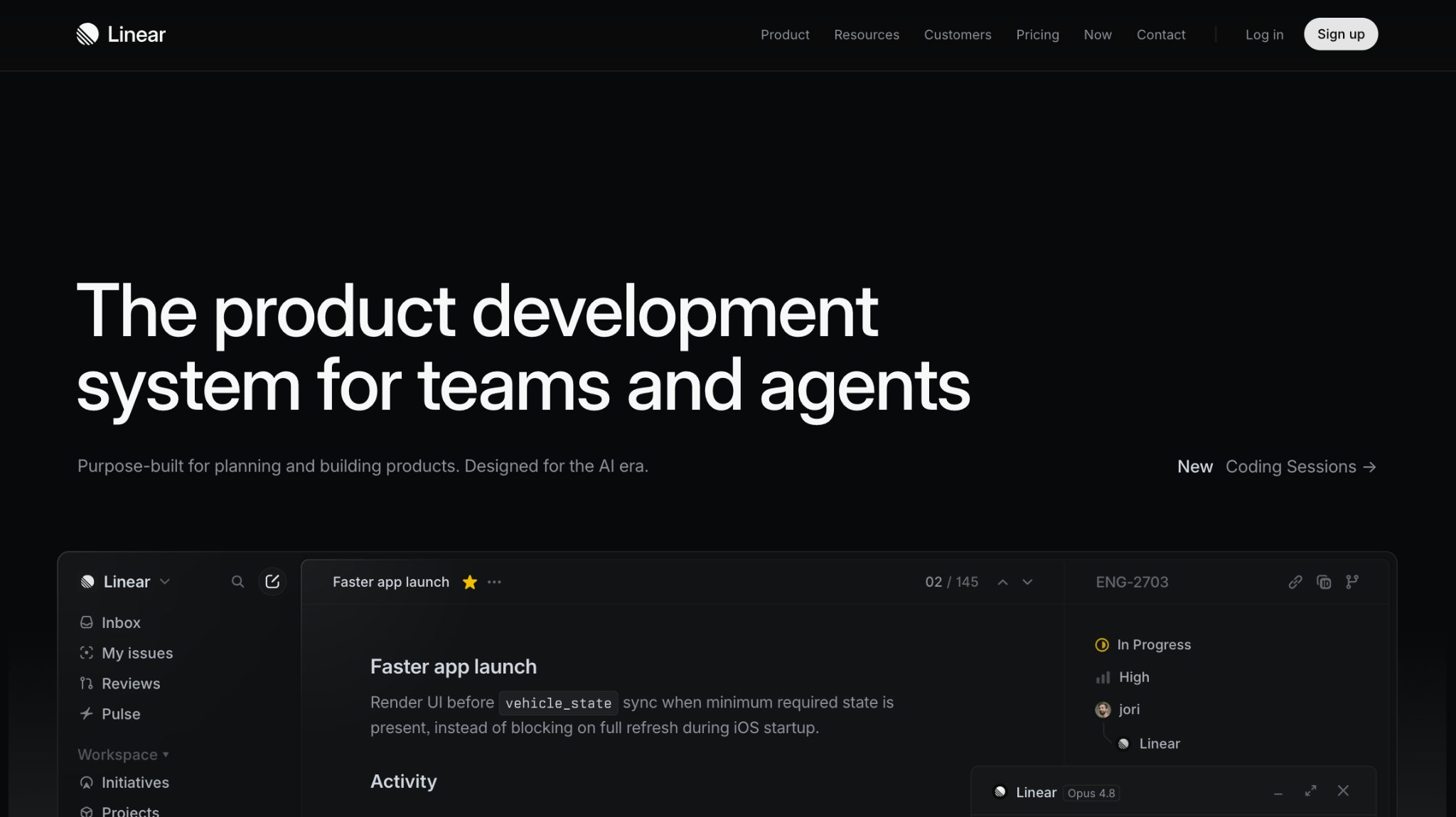
Linear UI redesign case is often cited as the current benchmark for saas website design. It utilizes paced 60fps animations. As you scroll, bento-box layouts reveal product capabilities sequentially. This structural pacing keeps the user engaged and avoids the scroll-jacking that ruins mobile experiences. It treats the website as a high-performance tool, proving that B2B productivity software can feel visually engaging.
Opal Tadpole: Bridging the hardware sensory gap

Selling a physical camera online strips away tactile data. The Opal Tadpole site overcomes this sensory gap by utilizing CSS to perform a virtual, in-scale hardware teardown directly in the browser.
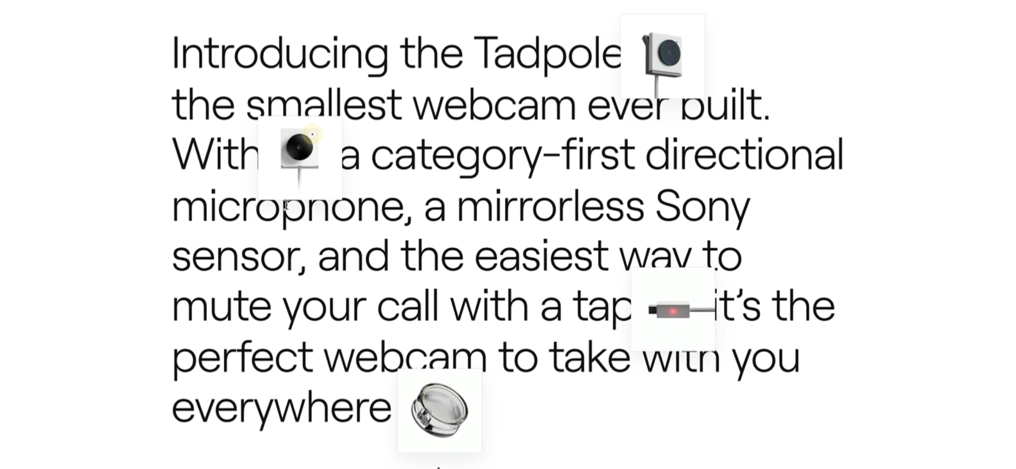
As you scroll down the page, the camera casing separates, exposing the internal microchip and microphone. It earns its spot among the top product websites because it uses interactive digital storytelling to make hardware feel tangible.
Adobe Frame.io V4: Taming data architecture
Designing for enterprise software requires managing data.
Frame.io V4 stands out among b2b website examples for executing a cloud-based video collaboration tool that feels like a native desktop operating system. It relies on panel layouts and instant micro-interactions. The core challenge is preventing user cognitive overload. Professional editors reject an interface if it adds a millisecond of lag to the workflow, so architects need to balance visual ambition with product page ux optimization.
Shopify Supply: Fabric physics and WebGL
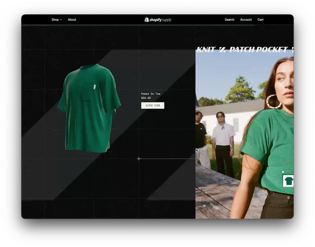
When looking for ecommerce ux best practices, Shopify Supply relies on webgl and three.js to simulate the physical properties of clothing. As you scroll, the garments digitally wiggle and flow, mimicking real fabric physics and weight.
This interactive product storytelling answers tactile questions visually. By investing in physics engines, it increases user confidence and reduces cart abandonment.
Cartier Watches: Ultra-HD zoom latency
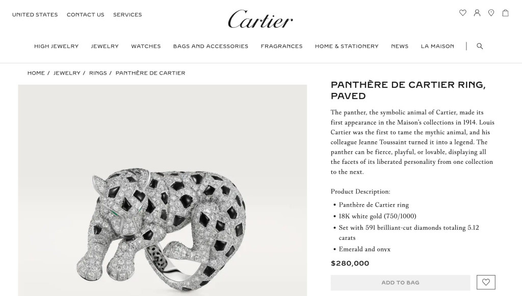
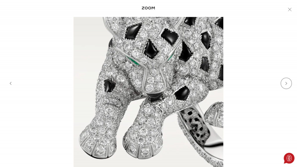
Luxury e-commerce operates on a different plane of visual expectation; a $280,000 jewelry demands microscopic inspection.
Cartier navigates this requirement without triggering the 3-second death rule. The site initiates high-resolution active fetching the millisecond the user performs a pinch-to-zoom gesture. This graceful degradation ensures fast initial load times while allowing the user to explore the diamonds with zero lags.
ATMOS Lamp: Environmental 3D simulation

When buying interior hardware, the user’s primary anxiety is: How will this look in my actual space? The ATMOS Lamp site solves this directly. Using real-time WebGL, the background of the site dynamically adjusts to cursor movement, simulating the lumen spread, color temperature, and shadow casting of the physical lamp in a dark room. This product website inspiration is in the interactive environmental simulation, that eliminates pre-purchase anxiety by showing the product in context.
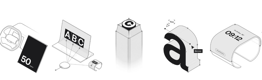
Bézier: Turning the UI into the product
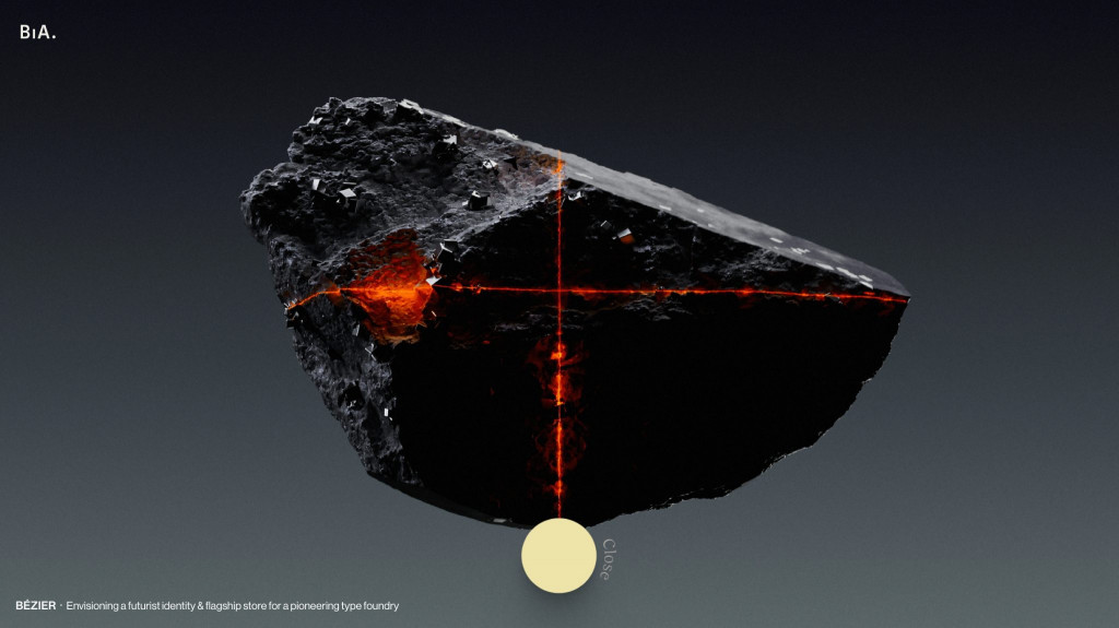
For a digital type foundry selling fonts, the typography is the product. Bézier constructs a brutalist product website examples where the font hierarchy acts as both the commercial showcase and the navigational UI. This approach relies on high-performance frontend engineering to erase the friction between browsing the catalog and experiencing the value of the digital asset.
In addition, we love the illustrative content that clearly visualized Bézier’s complex licensing options and services.
UX rules for high conversions
The visuals of the vanguard champions operate as delivery mechanisms for usability rules. Transitioning from visual execution to architectural planning requires following technical UX rules.
Graceful degradation and the 3-second death rule
There is tension between webgl and three.js environments and core web vitals. If a website takes longer than 3 seconds to load on mobile, according to Google data, over 50% of users will abandon it immediately, causing bounce rates.
The architectural requirement here is graceful degradation. Interactive 3D assets must load asynchronously. The core text, images, and conversion buttons must render instantly to satisfy the Largest Contentful Paint (LCP) metric. Optimizing perceived load times for heavy animations ensures that if a user is on a slow 3G network, the visuals fall back to an accessible static layout without breaking the narrative.
Sprightful renewable energy app users praising fast-loading app dashboard


The Goldilocks catalog and polyhierarchies
For SaaS features or hardware specifications, you must control the information architecture. Providing detail on a main catalog page overwhelms working memory; lacking detail forces the user into jumping back and forth between the main list and individual pages to find basic specs.
You must find the optimal level of data density. Structural navigation must be topic-based.
Users search for Analytics Tools or Plumbing Hardware. Utilizing polyhierarchies – where an item is cross-listed across relevant categories – reduces navigation friction and increases the user's perception of information scent.
Viewport priority and the sticky checkout
Mobile screens account for the majority of consumer traffic, yet their limited vertical space introduces interaction friction. When a user navigates into technical specs or reviews on a mobile device, they scroll past the checkout section. Forcing them to manually scroll back up to convert is a structural failure.
Implementing a sticky add-to-cart component attached to the edge of the mobile viewport resolves this.
Advanced checkout UX optimization strategies prove that locking the product title, current price, and Buy button to the screen reduces the mobile path-to-purchase by 1.5 steps. This sticky component must be spatially isolated with whitespace.
Overcoming stakeholder sabotage
The most common obsession in product websites design is keeping everything above the fold. Stakeholders demand that value propositions, video files, and calls to action be crammed into the initial viewport before the user scrolls. This compression destroys narrative, triggers cognitive load burnout, and guarantees bounce rates.
Teams must advocate applying the Jobs-To-Be-Done framework to SaaS pacing.
Pacing the feature rollout sequentially down the page aligns visual execution with reading comprehension, preventing early abandonment.
Another roadblock is the “lipstick on a pig” syndrome. C-suite executives mandate UI updates such as implementing 3D graphics or brand colors – while forbidding any changes to broken backend logic or complex checkout flows.
How Fireart architects elite product experiences
Building a product site requires an agency that speaks the business language, as well as the language of design systems and software engineering.
At Fireart, we operate as digital product architects. When we design user experience architecture utilizing animations or WebGL, our engineering teams build asynchronous data pipelines that guarantee sub-3-second load times.
We validate our web design and development services against performance thresholds to ensure the product functions across every device and network. Whether you are launching enterprise SaaS or hardware, we eliminate friction from the initial click to the final conversion.
Conclusion
The defining characteristic of successful product websites design is the integration of functional mechanics within high-fidelity visuals.
Core Web Vitals, pacing information architecture, and defending against stakeholder mandates will transform your website into a high-performance conversion engine.
Want to launch an industry-defining digital product?
Partner with Fireart's development team todayFAQ: common questions about website product UX/UI
Why do developers advise against scroll-jacking on product pages?
Scroll-jacking occurs when a website manipulates a user’s native scroll speed or locks the screen to force an animation. Attempting it without custom rendering pipelines creates mobile lag, known as jank. It removes user agency, breaks accessibility tools, and creates a frustrating experience.
What about putting everything above the fold on modern SaaS sites?
Cramming multiple calls-to-action, dense text, and videos into the initial viewport causes immediate cognitive overload. Modern users are comfortable scrolling. Utilizing sequential pacing – revealing one core concept per scroll depth – keeps users engaged and improves reading comprehension.
How can we use 3D product elements without building a laptop melter?
A laptop melter is a site overloaded with unoptimized 3D graphics that spins up computer fans and drains batteries. To use WebGL or Three.js safely, you must practice graceful degradation. Heavy 3D assets must load asynchronously so they do not block the primary text and navigation from rendering within the 3-second Core Web Vitals limit.
What is the difference between a simple UI reskin and deep UX optimization?
A UI reskin updates aesthetics, like swapping out brand colors, fonts, or images. Deep UX optimization involves repairing broken user flows, improving information architecture, and removing interaction friction. UX is the engine.
Why do designs that look perfect in Figma sometimes fail in the live browser?
The live browser is a dynamic environment. A design that looks flawless on a canvas fails in production because it ignores slow mobile networks, varying screen sizes, or database query latency. Successful product design requires tight integration between visual designers and frontend engineers.


