
The exceptional web design requires having the best footer design on your web page. In most cases, the designer doesn’t have enough time to focus on developing the website footer. However, website footers, require particular attention. Although it may seem like a minor detail, it holds paramount importance for a website’s effectiveness and success.
You might wonder, “Why?” After reading this article, you may even conclude that the website footer is as important as the header (or even more!). Also, we will look at some of the best footer design examples.
What is a website footer?
To realize the importance of a great page footer design, you must understand its purpose. The website footer is the crucial component of your site that will enable you to interact with your audience. For example, it can serve as a call-to-action (CTA) that will encourage visitors to sign up for a particular service you offer.
It also helps visitors find any articles they might be looking for on your website. Those in search of your contact information will easily find it in this section of your site.
How important are footers
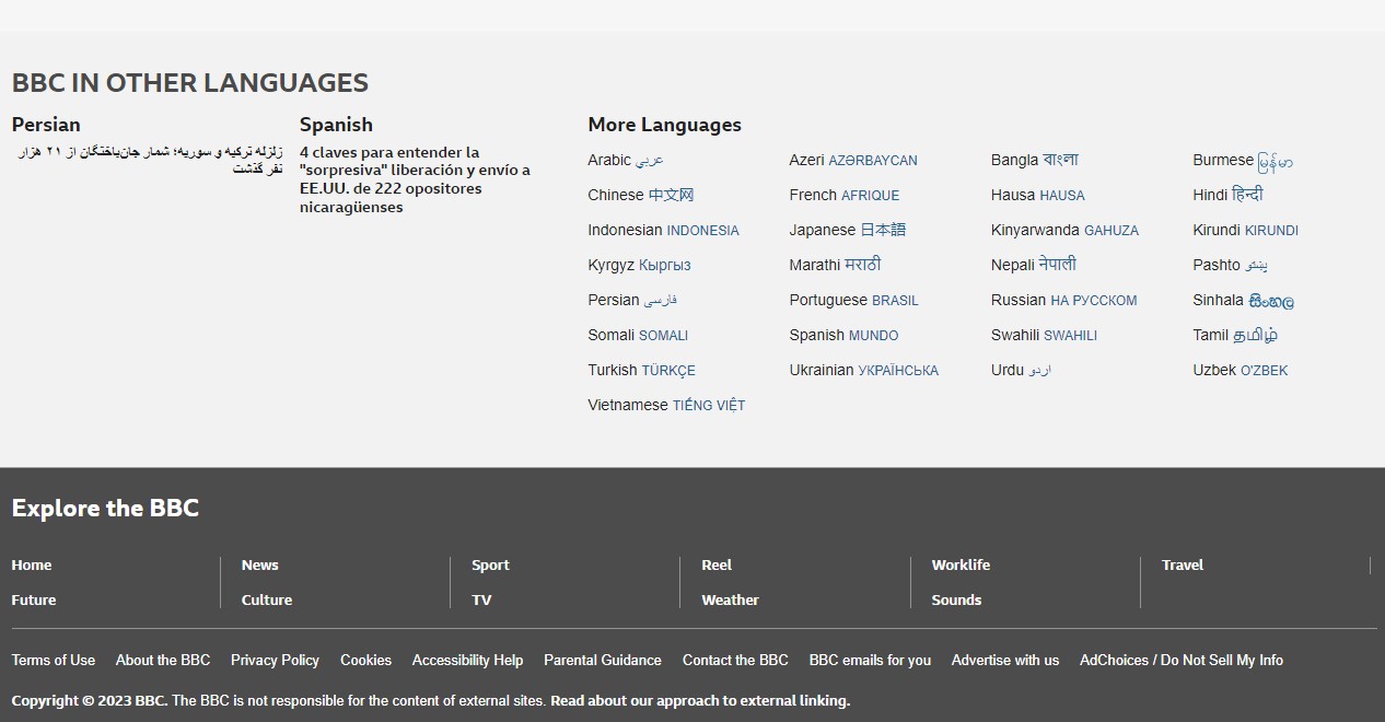
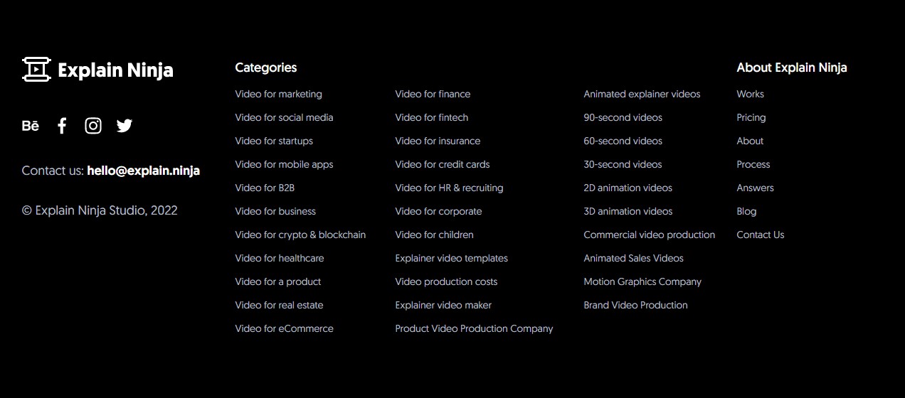
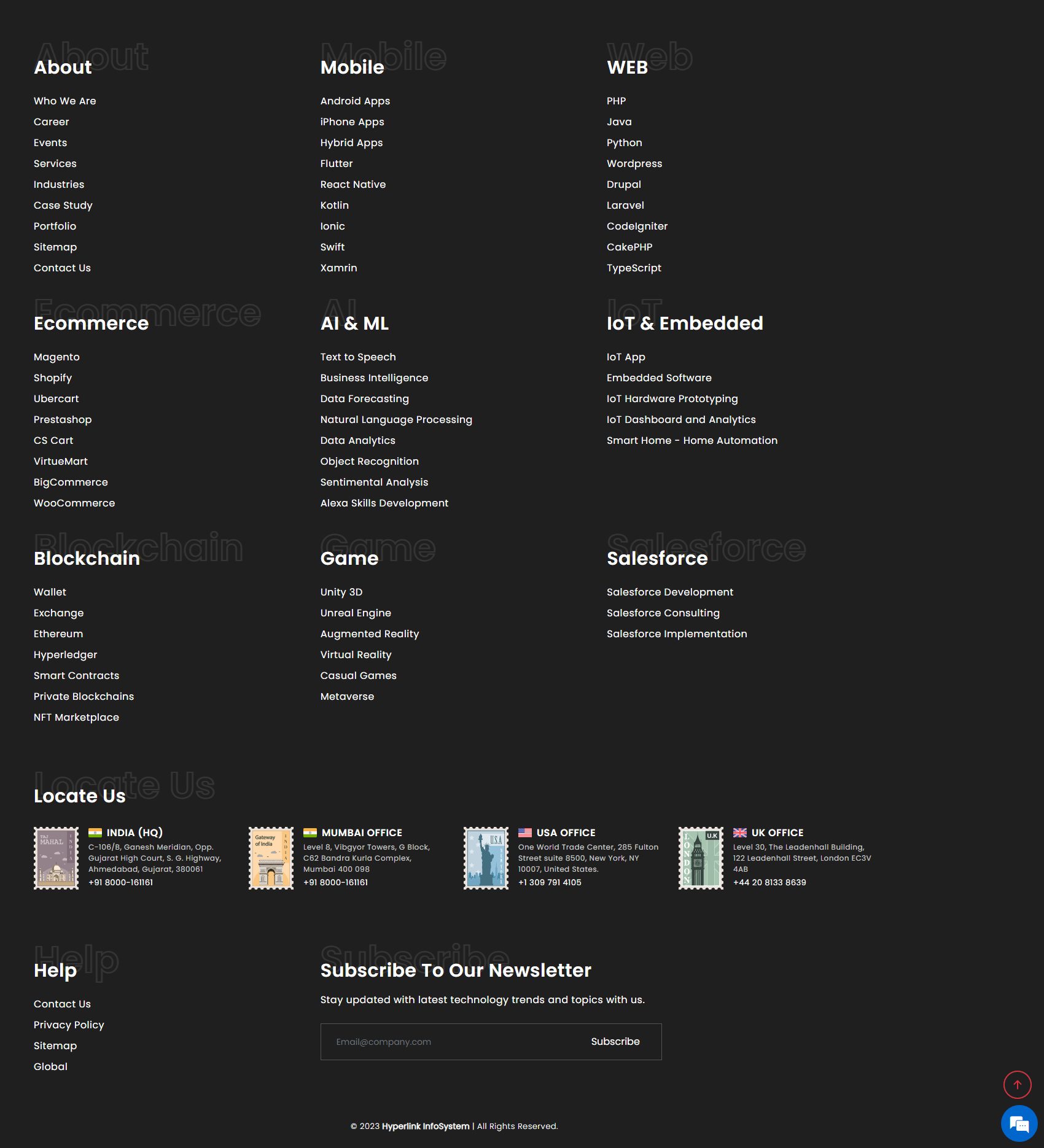
Thus, the section of content at the very bottom of a website is known as the footer. It often includes copyright disclosures, links to privacy policies, site maps, logos, contact details, social media icons, and email sign-up forms. In a nutshell, a footer includes details that enhance a website’s overall usability.
You might question the significance of the footer design. Indeed, it’s crucial since it’s one of the most visible spots on a website, and many website footer examples prove that. A study by Chartbeat, which analyzed 25 million website visits, found that visitors scroll way past the above-the-fold screen, through thousands of pixels. Another study by NNg shows that the footer receives the most attention among all screens past the first two or three scrolls.
The footer is important. It is like P.S. in your email — your extra chance to convert visitors.
Surprisingly, the effectiveness of a website depends on its footer. Contrary to popular belief, footers attract more attention than expected. Indeed, especially on mobile devices, people tend to scroll extensively. Relevant footer material that does not contain an awkward conclusion indicates to the user that they have reached the bottom of the page.
Although footers are not technically necessary for a website to work properly, they do offer useful places to enhance its functionality. This is especially true when used in conjunction with solutions that facilitate more effective content creation and delivery for website owners.
If you are skeptical, consider using digital analytics tools like Lucky Orange, Crazy Egg, and ClickTale to check the visitor’s “scroll depth” on your site.
What to include in the website footer?
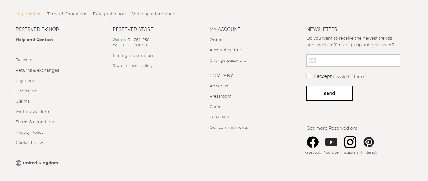
Three must-haves: copyright, privacy policy, and terms of use
These three content components are critical for every website, as they serve legal protection purposes:
- Copyright:
Featuring the current year and the copyright symbol protects websites from plagiarism. - Privacy Policy:
It explains to users how your company will use, store, and protect their sensitive data and other personal information. - Terms of Use:
Also known as Terms of Service or Terms and Conditions, this component provides general rules and guidelines for using a website or your products.
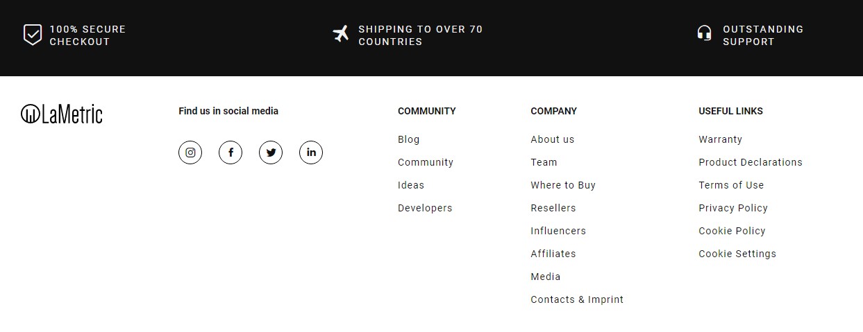
Sitemap
It is a link, usually placed in a footer and bringing the user to the HTML version of the sitemap. Although users rarely click on it, it can aid search engines in crawling pages and locating resources such as the XML sitemap.
Phone and fax numbers
Like the address, a phone number shows Google that your brand is a local business. We recommend turning a phone number into a clickable button when viewed on a mobile device.

Personality and brand
Tell your visitors who you are, what you do, and where you are. Step out of the tedious business box and show some personality instead. In the footer design, you can tell users who you are as a brand and show your personality. Consider including a logo, highlighting any awards, showcasing upcoming events, and featuring a mini-gallery of team members there.
Address and link to map/directions
The map with a precise location and directions is the website element that is usually expected to be seen in the footer. Adding information about the company’s address is crucial from the SEO perspective.
This practice allows Google to understand where your business is located and displays it in local search results. Consequently, this enhances your visibility to local customers, making it easier to find your brand in the offline world.
Navigation
Footer navigation is another important website component, as it allows website visitors to find the necessary information in case they fail to do it before scrolling through the entire website.
In recent years, we could also see the rising trend of the “fat footer”. It implies adding more elements to the website footer than usual. Usually, website footers contain the information displayed in the mega-menu in the header.
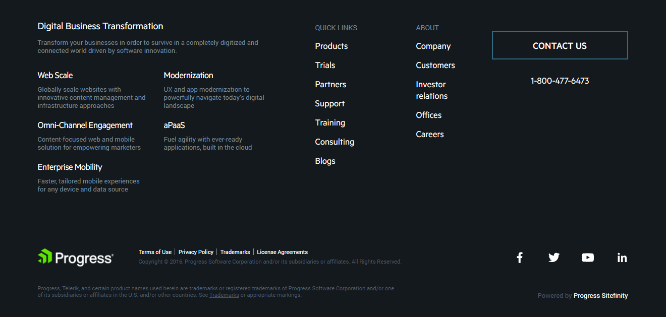
Social icons
Adding social icons to the footer allows users to easily find and connect with the company on social networks. Since most businesses prefer not to redirect website traffic to social networks, they put social media icons in the footer instead of the header. This practice provides users with the opportunity to interact with a brand on social networks, but it also keeps digital product design and development more focused on retaining users on a site.
Social media widgets
On the contrary, some website owners want to emphasize the brand’s social presence and encourage users to join their online community on social media. In this case, they use social media widgets instead of social icons, as they are bigger and more effective in grabbing the user’s attention. Social media widgets usually look like social media posts embedded directly into the website footer.
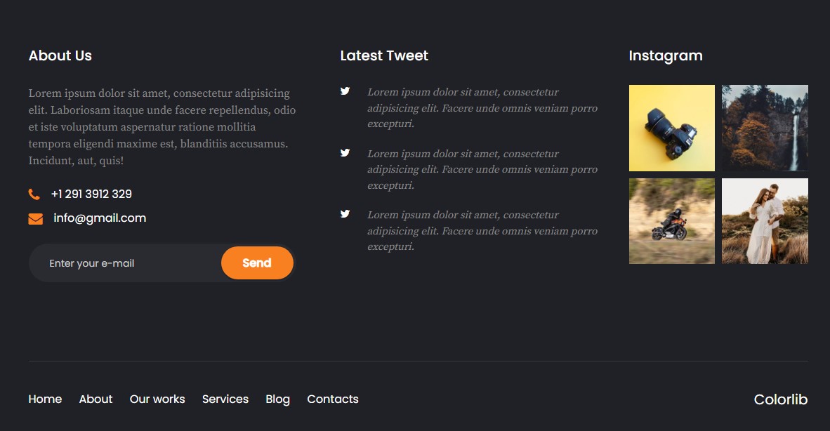
Email sign-up
Let your users easily find out how they can subscribe to your website or blog updates by placing an email subscription button in the footer. It’s the most common place on a website for email sign-up, and people are used to finding it there. According to recent research, 24% of sites have an email sign-up option in the footer.
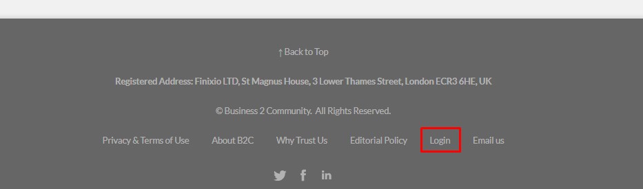
Login
Some websites may need to place the “Login” option in the footer. Not all web visitors might be customers or leads, some of them may be your employees, partners, or administrators. In this case, a website footer is a perfect place for an almost invisible “Login” button. Here is how a famous news blog Business2Community has implemented it.
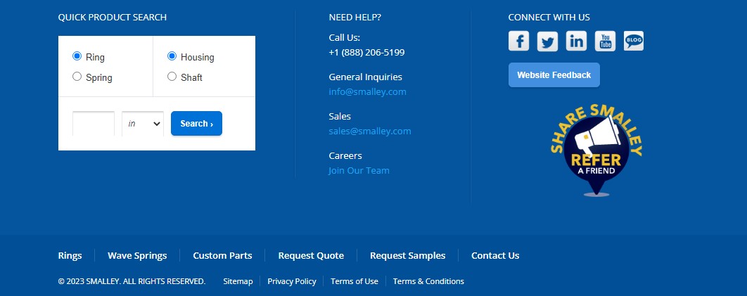
Site search
Placing site search in the footer is a great practice that can enhance user navigation on a website. If users don’t find it in the header, they expect to see the site search in the footer. It can look like a search box where users can enter the needed keyword to find what they’re looking for, or it can include advanced options for more refined searches. Here is how Smalley has implemented an advanced site search on its website.
Website footer design best practices
Best website footer designs will hint at what’s good or what’s bad with your footer. Of course, opinions may vary, but the leading UX design principles prioritize human-centricity and common-sense decision-making. Adhering to certain principles is essential for creating a user-friendly footer:
- Ensure links are functional. Verify that all the links in the footer are not empty or broken and lead to the right data.
- Consistent theme. The footer’s design should match the overall theme of the website.
- Clarity and precision. Make sure the elements within the footer are unambiguous, avoiding confusion.
- Descriptive terms. Use terminology that gives users a clear idea of what to expect before they click on a link.
- Organization. If you have a lot of information in your footer, try grouping some of the items into categories for easier navigation.
- Simplicity and aesthetics. Make your designs simple, readable, and aesthetically pleasing for your users to interact with.
- SEO and interlinking. Pay attention to SEO best practices and how footer links contribute to the site’s overall interlinking strategy.
Put in the footer everything the users are likely to search for and provide a positive user experience with no obstacles. However, remember that you should always keep in mind your niche and customer needs, for example, construction design examples will differ quite a lot from restaurant websites.
15 best web footer design examples
At this point, you may have an idea of why a great footer design for a website is essential. The next step is to find the best features to incorporate into your website footer design to make it useful and engaging for users. The following website footer examples can be a perfect fit for your design:
1. Tapbots
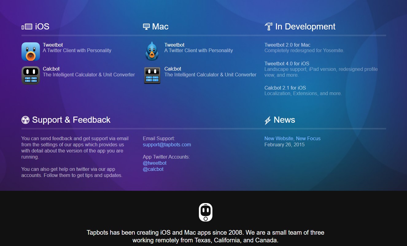
Tapbots stands out as one of the best website footer design examples. It is technically designed to be used on iOS devices such as the iPhone.
So, how do they work to make the address website footer design attractive? Their main function is to create a beautiful final look. A particular set of icons is used to represent specific information in the footer. This use of icons can make navigation intuitive for users, especially on mobile devices where screen space is limited.
2. The Noun Project
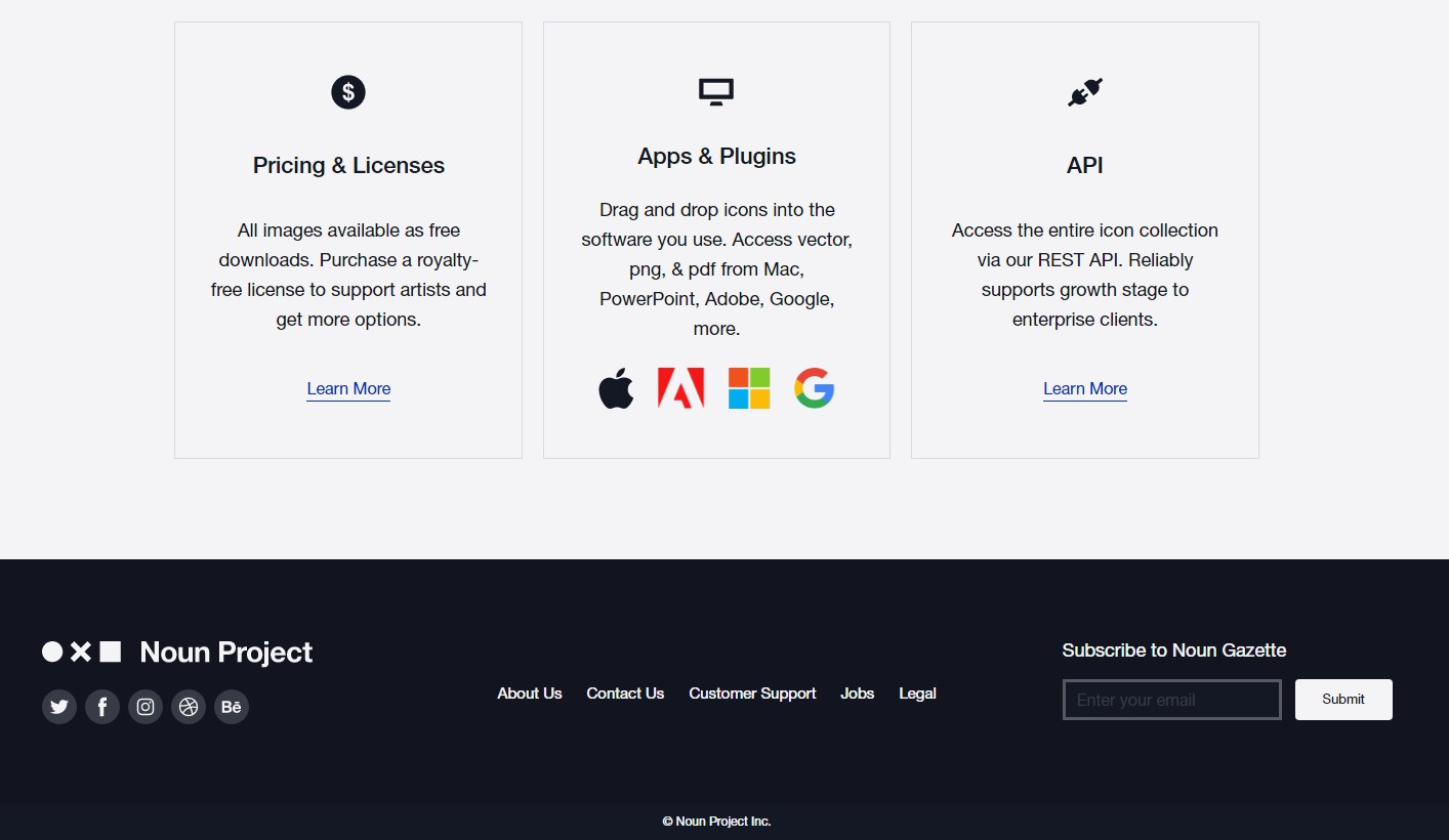
Incorporating a call-to-action (CTA) in the website footer is a strategic move that can significantly enhance visitor interaction and engagement. Effective CTAs in the footer serve as a last opportunity to encourage users to take a desired action before they leave the site. Many websites add large call-to-action buttons, which have been very useful in ensuring visitor interaction.
An excellent website footer template with call-to-actions is The Noun Project. Not only can visitors click on the social media icons, but they can also fill in a subscription form all in the footer. The Noun Project header enables the business to sell itself and has one of the best footer menu examples.
3. Siteinspire
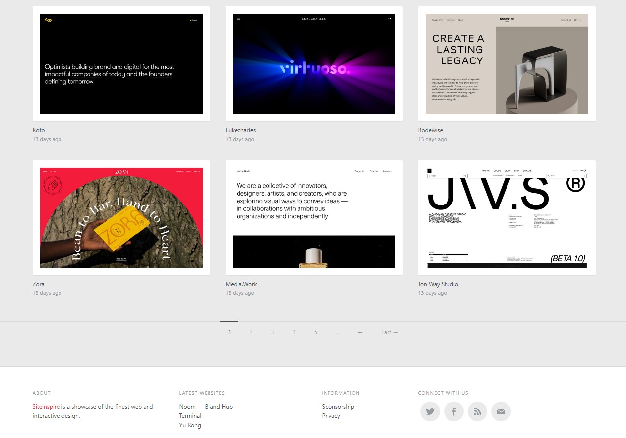
The most important thing for a new website or a blog to prioritize is catching the visitor’s attention, and encouraging them to stay longer on the site. Links, along with up-to-date content added to the page within the footer, play a crucial role in this.
In the website footer design of the Siteinspire, you will notice links to all the recent inspirational websites. What makes this a good example is an impressive attention to simplicity while remaining functionally efficient.
4. Jarad Johnson
We used to think that stuffing the footer with a lot of information was a general rule, applicable to almost any type of business. The consensus is that whether you are a freelance designer or your business has a physical address, adding numerous links, your contact, and the “About Us” section must be prioritized.
Still, Jarad Johnson’s page challenges this norm by keeping the footer content to a minimum. The footer consists of only five icons and links to social media, allowing visitors to easily find the email and contact the owner of the page. Additionally, an important element is the design of web ui pagination.
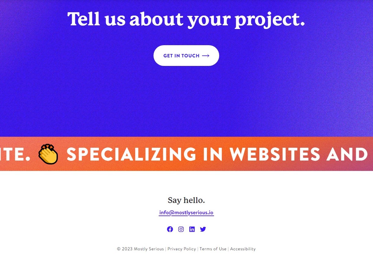
5. The Ministry of Type
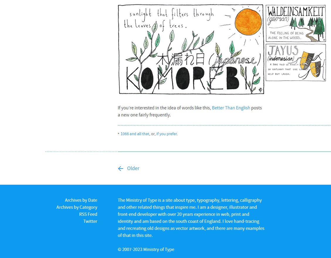
The Ministry of Type’s footer is another example that provides information about its author to help visitors connect on a personal level, making it a very responsive footer.
Similarly, you can use your website footer to promote your freelancing services – or any other work you do – to visitors.
6. Bei Blog
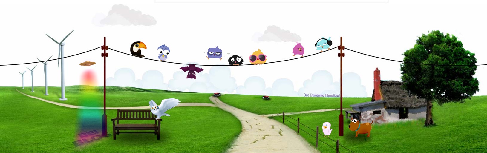
The Bei blog’s footer doesn’t contain any contact information or CTA. Instead, it uses a unique approach to website footer design that has brought it a lot of success. When you check out their website’s blog, you will notice a neat background featuring cartoon illustrations.
7. Monocle
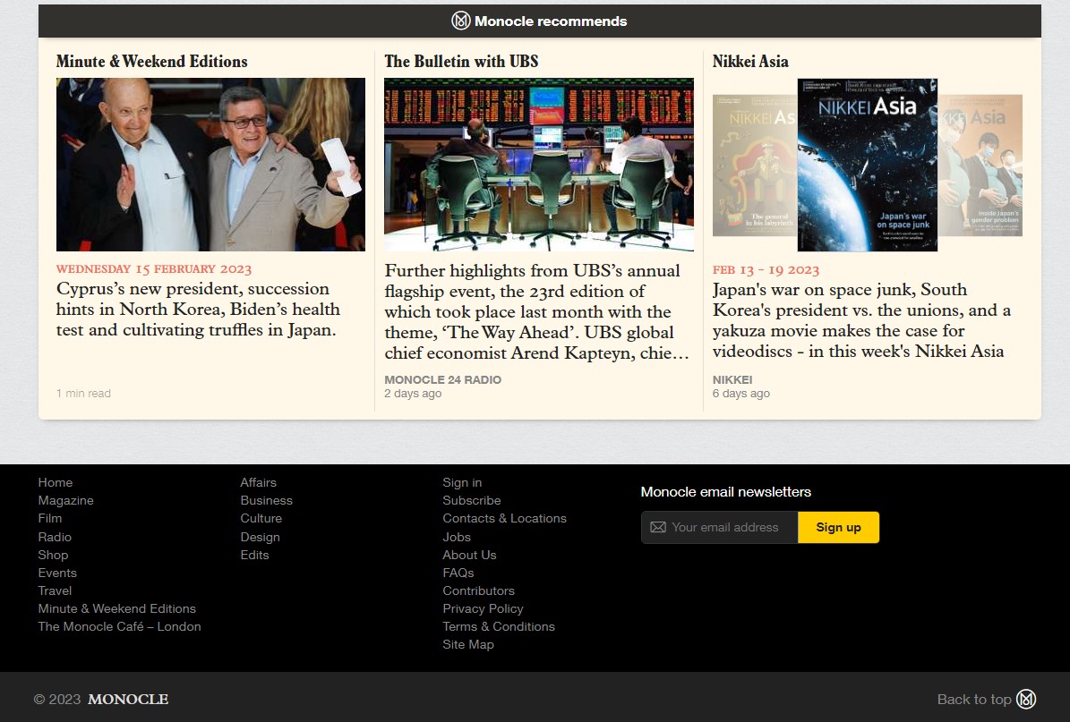
Monocle stands out as one of the most exciting website footer design examples on the list. An effective strategy is to use the footer as a tool for cleaning up your website’s main navigation. It means that you will have secondary navigation for the information on your website.
How is this done? In the case of Monocle, all the HTML links are placed within the footer. This approach results in a better navigation experience for visitors.
Sites with a lot of content in their footers can follow Monocle’s lead to improve the interaction between visitors and their websites.
8. Mom & Popcorn
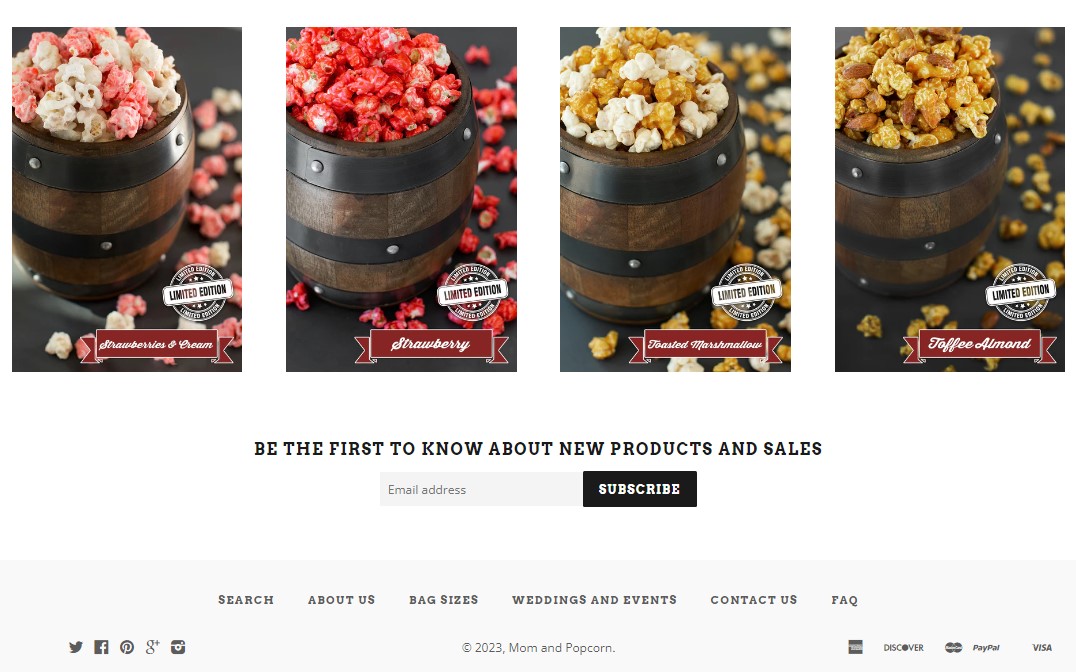
This website is all about gourmet popcorn. Its footer is designed in such a way that any visitor will easily find the specific treat they are looking for. It also features an interesting retro design to make it visually appealing. Additionally, the website provides a subscription form. This will enable a visitor to stay informed about the release of new flavors.
9. Cantilever Fish and Сhips
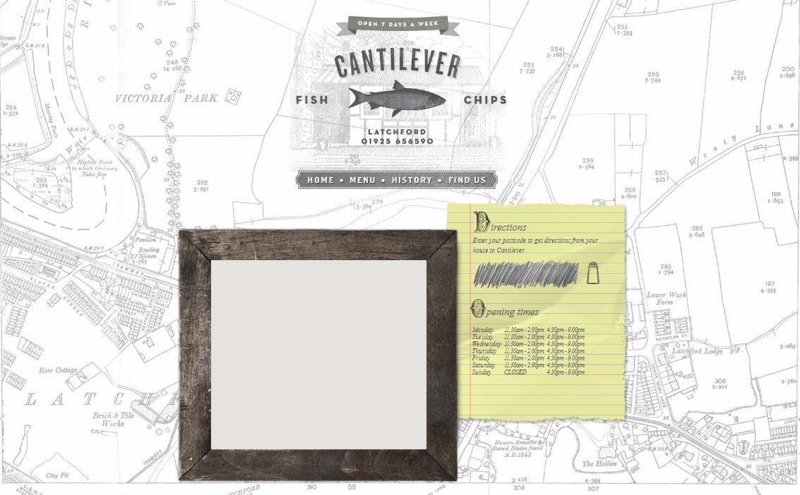
In this example, the website footer includes the geographic location of the restaurant. It also shows other important information, such as business hours and how to find a restaurant.
10. Ditto
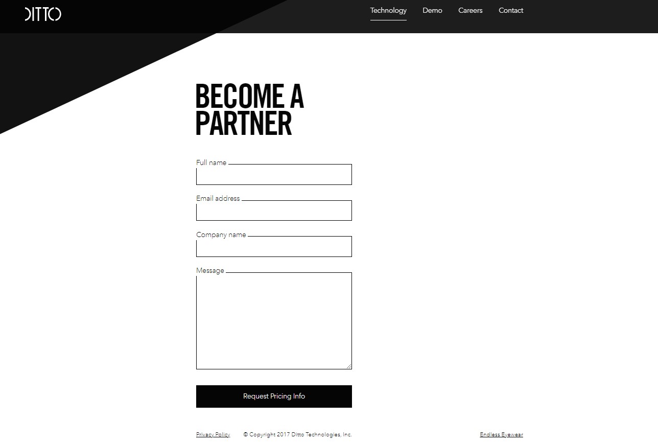
Ditto specializes in selling eyewear. The advantage of this site is that it is easy to guide customers can easily through the process of selecting items to purchase. At the end of the page, they have included a form that can enable any visitor to become a partner.
11. Fandom
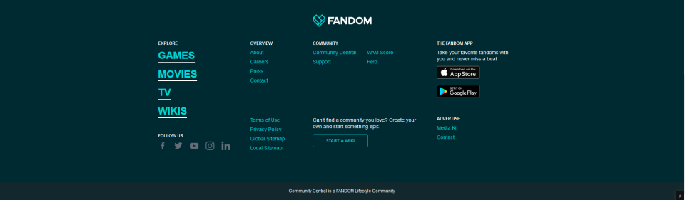
Fandom has an attractive, well-defined yet simple footer design. The lively color palette captivates users, and the copy includes a hover effect for added interactivity. Additionally, the presence of download options encourages users to engage with Fandom, contributing to an increase in its user base.
12. Arduingo
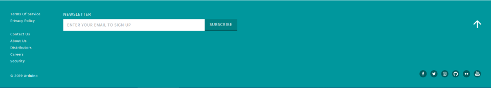
It’s impossible to ignore the open source community’s CTA to sign up for their newsletter. Simple in design, the Arduino footer provides all the information you need without any hassle.
13. Hook
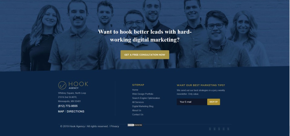
Hook offers services like data analysis, web design, and SEO. The nicest aspect is the large background photograph of their team members, which adds a touch of trust and individuality. Additionally, it draws attention to the logo, sitemap, and CTA for signing up.
14. L’Oréal
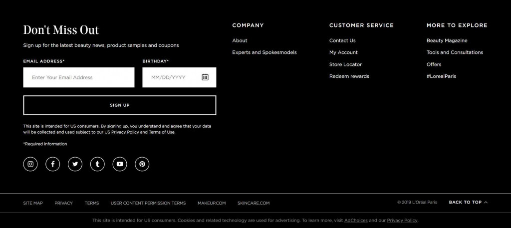
Leading provider of complete beauty care, L’Oréal Paris is headquartered in Paris, France. Scrolling down their website, you will see reasonably priced luxury items with thorough descriptions. The website’s footer design is particularly striking, reflecting its commitment to excellence in beauty. A prominent section on the right side of the page invites visitors to sign up for the latest beauty news, product samples, and promotions. Additionally, the subfooters offer more helpful information.
15. Griflan
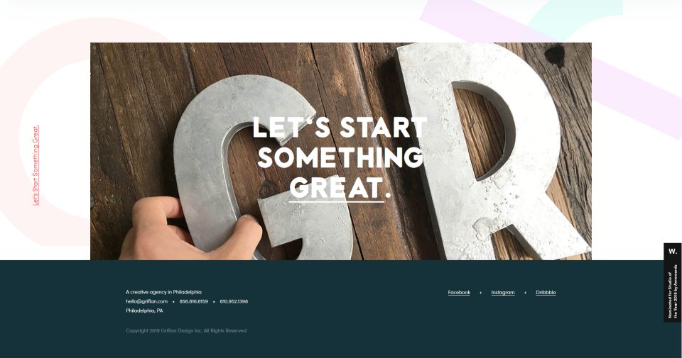
Griflan’s services include web design, print, brand marketing, illustration, and animation. Dark blue and white make up the majority of its webpage, and the footer follows suit. Thus, the footer harmonizes with the website’s primary content.
The footer is minimalist, providing just a few contact options: an email address, phone number, and social media links. The standout feature of the design is the large image just above the footer, which has an animated text underline effect and a powerful overlay effect. What’s even better is that it’s clickable.
Do you need some more inspiration for your future site? Feel free to explore 20 fun web designs of all styles in our article!
Finally
Here we have introduced the 15 best website footers and practices that will help you create a great footer design for your website. This article has also overviewed some of the best footer design ideas for websites and how to implement them.
Now we have a few final tips for you to follow:
- All website footers must have three essential elements: a copyright notice, a privacy policy, and terms of use. One of the best copyright website footer samples that include all three components is on adventure.com.
- A good footer design should also feature your logo, serving as a visual representation of your company.
- Making the most of the space you have is also very important. And of course, remember that simplicity often yields the best results in any footer.
We have considered all the basics of creative footer design and footer ideas for websites. Hopefully, it will help you make an effective footer design. You can contact our company with any questions related to footer design or digital product design and development.
FAQ
What is a footer in UX design?
A footer is a section located at the bottom of web pages, providing additional information and navigation options.
What is the best color for a website footer?
The best color for a website footer should complement the overall design and color scheme of the website, often using darker or muted tones for contrast.
Do websites need a footer?
Yes, footers are essential for improving navigation, offering additional information, and enhancing user experience. However, technically, a website can function properly even without a footer.
What does a good footer look like?
A good footer is clear, organized, and includes essential elements such as contact information, navigation links, social media icons, and legal information, tailored to the site’s audience and purpose.
Is the footer important for SEO?
Yes, the footer is important for SEO because it can enhance site navigation and keyword usage, help distribute PageRank across pages through internal linking, and improve user engagement, all of which are factors search engines consider when ranking websites.