Electrys

In this mobile app design case study, we tell how Fireart designed Electrys, an award-winning EV charging app design concept. We spent days and weeks researching the real-world frustrations of EV drivers, crafting the customer journey for this EV mobile app UI/UX, and creating the all-in-one app.

Branding
Mobile App Design
UI Design
UX Research
Motion Design
Electrys

Electrys is a mobile app concept built to fix the broken EV charging experience globally. Its mission is to remove a massive pain from the life of EV users: eliminate range anxiety and make charging an electric vehicle as easy as using a smartphone.

The platform acts as a single hub for drivers to find, use, and pay for charging. We approached it as setting a new standard for UI/UX for green tech startups, accelerating the switch to sustainable transport.

Client
Fireart
Product
Electrys App
Industry
Energy Tech, Automotive, Mobility
Region
Global
Duration
12 months
Electrys
electrys-3
A standout project, it has attracted Fireart multiple enterprise clients with the power of smart cross-platform product design.
image-2-1-1

The Problem: A Broken and Frustrating Charging Experience

Public EV charging is a mess. That’s what we confirmed after conducting interviews with 32 EV drivers and analyzing hundreds of real user reviews. While 81% of drivers depend on mobile apps, the tools they have are plagued by poor usability and a confusing information hierarchy. With not even one reliable app in this market,  we’ve seen a massive opportunity for a solution that works.

Challenges

Wasted Time

The number one complaint from drivers was arriving at a station only to find it broken or occupied. This unreliability creates frustration and erodes trust in the electric vehicle app design ecosystem.
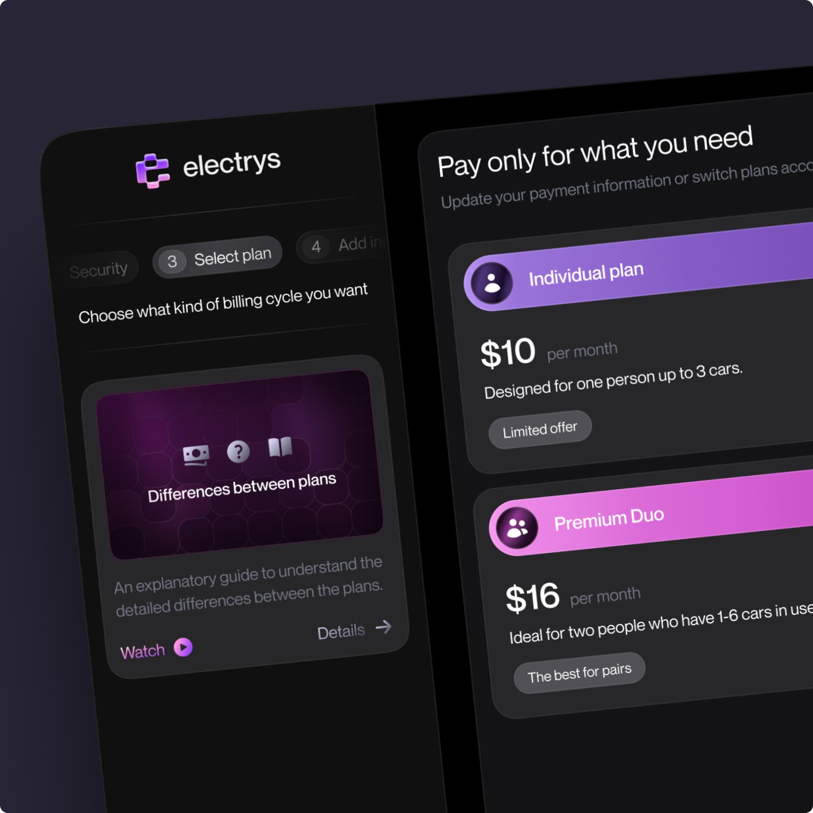
Payment Headaches

Users are forced to juggle multiple apps and proprietary cards just to pay for a charge. Existing apps are often slow and confusing, offering a poor interaction with little to no customer support.

No Reason to Come Back

The entire user journey is lackluster and forgettable. Apps lack personalization and do nothing to reward loyalty, missing an opportunity to drive retention.

Goals

All-in-One EV Super-App

A hub that consolidates station finding, trip planning, payments, and charging history into one sustainable mobility app UI.

User-friendly Experience

Prioritized usability with a clean interface incorporating motion design for apps, easy onboarding flow, and an intuitive payment system that works every time, everywhere.

Rewarding Platform

Turn a boring (yet sustainable) task into a rewarding one with gamification and a built-in loyalty program that keeps users coming back.

stakeholders
statistic

Our Approach

To fix the broken charging experience, we developed a strategic blueprint to build a solution from the ground up.

Our process was built on four key pillars.

Data-Driven Strategy 

A strategic roadmap built on a foundation of 32 user interviews and a detailed customer journey map. We created a base of explicit customers’ pains and wants, leaving no place for guesswork.

All-in-One Platform Design 

An EV “super-app” with all bells and whistles: real-time station finding, intelligent trip planning, and seamless payments. We took inspiration for this EV charging app design from sci-fi dashboards and electrical grids, creating a perfect wrapper for an intuitive, future-ready platform.

Loyalty Engine 

A built-in loyalty system to drive retention. We turned a boring charging chore into a look-forward-to activity with collectible badges and “electron” rewards that encourage users to come back.

Scalable Design System 

A comprehensive library of reusable components to ensure brand consistency and provide a future-proof foundation for the platform’s growth on any device.

approach-1

How We Designed 
an App to Count On

Our team moved from a wireframe and prototype to a full-fledged design to build the EV charging app we, as users, would want to use. 

01 Finding a Reliable Charger

Range anxiety is a trust issue, a fear of going far in an EV and not finding a working charger. To solve this, our EV charging app design features a map that allows navigation and shows which stations are available. We’ve implemented a range of other features to address this issue in full:

  • A reservation system for charging spots with limits on usage time.
  • Two modes: private (for home charging) and public (for public stations).
  • A route planning feature that automatically adds charging stations to the trip.
  • Real-time charge status tracking with notifications.
01 Finding a Reliable Charger

To collect real info from users, we checked applications in the App Store and read the reviews on forums. Negative reviews are a goldmine for detailed feedback, i.e., customer pains. They’re saying, ‘The problem is there are no empty slots.’ Or, ‘The problem is that I can’t reserve a slot when I want to book it for 20 minutes.’ We took the cases of unhappy users were unhappy, and that helped us map out the jobs to be done.

02 Frictionless User Journey

From the first tap, the experience had to be intuitive. We designed a central dashboard with a clear visual hierarchy, keeping critical information always front and center. An intuitive Onboarding process with subtle animations and transitions guiding the user’s eye and providing clear visual feedback enhanced overall accessibility. 

frictionless-user-journey

The dashboard provides analytics and statistics of your charges. The full information, broken down hierarchically, with the most important information highlighted. Everything that might interest you — current charge status, how much you’ve charged in total this year, how many payments there were, the history of your trips — you can manage all of it completely in one app. 

03 Platform People Want to Use

To drive retention, we designed “electrons”, an in-app currency, that allows users to earn points for using charging stations. Users can exchange their accumulated electrons for vouchers that reduce the cost of charging or provide other benefits. This way, every successful interaction, like charging or leaving a review, gets reinforced with a satisfying microinteraction, bringing instant value and boosting brand loyalty.

list

04 Top-Notch Design System

We based the cross-platform product design on several outstanding elements. The use of a pink-purple palette allowed the product to stand out among competitors, who typically use blue and green shades. The custom FireFlies font symbolizes energy and dynamism. Altogether, the visual identity helped create associations with electricity, making the product more recognizable in the market.

UI components

We went for the design that wouldn’t be flat, but rather flowing and dynamic, like a current, an electric current. This is why we used lots of motion design and interconnected elements.

Results: From a Powerful Concept 
to Real-World Clients

While Electrys was a conceptual project, its success was proven with tangible business outcomes. The depth of our research and the quality of the design delivered real-world value.

Attracting Enterprise Clients

The Electrys case study became a powerful magnet for new business, attracting multiple enterprise clients in the EV charging and mobility space. They saw our understanding of the industry’s challenges and chose Fireart to design their platforms.

Recognition from the Global Design Community

The project received numerous features and accolades on major design platforms like Behance, earning recognition from the global design community.

The goal for any product in this space isn’t just to be beautiful; it’s to be reliable. A driver’s core need is to charge their car, quickly and without hassle. This project proved that we understand that fundamental business reality. We know how to design a platform that not only looks great but is built to solve the most critical user problems.

Ready to build a dream product?