Parents

This mobile app design case study shows how Fireart partnered with All About Parenting,
a global leader in parenting education, to transform their flagship 12 Parents app

App Design
UX/UI Design
Branding
Motion Design
Product Design
Parents

Our comprehensive app redesign strategy turned a functional utility into an essential companion, creating a user-friendly experience that now supports a community of over one million users and holds a 5-star App Store rating.

Our client is All About Parenting, a global educational organization. With a team of nearly 150 people and a presence in 6 languages, their mission is to make learning about the parent-child relationship a social norm. They deliver research-based programs to a community of over two million parents worldwide.

Client
All About Parenting
Product
Parents App
Industry
Parenting & Family Support, EdTech
Region
Global
Duration
13 months (Oct 2021 - Nov 2022)
parents
The Parents app is their flagship digital product. It serves as the primary gateway for users to access their online programs and expert-led courses, translating proven methodology into a scalable digital format.
parents-case

The Challenge: From Functional Add-on to Foundational Asset

The Parents app is full of valuable, science-backed content. However, its original design didn’t reflect the quality. The platform felt stiff and visually disjointed, creating a gap between its mission and the user experience. This led to business challenges.

Challenges

Generic

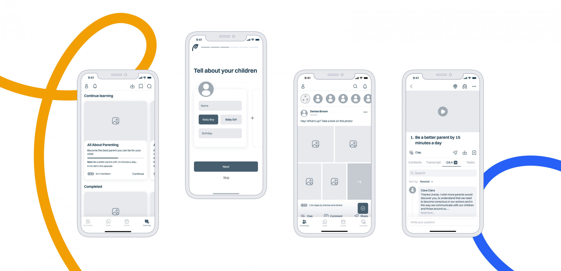
The app was purely functional, lacking the warmth and empathy crucial for a parenting support app. This made users feel “blah,” hurting emotional connection and long-term retention.

Inconsistent

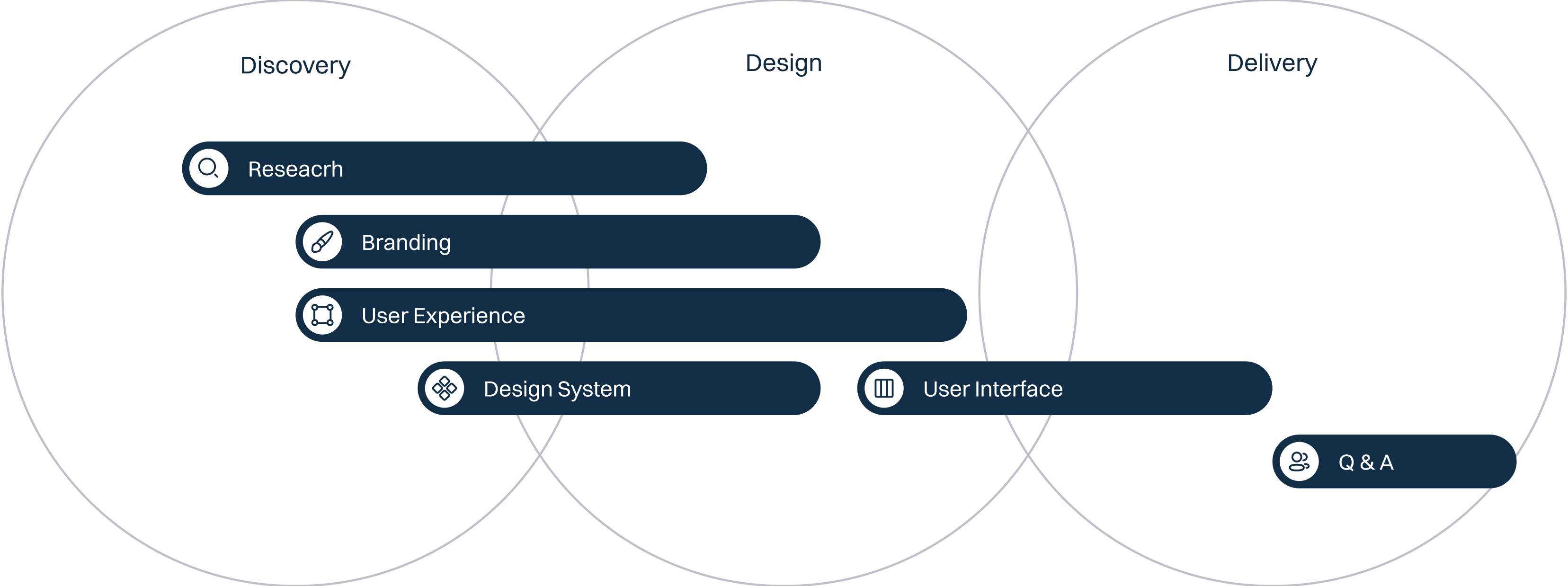
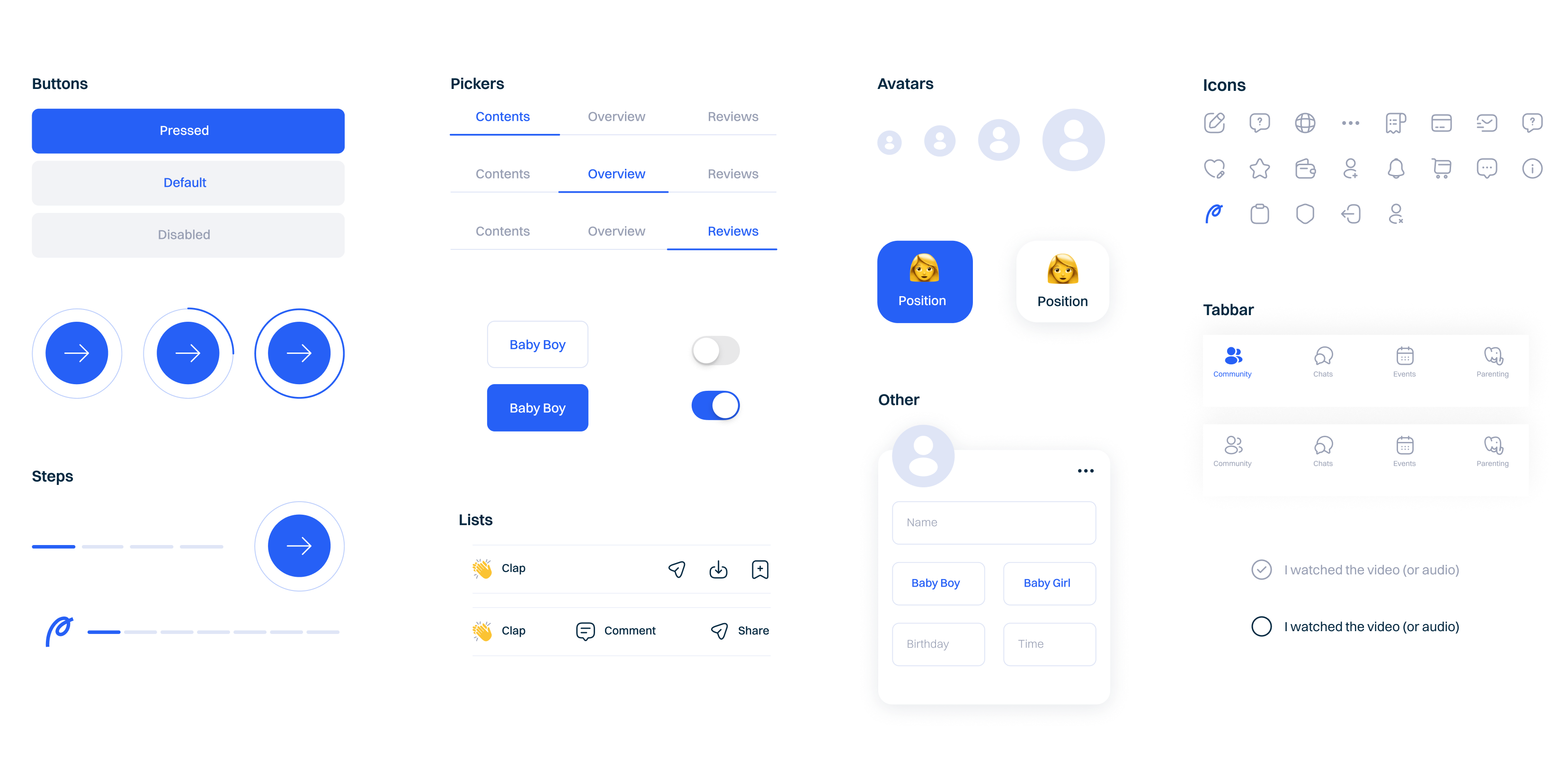
A lack of a cohesive visual system and mobile app branding created a confusing and unprofessional user experience across the app and its marketing.

Misleading

The outdated interface didn’t reflect the premium quality of the expert content; it was difficult for users to justify the subscription price and for the business to communicate its value.

Goals

Reposition as a “Digital Family Doctor”

Transform the app into a trusted, go-to companion that feels smart, human, and practical.

Create Bold Brand Image

Create a premium, consistent, and trustworthy brand identity that highlights the quality of the content.

Drive Engagement and Growth

Improve app usability to make the platform more intuitive, engaging, and helpful in a parent’s daily life.

parents2
parents1

Our Approach

To marry functionality and emotion in our update, we at Fireart implemented a holistic user-centric design process based on four key pillars.

scope video

How We Built an Experience Parents Trust

It took our team a year of strategic research and diligent work to customize and implement the best solutions for this parenting app UI redesign to reach the set goals. 

01 Empathy

Data-driven empathy was the base of our app redesign strategy, shifting the product’s focus from utility to an emotional support system.

The key was realizing we weren’t designing for users, but for parents on a complex emotional journey. Every design decision, from a button’s roundness to an illustration’s tone, had to answer the question:

Does this feel supportive and reassuring?

Empathy

02 Trust

To be a “family doctor,” the brand had to look the part. Finding this look was a core part of our mobile app branding work.

The Colors

We chose a primary blue, a “trust and competence” hue, that also associates with medical uniforms. It was balanced with a vibrant, warm secondary palette (yellow, orange, green) to bring in friendliness and energy.

colors
switzer-colors-1

The Logo

After presenting several draft options to the client, we picked the logo concept inspired by a doctor’s handwriting — a handwritten wordmark for a personal touch. The “P” icon doubles as a sprout, symbolizing the growth of the child and the parent.

the-logo
the-logo-2

03 Intuitive UX & UI

With a clear strategy, we moved to the app structure. Our team designed over 60 unique screens, starting with clean, low-fidelity wireframes to perfect the user flow before adding visual details.

Onboarding

Reframed sign-up process turned basic “creating an account” into a more emotional step of a parent joining a program to “grow and evolve together with their kids.”

Community

The community section became a safe, intuitive space for parents to connect with peers and share experiences, opposing the feeling of isolation.

Learning

The expert content got organized into digestible video courses, discussions, and practical tasks. New structure allowed parents to learn at their own pace. This was key to improving app usability for busy parents.

Intuitive UX & UI

04 Consistency

To solve the “inconsistent” problem for good, we built a design system: a library of buttons, avatars, cards, pickers, navigation bars, and other UI components that can be reused wherever. This system ensures every new feature follows the brand identity and helps the client build a user-friendly experience long-term.

Consistency

05 Web Platform

Parenting is often a team effort, with users having different devices. To meet this need, we developed an equivalent web platform. It has the same features as a mobile app, allowing parents to switch between their phone and desktop while staying connected.

web-platform

Results for client: 1,000,000 Happy Users and Company Acquisition

The comprehensive redesign and branding created a scalable asset that drove significant value for the users and the All About Parenting brand.

Successful Company Acquisition (2025)

Strong user engagement on the redesigned platform became a core asset that enhanced the company’s market value, contributing to its successful acquisition.

Thousands of 5-Star Reviews on the App Store

The app holds a 5-star rating, with users praising its intuitive design, supportive content, and product experience.

Growth to Over 1,000,000 Users

The redesigned app successfully scaled its popularity. In reviews, users describe the app as a “game-changer” and daily support in their parenting journey.

We are deeply grateful to the Fireart team for their contribution to our project’s success. Their dedication and creative approach to UI/UX design, branding, and illustration have been instrumental in our journey. Fireart has become a reliable partner for us, and we look forward to continuing our collaboration.

The Parents project received features and accolades on major design platforms, including Silver from London Design Awards, earning recognition from the global design community. 
winner
Ready to build something great?