


A hospital website is a critical clinical tool. The digital architecture of a healthcare organization operates in a regulated environment. Spiking patient anxiety or missing out on informing patient exposes organizations to legal liabilities.
Despite the acceleration of digital healthcare, the transition remains disjointed. Patients expect working technology but often find buried phone numbers, confusing menus, and the frustration of spending thirty minutes filling out forms online, only to receive an identical paper clipboard at the clinic.
We are examining 8 clinic website examples that solved the UX puzzle by merging clinical empathy with enterprise technology.
Article highlights
- Top sites adapt their UX to the user’s state of mind, separating panicked emergency users from deliberate elective researchers.
- 95% of hospital sites fail compliance. Market leaders build for ADA and WCAG 2.1 standards.
- Bridging the gap between the public website and the secure patient portal (like Epic MyChart) prevents the digital-to-physical drop-off.
- Examine 8 benchmark platforms, from established health systems to D2C tech outliers reshaping patient expectations.
Redesigning your digital front? Fireart Studio builds seamless healthcare experiences with clinical empathy and enterprise tech integration.
Contact our team todayThe 3 Pillars of Modern Healthcare Web Design
Building a healthcare digital front door differs from e-commerce. You cannot rely on standard templates when users navigate your site during personal crises.
Based on our projects like the Healthist (centralized dashboard, reduced cognitive load, automated workflows), and the examples below, we defined three pillars of a competent digital tool based on the top medical website design examples.
1. Designing for the User's State of Mind
Healthcare UX requires an understanding of the user’s psychological state at the exact moment of interaction.
The distressed user is experiencing a medical event. Their cognitive bandwidth is consumed by anxiety. They exhibit tunnel vision and need immediate directives. UX for this state of mind must strip away marketing fluff. It demands large tap targets, high-contrast UI, location-aware routing, and clear emergency wait times.
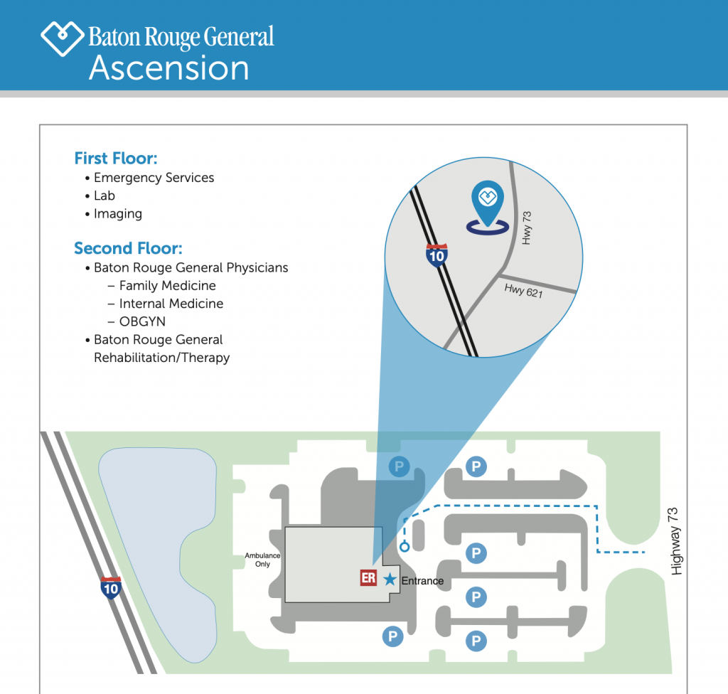
Hiding the urgent care phone number under a dropdown menu during a crisis has real-world consequences. The Campus maps should open into a clear, printable pdf file that’s easy to read.
Then, there’s the elective user researching a future procedure. They need trust and clinical authority. This user benefits from provider biographies, facility capabilities, and educational resources integrated into the site.
Good healthcare web design serves both user states simultaneously without creating clutter.
2. Ruthless Accessibility (ADA/WCAG 2.1)
In healthcare, accessible healthcare design is a federal mandate. Failing to provide equitable access to digital care exposes organizations to Title III ADA lawsuits and threatens federal funding.
Recent audits show that over 95% of hospital websites fail WCAG 2.1 compliance. Common failures include low-contrast text (making medication instructions unreadable for visually impaired patients), missing form input labels (blocking screen readers from parsing clinical intake forms), and inaccessible PDF uploads that withhold health data.
Hospitals that publish health equity statements while maintaining inaccessible digital journeys contradict their mission. To see how accessible design differs from general usability, check our insights on accessible vs. inclusive design.
3. The Digital-to-Physical Handoff (The Portal Problem)
Patients view their healthcare journey as one, combining the public website, the patient portal, and the physical waiting room. The digital infrastructure must reflect this continuum.
A friction point occurs during the digital-to-physical handoff. A hospital might have a polished hospital website design, but when a patient clicks Log In, they enter an unbranded legacy electronic health record (EHR) portal. If the transition is bumpy, or if patients must print forms they already filled out online, it hurts trust.
The best patient portal UX ensures that features like telehealth scheduling and bill pay feel native. We borrow principles from fintech design to ensure these secure handoffs are smooth and retain data context.
Are your patients getting lost in frustrating navigation loops? Let's rebuild your digital experience.
Explore our product design services6 Hospital Website Examples Nailing the Patient Experience
Building a digital front door for a health system is difficult due to regulations and database constraints. The following six health networks have managed this balance, setting the standard for the best hospital websites in the industry.
1. UNC Health
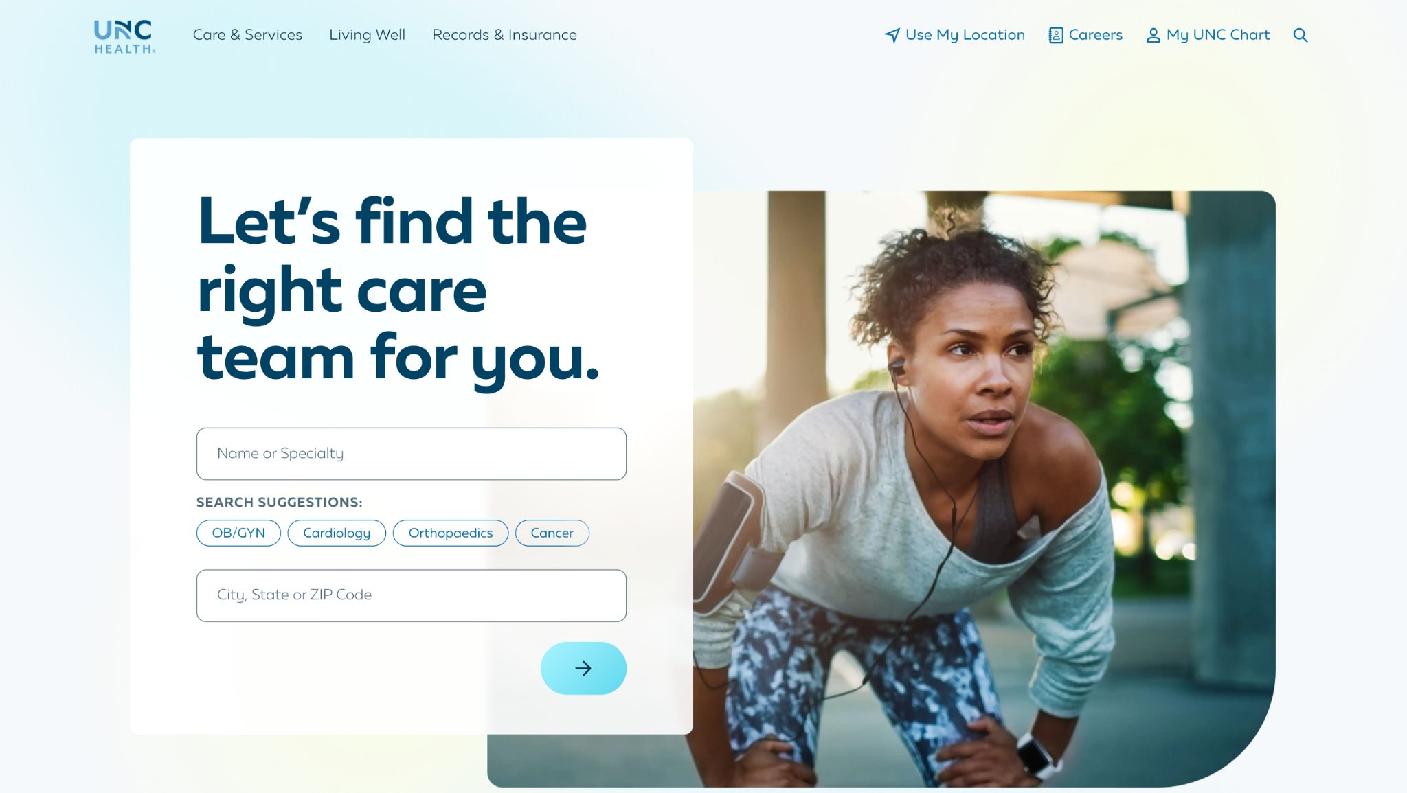
UNC Health’s platform reduces cognitive load. The homepage uses readable typography and an intent-based UI centered around the immediate action: let's find the right care team.
The standout feature of this medical website design is its “find a doctor” tool. It shows phone numbers and physical addresses immediately on the profiles, saving users from clicking through multiple screens to make contact. The site is built on an extensible, AAA-compliant design system that uses micro-animations to add brand personality without compromising load speeds or accessibility. It feels friendly and modern.
2. Children's Nebraska
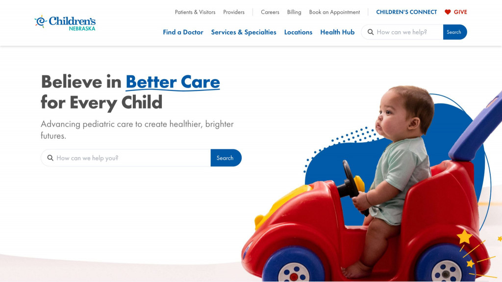
Pediatric healthcare requires a balance: the design must communicate clinical professionalism while feeling reassuring to parents. Children's Nebraska achieves this. The typography remains clean, while the use of hand-drawn squiggles and photography of real staff humanizes the experience, neutralizing the sterile hospital aesthetic.
Under the hood, this is a masterclass in healthcare website development. The site uses a composable MACH architecture (Microservices, API-first, Cloud-native, Headless). This allows them to use high-speed search tools and HIPAA-compliant intake forms. The judging panels praised accessibility of their build, that ensured parents across their five-state region can access care on any device.
3. Atlantic Health System
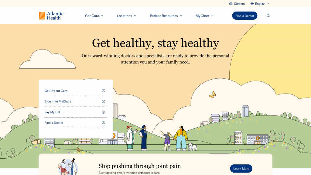
Atlantic Health System uses warm, animated illustrations instead of staged hospital photography. This softens the emotional vibe of the site, making it feel like a consumer-friendly service platform.
The UX success lies in its four-quadrant navigation strategy. By analyzing search behavior, the designers realized patients under stress should not have to guess how the hospital categorizes departments. They surfaced the highest-intent actions like booking an urgent care visit, paying a bill, or finding medical records, straight to the homepage. This intent-based routing ensures users never feel trapped in menus.
Struggling to integrate legacy hospital systems into a modern frontend? We handle complex architectures safely.
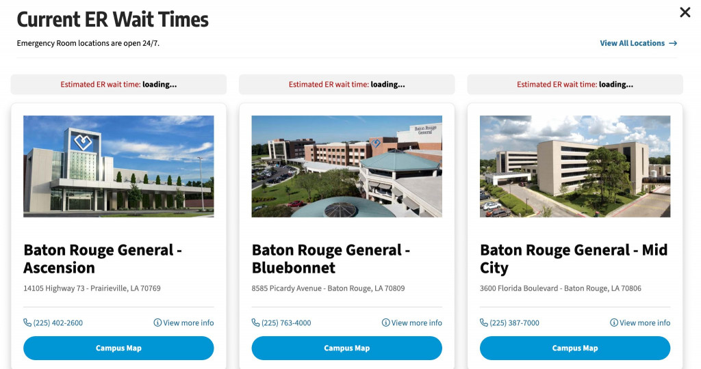
Explore our Web Development services4. Baton Rouge General
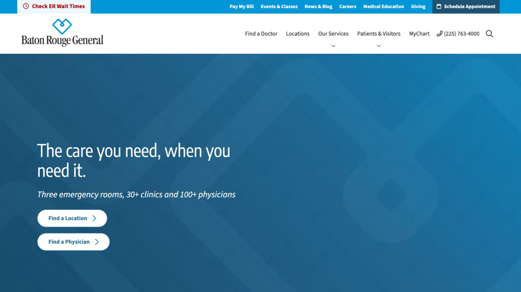
Baton Rouge General provides a strong example of utilitarian clinic website examples. It uses a 4-step quick-action menu on the hero screen. This guides patients to high-priority resources like emergency routing and primary care scheduling.
During functional testing, this site highlights a reality in healthcare website development: visual beauty cannot mask backend instability. If a patient attempts to book a doctor through the menu and the system hangs on an infinite loading loop due to a failing scheduling API, the UX has failed. A digital front door must lead to the underlying clinical databases; otherwise, the polished UI is useless.
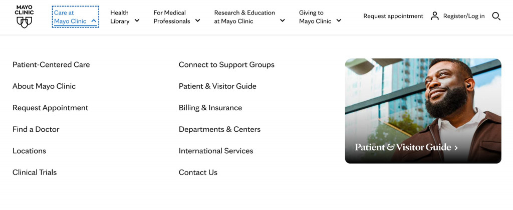
5. Mayo Clinic
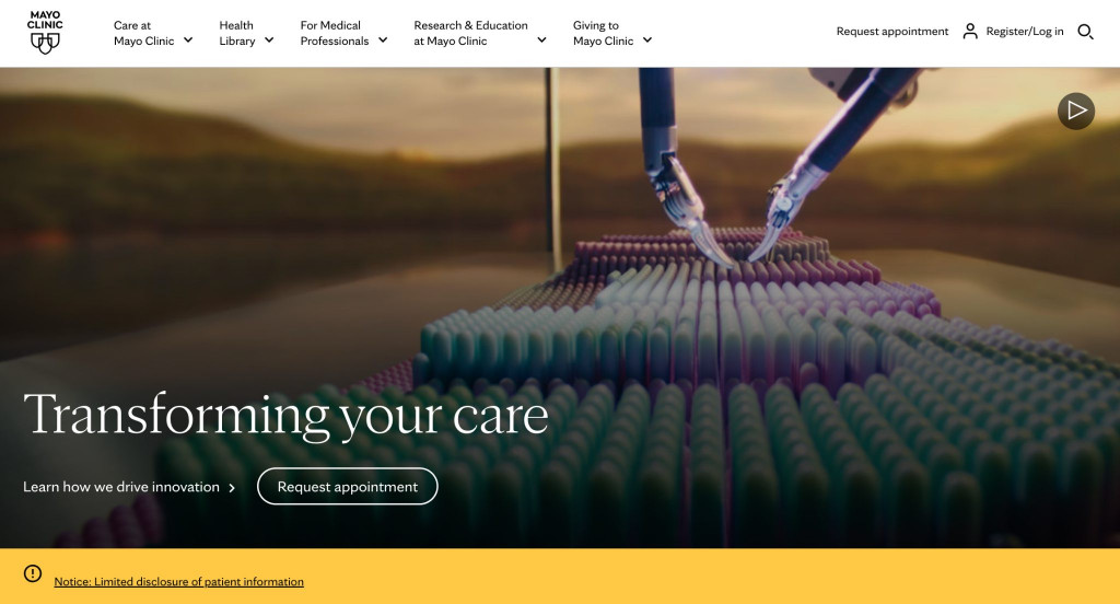
The Mayo Clinic site operates like an authoritative medical encyclopedia. The information architecture is crispy clean. Using cloud datasets and structured clinical data, it establishes search authority. The layout uses high-contrast buttons that make finding disease information easy.
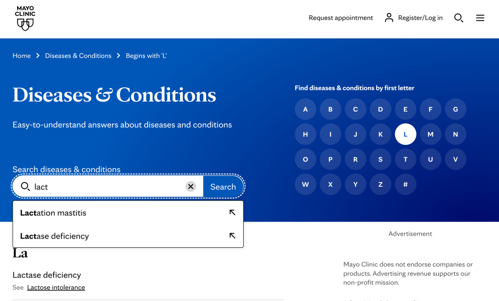
The friction here is emotional. The clinical efficiency creates a cold experience. While navigating conditions is straightforward, executing a telehealth scheduling action or finding a phone number to speak with a human is buried behind a Request Appointment funnel. It sacrifices human connection in favor of institutional authority.
6. St. Jude Children's Research Hospital
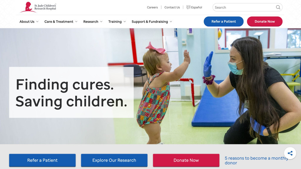
St. Jude’s public-facing medical website design is built around storytelling, fundraising, and global outreach. The site achieves emotional resonance by using genuine photography of patients, which establishes trust in pediatric oncology.
Operationally, the UX is a masterclass in conversion. During high-profile campaigns, the platform managed traffic surges of 200,000 visitors per hour without downtime. The donation interfaces are integrated, removing friction for donors, while separate, secure portals serve the clinical needs of patient families undergoing treatment.
Want to build an enterprise-level app that can handle massive data securely and efficiently?
Read our Enterprise App Development GuideThe Outliers: How Tech Disruptors are Resetting Expectations
While traditional hospital networks navigate legacy databases, tech-first healthcare companies operate from a blank slate. These platforms treat healthcare as a digital product.
By adopting Direct-to-Consumer (D2C) and SaaS visual languages, they reset what a patient expects from a medical web design agency. They prove that healthcare UI functions with the speed of a lifestyle app, forcing traditional hospitals to modernize or lose tech-savvy demographics.
7. Amazon One Medical
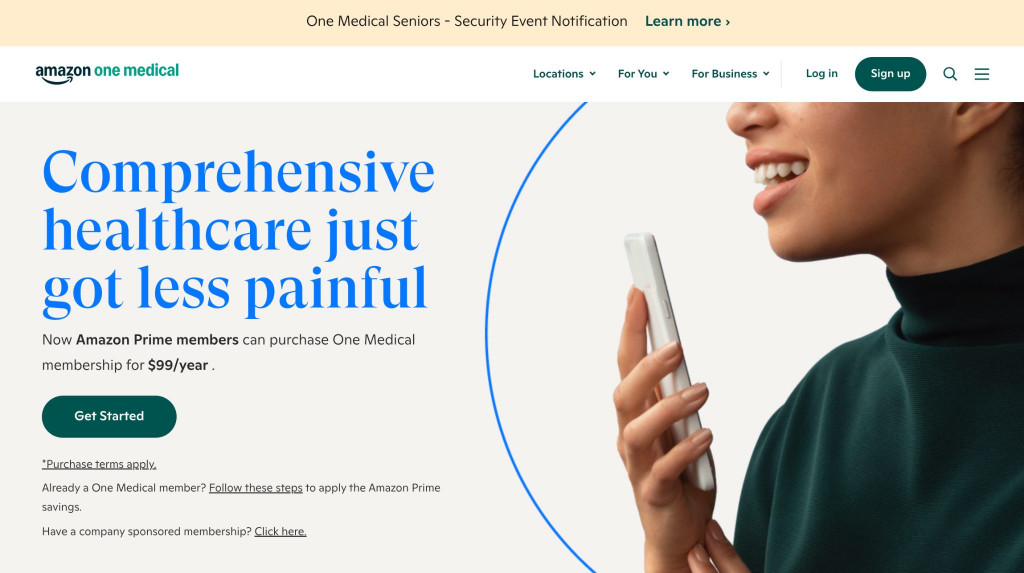
Amazon One Medical strips away the traditional hospital aesthetic. The interface is trendy and premium, and a color palette of greens and yellows aligns with a fintech or fitness app.
The UX is built around a subscription sales funnel. For users seeking immediate care, barriers are lifted for rapid booking. Those considering a membership see scannable content blocks. Behind the scenes, it utilizes a serverless AWS stack, ensuring the platform scales dynamically without downtime. It shows hospital website design adopting e-commerce conversion tactics.
8. Maven Clinic
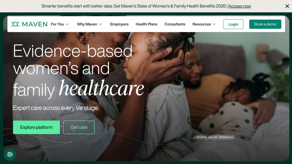
Maven Clinic approaches wellness from a B2B SaaS perspective. As a virtual clinic sold to employers and benefits consultants, its design language is polished and corporate. It leans on calming color psychology and lifestyle video assets to reduce anxiety, presenting a sophisticated corporate image.
Because it operates globally, its healthcare website development relies on localization and headless CMS architecture. By integrating tools like Lokalise and AI-driven search capabilities (AEO), the platform delivers multi-language navigation pathways to diverse international audiences.
Ready to build a medical app that feels as smooth as a premium consumer product?
Explore our Custom Mobile App DevelopmentHow to Choose a Medical Web Design Agency
Hiring a generalist web agency to build a healthcare digital front door is an organizational risk. An agency that excels at selling shoes will fail when faced with the technical realities of healthcare.
Generalist agencies focus on visual aesthetics. They struggle to navigate security audits, configure AWS environments for HIPAA compliance, or negotiate the API connections required for an Epic/MyChart integration. They frequently overlook WCAG 2.1 AA mandates, exposing your hospital to Title III ADA lawsuits due to accessible healthcare design failures.
At Fireart Studio, we build digital products from the inside out. We engineer secure, strong architectures. We understand that your homepage bridges the gap between marketing and clinical data, ensuring that patients transition from a mobile search directly into a secure patient portal UX.
Conclusion
In healthcare, a confusing menu or a broken form increases cognitive load during moments of vulnerability and delays access to necessary care. This is why the best hospital websites combine aesthetics with functionality.
By committing to accessibility, designing for emotional states, and eliminating physical paperwork with data integrations you transform your website into an empathetic clinical tool.
Don't let legacy tech ruin your patient experience. Architect your modern healthcare platform.
Contact our team todayFAQ: Hospital Web Design
Why is WCAG 2.1 Level AA accessibility a legal requirement for hospital websites?
Under the HHS Section 504 Final Rule, healthcare organizations receiving federal funding must achieve WCAG 2.1 Level AA compliance. Failing to meet these standards—such as using low-contrast text or building forms that block screen readers—violates civil rights laws, threatens federal funding, and exposes the hospital to Title III ADA class-action lawsuits.
How difficult is it to integrate a custom website with EHR systems like Epic or MyChart?
It is complex. Developers interface with the underlying EHR via open.epic or FHIR endpoints. This requires navigating hospital IT security audits, overcoming port blocking, and structuring API calls that withstand legacy databases.
What is intent-based navigation and why are health systems adopting it?
Intent-based navigation surfaces high-priority actions directly to the user (e.g., Get Urgent Care, Pay a Bill, Find a Doctor). It aligns the architecture with the patient’s mental model, reducing friction and confusion compared to legacy menus based on internal hospital politics.
Why do healthcare platforms take longer and cost more to build than standard websites?
Healthcare development carries compliance and security overhead. Before functional coding begins, budgets and timelines go toward establishing secure AWS cloud environments, signing Business Associate Agreements (BAAs), and conducting multi-month security audits to ensure the architecture meets HIPAA regulations.
How does UX design adapt for an emergency patient versus an elective patient?
An emergency patient has elevated cortisol and tunnel vision, requiring large tap targets and fast geographic routing without marketing clutter. An elective patient researching a knee replacement requires asynchronous research tools, provider biographies, and educational video. The site architecture caters to both distinct psychological states.


