10 Worst User Experience Website Examples
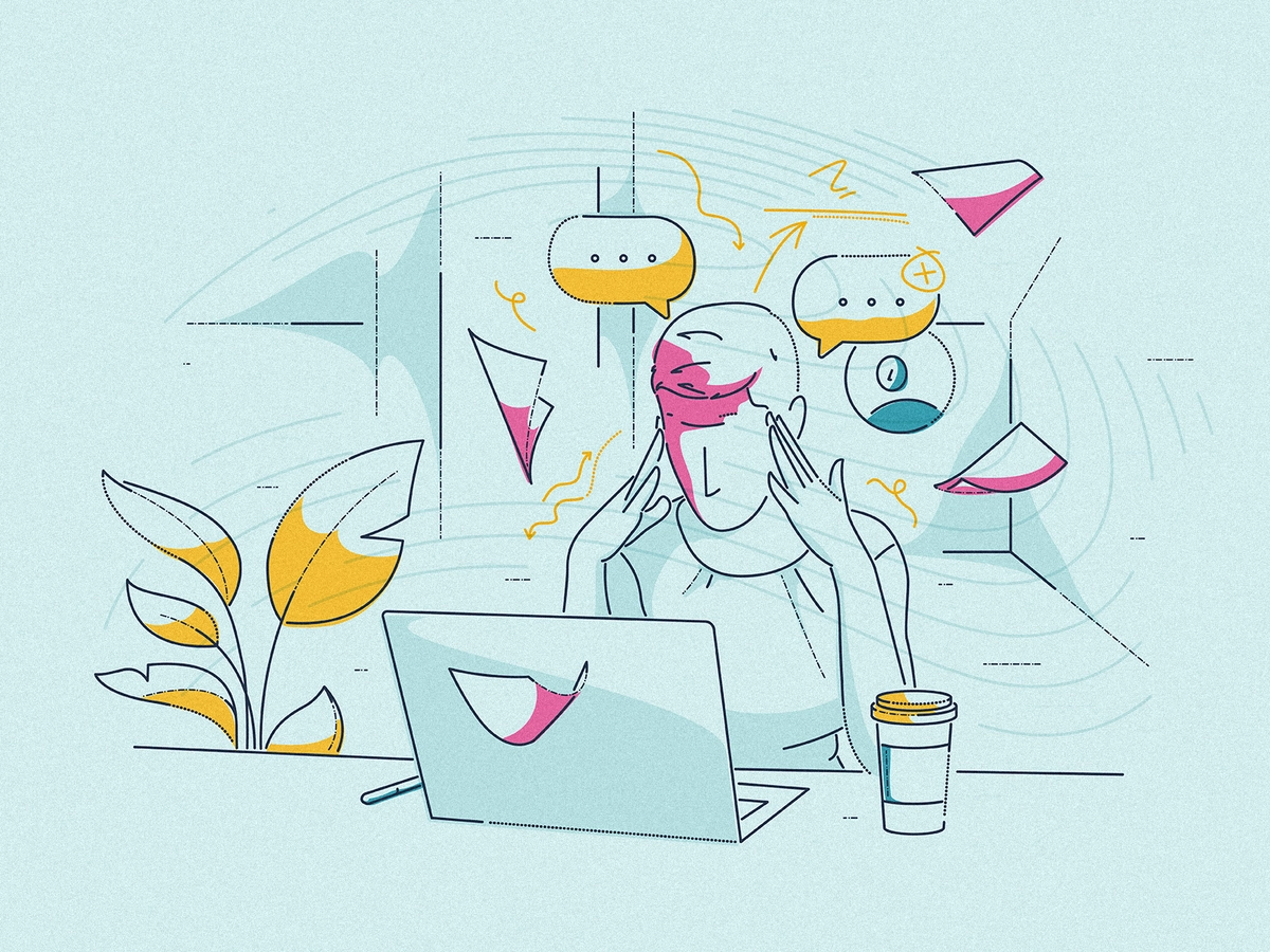
Are you not satisfied with the average number of visitors to your website? Don’t get enough sales and other types of conversion as you’ve expected? Probably, you need to review your UX, but to understand what can be wrong with your site, read the article explaining the worst UX design tactics. Look closer at what may drive your users away from the site and learn from it!
What is UX?
Generally speaking, User Experience (UX) embodies the customer’s perception of the product or service and includes the reaction to your offer while using it. Relying on the specific actions or their absence, you can infer the solution’s relevance to the TA and the success of your brand marketing campaigns.
Not to give the worst user experience at the website, mind three vital constituents of the UX design: why, what, and how. ‘Why’ refers to understanding your audience’s motives to use the product and account for their system of values. ‘What’ is the adoption of specific features and functions within your service. And ‘how’ is about aesthetics and usability.
In good UX design, ease-of-use comes first, while aesthetics follows the pace. In contrast, poor UX goes with insufficient care about the customer’s convenience, visual pleasure, and interaction tools. So mind it carefully while wrapping your product into the visual form!
Why is UX important?
Convenient, attractive, and useful (or interesting) UX is a sure prerequisite for the company’s growth. UX is another critical concern if you’re not thinking about the clicks solely, but your business priority is the quality of coming traffic and leads to the website. Do everything smartly so as not to irritate your potential customers with the worst UX design!
What to start with? According to Top Design Firms, the best scenario is to start with images, color, and videos as they’re the most tangible UX elements. Then comes the textual content, which should also comply with the brand marketing and highlight your competitive advantage properly. Finally, for better visualization, create a sketch to see each page before it goes live.
Are “click-baits” considered a bad UX?
No doubt, you’re familiar with these scandalous headlines and their rare accordance with the actual gist of the piece. It’s a vivid illustration of bad UX or, to put it correctly, a misleading UX. If you use these marketing hints, you’re lying to your customers and won’t live up to their expectations. This negligence can easily turn any source into the worst UX website.
However, click-baits are only the tip of the iceberg. There’s more to discuss when it comes to the worst UX examples. Follow our selection to raise your level of awareness!
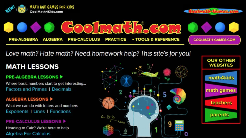
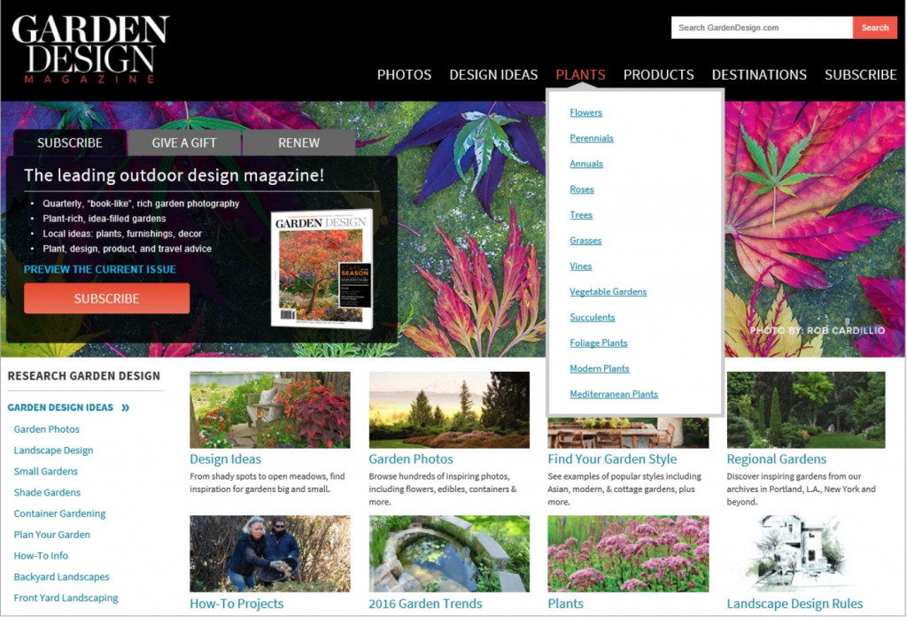
1. Long dropdowns
Believe us, no one is a fan of the ‘massive wall of text,’ and that’s truly a sign of the worst UX website. Weighting its necessity, imagine yourself in the user’s shoes — would it be pleasant to see such a long dropdown? Will it complicate your search for the appropriate response or functional item? Obviously! So, never include it without a solid reason!
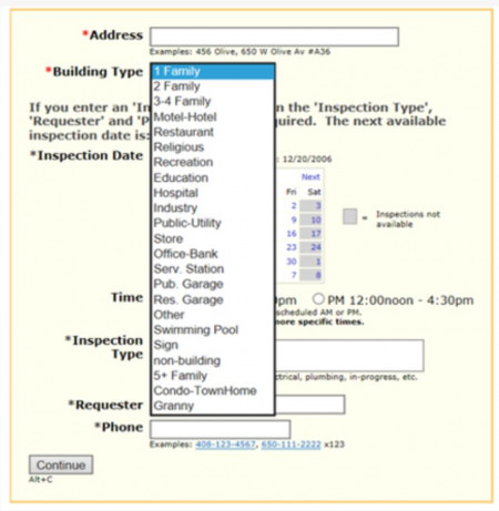
This example perfectly explains what we mean by the long dropdowns. How can you solve the issue? Better leave your customers some space to put down this information manually. It’s much quicker than asking them to search for the correct answer in the long horizontal listing. Take care of your users!
2. Tiresome checklists
This wrong UX tactic is much similar to the previous one. The slight distinction is that here the user sees the long checklist where they need to tick the box. In the best case, the number of items here should be either three or four. Don’t create a challenge where it’s not necessary at all!
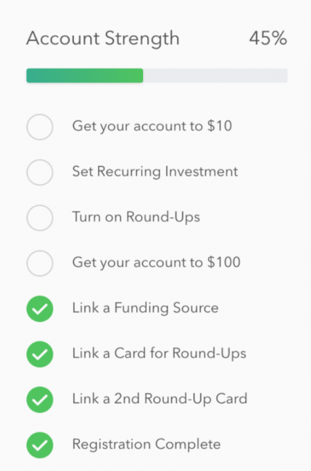
This kind of onboarding journey is less likely to end up successfully as not every customer will make an effort to complete the procedure. Besides, this approach is rather detrimental and ineffective when the user makes the first steps at the site. We at Fireart don’t recommend trying it!
3. Detailed tooltips
What should be brief has to remain brief. Please, don’t ignore this simple UX rule! By function, tooltips are the short explanations for users to make an action or fill in the field correctly. If the tooltip is written in a complicated language or is too long (as in the example below), the user will be puzzled at best and lost as a potential client at worst.
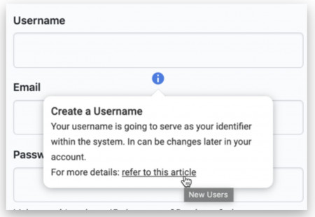
The natural integration of tooltips into the User Interface (UI) is a crucial requirement not to join the club of the worst UX websites. Prevent your user’s loss by not skipping this piece of advice!
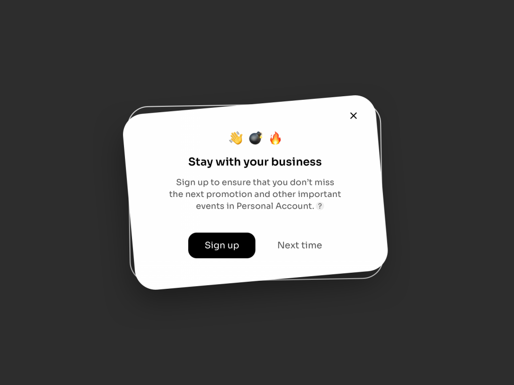
4. Too sophisticated passwords
Security is an excellent standard of your website’s policies, and it’s praiseworthy if you invite your users to create strong passwords. Nevertheless, you should remain on the customer’s side while explaining the password rules. Please, don’t do it this way:
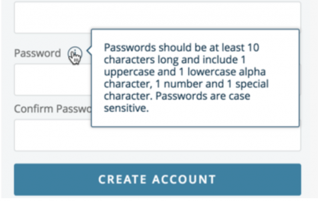
Be supportive instead of demanding! Don’t forget that customers are usually asked to come up with a new password for each website, while the latter has something special in what they should look like. Better find a balance between safety and ease of use, and the users will express gratitude to you in the form of loyalty to the service or product.
5. Industry jargon
Do you respect people who make every word count? This quality is also significant in the UX design. Get right to the point and use simple lexis! Of course, your website’s content may contain a small percentage of professional terms and industry vocabulary. Meanwhile, reread all the content through the conversational lense. Would you explain it so to your friend?
Have a look at this example to answer this question!
If the answer is no, you’ve got the work to do. Every line at your site should be meaningful and easy to grasp. Don’t try to sound smart — make a better attempt at being understandable!
6. Intrusive videos
Video marketing is an awesome method of attracting more customers to your site, making your content more interactive, easy to learn, and standing out from competitors. But though it can be your brand’s strength, it can also appear to be a severe drawback if implemented wrong.
Check the example by Paypal!

Now ask yourself whether your website includes the autoplay videos. And what for? Be sincere in your reply and make the quick decision to withdraw it ASAP. Why? Users don’t like the infringement of their right to choose. No one would! All videos should be played per the customer’s agreement and the specific purpose.
7. Numerous pop-up ads
Frequent pop-ups are another immense hatred in the users’ worst UX website list. For instance, the recent Statista research confirms that more than half of the American web users consider tracking prompts the most annoying thing. So, again, place yourself in the customer’s place and think about your typical reaction to the pop-up ads. See?
These types of promotional pop-ups aren’t a surprise these days. But, unfortunately, many websites continue inserting them in the UX, which is almost likely to result in a quick leaving the site and ordering the service or product somewhere else. Would you like to preclude this pitiful outcome? Abandon this practice on your platform!
8. Awful color palette
Though tastes differ, there are still some widely accepted canons of what a good and a bad UX design look like in terms of colors combination. Black & white is a classic, while a soft color palette is often a good option. In the meantime, there are some cases when even a black & white scheme can be spoiled. Here’s one of them:
Will you imagine yourself being a loyal visitor of this site? Improbable! Learn from the painful experience of others, and don’t fall into the same trap!
9. Obsolete design
Though it’s hard to define the concept of ‘being obsolete’ in the UX website design, you’ll see and feel it if you have good taste! Often, an obsolete website is synonymous with a weak content structure. Altogether, these two factors provide solid reasoning for users’ quitting the site: 38.5% and 34.6% of users prove it by the corresponding ‘exit’ actions.
Sift through this one and think about the first impression it evokes!
Well, it’s not that bad compared to the other worst UX examples from our selection, but it has something to pay attention to. What’s this? The messy content organization in numerous separate menus and windows. After a couple of minutes, your eyes would be tired if you dared use it. Make sure your site’s content is in perfect order!
10. Poor navigation
That’s the last but not the least detail that can turn your website’s UX down. It logically comes from the previous point and moves to the presentation of the site’s logic. Never undermine the value of web navigation and cherrypick the clear-cut and convenient menu pattern. Don’t add another reason for your site’s guests ‘goodbye’.
Here’s the example to learn from and never follow the same path of action:
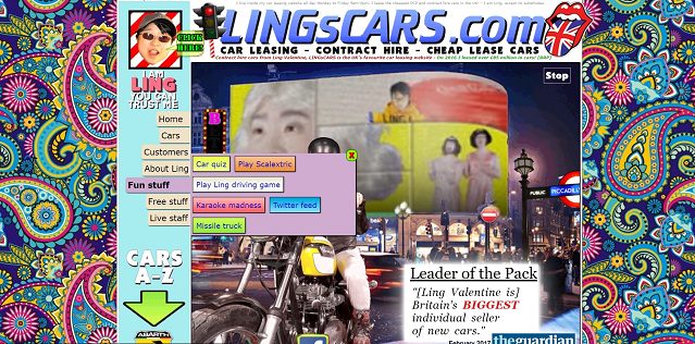
The site’s menu is clearly very chaotic and disorganized. How can one use it? It’s a big question. Your priority should remain on the quality of interaction with users. Work harder to make it accurate!
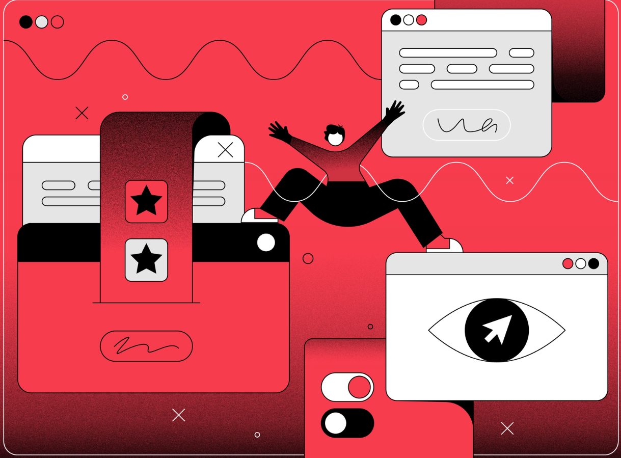
Are you looking for UX developers? – Feel free to contact us!
Now you can differentiate a bad and a good UX website like cracking the nuts. Do you feel that your site also needs some UX design improvement? We can readily hire UX developers for your specific project, so don’t hesitate to start the way to your UX amelioration!
Conclusion
Good UX design accounts for the customer’s usability, the attractive visual side of the site, and the functionality of each present element. So mind it carefully while brushing up on your platform’s UX, and don’t repeat the errors described above!
Contact Fireart Studio and let us help you to build long-term and trustworthy relationships with your customers! Your website will transform into a tidbit after our ux design studio designers’ help.