Sometimes an adventurous design can do more harm than good. And most often, the navigation of a new web resource suffers from various kinds of experiments. To improve the user experience while navigating websites, use some tips with us.

Why Web Navigation is Important?
It’s true that the menu can be presented in different ways. Analyze the behavior of visitors on the site regularly. If you realize that the users are not using it, or get poor UX it might be worth changing the look of the menu.
A report on web usability by KoMarketing revealed that about half of those surveyed in the study use the navigation menu when exploring a new web resource. At the same time, 37% of respondents said that inconvenient site navigation was a sufficient reason to leave the site and never return to it again.
That doesn’t mean you can’t try out newer techniques like left-aligned or full-page menus, or those that appear on scrolling. It simply means that you must organize everything in such a way as to make the process of working with the resource as easy as possible for visitors, to improve the quality of their interaction.
Remember that user experience should come first on the list of your design priorities.

Top 5 Basic Tips to Apply in UX Improvements
Navigation design seems straightforward, especially if you follow basic navigation rules, but you may never be sure what will be best for your audience until you try out other options that exist. It’s pretty easy to test all of these alternatives with split tests.
However, before you go to design your own experiment, take a look at the expert UX improvements. They may give you a better idea of which hypotheses to test first in your own tests. Here they are.
1. Crystalize the Menu Structure
The menu design itself may be too difficult to grasp, and the structure may be confusing. After identifying the goals on why the visitors should use the menu, decide on the UX updates on design and structure. Test it and then repeat if needed, meaning refusing of superfluous or useless elements.
2. Think out the Headlines
Menu names should be concise, but at the same time succinct. This is not a place where you can let your imagination run wild. When you come up with the names of each menu section, try to answer questions like:
- What kind of content should be displayed on the menu?
- How should it be structured?
- What are the pages to be prioritized?
Commonly, the page where you launch your navigation menu should be highly visible and positioned in the most convenient way to reach out, click and open. The headlines of the menus should be well thought enough to drive enough traffic and conversions. For example, a slight change from “Why Use Us” to “How It Works” may speak volumes.
3. Mind the Navigation Logic
To improve UX, the menu logic also matters. The lack of logic and simplicity may force the developers to radically change not only the menu but also the headlines, so you’ll have to start over. This could make the search process easier for visitors when all are ready.
In order to create an improved and more intuitive mobile navigation system for the site, A / B testing should be carried out.
4. Careful with Hidden Menus
When arguing about the benefits of hidden versus visible menus, it’s really about whether or not to hide navigation behind an icon (like a hamburger menu) or not.
While hidden menus are indeed necessary on mobile-viewed sites, the question of whether these minimalistic navigation solutions should be used on desktop resources is still open.
Nielsen Norman Group conducted an experiment trying to figure out exactly what happens if use the hidden menu on desktop and mobile versions of websites. Here are their conclusions:
Desktop version:
- Visitors use hidden menus in 27% of experiments.
- The visible menu is used in 48% of cases.
- On sites with a hidden menu, people have to spend more time trying to figure out where to look and for what information; in particular, they are 39% slower than those on sites with visible menus.
Mobile version:
- Users click on hidden menus in 57% of experiments.
- When the menu is partially visible (using a fully visible menu is not practical on mobile versions), it is used in 86% of cases.
- Hidden menus slow users down by 15% (as compared to those who work on a site with visible menus).
In addition, the researchers also find that hidden menus are more difficult to detect (which is quite obvious). On sites with no clear signs at the top, visitors spent more time finding the information they are looking for. Hidden menus increase complexity by 21% and reduce task performance by 20%. So, mind that while coming up with your navigation decisions.
5. Think Twice of Mobile Version
When it comes to figuring out how to create a hidden menu for a mobile site, it’s not enough to rely on a traditional hamburger icon. In this case, you may need to do some tests. For example, to check if
- the word “Menu” placed next to the icon has any impact on the number of conversions.
- the word “Menu” instead of an icon.
- the hamburger icon and the word “Menu” are placed together and outlined.
- the word “Menu”, enclosed by a line, etc.
The more variants of design you have, the more tests you should conduct to define which navigation element drives more traffic or converts more on the mobile version.

Extra UX Improvements to Design like a Real Pro
When designing a navigation menu that is beautiful and highly functional, also keep the following guidelines in mind.
- The company logo should always lead to the home page.
The “Home” item overloads the menu. Users have learned long ago that they may go to the home page of a website by clicking on a company logo.
36% of people tend to use a logo as a way to go back to the beginning as per KoMarketing research.
- Apply a preloader
Designer websites always include portfolios with lots of photos, pic or other content. Some of them may take some time to load. While loading, the visitor screen will be blank.
So that the user does not think that the studio’s website consists of empty pages and leave, you need to put a loading indicator – a preloader. This is a small gif picture that will load without any problems on the computer with the slowest internet connection.
Indicators with a spinning wheel or a figure reflecting how many percent are loaded are very familiar.
- Keep it simple.
The more pages you try to fit into one webspace, the more likely you are to simply confuse your visitors with a poor UX. Simplify your menu layout and try to use as few menu options as possible (5 – 7).
- Organize your menu based on priority.
The Serial position effect indicates that pages near the beginning or end of the list will automatically dominate the minds of users.
- Adjust the menu sizes for all devices.
Menus should be as large as possible for any screen size: text will be easier to read, and buttons to click.
- Use colors to improve UX
Use colors or any other hover effect to be able to tell visitors through the menu which area of the site they are in at the moment, etc.
- Apply sticky menus
It’s often better to make the navigation menu sticky, that is, visible on the screen even when scrolling so that it is always in focus. This applies to any style of navigation: mobile or desktop, visible and hidden, horizontal or vertical.
- Other
In the case you need to apply a creative navigation option when entering your site, feel free to do so. However, place the main menu where users expect them to be placed.
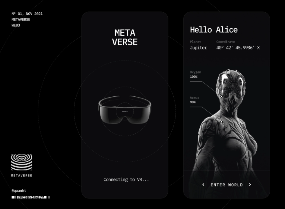
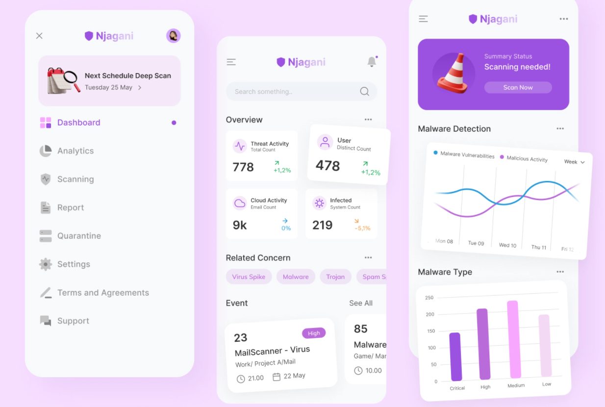
When you start designing a menu for a mobile version of the site, remember to emphasize the less visible elements the most. Borders are the best way to do this. If you need nice cases, or best practice portfolio examples, we’re here to help:
Conclusion
Many factors need to be tested if you need UX navigation improvements to your website. You may start with the basics, but be sure to also check the color scheme, menu location, logic, category names, and more.
Think about navigation elements right away. You need to do your best to make it convenient for guests to use your portal.
Analyze from the point of view of a new visitor how convenient it is to use the menu. The site may need to be improved. And if you need expert advice on how to improve the user experience or make effective changes to your product/service, hire us.


