
 Kotlin
  C++
C++  C#
C#  Ruby on Rails
  Java
Java  Firebase
  Python
  Vue.js
  HTML5
HTML5  CSS3
CSS3  Azure
Azure 

In this article, we are considering why the dark mode of mobile apps is becoming amazingly popular today and how to design it the most effectively.
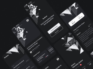
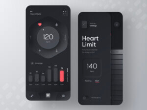
Dark mode has become one of the most requested features among modern users. Both Google and Apple have incorporated the dark theme in their user interfaces to meet the user demands. The dark UI minimizes the eye strain in dark environments, saves the battery life, and unlocks another side of the product’s personality. Such interfaces look dramatic, minimalist, and elegant. Nevertheless, designers should know how to avoid some design pitfalls if they want to walk on the dark side.
Dark, darker, and the darkest… Here we will talk about an amazingly beautiful UI design trend – dark mode. Why do so many users around the world prefer dark UI? Is it better for the user’s eyes? How to design the dark user interface effectively? These and many other questions are answered in this article. Are you ready for a deep dive into the insights about the dark mode, learn about the benefits of dark UIs, and enjoy “the beauty born in the darkness”?
Just keep on reading.
Why dark?
The first question coming to the designer’s mind is, “Why dark, really?” I have found out the four key reasons why so many people like it. Let’s take a look at them.
An in-demand trend
The dark mode has become an in-demand trend in recent years. Any trend-focused designer would tell you that if you’re going to create an app, it would be best to design it in two modes: light and dark one. It allows addressing different user’s tastes and preferences. Although the classics of the light mode is still preferred by the majority of users, the dark UI is gaining momentum. The number of people switching their mobiles to the dark mode is fast-increasing, so we shouldn’t ignore this in-demand trend.
It’s healthier for eyes
Just think of what you experience when switching your phone in the darkness. Likely, it’s the flash of the light interface breaking out through the darkroom. Too bright. Too sudden for your eyes. It takes too much time to get used to looking into the light screen at night. The eyes become dry and itchy over some time. The health and comfort of the user’s eye is the second significant reason why dark mode has become so popular.
It prolongs the battery’s life
The dark UI allows users to save more energy when using a mobile app. At its 50% brightness, YouTube saves up to 15% more battery life in dark mode compared to light-theme apps. So, why shouldn’t your app too? The dark design helps prolong the mobile device’s battery life, and it’s another crucial advantage.
It enhances accessibility
The dark theme enhances the overall app’s accessibility. If designed professionally, the dark UI is based on some color contrast standards that make an app even more accessible and easier-to-navigate. People who “think dark” (I mean who mainly switch a mobile phone and apps into dark mode) say that dark interfaces are more convenient in use even at daytime.
A few helpful tips for designing a mobile app dark theme
Would you like to learn more about how to design the dark UI efficiently? Here I have gathered several UI design tips and trends that might help.
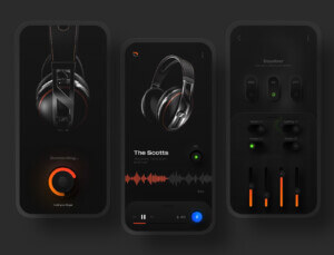
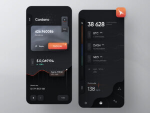
1. The pure black harms usability. Use the shades of black
It’s advisable not to use only black color in the user interface design. The dark mode means not using the white text on a black background, but a black and grey palette. Looking into the high-contrast screen might be too difficult for users. Using black and grey shades helps ease eye strain and make the overall design more pleasant.
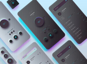
2. Avoid using saturated colors
Be cautious about using bright and saturated colors in the dark UI. Looking fabulous in the light user interface, they may vibrate against the dark background. The text and UI details of saturated colors might be difficult to read and irritate the user’s eyes. Many designers recommend using light tones of those colors to make the theme smoother and easier to perceive.
3. Don’t try to express the same mood as in the light theme
We all understand that every digital product has its mood and personality. Although it would be logical to attempt to express the same vibes in the light UI, the dark theme is still too different to evoke the same user’s feelings. You operate with the two different palettes in these modes, and imitating the same mood might be challenging. What if you try to create another side of your product’s personality – the dark one? It might be exciting and may enrich your product image with a variety of new associations and feelings.
4. Test the design in both modes
Most users will switch your app between two modes at different times during the day. So, it’s crucial to test both of its appearances to ensure the app looks as good at night as in the daytime. It must be convenient to scan all-around-the-clock and in different light conditions. It might seem a detail, but it’s not, actually. Testing both modes is uber-important for app success.
5. Adjust in-app animations and illustrations for the dark theme
If your mobile app design includes some animations and illustrations, don’t forget to optimize them for the dark theme. It’s recommended to fully desaturate the background colors to make the illustration look good in the dark mode. It’s especially important if there are dark backgrounds in the illustration or animation.
Are you ready to design for the dark?

Hopefully, these insights have shed light on the dark side of the mobile app UI design. The dark theme is your chance to stand out from the competition, as it’s an app design aspect that requires much creativity and thinking outside the box. Here we have shared the key reasons why your users might hire android application developer be keen on the dark theme this year and why it’s worth paying particular attention to it.
I also hope the tips and tricks mentioned above will help you create a dark design for a mobile app that will bring users even more delight and satisfaction from interacting with the brand via mobile. Haven’t you stepped over to the dark side? Now is a perfect time to ask ui design consultants.


