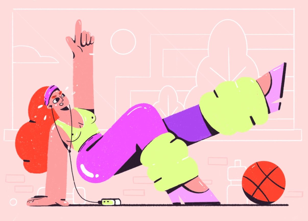
Flat graphic design may become a new key trend in illustration or web design for the coming years, so let’s take a closer look at what is flat design and learn more about the fundamental principles of good flat illustration that may contribute into your design project.

What is Flat Design?
Flat design is a more simplified and at the same time aesthetic solution with a minimalist approach to design for usability. The focus is on user comfort and opposed to that of visualization of objects, as in reality. Users who are tired of realistic visualizations enthusiastically accept this approach, and more and more web projects are moving to this format. Large companies use it now: Apple, Amazon, Microsoft and even IBM work in the flat style. Obviously, this is no longer just a design trend, but a real practice.
Benefits of Flat Design
Flat design creates a feeling of an expensive and modern product, and in some cases is used to attract the attention of young users. The flat design features a simple user interface. It easily adapts to any device.
Flat design, especially combined with minimalism, is a solid aesthetic tool in any designer’s arsenal. Flat does not mean boring. Flat design solutions can be beautiful, they are more refined, clean, free from the redundancy of anything, transforming into a clear picture. They finally make the content understandable.
How to Create Flat Design
It remains to learn how to create awesome flat design style in order to put it into the product design practice successfully. Here are some five principles that may help:
- The simpler the better
It is highly recommended to use monosyllabic figures in design, as well as to follow the clarity of the contours, colour, which is designed to emphasize lightness and weightlessness. In addition, apply concise elements, generating a desire to interact with the object (CTA, forms). However, the simplicity of the elements does not equal the simplicity of the design as a whole – this applies only to the outlines. As a result, everything that the user sees is clear, and they can easily use it.
- 2d all the way
Since flat design does not seek to convey volumes, two-dimensional visualization is the basis. This means that you will not see any shadows, reflections, or highlights with textures (the exception is long shadows). Only the transfer of contours, and nothing more.
- Typography matters
Flat design calls for extremely careful work with fonts. That is, their characters must complement the design scheme, without contradicting it. Moreover, in flat design, the font is also a key navigation element.
- Colour accents
Not only fonts, but also color is an essential part of flat design. The vast majority of palettes are based on 2-3 colors, although, of course, there are exceptions. Usually juicy and bright, but pure colors are chosen. There are no gradients or unnecessary transitions used.
- Minimalism rules
Flat design is a prime example of such a global trend as minimalism. Designers are abandoning unnecessary tricks, and moving away from complex and implicit approaches to visualization, which bears fruit in the form of user activity.
Ideally, to create the flat interfaces that both work and look god, you may apply along with simple and concise elements and two-dimensional space, 1-2 tricks for depth and perspective for a better result.

When to Use Flat Design
Before you switch to flat style, decide if it suits your business goals well. Factors that say the result will be successful when you use fat design will be the following:
Small amount of text and simplicity of information architecture.
Ultra-flat design is optimal for small sites and landing pages with a volume of 1-10 pages max.
Low level of interactivity and lack of complex elements.
In the case of ultra-flat user interface design, complex applications or interfaces with unusual interactivity patterns will not be able to guide users.
High percentage of repeat visitors.
Sites that have a large number of regular visitors tend to be more successful if they are made in a flat style. In such cases, visitors are more likely to intuitively use interactive elements.
Target audience of users with the technological expert level.
If your audience is made up entirely of designers, developers, or power users, they will easily figure out how to navigate your flat site.
But even if the features on the list match your goals, we recommend that a designer should avoid an entirely flat interface app or website building. Of course, when creating a design portfolio or simple marketing websites, it won’t hurt. What’s more, such websites can benefit from trendy flat design without sacrificing usability; custom features in such websites are minimal. Thus, it doesn’t interfere with the UX.
When it’s Better Not to Use Flat Design
In cases opposite to those where flat designs are appropriate and bring benefits to the UX/UI, it’s better avoid applying flat illustrations to prevent frustration with the users.
Flat design websites are not always user-friendly. For example, users may not understand which elements are clickable and get lost in navigation because of this. But this problem can be avoided if you consistently and clearly show the difference between active and inactive design elements.
If you are sure that flat design is completely suitable for your business goals, carefully consider how you will inform the user about the possibility of interacting with its active elements on the website or via an app (links, icon, buttons, form fields, sliders, and so on).
Thus, flat design may have a significant drawback: often the user does not know where to click, which, as a result, reduces the efficiency of performance. When choosing a flat interface, designers tend to remove obviously active elements, and the user does not know where to press. So, watch out when you apply flat image elements, there are cases when it’s better not to use them or supplement with other styled elements partially.
Despite the drawbacks, flat design can look very cool.

Features of a Good Flat Illustration
When users are not sure whether they can click or tap on an interface element, they hover over it with the mouse. Unfortunately, these click-through rates may be weak and require effort to engage. As a result, they actually reduce the target accessibility of the site. So, if you want your flat design UX was all right:
-
Use traditional layouts or standard site templates
With a standard layout, users can easily guess the purpose of each element, even without traditional indicators. Combining a standard layout with a clean visual design and plenty of white space will make every section of the site stand out and be understandable.
Apply simple visual design with a fairly traditional online layout, and the site will be easy to use despite the flat design. The white space and appropriate layout of the top menu bar will help users easily recognize the purpose of the web.
-
Never make regular and clickable text the same
If you use bold text or a certain colour for links, for example, then you should not use bold text or the same text color just for the sake of it elsewhere. Use visual design to clearly label active and inactive buttons and elements. Be consistent.
-
Clearly label active elements
Active elements can be: text, buttons, images, graphic elements, tabs and icons, etc. Buttons should be at least a little like the real thing. If you choose a flat design, refrain from using transparent buttons (they look like text enclosed in a thin rectangular box).
Small elements should be enlarged on mouse click.
Use standard, easily recognizable icons in links. With rare exceptions, these icons should work in tandem with the element’s text content.
-
Pay attention to the contrast
Make sure that the text and all elements are in a clear and conspicuous form. Using light gray on a dark gray background is a popular flat design technique, but rarely works well. Also, don’t get carried away using background images with text content.
You can enhance your page design by adding a color accent, such as a darker shade of blue that is already used in the user interface, etc.
-
Add depth
Flat design doesn’t have to be completely flat. Add subtle 3D shadows or gradients. This way you clearly define the relationship between the elements.For example, shadows and gradients are often used to enhance visuals, rather than to support users and create clear indicators for them.
The fairly flat app for iOS uses subtle shadows. They fall under interactive elements and the toolbar and separate UI elements from text. For example:
-
Add a link
When users naturally assume that the element they are seeing is a link, it really should be a link. For example, if a link contains descriptive text, a title, and a thumbnail image all in one, then all linked elements must lead to the same page.
Conclusion
Use flat graphic design style in your product design wisely to get the most benefits out iof the technique. Since flat design is the key trend in illustration or web design for the coming years, take a closer look at what it is and learn more about its peculiarities and advantages of usage for website or app design to the utmost. Not sure if it’s worth an effort? – then apply the tips for building original flat design components for your project or directly ask for help from professionals. Feel free to contact us at any time.


