
 Kotlin
  C++
C++  C#
C#  Ruby on Rails
  Java
Java  Firebase
  Python
  Vue.js
  HTML5
HTML5  CSS3
CSS3  Azure
Azure 


Iconography design is what most businesses use to facilitate website or mobile app navigation. Icons are clear to read and identify, and you don’t need an extra explanation to understand what they mean. This perfect UX element lowers the cognitive load and removes excessive text from the interface design.
So what should you know about the key iconography principles and how to implement them into your website and/or mobile app? This article will provide an in-depth guide to creating a fantastic iconography design with an outsource web design company for your project. So let’s dive right in!
Features of Iconography
The key feature of the icon system is the ability to facilitate navigation and accelerate the customer journey through the app or website. Implementing icons into your UX design is a great alternative to overloading the page with plenty of text bubbles.
The icons system helps users get an instant understanding of where to go and what button to click to reach the desired page or function.
Icons are, in most cases, minimalist, easy to recognize, and not confusing. They neither require nor contain words or extra elements to help users understand what each of them is about.
Plus, icons aren’t necessarily the same in every app or web platform. There are different iconography styles — they vary from app to app. This allows developers to add a unique, personal touch to the final product they’re working on. And, whatever style or design you pick, it’s always clear where the icon would lead the users.
In a nutshell, here’s a quick list of the main features of iconography:
- Diversity
- Consistency
- Memorability
- Uniqueness
- Scalability
- Minimalism
6 Basic Rules of Icon Design
Time to discuss what is the most important in creating icons for your website or mobile solution. These simple rules are essential to follow so your designs will look great and bring that exact value your users are looking for.
Below, you’ll find our top-6 rules of iconography design that’ll help you on the way!
Rule #1. Make clarity your key priority
Sure, you want your designs to stand out. However, don’t forget that your icons should be easy to understand. Don’t try to overdo the job here and focus on clarity in the first place.
Once you’re done, take a thorough look at each design. Ask your colleagues or friends whether every icon is comprehensive and easy to understand. If not, maybe you should consider a quick makeover.
Rule #2. Universal icons are your guy
You may want to add some extra designs to your symbol set. However, you should never forget to keep your icons minimalistic if possible. You’re still free to experiment with styles and their look — just use basic, well-known images and add some beauty to them.
To help you understand what we mean, here’s a basic set of what items you should use to symbolize a particular action:
- Use a bookmark to save a file, link, or item.
- Place a house to go to the homepage.
- Add a heart to like something or add to Favorites.
- Add a magnifying glass to search for something.
- Use a pencil to edit a profile, a text, etc.
- Place a tool to show the Settings menu.
You get the idea now — use these symbols as a base for your design fantasies!
Rule #3. Take care of accessibility
Accessibility is what every socially responsible business should take care of. That’s why most companies like Apple use various tools to simplify the app/website usage and navigation.
Even if you’re not using text boxes or labels to explain each icon, you still need to make them easy to read and identify. That’s when alt tags come to the rescue. It will allow people using screen readers to raise the accessibility of your icons and improve their UX.
Another way of doing so is ensuring proper sizing and contrasting backgrounds so users can easily see the icons and identify them.
Out of ideas? Have a look at your competitor and think of what else would be a perfect fit for your website or mobile app. It can be a colorblind version of your icons, touch targets, voiceover features, or a zooming tool.
Rule #4. Use vectors
This one’s simple — vectors help your icons maintain their quality, scalability, and transparency. You’d better use two formats for any design system iconography: SVG and PNG.
One more perk of saving icons as vector files is their small size and high load speed. This is a crucial thing when it comes to app or website usage. Even a couple of seconds can make a huge difference for your solution and significantly influence your page’s performance.
Rule #5. Add colors wisely
Another thing that’s important in icon design is ensuring every product design icon is of the same color. You might add a different color to show which icon (such as a feature or menu element) is active, but if it doesn’t contribute to improving the user experience, it’s better not to use it.
Suppose you want to emphasize the currently used icon. In that case, you can encircle the active icon and place a line or a small dot below it. This removes the need for an extra color and clearly shows where the user is. Additionally, looking at black and orange website design examples can provide good coloring inspiration for your icons.
Rule #6. Mind the grid
Last but not least — while working on icon design, you might want to use the help of a pixel grid to make sure you’re doing everything right. If you want your icons to show up sharply for everyone, always try to pixel-fit or pixel-snap your designs. In other words, make sure every stroke and shape snaps into a 1 px piece and is properly “placed” on a pixel.
If not done correctly, you’ll get a blurry icon in the end. For instance, it’s quite hard to fit curvy lines, but it’s not mission impossible. Make sure your icon fits in the grid as perfectly as possible — you must have a sharp eye for that!
How to Create a Great Icon
Once you’ve memorized these simple rules — congrats! Now it’s time to learn how to design icons. Word of advice: try one of the basic icons first, like a house or a camera.
This step-by-step guide will help you out if you’re doing it from scratch.
Step 1. Get to know what you’re about to design
What’s the easiest way of doing so? Right, google it! For example, if you’re going to design a house icon, take a thorough look at various pictures.
Next, try to spot some commonalities that you should implement in your work. For a house, these can be a roof, a base of a house (walls), and probably a door or window if you want to add some detail to your product design icon. While working with other objects, always make a list of such elements. This will facilitate the drafting and final implementation.
Step 2. Break down the object
Once you’ve got the key elements of your icon, let’s look for the most important shapes you’ll need to add. As for the house icon, these shapes are:
- Triangle for the roof
- Square for the walls
- Rectangle for the door/square for the window
Take these elements, and…
Step 3. Get to creating!
For an icon design, you may go with a 24x24px artboard with a pixel grid. Start drawing the main shapes you defined in the previous step. Be sure all the shapes fit perfectly in the grid.
If something’s wrong, border settings can help. The borders need to be set to the outside or inside the shape. If they’re set to the center, your design might not fit in the pixel grid, making the final design fuzzy.
If you want to make your icon with a personal touch or more detail, add some extra elements. For example, you could add a circle-shaped doorknob or a smaller window on a roof.
Step 4. Test your design and make amends
Get some opinion from the outside. Ask your colleagues or friends if they can quickly recognize what you’ve drawn. Ask whether anything needs to be polished. Then, after you’ve heard several comments, get to fix what was wrong at first. One final thing: ensure you’ve got only whole numbers in the inspector before you finalize your design.
Step 5. Export your icon
The fastest one — save your design and add it to your project! You already know what formats are the best for keeping icons. So hopefully, you won’t have any problems with the quality and scalability.
Okay, you now know how to design an icon, but what are the best platforms for drawing them? Let’s find out!
Icon Design Tools
There are plenty of UI / UX design tools, but not all of them help you create icons for your website or mobile app. Below, you’ll see solutions to help you with that. You must know them all, right?
Figma
Figma is probably the most well-known and broadly used tool for designers. It’s cloud-based, works on macOS and Windows, and has a browser version, unlike most design solutions.
Figma is cloud-based that allows you to smoothly go through projects with your coworkers and make necessary changes together. Plus, it easily integrates with Confluence or Zeplin. So you won’t face any trouble working on your designs (even the craziest ones).
Figma offers a free plan for up to three projects. A paid plan goes for $12 for one editor per month.
Sketch
Sketch is a macOS-friendly, vector-based platform used mainly for creating UI and UX designs for websites and mobile apps. It’s suitable for beginners and professionals, and you’re free to collaborate on a joint project with your coworkers here. This makes Sketch a perfect tool for learning stuff and progressing on designs with a remote-working team.
It’s also an excellent option for those who like experimenting with functionality and adding extra features to their solutions. Sketch has a great collection of various assets and plugins, so you won’t have any issue trying to bring some innovative elements to your website or mobile app.
The tool has a 30-day free trial and costs $9 monthly or $99 yearly. Unfortunately, there’s still no Windows version of the platform.
Adobe Illustrator
Unlike Sketch, Adobe Illustrator is available on both macOS and Windows. It’s a part of the Adobe Creative Suite and a vector-based tool for graphics and design.
It’s mostly used for creating web designs, UI elements, and icons. Since it’s a vector-based solution, it’s perfect for designing logos for multiple purposes, including print media. The tool allows you to generate and resize designs with no loss of quality, and it’s one of the best players on the market.
However, it’s not that easy to use, so beginners won’t be 100% comfortable with it. But, if you master Adobe Illustrator, it’ll be a great sign of professional growth.
If you want to try Illustrator, it costs $20.99 per month.
Best Practices of Icon Design
Whatever style you pick for your icons, always keep in mind that they reflect your brand and what values it professes. To better understand it, start with creating more detailed and complex icons to see if that’s what your brand is about. Then, get back to creating simple, minimalist ones to find the perfect balance.
If you’re still unsure about the icon style and your brand’s position, think about whether it’s more liberal or strict, casual or formal, modest or luxurious, etc.
There’s a variety of companies that got it just right. Have a look at some of the best practices icon design teams have created for their brands.
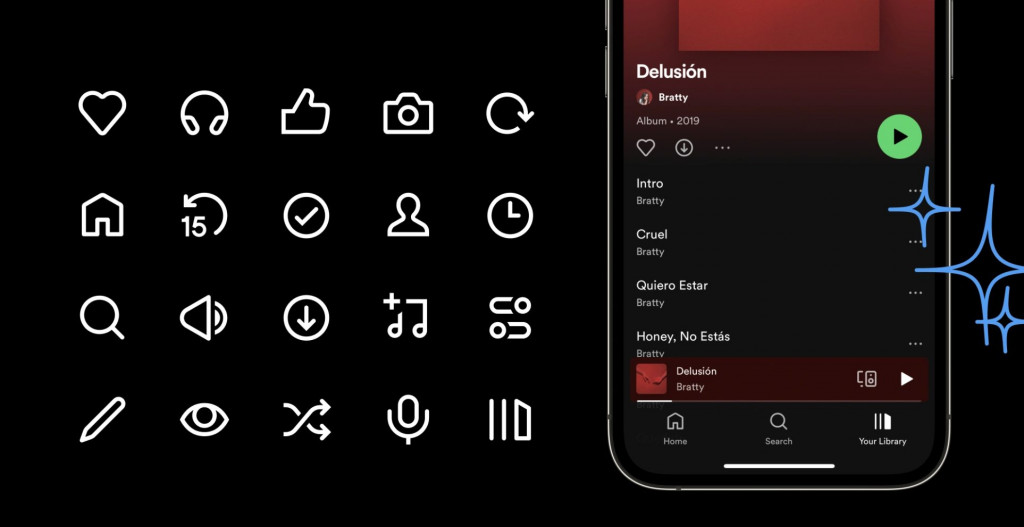
Spotify
Spotify has recently released an update that included some icon design changes. Apparently, they’ve increased the weight and size of their icons — the stroke is now 2 px at 24 px icon size.
Plus, they refreshed the style and added more detail to some of their designs. Finally, Spotify designers increased the overall portion of the icon and made them slightly more visible and prominent when you launch the app.
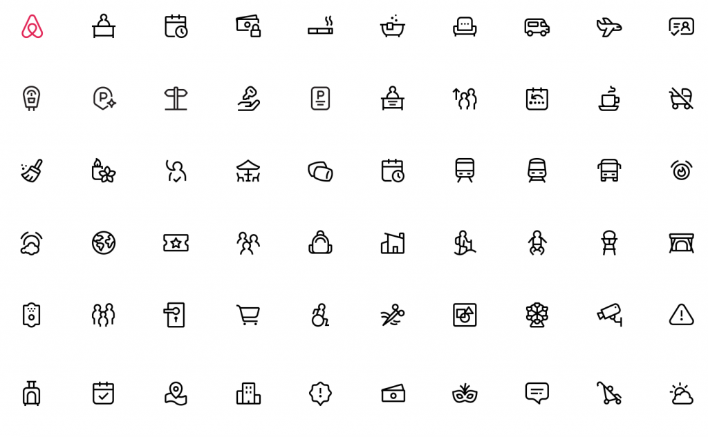
Airbnb
Airbnb uses a lot of details and creative icons in its design. This service has nailed the “original and unique” part of the task. Since the service offers a huge variety of options and not just places to stay, it’s important to diversify the set of icons to the max. This way, users could see the full range of services and facilities each destination offers.
They’re lightweight and soft, which totally aligns with the overall website outlook. That’s a perfect example of how the brand’s mood and philosophy are transmitted through its icon design.
OnePlus
OnePlus has also paid quite a lot of attention to detail, but not too much. The icon designs don’t look boring or too heavy, and they’re easy to comprehend. The OnePlus design team believes their icons shouldn’t use varying stroke weights or solid shapes, as well as they shouldn’t contain too many extra elements.
Plus, some general rules should apply to each icon. For example, a crossing line always goes left to right from the top to show an icon with an off. This is an excellent example of uniformity and great alignment with icon design standardization.
Integrate Icons Into Your Product Design
As you can see, icons can play a significant role in showing your brand voice and how others should perceive it. It’s a great solution to avoid excessive text and lower the cognitive load of your app or website users.
Implementing icons as a part of digital product design services isn’t hard if you know what tools to use and what key rules to remember. The main goal is to keep your icons scalable, clear, and uniform throughout the entire user journey.
Conclusion
Iconography in UI / UX design is a crucial element in facilitating navigation and ensuring better accessibility of a website or mobile app. It’s a powerful means of expressing your brand and adding a personal touch to it. If you want your solution to be as simplified as possible, icon implementation is the right thing for you, and ui ux design studio will help.
We at Fireart Studio are here to help you with that! So if you want to learn more about how to design icons and make your brand speak for itself with its help, contact us, and we’ll work on some great stuff together!


