


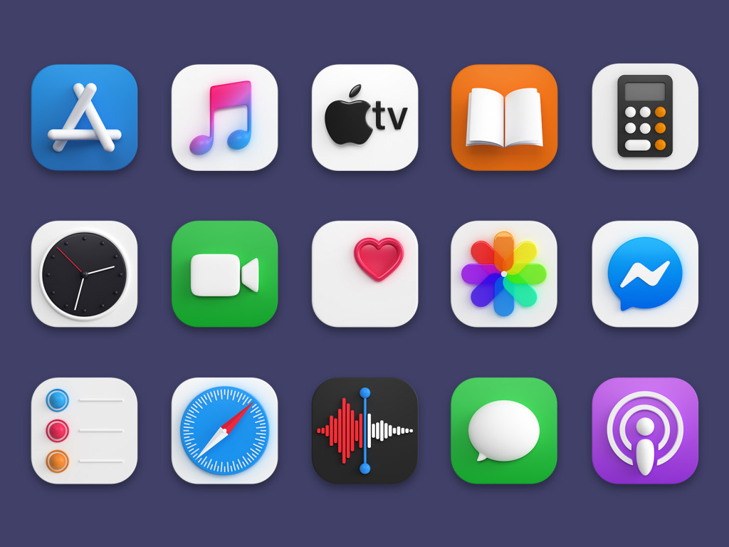
Have you ever wondered why popular mobile apps have those nifty little pictures? They’re called app icons and are more important than you might think. They have a unique style, distinctive colors, and no extra fluff. These icons help us find and use our apps easily.
So, how to make an app icon and make sure it’s outstanding?

Creating an app and giving it a name are super essential steps. They usually get more attention than the app icon itself. But remember, the icon is what people see first. Let’s explore how to make an icon for an app that’ll be fantastic and explore some tips to help you do it.
What is an app icon, and why does it matter?
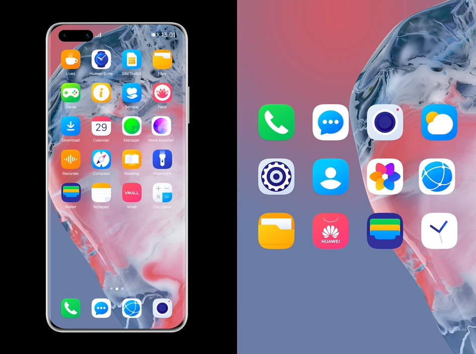
An app icon is a small picture on your phone’s home screen. When you tap it, you open the app. App icons can look different but should be simple and easy to recognize. Just look at your phone – you’ll see that most icons are clear and straightforward. Your app’s icon should be the same. How to make an app icon? Read on to find out.
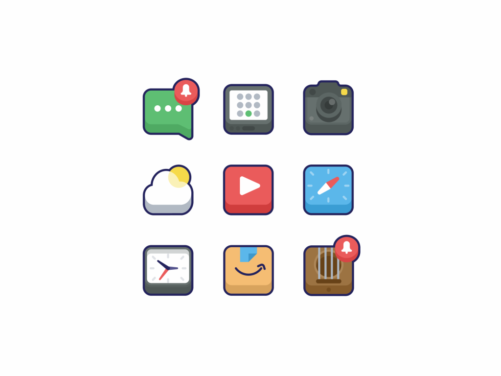
Now, why is the icon so important? It doesn’t make the app work better, but it helps you find it quickly. Modern phones have many apps, so your icon must stand out — it will help your mobile app marketing, too. The app icon should be simple and recognizable, and that’s not always easy to design.
How to make an app icon: principles
If you’re new to making app icons and mobile app UX design in general, don’t worry. We’ve got simple tips to help you out.
Right off the bat, you should understand that everything in the field of web design comes with certain principles. Previously, we’ve looked at some of the pillars of UI design, and now, we’ll tap into the fundamentals of amazing app icon design.
In short, these are the things you’d have to keep at the top of your head:
- Scalability
- Recognizability
- Consistency
- Uniqueness
- No words
An icon needs to scale properly, while it also needs to be recognizable. It has to be consistent with your overall brand-building strategy while also being unique on its own. And, of course, no words – that’s a must (we’ll explain why below).
Most of these speak for themselves, so let’s go ahead and jump right to the tips of creating an app icon that will stand out. These tips can make your app icon awesome!
12 tips for designing an app icon
We’ve compiled ten simple tips for anyone who looks for advice on how to design app icons. Leverage the expertise of professionals to make an icon for an app that will be perfect for you!
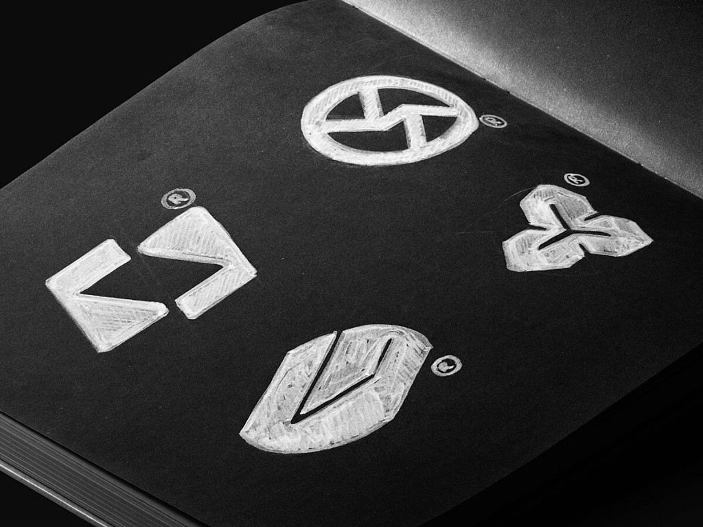
1. Utilize a unique shape or symbol.
Consider the platform you’re developing for when choosing your icon’s shape. iOS icons are all square, while Android allows more flexibility in shape design. Your unique symbol could be your company logo or another recognizable element.
Think about Twitter, for instance. It employs a distinctive symbol – a bird. The iconic blue bird logo is easy to remember and unmistakable, making it challenging to confuse with any other social network. Perhaps you can find a similar approach for your app’s icon?
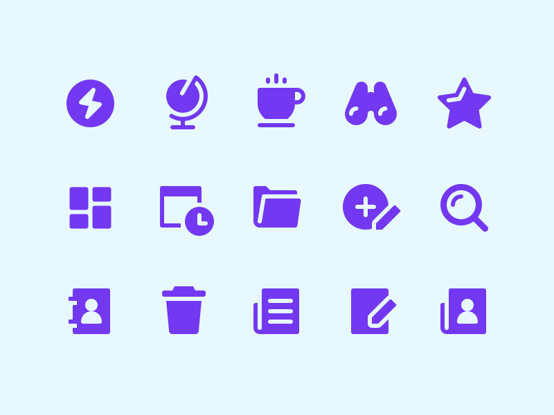
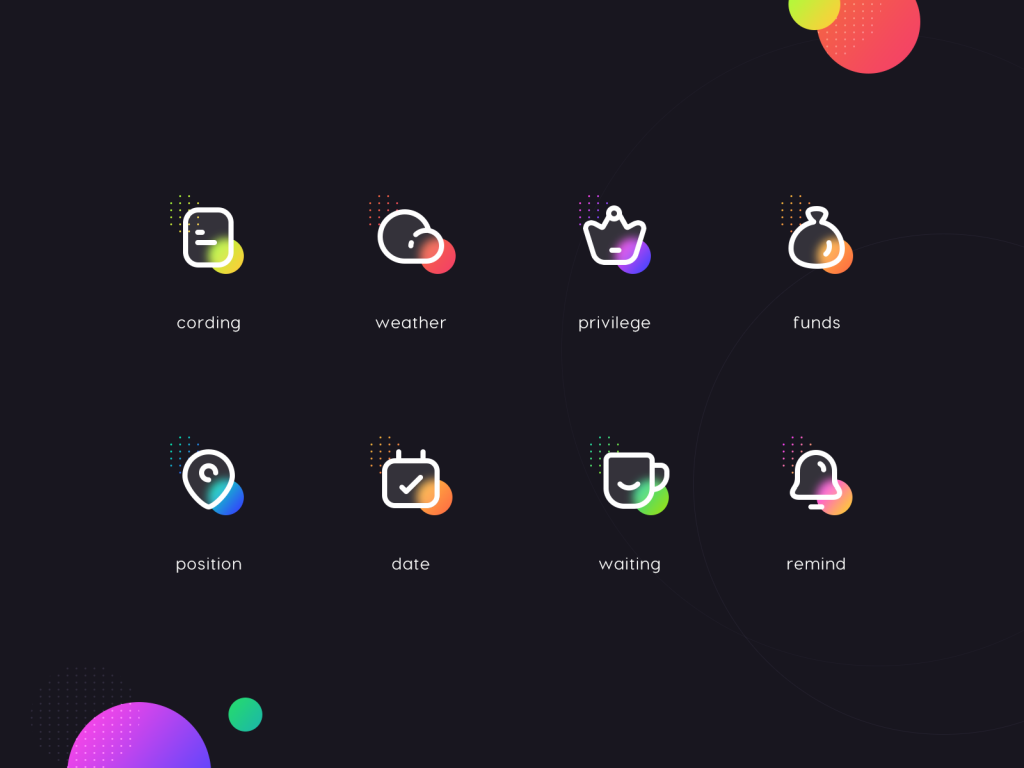
2. Keep it simple
Simplicity reigns supreme in popular app icons. You don’t need to get overly creative and incorporate every design trick. Save complex designs for app mock-ups. When it comes to your desktop icon, distill it down to one or two recognizable elements, nothing more.
Note: Simplicity is essential, but not at all costs. Everyone’s always talking about how app icons must be simple and straight to the point. That’s true, for the most part.
Yet, you don’t have to sacrifice your brand’s uniqueness to create a simple app icon design. Instead, take an extra step forward and think outside of the box. If your brand has certain brand-building elements, you can re-touch them and convert them into self-explaining symbols.
Not only can this serve you well when you’re working on an icon of your iOS application design, for example, but it can also provide an additional marketing tool – something additional to leverage on your users. Symbols are powerful, especially when they are memorable. Take advantage of that.

3. Avoid using words
Resist the urge to include your app’s name on the icon. Why? Most devices automatically label apps, displaying their names below the icons. There’s no need to waste precious icon space on redundant text.
Secondly, the goal when you create icons for apps is to create a memorable and recognizable element so users can identify it without reading the app’s name. This is a crucial designer’s task.
4. Opt for vibrant colors
When designing your app icon, consider this tip. Many mobile device users opt for either a dark or light theme. If your icon lacks vibrant colors, it may blend into the background. You want your icon to stand out, so consider using your company’s brand colors or a color contrasting with the available themes. Additionally, this color should align with your app’s functionality.
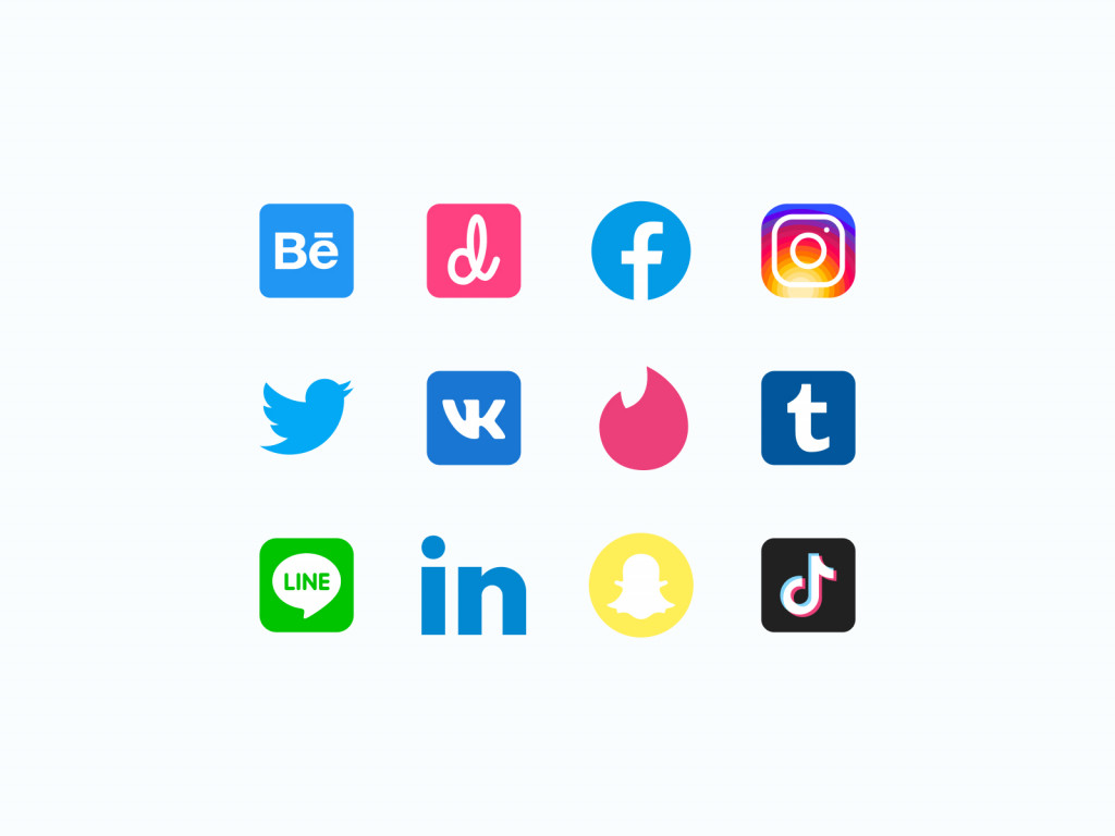
For example, look at social network icons; they often incorporate blue elements. Facebook, Twitter, LinkedIn, Telegram, and others use blue icons. If you’re creating a social network, using blue in your app icon design makes sense.
5. A/B test different versions
Creating the perfect app icon on your first attempt is a rarity. How to design app icons that will work? To iron out any flaws before launching, consider testing various icon versions. Evaluate their appearance on different operating systems and whether they stand out among similar apps. Utilize marketing tools for testing purposes.
Remember, if you’ve already launched an icon and decide to update it later, that’s not an issue. Many popular apps periodically enhance their icons, so it’s a common practice.
6. Avoid overloading the icon with colors and details
We’ve emphasized simplicity, but let’s clarify it further. Overloading your icon with intricate details can complicate user perception. Focus on a single element that conveys your app’s essence without needing words.
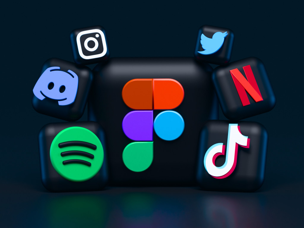
Your app’s icon should be synonymous with one color – think Snapchat’s yellow, Facebook’s blue, or Uber’s black. Multiple colors can make it challenging for users to remember and distinguish your app from competitors.
7. Analyze your competitors’ app icon designs
Don’t mistake inspiration for plagiarism. If you notice your competitors changing their app icons, analyze how and why they made those changes. By studying your rivals, you can identify trends and gather fresh ideas to incorporate into your icon.
Our experience has taught us that nothing reveals more than competition does. By assessing what your rivals are doing, you can exploit the weak spots and missed opportunities. For instance, when you see an amazing app icon, you want to learn from it how to design app icons. Ask yourself the following questions:
- Why is it successful?
- What’s the central theme of the icon?
- How can I improve it?
Answering those questions and others like them will provide solid grounds for brainstorming sessions and ideas.
Analyzing competitors provides inspiration and helps you avoid common mistakes in app icon design. By studying your niche, you can identify which icons work well and which need adjustments. Your competitors can inadvertently guide you in the right direction.
8. Prioritize quality
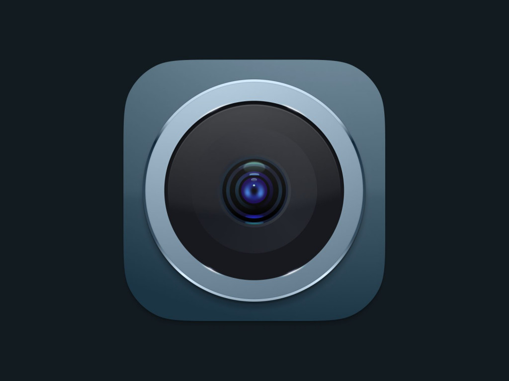
If you can look the other way regarding simplicity, you can’t afford this regarding quality.
Quality has to be outstanding. Period. This is true for every element of your app icon design – from background colors to main features. Everything has to be perfectly aligned and matched so that every detail pops up exactly as much as it’s needed.
9. Reflect your app’s identity
This is a more challenging aspect, but it’s important to discuss. How to make an app icon that aligns with your app’s functionality and purpose? Go for a visual representation that conveys the right message and prompts action. Aim to create a chain of associations.
In other words, your app’s icon should harmonize with your brand’s colors, message, and company objectives. You can ask people you know to evaluate how well they associate your app’s icon with established companies. The icon is what users remember, so collaborate with a web design specialist to create an app icon that complements your communication strategy.

While it’s not an easy task, give your icon the attention it deserves to make it an extension of your communication strategy, enhancing your engagement with customers.
10. Foster recognizability
Your app must have a distinctive style to stand out in a crowded market. Take a close look at the logos of popular apps – the easier it is to recognize an app icon, the more downloads it’s likely to garner on all platforms. Design an app icon that will be unforgettable.
Your designer’s challenge is to make your icon the most memorable and recognizable among competitors. Utilize the tips we’ve mentioned earlier, including competitor analysis and testing, to gauge the effectiveness of your app icon.
Remember, recognizability equals uniqueness. Without recognition, all your other efforts may go to waste.
11. Tailor it to the platform
When designing your app icon, consider the platform for which you’re developing it. Icons for iOS and Android differ in size, format, and permitted shapes. Therefore, avoid using the same icon for different operating systems.
Study the platform’s requirements, examine your phone, and make app icons that maintain consistency across various devices while adhering to the operating system’s rules. This task becomes more manageable when working closely with a designer or hiring a web application developer.
12. Be bold, be brave
This is something we like to tell all of our clients wondering how to make an app icon that will differentiate them. In a dynamic environment, you can’t afford to be static. You have to be brave and bold and take advantage of new opportunities.
When there’s a trend, run with it. If there’s no identifiable trend – try to create one. The same is true for icons.
Look at what’s popular and do it. People like familiarity. Hence, it’s your responsibility to make sure your icon is relatable. When there’s a trend, people relate to it. Capitalize on this.
In addition, you’d also want to think outside of the box. Take advantage of it if you can do something different, even if it’s just a simple element. Use it. Don’t be afraid.
Choose the right tool for your app icon
Creating an app icon can be fun, but you need the right tools to make your own icons for apps. There are many software options out there, depending on your experience level.
- Professionals often use tools like Sketch, Adobe XD, and Axure for mobile app design.
- If you’re new to design, Balsamiq is a user-friendly option to start with wireframes and basic app drafts.
- Adobe Illustrator is a top choice for making icons, but it can be expensive and takes time to learn.
- You can go for app icon generator or app icon maker options available online but do not expect great quality from those.
Due to its extensive toolset, Fireart designers frequently prefer Adobe Illustrator when they create icons for apps, as well as for logo, and graphic design projects. Using vector graphics guarantees you can scale your logo from business card to billboard size without losing quality. Other commonly used design applications for creating app icons include Photoshop, Illustrator, Sketch, and specialized tools like Android Studio’s Image Asset Studio.
Conclusion
Your app’s icon is a powerful tool for your business. If you design an app icon right, it can help you connect with users more effectively. But if you ignore it, you might miss out on reaching your goals. Hire mobile app development specialists if you think you may use some help with this task.
If you need more insights into navigation, microinteractions, and other top design practices, make sure to browse our blog.
So, use our tips to create a fantastic app icon. A great icon can lead to more downloads on app stores. If you need help to make app icons, we’re here to assist at Fireart Studio. Contact us, and we’ll discuss your project in detail and give you an idea of the mobile app development cost. Our experience can guide you in creating a unique and memorable icon that perfectly represents your app.


