


Do you feel something is missing in a product UI? In UX, we often emphasize the need for proper white space, but this does not necessarily mean using white or leaving blank pages. It’s possible to use a range of rich shadows in the project to bring your designs to life and utilize the empty spaces to make the product stand out from the crowd. But that’s a real product design challenge.
What’s great UI?
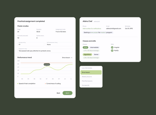
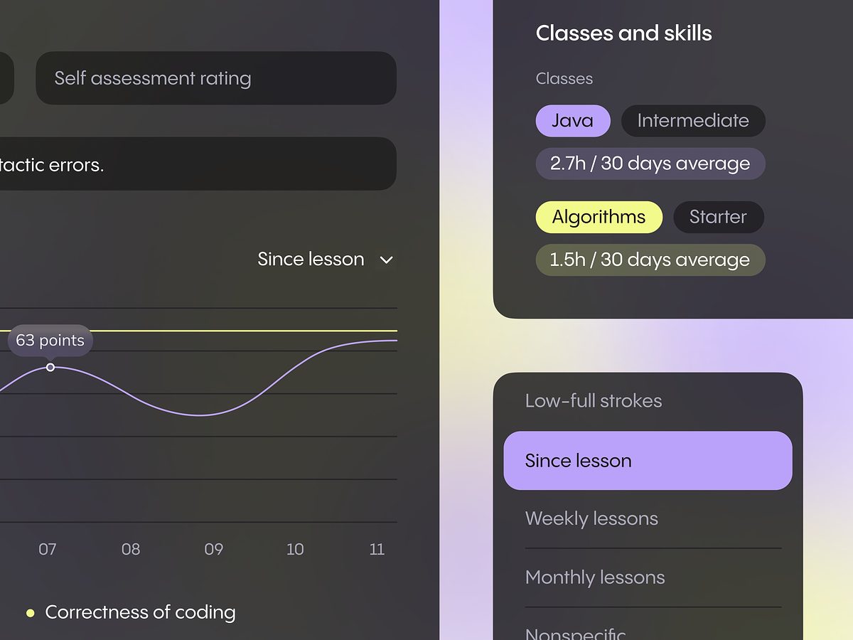
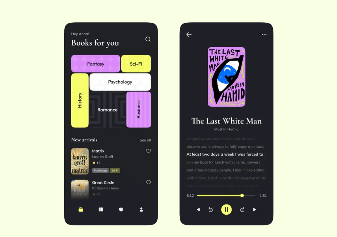
The UI/UX design challenge is building a good interface design which is the thoughtful use of white space at all levels, from component to page, micro to macro. When white space is used correctly, you get a harmonious, legible, efficient, and easy-to-use interface.
Why empty spaces?
Research shows that empty space on a website has a positive effect on how users perceive content. Free space arranges, emphasizes, and also does not prevent users from concentrating, and also makes familiarization with the text pleasant and convenient.
The point is that in design thinking, empty spaces are not just fillers of space – they are its most crucial element, which may also carry semantic meaning. Like pauses between the words in speech, they may also be applied in design to separate its components and beautify the data.
These product design voids may also be compared to glue between bricks or that in a stained glass mosaic, etc. Our eyes are trained to admire blocks of content. And the whitespace is the padding in between, that keeps the content areas together and helps shape the overall direction of the design.
Like a mosaic laid out without glue, our designs without gaps will be just a mess of color and shapes. When you learn the importance of the so-called white spaces in the design, you will be better equipped to use them in the most effective way in your product UI.
How to effectively use white spaces in your design?
The use of free space between paragraphs, left and right increases the perception of information by 20%, that is, the content looks more clear and legible.
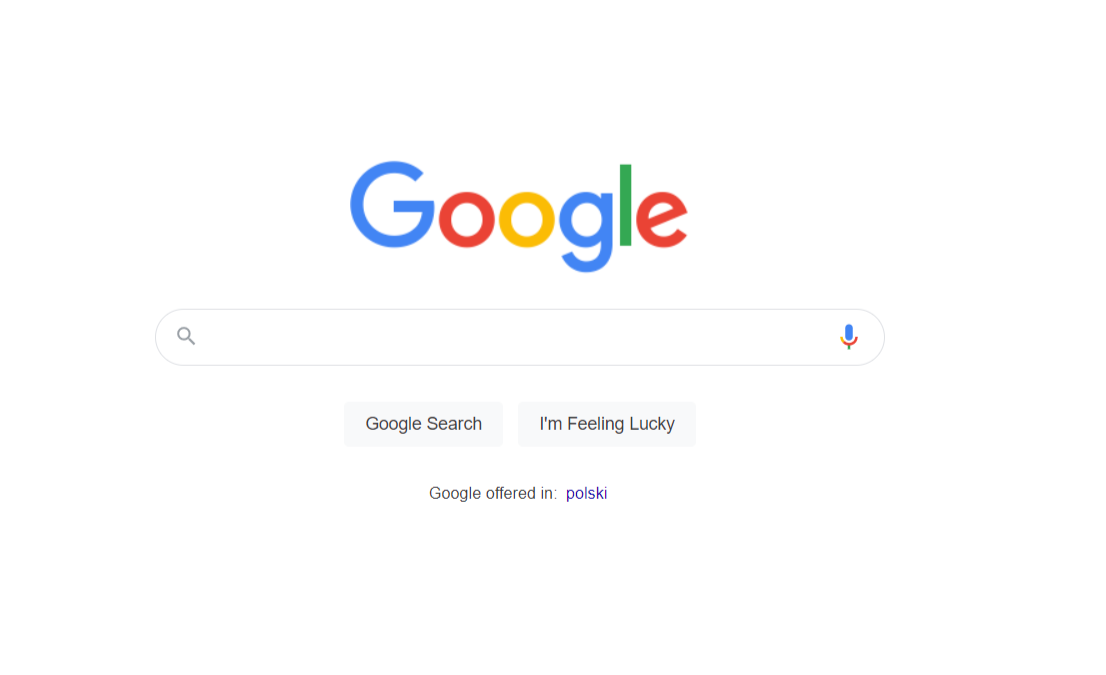
Google effectively uses white space to focus the visitor’s view in the center of the main search page, where the essence of the page resides. Whitespace is one of the easiest and most useful methods to manipulate your audience’s attention.
You can use them to place semantic stresses in the layout. By focusing the audience’s attention on these areas, we can highlight important content and convey its meaning to the visitor more effectively.
So, how to overcome the white space trap as one of the challenges in product design and create awesome content interfaces? Here are some useful tips:
Create hierarchy
White spaces along with the text size, weight, and color are used to convey the hierarchy of elements in the interface. Let your design breathe. A reliable way to increase the usability of an interface is to add a lot of white space between its elements from the start. You will fill that space in gradually.
Make accents
With the right accent, you direct the audience’s eye to the right places. Whitespace can really help highlight the most significant design elements within the UI hierarchy. Breaking up a continuous flow of content with the empty space can quickly draw attention to the right sections. Manipulate this property skilfully and accurately.
White space can also be an effective way to highlight desired text. It can be used in combination with increasing the font size or changing the color, case, or weight of the text, and even as an alternative to these techniques.
Follow the Law of Proximity
The number of spaces between elements in an interface indicates how the elements relate to each other. The Law of Proximity suggests that:
- Related elements should be located closer to each other. Conversely, unrelated elements should be further apart.
- Elements of the same “type” should be placed at an equal distance from each other.
Follow this rule to help users easily understand the logical groupings of your interface.
Measure space
Use the same space measurement method for both design and development. This is necessary so that the design can be accurately translated into code. It is essential here that the same way of measuring space is used in design and development to make it easy to preserve the space intervals precisely during the transition.
Vary text sizes
Decrease line-height (i.e. leading) as text size increases. Increasing the text size, while maintaining the same proportional line-height may result in too much space between each line of the text. Concerning the size of the text, the proportional height of the heading line should generally be less than the line-height of the body text, etc.
An excellent example of the simplest implementation is to slightly change the spacing between the letters in the headings that you want to emphasize. When you feel the result, go further – try changing the amount of spacing between sections of elements in your layouts. It will work.
Go dark
Since dark interfaces are a hype, the voids don’t necessarily have to be white, either. It’s up to you if use one color or its complete absence between the key design elements. Content blocks are often designed to create continuity between them – one flows into the other in a logical way. By changing the color of the empty space in them, you can achieve the selection of each area, while delimiting their significance.
Use indentation
The indentation system is to white space what the palette is to colour. It changes the height for each breakpoint. It defines a set of possible padding values to be used in the product design. Using the indentation system can help give the interface a sense of coherence and harmony. If you experience difficulties – ask for help from aproduct design and development company.
Final words
So, a systematized use of white space in your work will mitigate the challenges for your product design services and help create a recognizable style in the eyes of your audience. As the visitors explore the pages you have put together, they will develop a strong impression of a branded, high-quality design. The hallmark of your work is the skillful use of empty spaces to focus on the most important in UI. Contact us in case you need some expert team view.


