
 Kotlin
  C++
C++  C#
C#  Ruby on Rails
  Java
Java  Firebase
  Python
  Vue.js
  HTML5
HTML5  CSS3
CSS3  Azure
Azure 


Mobile menu design for navigation in mobile apps is an effective tool to help users interact productively with your app. The principle is simple: the more intuitive the interface, the less difficulty the user will have, and the more they will enjoy the app.
The secret behind a successful mobile menu design is the proper utilization of the navigation elements. Also, you must keep your customers’ needs in mind during the planning process. Remember that your success heavily relies on your customers’ satisfaction.

This guide will explain the significance of creating effective mobile navigation in your apps. You’ll also learn about the most common types of mobile navigation, and as a bonus, you’ll get ten valuable tips for developing it.
Well, let’s get into the details of mobile navigation menu design!
What is mobile navigation, and why is it important?
The navigation menu is a helpful guide in your app that assists the user through all stages of interaction with the product. In simpler terms, the mobile menu design should provide a user-friendly way to move from one feature to another. The mobile navigation menus allow the user to quickly grasp the app’s interface and navigate to the desired page.
The clearer your menu is to the customer, the better the designer has done his job. If the user needs additional instructions to understand the navigation menu, then it loses its primary purpose
How do you know that mobile menu design passes the standards?
Good design is responsive and outstanding in style while remaining fully functional. The interface should appear smooth, which can be further improved with custom icons, well-used animation, and readable content. Also, it has to cater to different platforms, such as Android and iOS.
You might think that it is a good idea to utilize all elements to meet all criteria, but you have to be careful. Using all of them does not guarantee a great result. It is essential to consider how you can make everything work together. To implement all this, you may need to see the best navigation examples first.
Types of mobile navigation menu:
To help you better organize your app’s mobile navigation, we’ve compiled seven types of mobile menu design. Check out popular mobile navigation examples that have already proven successful in various apps.
1. Tabber
Tabber is a classic navigation menu design for mobile applications. Many developers usually choose it. It is easy to develop and implement in the product, as well as intuitive for users. This design offers a significant advantage – you can comfortably operate the phone with one hand rather than requiring two hands or switching hands frequently. This has made Tabber perhaps the most popular mobile menu design option.
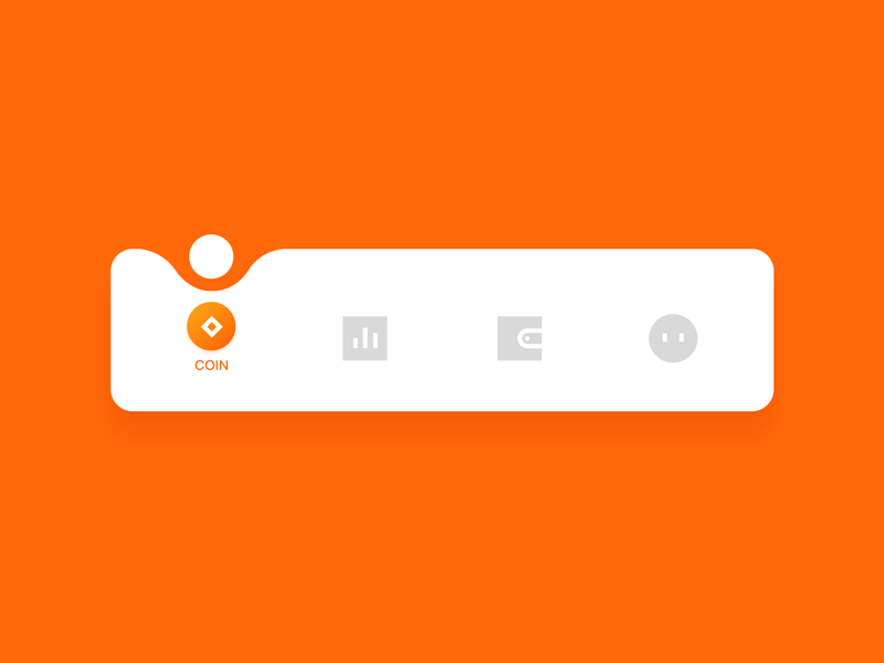
However, this design does have disadvantages. The more items you have on your menu, the more cumbersome the bar will seem. In that case, you might want to consider implementing a different type of navigation for your app.
2. Rectangular
This is another classic way to design an app’s navigation menu. It helps you combine the main outputs to the home page effortlessly. This way, you’ll give users the choice of how exactly they can navigate to the home page. You may be surprised, but mobile app developers are now favoring other navigation models simply because of more appealing alternatives. But if you want to implement a tried-and-true navigation in your app, go for this option.
As for the disadvantages, when selecting this menu type, you should be careful with the color design. Too bright colors can make the user tired of interacting with the app. The purpose of the navigation menu is to simplify the user’s interaction with the application. So, take a responsible approach to this matter.
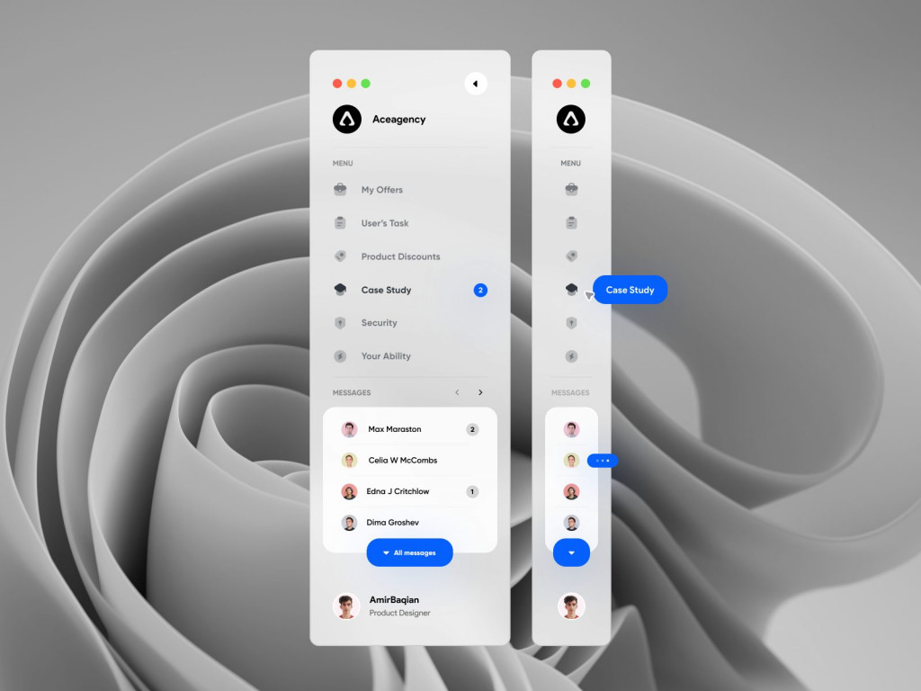
3. Drawer
You can solve the overload problem by arranging the elements vertically. In this way, you can hide the mobile website menu design from the current page, making room for the main content. It only takes one click for the user to display the hidden menu again and use the elements for navigation. It is an excellent example of navigation design, which helps to supplement the lack of constraints in switching between the application’s tabs.
With this mobile website menu design, you’ll give customers the ability to focus on a specific landing page and not be distracted by other menu elements. Speaking of disadvantages, you’d better not use this navigation if your users need to switch the tabs of the mobile app frequently.
4. Rudder
If you use dating or food ordering apps, you may have already seen this type of mobile menu design for navigation.
The central button that opens the menu resembles a steering wheel and is round. That’s why this popular mobile navigation type is called a steering wheel. This button brings up the menu items on either side of it. If your app pages have the same content structure and require frequent login operations, you can stop with this option. Otherwise, apply it to develop a navigation menu for your mobile app..
5. Hamburger menu
Despite numerous developer critiques, this type of navigation menu design is still at the top. The Hamburger menu and its drop-down list are great solutions for applications with limited menu layout space. It has more merit than you might think at first glance. Users are familiar with this kind of navigation and, intuitively, will be ready to see it in your app.
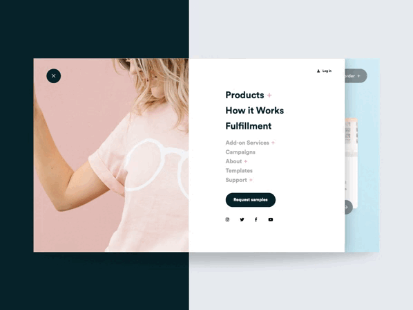
In case your menu has too many items and you are unable to reduce their number, the Hamburger menu allows you to avoid occupying a lot of space in the application interface. On the downside, a small percentage of users won’t be able to figure out if it’s worth clicking on a small item to see the expanded menu.
If some of your app’s users may not be familiar with modern mobile navigation, use traditional models. If you’re not sure about the percentage of these users, add a pop-up to help them find the menu button easily.
6. Bottom navigation bar
On the user side, the Bottom mobile app navigation bar helps you navigate through the application’s tabs with the thumb of one hand. Raise all the necessary buttons with links to the relevant sections of the application. In this way, you can avoid the problem of users not seeing your menu. It’s a simple scheme, easy to design and implement. However, it’s not a new and original solution. It’s just a time-tested, workable, and user-friendly mobile menu design.

This navigation is very compact and convenient. A simple design allows the user to perform minimal actions to reach their end goal in your app. If you don’t know which option described in the article is best for you, go with the standard Bottom mobile app navigation bar.
7. Card-based
For those looking for the most original and interactive navigation menu format, we suggest considering Cards mobile navigation menu examples. They come in various shapes and allow you to improve user interaction with the app just the way you would benefit from it. You can change their number and place them in different corners of the application interface.
10 mobile navigation menu best practices
As a bonus, we’ve prepared ten mobile navigation best practices based on top mobile menu examples. These will help you simplify the process of developing a navigation menu and avoid beginner mistakes.
1. Choose proper labels and icons
Make sure you’ve chosen the correct labels and symbols for your menu implementation. It is essential because every element in the navigation bar should play on the user’s side and make interacting with your mobile product easier. That seems evident until you start noticing poorly implemented menu elements yourself.
2. Place critical actions at the top
Another tip is lying on the surface but so often forgotten by designers. Always put the most significant actions first. Build a scale of priorities and determine which actions your app users perform more frequently than others. Focus on them and put them in the most prominent place so that the customer will pay attention to these elements right away.
3. Provide the option to go one step back
Remember that the back to the previous section button should always be in a prominent place. Don’t put this button in a hidden menu because users need to have easy access to it. If you hide it in a drop-down menu, you’ll only make it more challenging to navigate through the application. That’s not your goal, is it?
4. Think about fonts and background
It’s worth thinking about design details such as fonts and backgrounds for the mobile app navigation bar. These elements should blend in with the main interface of the application. Don’t bore the user with too bright colors, so they don’t lose attention and get distracted from the application’s landing pages.
5. Be careful with scrolling
Scrolling through many items in the navigation menu to find the right one means forcing the user to perform unnecessary actions. That doesn’t make it any easier to work in the app. Try to cut down the scrolling process and the number of items in your drop-down menu.
6. Minimize breadcrumbs
Breadcrumbs in mobile apps can rapidly grow to multiple lines and take up valuable screen space. Consider simplifying the latter components to avoid cluttering the screen.
7. Stick to small menus
Simplicity is the key to success, so focus only on the priority menu items that benefit your app and the user. Look at the mobile navigation menu design examples below to see how it works.
8. Account for finger and hand positioning
Usually, we use the phone with one hand. It’s more convenient and fast. Keep this in mind when developing an app for your customers. Your mobile app navigation bar should be available for one-click navigation.
9. Avoid clutter, respect visual hierarchy
It’s simple here. Confusion can confuse the user. Since confusion is not part of our plan, you should use a clear menu structure. This will have a positive impact on the user experience, and customers won’t have any unnecessary difficulties.
10. Content needs to be legible
Don’t stack elements on top of each other. As you will see in the mobile navigation menu design examples below, the more legible your menu is, the easier it is for your users.
Top 10 great mobile menu design examples
Sometimes, it’s much easier to create something better if you see how others implement it. It helps make the correct conclusions, learn from other’s wins and mistakes, and design something really unique. These ten mobile navigation examples will help you see and understand what performs well for average users.
We hope you find these mobile menu examples and animations practical and valuable for your design process!
Abracadabra

It is one of the best mobile menu examples available online. Each icon is specifically designed to match the project theme, which is retro. This is one of the mobile navigation patterns that utilize animation in a subtle yet stirring manner. The designer also used the perfect shades of reds and browns to keep it retro, fun, and professional at the same time. It could’ve been perfect if a slightly different font style was included.
This kind of application is fitting for a company that would like to appeal aesthetically. For example, if your business involves selling music, this can be quite an impressive interface to welcome visitors.
Shario

These screenshots of the app interface design immediately give a pleasant sense. Choosing light colors is a good move since it creates an impression that your business is easy to understand and transact. Users will definitely be satisfied with the experience. Also, the font style and size are just right for easy screen display: not too big to crowd the whole screen and not too small for reading difficulties. The transition animation is smooth and subtle.
Mobile navigation examples like this will work for a business that deals with handling money, like banks or online payments. The interface is easy to understand to prevent errors and confusion. It is also welcoming enough to convince people to trust your brand with their transactions. It is likely one of the best mobile menu design samples.
Explore the Moon

This template was initially created for a desktop audience, but the developers also came up with its mobile menu design. What’s impressive is that they managed to capture the theme and the elements in a responsive manner for smaller screens. It is easy to use since everything is simple and straight to the point. The theme is minimalistic, utilizing black color to implement class and elegance.
This kind of mobile app menu design and layout is ideal for those who want to highlight their products, especially those who sell products in the technology industry. It conveys a clear message that your products are high-quality and superior to competitors.
Elevatr

Here’s another app menu design inspiration to follow if you are looking for a clean and easy-to-understand interface. Elevatr is an app that aims to improve the user experience of mobile navigation menu design by offering new features. Aside from its simple design, it has bright colors that perfectly contrast the white background. It is lovely and helps in making mobile navigation fun and engaging.
If you plan on having an app that is focused on productivity, you can use this mobile menu design as a reference for your project. However, it can also be used as an inspiration for other mobile navigations focused on a different service, such as news and current events. It is one of the best mobile navigation instances.
Nextr

This app was planned to help users navigate through the city without stress and confusion. It would’ve failed if they followed bad mobile app menu examples, but they came up with own instincts on what can make it work. Wouldn’t it be ironic to feel lost in the app navigation that was supposed to make place navigation easier?
Developers made sure that everything a traveler needs to know is in a prominent place. The app has unique features, including the “bring me home” option that will immediately show you the way home from where you are.
This design is perfect for businesses that utilize maps, such as car booking or delivery tracking.
Favro

How can someone build a more effortless remote team collaboration process? The Favro template has provided a solution for situations where team sharing gets a little tricky. What makes it stand out among other mobile menu examples is its sleek and professional-looking interface. It gives users the idea that it is for creative professionals who wish to experience easy transactions.
The app has a desktop counterpart, but that doesn’t mean the mobile menu design is lacking components. In fact, every function and feature on a desktop can be used by mobile users, too.
Crave

For food entrepreneurs, it is crucial to make your visitors crave your products. This is what the Crave App succeeded in, thanks to the proper use of mobile navigation examples. Their design is simple and straight to the point. You will see an inviting picture of the food they are offering, with the express checkout button directly below it. It is like saying to their customers that if they like what they see, why not go ahead and proceed to checkout?
The simple interface is accompanied by vibrant colors that invite customers to scroll for more food purchases. This is an excellent way to attract new customers and convince previous buyers to continue supporting your products.
Call of Duty Elite

Mobile apps can be used to provide support for your subscribers. For example, this app template is designed to help Call of Duty players organize their items and monitor achievements even outside the game. The attractive layout uses elements that can also be found in-game.
Everything users need is readily available in the app, with the navigation arranged and placed in intuitive places. If it is not found on the screen, the users can access more options by sliding left or right. A great example of mobile app menu design!
Spootnik
A minimalist navigation design can impress users instantly, especially when paired with appropriate animations. This is where the Spootnik App shines. The layout of the app is easy on the eyes and gives off a classic chic vibe. It also makes shopping easy because of its straight-to-the-point design, like the Crave App. You will see the product, its price, and cost, and buy it in just one click of a button.
This kind of design is perfect if you are looking to create a shopping app since it is easy to use for a pleasing shopping experience. Once customers experience the ease of using your store app, expect them to come back for more.
Blank

Contrary to the project title, the app is full of fun and colorful elements that bring it to life. The app has everything needed to be successful in mobile navigation. Although it may seem overwhelming to include all features in one app, the developers have managed to make them work together seamlessly. The app features vibrant colors, a simple interface, animated icons, and transitions. The developers’ skillful execution is what made all these elements work in perfect harmony.
Conclusion: choose the mobile menu design that suits your needs
In this article, we’ve looked at the reasons why a mobile navigation menu is essential to design. You can use your template or take no chances and pay attention to one of the seven popular templates we mentioned. Also, you can get some inspiration from the provided mobile navigation menu design examples.
If you need help developing a mobile application and menu for it, we will be happy to help you implement a project of any complexity. We have mobile app navigation best practices at our fingertips. Contact us to hire mobile app developers from Fireart Studio. We will find the best solution for your product as we know all the secrets of how to make it happen!


