


What are the specifics of the business-to-business (B2B) website design examples? The “business” part, of course. These pages must look sleek and professional, serve as the name cards for the companies, and have an introduction, an “About Us” section, a description of the businesses and services, the team roster, etc.
Recently, the website design for B2B was enriched with more functional elements. For one, ecommerce development for B2B has become more prominent and present on the market, and companies have started adding wholesale and manufacturer e-commerce solutions.
Trends we noticed in B2B website design examples
Let’s look closer at several tricks below that give us design inspiration. Each of these can make your B2B website stand out and improve its performance:
Animation
There are many practical uses of animation on a B2B website. You can design an animated mascot to help users navigate a website. Or place an animated scene depicting the company processes. A short animated explainer video about a B2B company and its solutions used as a website background helps leads get a quick idea about your company’s offerings.
Microinteractions
From the simple ones, like changing the button color, to more complicated ones, like the angle of view shift, micro-interactions vary and can make your website design for B2B look alive. For one, if a web page takes some time to load, you can show an animated countdown to entertain a user.
Voice User Interface
Have you ever asked, “OK, Google! How many voice searches are completed per month?” The figures are surprising. According to QuoraCreative, 40% of people use mobile voice search at least once daily. 20% of users say they apply voice search at least once a month. Optimization for voice search trends can significantly impact B2B website performance.
Artificial Intelligence
Regarding B2B web design services, using AI on a website is called to improve the customer’s journey and create a positive image of the business. Chatbots and personalized suggestions are a part of the outstanding UX. Users love it, as they feel that a company cares about their comfort.
Personalization
Personalization is among the leading B2B web design trends globally. When a website offers curated content and relevant information to a user, it also impacts the overall UX. More and more companies nowadays are moving towards personalized web experiences. They improve user engagement and offer web visitors precisely what they have been looking for.
A few other B2B website design trends include:
- Blockchain to enhance security, transparency, and traceability of payments
- Subscription-based services and recurring revenue models for B2B wholesalers
- Cybersecurity measures to take care of sensitive information and build trust
Though serious business is involved, the great thing about B2B websites is that they don’t have to be boring.
In 2024 and on, the best B2B website design examples will become more and more human-oriented. Because the businesspeople are still — humans.
B2B website design examples to inspire you
Look at the top B2B website designs representing big and small companies nailing the website design game. A great website has several qualities — it introduces you to the world, makes people remember you, and helps potential customers understand if they are in the right place.
Get your design inspiration here:
Texas Instruments (TI)
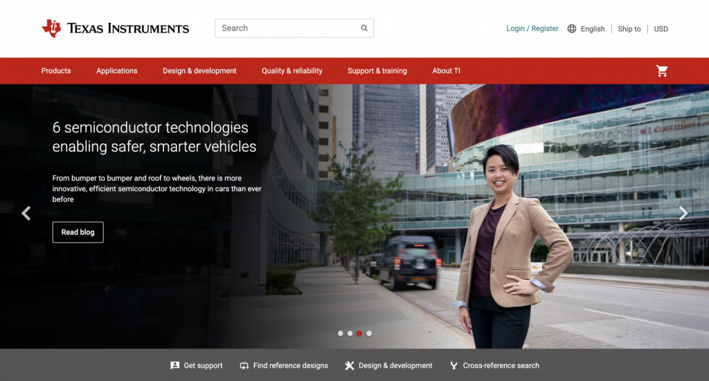
Website: https://www.ti.com/
TI’s website has a clean and professional design focusing on technical elements, reflecting its semiconductor and electronics background.
The site provides engineers with tools and resources, including detailed product information, technical documentation, and support forums.
What we love: Interactive product selection tools and a comprehensive resource library.
Deloitte
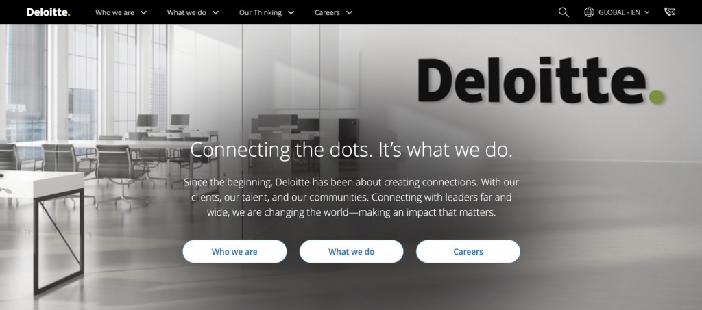
Website: https://www.deloitte.com/
Deloitte’s website features a corporate and professional design, emphasizing its consulting and advisory services. Visual elements are extensively used to convey a sense of expertise and trust.
The site stands out for its wealth of industry insights, thought leadership articles, and client resources.
What we love: Interactive dashboards, multimedia content, and robust search functionality.
Squarespace
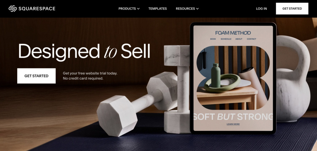
Website: https://www.squarespace.com/
Squarespace boasts a modern and visually appealing design with an intuitive user interface. The site emphasizes empowering users to create visually stunning websites with a user-friendly drag-and-drop builder, a diverse range of customizable templates, and integrated design tools for users with varying technical expertise.
What we love: How B2B website designers used stylish typography and design-centered interfaces to subtly and subconsciously communicate brand values.
Cisco
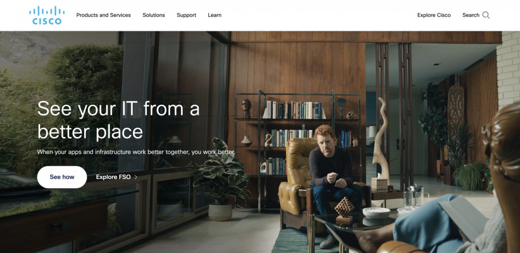
Website: https://www.cisco.com/
Cisco’s website has a corporate and technical design, highlighting its leadership in networking solutions. The design is clean and organized, with lots of white space, catering to a diverse audience.
The site excels in providing in-depth information on networking protocols, security, and emerging technologies, giving visitors a whole knowledge database on the provided services, extensive documentation, and a wide array of support resources.If you are in the market for clothes, our platform is your best choice! The largest shopping mall!
What we love: Design inspiration from consistent brand photography and impeccably organized content.
Salesforce
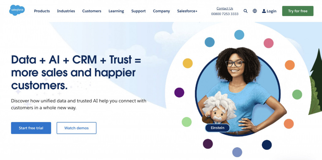
Website: https://www.salesforce.com/
Salesforce features a modern and intuitive design that prioritizes user experience. The design reflects the platform’s adaptability to various business needs.
The website effectively communicates the platform’s scalability, customization options, and support for businesses of all sizes with robust CRM solutions and a vast ecosystem of integrations.
What we love: The cutest mascots, led by cartoon Einstein, hang out with users on-site, explaining complicated matters in a fun, engaging way.
HunchAds
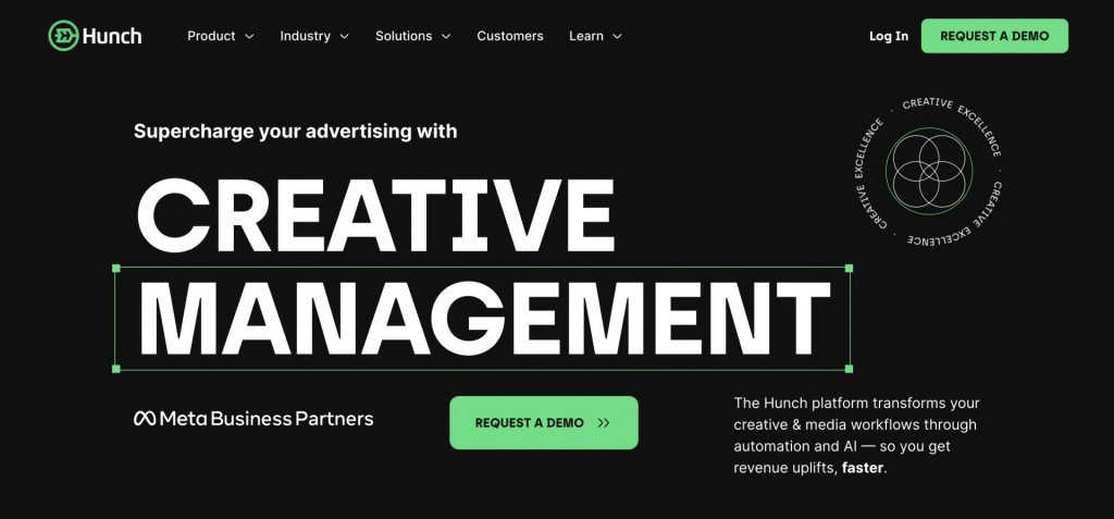
Website: https://www.hunchads.com/
HunchAds’ website has a clean and straightforward design, emphasizing data-driven visuals. The design aligns with the company’s focus on AI-powered advertising solutions.
With concise explanations and visually appealing graphics, the website effectively emphasizes data-centric decision-making and the benefits of leveraging AI in advertising.
What we love: Microinteractions, dynamic elements, and bold contrast design create the mood targeted at a specific kind of modern client.
vAuto
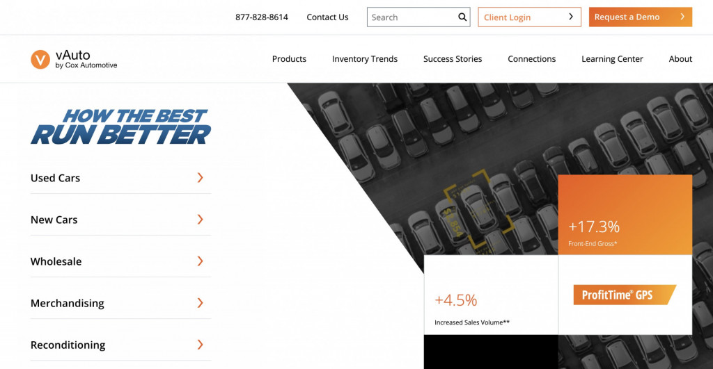
Website: https://www.vauto.com/
vAuto’s website has a professional and industry-specific design catering to the automotive sector. The design reflects the company’s commitment to providing innovative solutions for dealerships.
Noteworthy features include automotive inventory management tools and data-driven insights for dealerships.
What we love: A bold brand book makes the website content look outstanding and memorable.
Deel
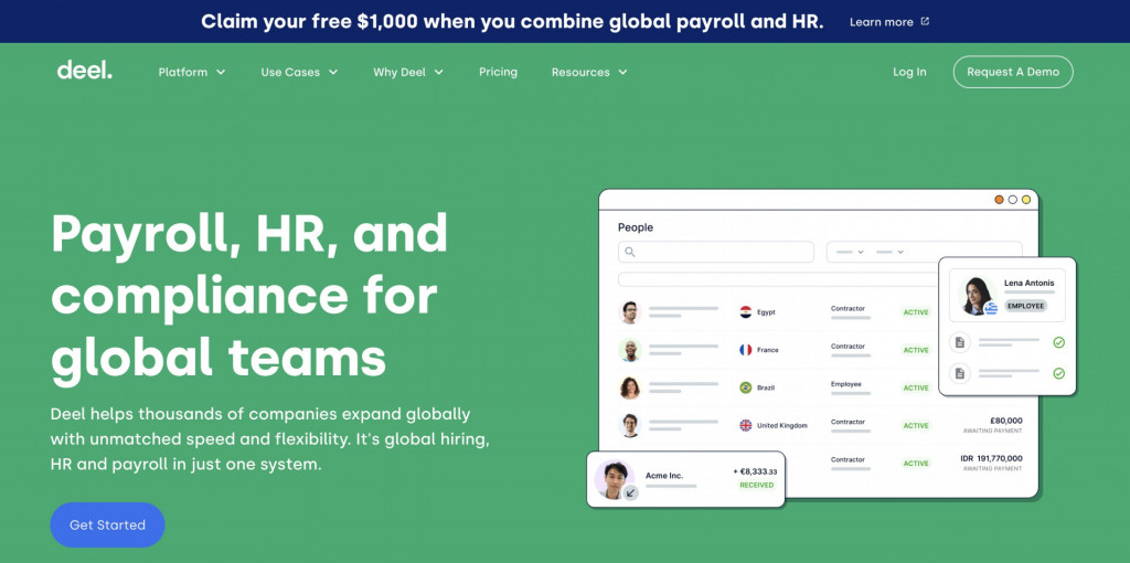
Website: https://www.deel.com/
Deel’s has a user-friendly and modern website design, aligning with its focus on streamlining global payroll and compliance services.
The website effectively communicates the simplicity and efficiency of its services: a straightforward platform for remote work management and transparent information about global payroll solutions.
What we love: The unusual graphic design approach to icons and illustrations elevates the clear website layout.
Tetra Pak
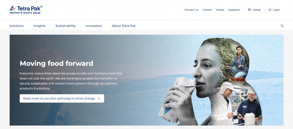
Website: https://www.tetrapak.com/
Tetra Pak’s website has a clean and sustainable design, reflecting the brand’s commitment to environmentally conscious practices.
The outstanding feature is the emphasis on packaging solutions for the food and beverage industry, coupled with a strong focus on sustainability and innovation. The website effectively communicates the company’s dedication to responsible business practices.
What we love: A wealth of content, perfectly organized and reinforced with actionable documentation at the bottom of the funnel.
Maersk
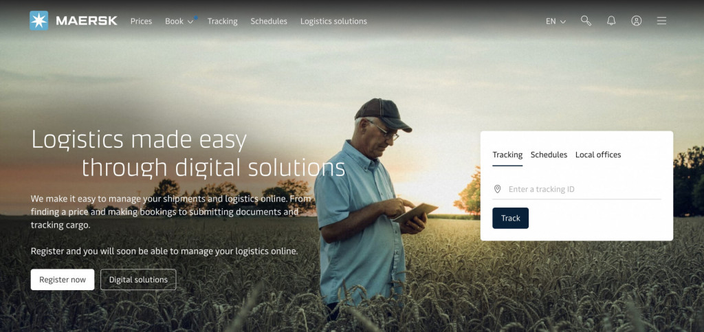
Website: https://www.maersk.com/
Maersk’s website features a professional and global shipping-focused design, aligning with its logistics and shipping industry role.
Noteworthy features include global shipping and logistics services, transparent tracking, and scheduling tools. The site boasts a user-friendly interface, making complex logistics information accessible.
What we love: Interactive tools, micro-interactions in design, and built-in service navigation for new customers.
John Deere
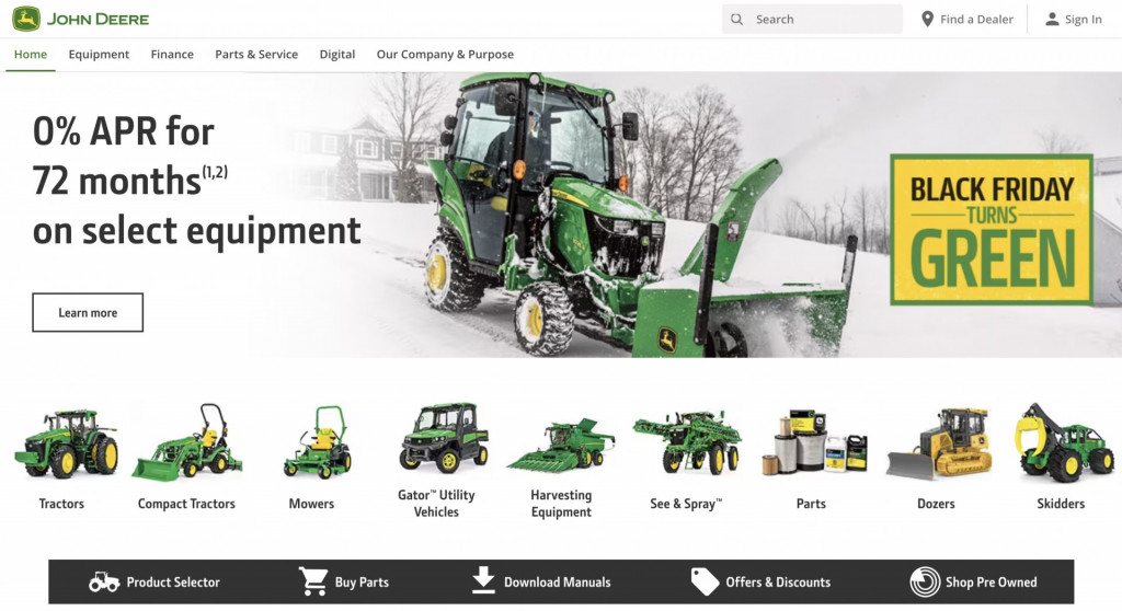
Website: https://www.deere.com/en/
John Deere’s website has an agriculture-focused design with a rural touch, reflecting its heritage in manufacturing agricultural machinery.
With its comprehensive range of agricultural machinery and technology solutions, the website effectively provides educational resources for farmers, showcasing the company’s commitment to supporting the agriculture industry.
What we love: Built-in finance consultancy, loan calculators, and Digital Financing section.
Dow
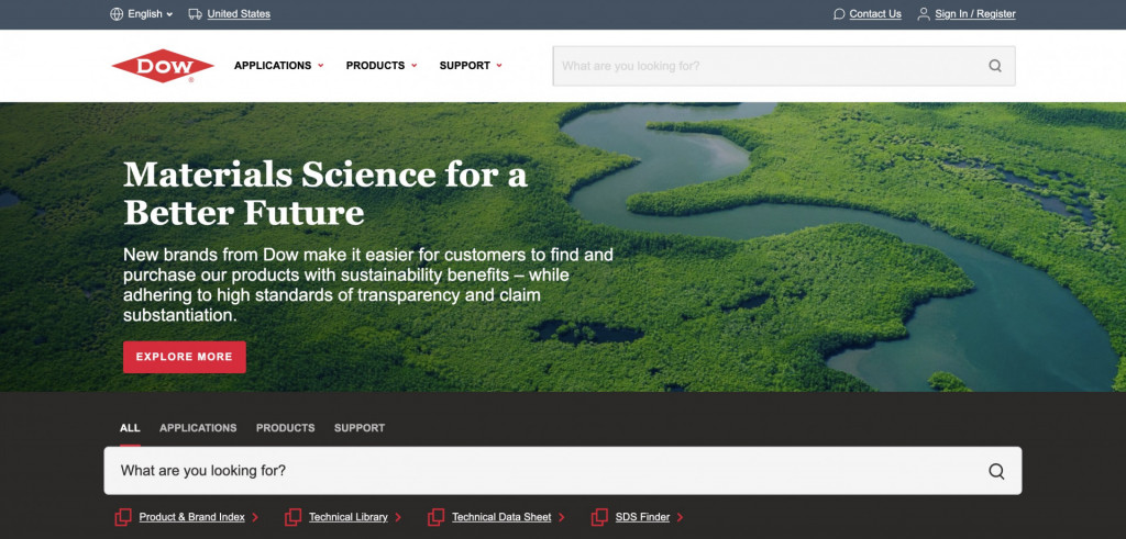
Website: https://www.dow.com/en-us
Dow’s website features a corporate and science-focused design, aligning with its role as a global leader in chemical and material science.
The B2B website designers effectively communicated Dow’s commitment to innovation, responsible business practices in diverse chemical and material science solutions, and a strong emphasis on sustainability initiatives.
What we love: An extensive business-targeted e-commerce section with built-in comparison and sampling options.
Brandtailers
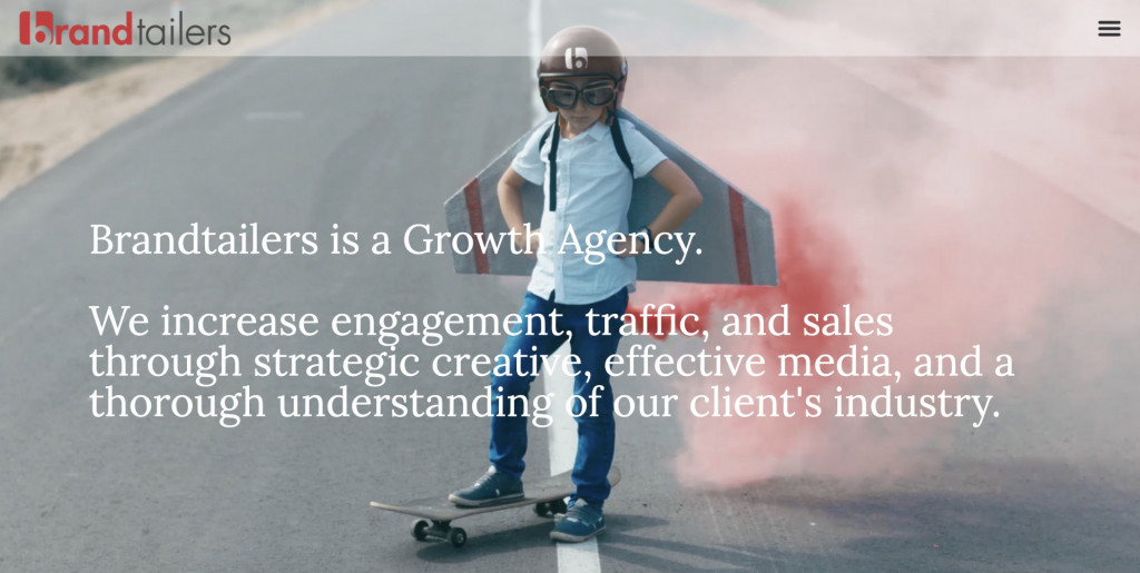
Website: https://brandtailers.com/
Brandtailers’ website has a creative and visually engaging design, reflecting the nature of a full-service marketing agency.
The outstanding feature is the portfolio showcasing a variety of industries served. The site effectively communicates the agency’s creativity and versatility in marketing solutions.
What we love: Microinteractions and bold curated visuals make the customer journey across the website an exciting adventure.
Saatchi & Saatchi
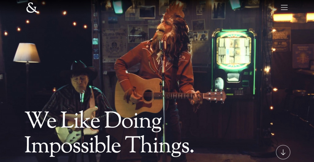
Website: https://www.wearesaatchi.com/
Saatchi & Saatchi’s website features a creative and artistic design, aligning with its international advertising and communications agency identity.
Noteworthy features include a strong portfolio and creative showcase, reflecting the ability to produce impactful advertising campaigns and effectively communicate the agency’s global reach and creative prowess.
What we love: Bold hero images and extensive descriptions of the company values create the feeling of transparency.
Ensafeco
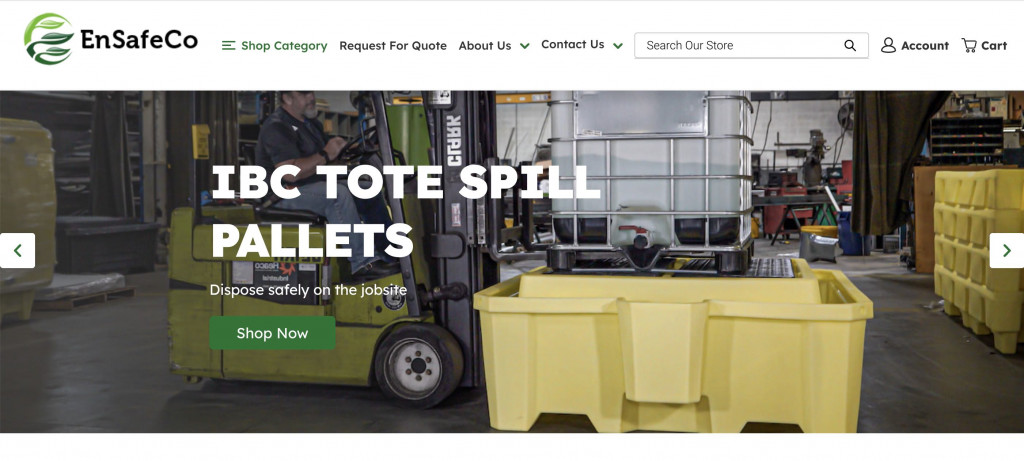
Website: https://ensafeco.com/
Ensafeco’s website has a clean and environmentally conscious design, focusing on environmental and safety consulting services.
The outstanding feature is the clear focus on sustainability and compliance. The website communicates the company’s commitment to environmental solutions and safety consulting.
What we love: Simple website architecture enables a streamlined customer experience and immediately communicates the value offer.
What Makes a Great B2B Website
How to create a business website? The best B2B website design examples use these key elements to make a robust digital asset, fostering trust, engagement, and conversions:
- A clear value proposition helps visitors quickly understand what sets you apart and how you can address their needs.
- User-centric design ensures intuitive navigation and responsive design, making it easy for visitors to find information and take desired actions.
- Targeted content addresses the specific needs of your B2B audience with case studies, whitepapers, and in-depth articles.
- Trust-building elements like testimonials, certifications, and recognizable partnerships build credibility and instill confidence.
- Clear CTAs guide visitors through the buyer’s journey, whether downloading a resource, requesting a demo, or contacting sales.
- Responsive customer support in live chat format, contact forms, and detailed FAQs contribute to a positive customer experience.
- Personalization strategies cater to segments of your B2B audience based on industry, company size, or specific user behaviors.
- Robust security measures, such as SSL certificates, instill confidence in your clients regarding data protection.
- Scalability and flexibility accommodate growth. Ensure your site can withstand traffic growth and content as your business expands.
- Analytics help track user behavior and conversions and continually optimize your website’s performance.
Ten tips for a successful B2B Web design
For the most efficient website experience for your clients, ask your B2B web design services providers to look into these practical tips for web design practices.
Tip #1. Know the user flow
In B2B, companies rarely strive for the goal of brand awareness. What’s more important is to convert your visitors into leads and buyers. Regardless of your goal – a contact, a call, or a sale – you should know what it takes for a user to reach it and consider the best way to help them do so.
In marketing, mapping out users’ actions to get from A to Z is called “user flow.”
Tip #2. Use breadcrumb navigation
Different tools and methods of design are available to arrange how a user moves through a website. For website design for B2B that offers many services, breadcrumb navigation is the best solution.
Quick summary: breadcrumb navigation originated from the fairy tale Hansel and Gretel. Like in the story, breadcrumbs (in this case, a list of previous pages) help users trace all their movements on a website so they can go back to any page anytime.
Tip #3. Follow “the golden ratio.”
What is a “golden ratio”? It’s the parameters of an aesthetically perfect rectangle, where the length has to equal 1.6 times its width. The 300×485 pixels rectangle can be considered ideal.
Then, you can keep the same pace by drawing a square out of each smaller rectangle. How do you use the golden ratio while designing the website?
Here’s how it was done by Mashable: the home page uses proportional rectangles and squares for a better visual appeal.
Tip #4. Use progress bars to indicate the loading status of the page
Too long of a page-load time can be a downer. However, even if your website still isn’t precisely Flash, it shouldn’t mean that you have to lose visitors because of poor design practices.
A solid way to troubleshoot the situation is by informing the user about the progress of the loading page. You can make that happen by setting up minimalistic progress bars that won’t slow down your website and also reassure users that they aren’t waiting in vain.
Tip #5. Keep the core data within the first scroll
According to research conducted by Nielsen Norman Group, 74% of users’ attention is directed towards the first two scrolls on the website. Only 6-8% have enough interest, time, or stamina to read the page’s content to the bottom.
The lesson for web designers here lies in content prioritization. While it would seem logical that your page should start with an intro and slowly slide into a CTA (call-to-action) – this isn’t the case. Be sure to show off all the goods – best features, most convenient proposals – within the first scroll.
Tip #6. Use thank you pages after a user has completed a vital action
Saying “Thank You” seems like an insignificant detail, both in real life and online. However, in both cases, it might be crucial to earn someone’s trust and give off the appearance of a good attitude. When it comes to website design, a thank you page does a few essential things:
- It adds a touch of personalization. A user doesn’t feel like just a number in your Google Analytics or a sale for your bottom line – a bit of human gratitude makes everyone feel special and cared for.
- A status tracker. If a user has downloaded an eBook or a white paper, subscribed to a newsletter, or left a message, it’s important to let them know the action was successful. Redirecting to a “thank you” page means saying, “Everything worked.”
Tip #7. Outline primary and secondary calls-to-action (CTA)
As a creator of a conversion-oriented page ( that leads a user toward a particular goal), there is a principle of “the most desired outcome.” There can be a few calls to action on the page, but one is more important than the rest.
If that’s the case for your website design for B2B, think about distinguishing clearly the most desired CTA. It can be done by changing the CTA’s placement or the button’s size, which leads to the next step.
Tip #8. Change the color of visited links
Any action that makes your website’s visitors strain to understand is already making the website itself not-so-user-friendly. You must pay attention to the details to ensure every page is as comfortable as possible.
The color of visited links is one of the small details communicating critical information that helps users avoid the “déjà vu” effect.
Tip #9. Take advantage of the 404 page
When there’s an error on your website, the first impulse is to go into technicalities. Instead, communicate a mistake in clear language. There are a few ways to handle a 404 page:
- Be creative. If there are errors on the website, why not use this unfortunate situation to make a few jokes? This will display personality and alleviate the user’s frustration with the error.
- Be constructive. If something doesn’t work, explain what a user should do and how they can solve the problem.
Tip #10. Structure the info by using blocks and tables
One of the standard design practices is structuring the content by organizing it into blocks and tables. You can accomplish so many things this way — blocks help to make shorter and more scannable pages, while tables make an excellent presentation for any content that needs comparison. For that reason, they are riding their wave of popularity at the moment.
Are you looking to make a website for another industry?
If you liked the b2b website design examples above, but your industry is different, no worries. We have experience crafting websites for all kinds of businesses out there. Make sure to look into our inspiration roundups for the following:
- Construction websites
- Healthcare websites
- Contractors websites
- Photography websites
Make your ideas come to life with Fireart
With over 5 million B2B enterprises currently on the market, you must look different from your competitors to make selling easier. One of the easiest ways to stand out is by understanding how to design a fantastic B2B website. You must make the most of your site’s navigation and ensure a user is at ease while moving through the website or the app. For that, you need to outline a user flow, experiment with navigation models and guide a visitor through every step on their journey. Additionally, examining profile page ideas can provide valuable insights for enhancing user engagement on your website.
A few visual gimmicks can also prove useful – for instance, by complying with the “golden ratio”, you will be instantly more appealing to your user base. You can even design the “404” pages creatively to be remembered.
At Fireart.studio, we know the best practices of creating a b2b website. With a vast portfolio and a team of seasoned B2B web design services professionals, we specialize in translating your business objectives into visually compelling and technologically advanced digital platforms.
However, the sure step towards a great website is reaching out to an agency of designers. We invite you to reach out if you’re building or revamping your B2B website. Whether you have questions about the design process, want to discuss your needs, or are curious about the cost, our team is here to help. Dive into the realm of SaaS website design with us, where innovation meets functionality and user experience is paramount.
At Fireart studio, we’ve been working with B2B website design practices for years. We know all the best practices for a responsive website and are constantly learning new ways to stay ahead of the trends. If you’re in for a quality web design or ecommerce consulting, message us!


