
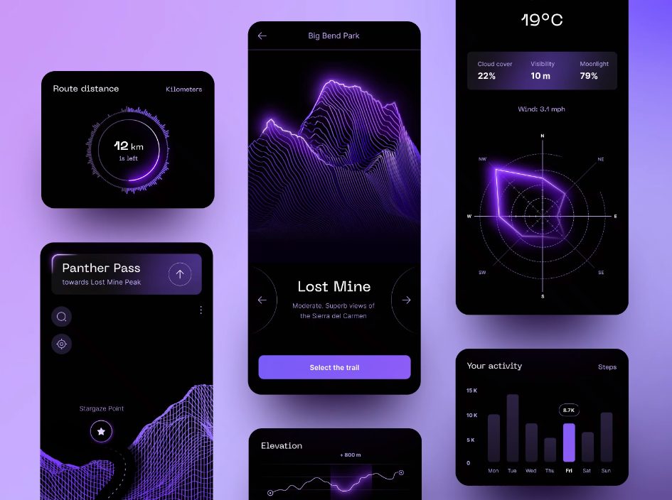
When exploring fresh widget design ideas, teams often mistakenly treat a widget like a miniature app. It’s different. A widget is a dedicated, glanceable surface built to solve a single intent in seconds.
Research by the Nielsen Norman Group shows roughly 40% of mobile interactions are brief microsessions lasting under 15 seconds. When users look at their home screen, lock screen, or a SaaS control board, they want immediate answers: Did my flight change? Is my daily target met? What is our server load?
Great mobile widget design and dashboard cards balance data visualization with instant feedback. At Fireart, we approach widget development as an exercise in cognitive economy. We combine information hierarchy with purposeful interactions so users extract value before launching the full application.
Table of contents
Quick guide. Matching widget patterns to product intent
| Product type & user intent | Recommended widget pattern | Primary UX priority |
|---|---|---|
| Habit tracking, to-dos & smart home | Single-tap action controls | Sub-second optimistic visual feedback; minimum 44pt/48dp touch targets |
| Delivery, transit & live tracking | Dynamic Island & Lock Screen cards | Tabular numbers to prevent layout jump; strict 2-second animation caps |
| B2B SaaS & cloud monitoring | Data-dense metric summary blocks | Bullet graphs and sparklines over gauges; 5–9 metrics per card cluster |
| Health, fitness & clinical apps | Segmented arcs and metric rings | Accessible non-color cues; system-level privacy redaction on locked screens |
| Weather, travel & ambient tools | Context-aware adaptive card | Material You color tokens; 24–32pt type for distance viewing |
Translate your most complex product data into microscopic interfaces that command absolute attention
Design the glanceWhat makes a widget design truly effective
How do you apply dashboard design principles to an area no larger than a coaster? Treat every pixel as valuable real estate. A glanceable UI must pass the 5-second test: if a person cannot register the primary metric, status change, or alert in the time it takes to glance at their device, the layout has failed.
This requires maximizing the data-ink ratio. On a micro-canvas, borders, drop shadows, and background gradients turn into visual noise. High-performing widgets establish a visual hierarchy. They highlight one display value – such as account balance, current wattage, or heart rate – and support it with contextual metadata, like a percentage delta or time marker.
Effective widget design guidelines demand a disciplined use of white space. Giving core numbers room to breathe prevents cognitive fatigue and ensures interactive triggers do not visually blend into passive information. Clarity beats visual density.
1. Interactive micro-utility widgets
If your product revolves around daily actions – like habit tracking, to-do lists, smart home adjustments, or health logs – build this category. Forcing someone to launch your full app to check a box or bump a setting creates friction and erodes retention.
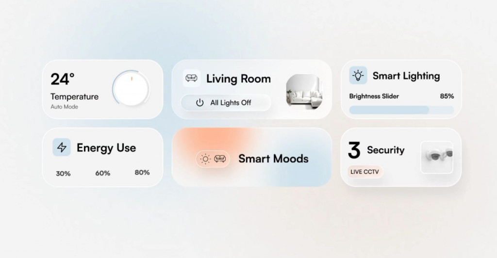
When to apply this pattern
Choose this approach when a task takes under three seconds to complete and requires no textual input. If the user’s intent is binary (turning on a smart plug, checking off a vitamin) or incremental (logging 250 ml of water, stepping a thermostat up by one degree), an interactive micro-utility widget keeps them engaged from their home screen.
How to design it
Modern widget UI patterns turn widgets into functional remote controls using frameworks like Apple App Intents and Android Jetpack Glance.
When we designed fitness experiences like Pure Plank, removing logging friction kept users on track with their routines. The success of these tools depends on microinteractions. When a user taps an inline control, the interface must respond immediately: the checkbox fills, the counter advances, or the button pulses to confirm the tap.
The technical hurdle here is touch accuracy. To prevent mis-taps, keep your interactive touch target size aligned with platform baselines: at least 44×44 points on iOS and 48×48 dp on Android. Its invisible hit zone must be generous. If you are designing a 2×2 card, stick to a single trigger. Reserve multi-button matrices for medium and large cards where fingers have room to tap without errors.
2. Ephemeral and real-time live activity widgets
If your product handles ongoing events – such as ride-hailing, food delivery, flight tracking, sports scores, or electric vehicle charging sessions – use dynamic cards. Users constantly unlock their devices to check a timestamp or progress bar.
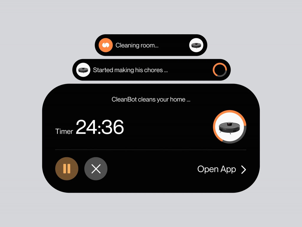
When to apply this pattern
Choose ephemeral surfaces when user attention is tied to a lifecycle that lasts from ten minutes to a few hours. These widgets dynamically appear on the Lock Screen, ambient standby displays, and hardware cutouts like the Dynamic Island for the duration of the event, then disappear once the task wraps up.
How to design it
Designing for live surfaces requires managing three visual states: compact, minimal, and expanded.
In the compact Dynamic Island view, space is tight. Place a brand or category icon on the leading edge and a dynamic metric (such as 4 min or 78%) on the trailing edge. When the user touches and holds the cutout, expand the card into a dashboard showing milestones, route maps, or action buttons like Contact Driver or Pause Charge.
Because these micro-surfaces update constantly, keeping typography stable is critical. Use tabular numbers with equal character widths to prevent horizontal text jumping as counters tick down. Platform specifications, such as Apple’s Live Activity guidelines, cap visual transitions at two seconds to protect device battery life. Incorporating functional animation ensures the card communicates real-time data updates clearly without creating visual chaos on ambient screens.
3. Data-dense SaaS and analytical cards
If you are building a B2B platform, cloud monitoring console, CRM, or financial reporting tool, your users want high-signal summaries that answer one question: Is business performance healthy today?
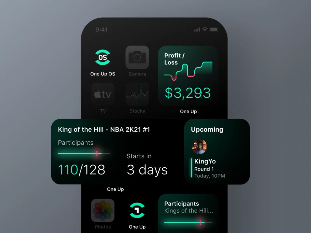
When to apply this pattern
Use analytical widget cards when your product relies on continuous performance monitoring – such as monthly recurring revenue (MRR), server error rates, active sales pipeline value, or energy output. In SaaS dashboard design, these cards act as executive summaries at the top of a control panel or desktop view, helping decision-makers spot anomalies.
How to design it
The rule of analytical dashboard layout best practices is data curation. Human short-term memory struggles with visual overload, so cap each card cluster at five to nine primary metrics per viewport.
When we designed the interface for Sprightful, translating solar production and battery reserves into scannable units was essential for daily monitoring. To achieve clarity across layouts, eliminate clutter:
- Use horizontal bullet graphs, which display actual figures against targets in a fraction of the screen space.
- Pair numbers with sparklines to show historical trend context.
- Include delta badges (e.g., +12% vs last month) backed by semantic color cues so users know instantly whether a movement represents positive progress or a warning.
Structuring each KPI dashboard component around a comparison point turns a number into an operational signal.
4. Health, biometrics, and progress visualizers
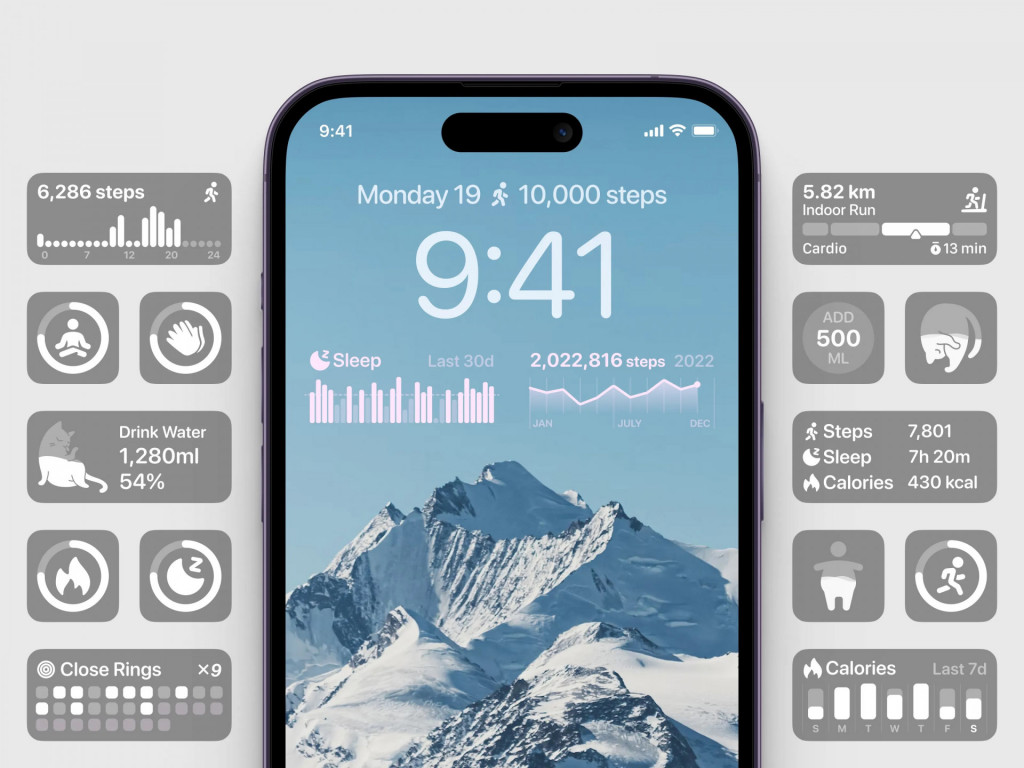
If your product lives in the health, wellness, medical, or athletic space, your users seek quick confirmation of their progress. Tracking step goals, monitoring heart rate trends, or keeping tabs on insulin units via home screen widgets removes friction.
When to apply this pattern
Choose biometric visualizers when user behavior is motivated by goal completion, streak tracking, or vital sign management. This pattern fits fitness apps, condition management platforms, and sleep coaching tools.
How to design it
Designing for health metrics requires balancing visual feedback with privacy standards. When we created the interface for Diabetes Control, presenting blood glucose trends and insulin dosages clearly was our priority.
- Use concentric rings or segmented progress arcs to represent target completion. The human eye parses circular completion faster than text ratios.
- Combine color cues with direction indicators. Pair color shifts with arrows or status labels.
- Protect biometrics on locked devices. Implement system-level privacy redaction tags (like Apple’s .privacySensitive() modifier) so medical readings or biometric charts blur into pill placeholders on keyguards until the user authenticates with Face ID.
Pairing progress shapes with privacy controls builds a health companion that informs securely.
5. Adaptive and context-aware widget concepts
If your product serves users across shifting routines, time zones, or lighting conditions, modern operating systems expect widgets to adapt dynamically to the environment.
When to apply this pattern
Choose context-aware architectures when the relevance of your data changes with time or location. This pattern is essential for calendar apps, weather utilities, travel planners, and IoT home dashboards.
How to design it
Building adaptive cards requires designing for system-level context switches.
In mobile app UI design, you must embrace platform-native theming engines:
- Adopt dynamic color extraction. With Android Material You widgets, use tonal palette tokens (like surfaceContainer and onSurface). This ensures the card harmonizes with the user’s wallpaper and launcher palette.
- Design for iOS tinted modes and Smart Stacks. Under Apple’s Human Interface Guidelines, widgets placed in stacks should carry relevance metadata so the operating system surfaces them when an event is near.
- Support distance viewing for ambient modes. When a device docks in StandBy mode or acts as a desk monitor, scale up the layout: drop labels, bump numbers to 24–32 points, and ensure dark mode support includes monochrome treatments that remain legible from across the room.
When your widget responds to the user’s environment, it becomes a daily assistant.
Engineer apps so context-aware they feel like an extension of the user’s mind
Engineer the MagicQuick rules: how to keep your widget designs functional?
Creative widget design tips will fail if the technical foundation breaks in production. To ensure your components behave reliably on devices, keep these execution baselines in mind:
- Respect container margins: Stick to the standard 16-point (or 16 dp) system margin for card containers. Forcing custom outer padding clashes with native launcher grids and triggers layout clipping on Android devices.
- Design for background refresh quotas: Mobile operating systems budget battery consumption, limiting background reloads to 40 to 70 refreshes per day on iOS and clamping periodic background updates to 30-minute floors on Android. Display a relative timestamp (e.g., Updated 12m ago) when data updates are batched.
- Provide structured loading and empty states: Supply skeleton shimmer shapes that match your typography layout while data fetches in the background.
- Trigger deep-links for input tasks: If a user task requires input, trigger a deep-link to the sub-view inside your main application.
Conclusion
Building widgets is an exercise in constraint. Surface the single piece of information or action that matters most in a brief interaction.
When you respect platform boundaries – from touch targets and background refresh quotas to dynamic system theming – your widgets become extensions of the operating system. By pairing visual hierarchy with micro-interactions, you turn glanceable data into user engagement.
Turn your product data into micro-interfaces that conquer the home screen
Start the ConversationFAQ: Common questions about widget design
What is the difference between designing an app and a widget?
An app is a destination designed for workflows, exploration, and task completion. A widget is an asynchronous, glanceable projection surface built for check-ins or single-tap actions. Place features requiring text input, navigation, or scrolling inside the app.
How do platform memory limits affect widget design decisions?
Mobile operating systems enforce background memory limits (such as the 30 MB crash threshold on iOS). Including uncompressed bitmap images, multi-layer blurs, or custom animations in a widget extension triggers system crashes. Designs rely on vector glyphs, tabular system fonts, and declarative layouts to stay within resource budgets.
How many metrics should fit inside a single SaaS dashboard widget?
Aim for five to nine data points per card cluster. Exceeding this threshold overwhelms the user’s working memory and triggers visual fatigue. When designing business intelligence cards, pair one display metric with a sparkline and a percentage delta.
Why do brand colors look different on iOS and Android widgets?
Both platforms feature system-wide theming engines – such as Android’s Material You wallpaper color extraction and iOS tinted home screen modes. Operating systems desaturate or clash with hardcoded hex values. UI kits map colors to semantic platform tokens (like surfaceContainer or .widgetAccentable()) so widgets adapt to user preferences and maintain contrast standards.



 Kotlin
  C++
C++  C#
C#  Ruby on Rails
  Java
Java  Firebase
  Python
  Vue.js
  HTML5
HTML5  CSS3
CSS3  Azure
Azure