


Do you want to stand out among the competition, where your content, reports, presentations, or social media posts are professional, engaging, and accessible across various platforms? You will have it all if you visualize your data according to the data visualization rules.

What is Data Visualization?
Data visualization is the practice that is aimed at translating information into a highly effective visual context, such as a map or graph, etc., to make data easier for the human brain to understand and pull insights from. The main goal of data visualization is to make it easier to identify patterns, trends, and outliers in large data sets.
(Techtarget)
Today, visualization is especially important, as people get lost in the abundance of superfluous data and too much time is spent on its processing. Therefore, boring incomprehensible content is often left without attention. The reader will not waste time understanding it. Design rules for data illustration will help to improve the data so that to make it stand out.
10 Golden Rules of Data Visualization
To visualize your information in the most effective and organized way, it’s recommended to stick to the golden rules of data visualization applied by specialists all over the world for decades in pursuit of high data efficiency. To make your design data-driven and engaging, they will do for good.
Conventions on aesthetics
Visualizing aesthetics deals with notions of cultural conventions and taste. These are the ideas of art being ‘good’ and ‘bad’ based on specific cultural data, beliefs, and judgments that viewers make based on perceptions. So, beautiful or not, your data should preserve certain aesthetics.
Ideal chart type
The main goal of visualization is to speed up the receipt of data. The chosen type of graph and its format should be consistent with this goal, and not interfere with it.
Simple design
A selection of useful design elements is needed, including elements such as 3D effects, gradients, and shadows. Such insignificant effects may improve the visual appeal of the information conveyed.
Minimalism
You will need to remove all non-informative elements from your charts and graphs, leaving only the most necessary ones. Overuse of unnecessary data greatly complicates the perception of information.
Color palette
Visual elements (such as charts, and diagram graphs) throughout the study or report should be maintained in a single color scheme. If the visualization offers data from a research company, then the color palette should be the same in all studies, which is important for maintaining the corporate identity.
Visualization types
Diversity should be avoided just for the sake of diversity. Such diversity will not always be beautiful, but it will always be useless. For data of the same type, it is better to take one type of chart or any other visualization type.
When to ignore conventions
Make sure you arrange the data in a logical order. Most often this is a sequence from largest to smallest. Logic comes first and then we may ignore our conventions if they are not reasonable.
Logic
Data can also be sorted from smallest to largest if it suits the purpose of your message. The goal always comes first. Before you start building a graph, clearly articulate what idea you want to convey to viewers, what you want to draw attention to, etc. Only then think about how to make it beautiful and not violate the logic.
Comparability
Visualize data in such a way that it can be easily compared. One of the main goals of visualization is a convenient visual comparison of two or more indicators. So to make your charts valuable and useful, show the relationship between the data. If you break the same type of information into many separate graphs, visualization becomes meaningless.
Title & signatures
The chart is done with a title and a full-text legend. Make sure that your data visualization always has a full clear title and captions; otherwise, there is a risk of misinterpretation. The period and units of measurement should always be clear. Don’t rely on the user of your graph to guess this from the context.
Figures
In large numbers, it is necessary to carefully separate the digits: 10,000,000, not 10,000,000, otherwise the numbers will be unreadable. Also, do not use decimal places in the visualization, unless it is absolutely necessary to use them in such a way. And you need to make sure that the format of the numbers is the same. If, nevertheless, it is decided to show the sign after the comma, then you already need to do this for absolutely all data signatures, and never do that randomly.
Customer-Centric Examples
Customer-centric data should reflect customer interests, behavior and engagement at all stages of the customer lifecycle by going beyond simple contact and demographic information. (Optimazely).
Implementing a customer centric business model requires this comprehensive data to shape all decision-making processes, ensuring that customer needs and preferences are at the heart of every business strategy.
Here you will find some useful basic customer-centric data visualization samples created by various product-centric companies for their projects:
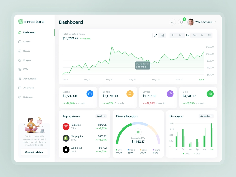
Source: Fireart
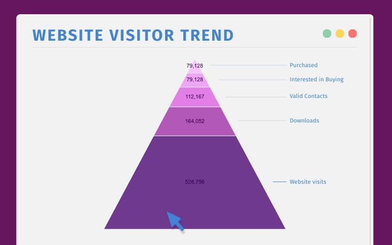
Source: Exponea
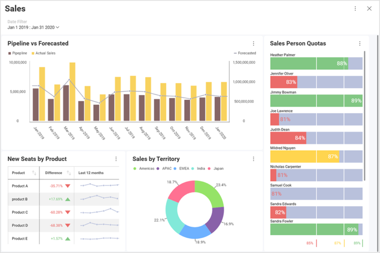
Source: Slingshot
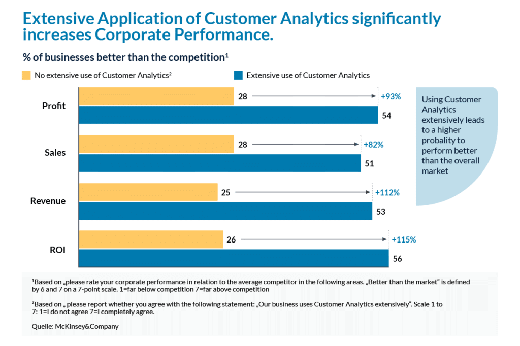
Source: McKinsey
Source: Monterail
Results
Visualization is of particular importance these days and has an absolute impact on how your users perceive the data. Sometimes people may simply get lost in the huge amounts of data that is offered to them in an endless stream. It may take too long to process it, not even perceiving. Therefore, convenient text may be too boring and incomprehensible, often left without any attention. The reader simply does not want to waste time understanding these texts. Many of us want the information on websites stands out from that of our competitors. This is where information visualization helps us. Don’t ignore simple yet very important visualization rules to take care of your users, especially if you launch projects in Digital Product Design.


