
 Kotlin
  C++
C++  C#
C#  Ruby on Rails
  Java
Java  Firebase
  Python
  Vue.js
  HTML5
HTML5  CSS3
CSS3  Azure
Azure 


Do you know this feeling when you browse through dozens of websites, and suddenly, one of them makes you go, “Ooh!”
You would want your website to make people feel the same, right? So that they would spend more time at your site, make more purchases, convert into more leads, and send your page to their marketers with a note “This!”
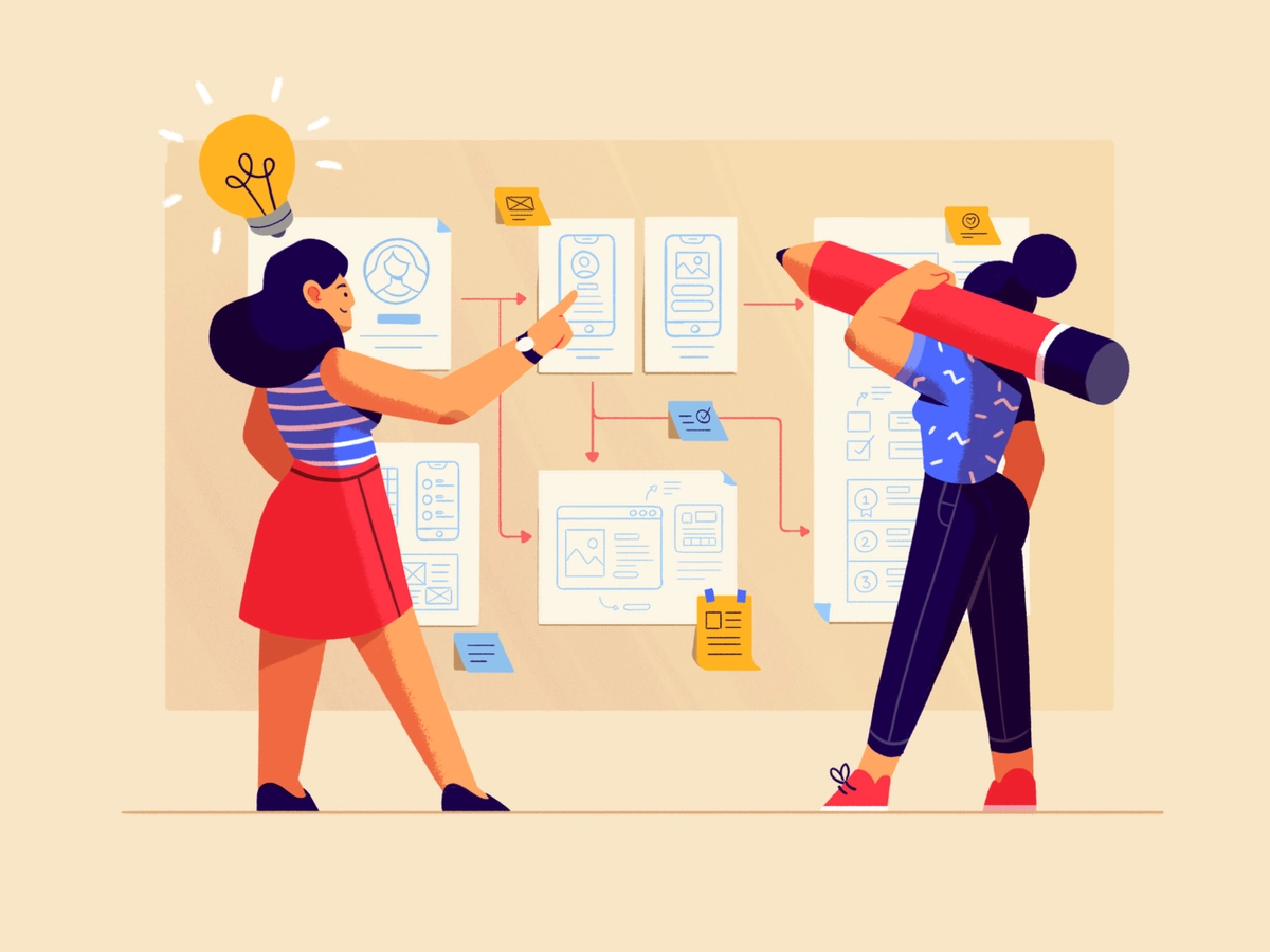
But what secret sauce makes some websites stand out, be remembered, and go back to them as your reference for years? We at Fireart know precisely where to look. Let’s find these unique web design best practices that differentiate between the meh and the wow.
As specialists in web design and development since 2013, we know the critical elements of excellent web design and follow the trends in development closely. This is what we do!
What are web design best practices, and why do they matter?
Good web design creates that first impression, based on which you may or may not lose up to 94% of your visitors. And it’s not just about how the site looks, but also how it works. Good web design means a site is nice but user-friendly, easy to navigate, and works well on all devices, from phones to computers to watches.
Why does this matter for customer experience? Imagine walking into a store that’s messy and confusing, with ads jumping on you from dark corners – you’d probably leave, right? It’s the same with websites.
A well-designed website makes visitors happy.
It is neat and stylish, visitors feel welcomed without pushiness, they can find what they need easily, everything loads quickly, and it’s a pleasure to use.
Good web design best practices make people more likely to spend more time here, return, and trust the brand.
There are a few stats to prove it:
- Poor user experience will make 89% of consumers switch to a competitor (WebFX)
- 42% of consumers will abandon a website due to a lack of functionality. (Top Design Firms)
- 60% of consumers rate usability as an essential design characteristic for an online shop. (Statista)
The exact ways to create convenient web design have evolved since the first web pages of the late 1990s. Today, web design trends are changing every 2-3 years (funnily enough, they have recently returned to Y2K style, which is based on 1990s aesthetics).
Our web designers constantly master the best web design practices to deliver outstanding products and websites to our clients.
Below, you will find
- best web design principles to apply to your website
- practical examples from the market leaders
- top technologies that shape web development
Read on and find out tips for website designing for the perfect functionality today and discover what to include so they are still trending tomorrow.
Top 10 Best Practices for Effective Website Design
Web design consists of several major parts.
First is the site structure and navigation, and the site architecture defines which page comes after which. These are the bones of graphic design.
Second, you have the layout, navigation, breadcrumbs, microinteractions, and all the details that make user experience and user interface (UX/UI). This is your car’s dashboard, which defines how easy and how comfortable you will be browsing your website for a visitor.
Third are the images, visuals, details, colors, shapes, and overall looks. These graphic design elements are in for aesthetics, and they must be cohesive and harmonious to make a pleasant, enjoyable, easy-on-the-eye, beautiful picture.
And fourth — of course, it all has to run smoothly — that’s where the technicalities like the page loading speed and responsive design practices come into play.
For more details, read on. We are going to describe each of the above now, with examples.
Stick to these website design principles to get the best result every time.
1. Clarity and simplicity
Clarity and simplicity in web design make your site easy to use and understand. This involves organizing content, using easy-to-read fonts, and avoiding clutter.
A simple layout with plenty of white space helps users focus on what’s essential without feeling overwhelmed. The text should be straightforward, avoiding jargon or complex language. This approach is very helpful for people who might be new to the internet or prefer direct information without distractions.
- In a nutshell: Simplicity isn’t just about minimalism; it’s about delivering content in a straightforward, understandable way.
- Expert insight: Design experts argue that a user should understand the purpose of your site within seconds of landing on it. A cluttered, confusing design can overwhelm visitors, leading to a higher bounce rate.
- Statistics: Research shows that 38% of people will disengage with a site if its layout or content is not appealing.
2. Consistent navigation
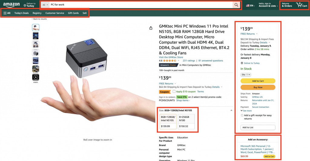
Consistent website navigation is about making it easy for users to find their way around your page. Ensure your menu is well-organized, looks the same on every page, and uses familiar terms for menu items.
A home button should always take users back to the main page, and a contact link should always lead to your contact information. Consistency helps users feel comfortable and confident as they move through your site, reducing frustration and confusion.
- In a nutshell: Consistency in navigation creates a sense of familiarity and ease for the visitors, contributing to a positive user experience.
- Expert insight: The main principle is users should not have to think about how to move around a website; the navigation should feel intuitive.
- Industry example: Amazon’s website masterfully handles complex navigation, ensuring that even new visitors can find what they need without confusion.
3. Mobile responsiveness
Mobile responsiveness means your website has responsive web design and works well on all devices, from desktops to smartphones to watches. Your site should look good and be easy to use on a small screen. Think of buttons and links that are easy to tap with a finger.
In mobile UI, text should be large enough to read without zooming in, and images should be adjusted to fit the screen size. This is important because more people are using their phones to go online, and you want everyone to have a good experience on your site.
- In a nutshell: With mobile browsing making up over half of web traffic, a site must look and function well on all screen sizes.
- Expert insight: Embrace the ‘mobile-first‘ approach, as it’s often the primary way users interact with websites.
- Statistics: 74% of users are likelier to return to mobile-friendly websites. (WebFX)
4. Fast loading times
The average website load time in 2023 is 2.5 seconds for desktops and 8.6 seconds for mobiles (Google). This is a good benchmark to follow when creating and optimizing your website. To ensure your website opens quickly, optimize images so they’re not too large, minimize code, and use fast hosting services.
A site that loads within a few seconds keeps users engaged, while a slower site might make them leave before seeing what you offer. Quick loading is essential for maintaining users’ interest, especially when browsing on mobile devices where internet speeds vary.
You can use the Website Grader tool from HubSpot to check your website loading speed.
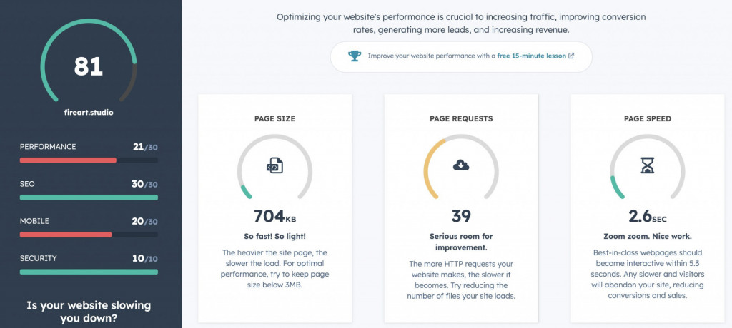
- In a nutshell: Speed is crucial. Aim for having your website up and running in 4 seconds or less. Slow-loading websites test user patience and can lead to site abandonment.
- Expert insight: Web professionals go for optimizing images, leveraging browser caching, and minimizing HTTP requests to improve loading times.
- Statistics: A site’s bounce rate can increase by 32% if the loading time increases from one to three seconds and by 90% if from one to five. (Google)
5. SEO and web design
SEO must be built into your web design from the get-go so they can work together to increase your site visibility on Google and other search engines.
Checklist: do this to incorporate SEO into your web design best practices
1. Keyword research, including intent and LSI
2. Meta titles and meta descriptions for all pages
3. Alt tags for visual content
4. Content optimisation and readability
5. Mobile responsiveness across all devices
6. Clear site map and navigation
7. Website loading speed (2 to 4 seconds or fewer)
8. Descriptive URL with the keywords (company.com/about-us, NOT company.com/123cdb6kone)
9. Security mark (the “s” in the https in web link) to reassure the users
10. Optimized images, rich snippets, Google Merchant tags, etc.
A site that loads quickly has relevant and well-organized content and includes the right keywords in both textual and visual content will likely rank higher in search results. This, in turn, makes it easier for people to find your site when they’re looking for something you offer.
- In a nutshell: Natively SEO-friendly web design is the key to building up a site’s visibility in search engines.
- Expert insight: Running the design process with integrated SEO strategies, like optimizing for keywords and mobile-friendliness, will save you time and money down the road
6. Accessibility for all users
A website design basics today, accessibility in web design means creating websites that are convenient for everyone, including people with disabilities. This means designing for various visual, auditory, motor, and cognitive abilities.
For visually impaired users, websites should be navigable using screen readers, with alternative text for images and meaningful link descriptions.
Providing captions for audio and video materials is critical for those with hearing impairments.
Websites should also be operable with keyboard-only navigation for users with motor disabilities and designed with clear, simple language for those with cognitive challenges.
This website by partakefoods.com is an excellent example of applied web design standards for accessibility.
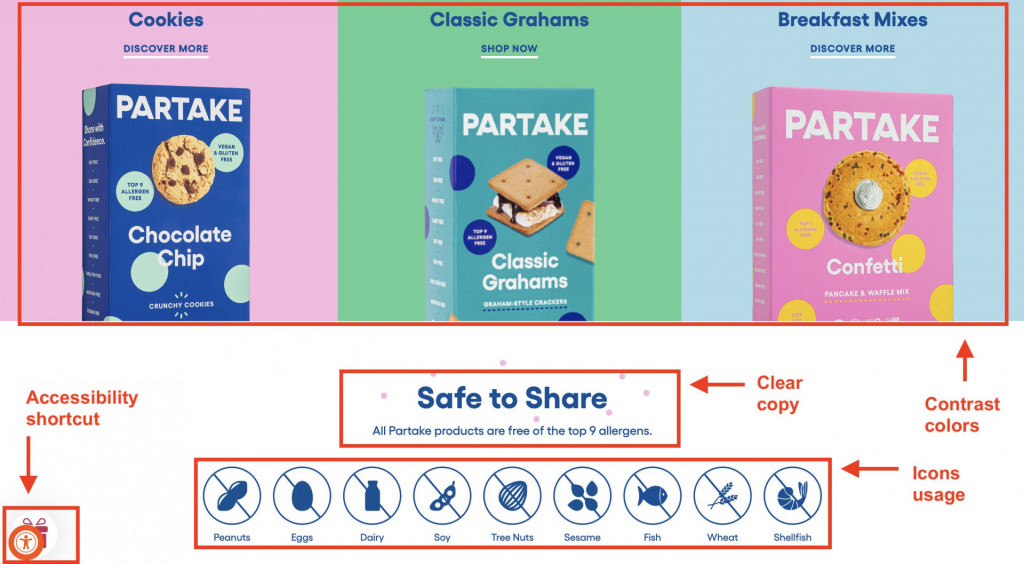
This inclusive approach expands the audience’s reach and demonstrates social responsibility.
- In a nutshell: Designing for accessibility means ensuring everyone, including people with various disabilities, can benefit from your website.
- Expert insight: Accessibility is a legal obligation and a moral responsibility. It expands your audience and improves user experience for all.
- Statistics: An estimated 1.3 billion people (1 in 6 people worldwide) experience significant disability. (World Health Organization)
7. Engaging Visuals
Engaging visuals in web design means using images, videos, and graphics that grab and hold the viewer’s attention. Choose high-quality and relevant visuals that complement your content and brand.
A travel website might use beautiful, vibrant images of destinations to entice visitors, while the educational facility website will benefit from lively pictures of students, venues, and the learning process. Engaging visuals are important because they make a website more appealing and memorable, helping to communicate your message more effectively.
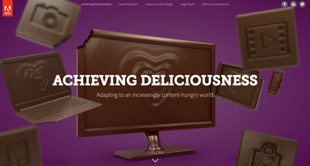
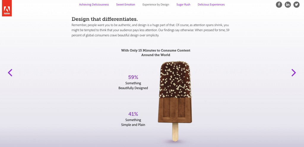
For loads of statistics and website design tips and tricks for engaging visual content, we recommend you check this report from Adobe — stunningly illustrated to get the point across.
- In a nutshell: Compelling visuals are crucial for a memorable user experience. Designers suggest including high-quality images and videos that align with the brand’s messaging into design guidelines..
- Expert insight: Adobe’s research shows that 3 in 5 people prefer to consume content that is beautiful rather than plain and simple when pressured for time.
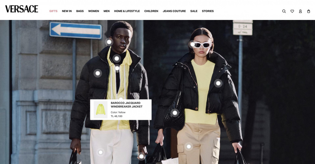
- Industry example: Luxury brands know well the power of engaging visuals to draw users into their listings. They are taking the next step by turning visuals into sales tools, like in this example from Versace.
8. Compelling Content Layout
A compelling content layout is about arranging text, images, and other elements in an attractive and easy-to-read manner. Think about breaking up large blocks of text, using headings and bullet points, and placing images strategically.
A news website might use a mix of headlines, summaries, and images to guide readers through articles. An e-commerce site can make the most of the layout to demonstrate the upsell and cross-sell products. A B2B website can put their conversion tools upfront and center to save time for their busy users. A well-planned design helps visitors quickly find what they’re looking for and absorb information without feeling overwhelmed.
- In a nutshell: The layout of your content defines how visitors interact with your site.
- Expert insight: Among the best practices for website design, web designers recommend a balanced layout that guides visitors through your content in a logical, appealing manner.
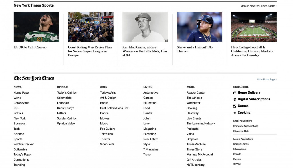
- Industry example: The New York Times skillfully arranges content, ensuring it is easy to navigate through their stories.
9. Interactive elements
Interactive elements in website design best practices include clickable buttons, forms, calculators, sliders, carousels, and other features that users can interact with. This could be as simple as a hover effect on a button or as complex as an interactive infographic.
An e-commerce site might use interactive elements to allow users to see different colors of a product. On the educational site, the interactive maps and sliders may provide an extra learning experience to increase memorability of the material. Interactive design makes a website more engaging and improves the user experience by making it more fun to explore.
- In a nutshell: Interactive elements, like clickable buttons or scroll animations, enhance the user experience.
- Expert insight: Interaction design experts point out that such elements can increase engagement and make navigation more enjoyable.
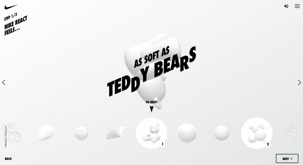
- Industry example: Nike React’s website uses interactivity to create an engaging and memorable shopping experience. Users can create their running avatar with a few clicks out of the most unexpected objects.
10. Continuous testing and improvement
Continuous testing and improvement mean regularly checking your website and making updates to improve the user experience. Commit to gathering user feedback, monitoring how people use your site, and testing different versions of pages to see which works best.
Regular updates based on customer feedback and changing trends are crucial for keeping your website relevant, effective, and user-friendly.
- In a nutshell: Websites are not static; they require ongoing updates and improvements based on user feedback to remain relevant.
- Expert insight: Continuous testing, like A/B testing, tracking the user behavior with tools like Hotjar, and further adapting to user feedback are crucial for keeping your website effective.
Top 5 Technologies in Modern Web Design
The tools and technologies used by designers are constantly evolving. Staying updated with the new solutions is crucial for applying the UX best practices for websites without sweating too much.
Let’s explore the top five technologies shaping modern web design today, from the languages that form the structure and style of web pages to the frameworks and tools that streamline the design process.
HTML5 and CSS3
HTML5 and CSS3 are the backbone of modern web design, offering flexibility and efficiency.
JavaScript and JS frameworks
JavaScript and frameworks like React.js are indispensable for dynamic content and interactive features.
Responsive frameworks (e.g., Bootstrap)
Bootstrap and similar frameworks provide a foundation for creating responsive designs efficiently.
Content management systems (CMS)
Platforms like WordPress allow for easy content management and customization.
Web design tools (e.g., Adobe XD, Sketch)
These web design tools facilitate the design process with robust features and functionalities.
Best web design case studies by Fireart Studio
The best web design examples don’t have to look striking. It’s rather about the ease of use for the customers, accurately conveying the brand essence for the businesses, and eventually providing the best possible experience to everyone involved.
See Fireart Studio’s website design case studies, where innovative ideas meet cutting-edge design, to see how we apply all the best web design principles from above.
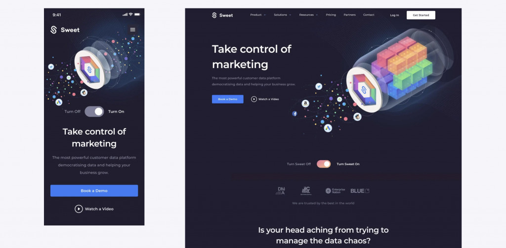
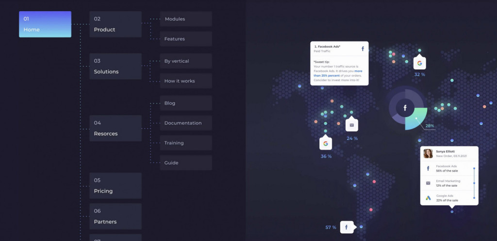
Website redesign for analytics provider
We prioritized how users would view the company in the Sweet analytics redesign approach. Our take centered on keeping up the golden principles of website design — a straightforward, neat platform layout complemented by graphics that effectively showcase its features.
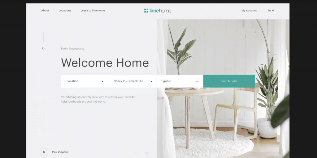
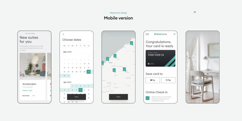
Website design for the hospitality business
Limehome stands out from typical hotels by blending the high-quality standards of hotel accommodations with the benefits of an apartment. Managed by hospitality experts and styled by professional interior designers, Limehome offers a unique experience. In designing their website, we used website design best practices — embraced a minimalist approach, using carefully selected images highlighting their offerings’ upscale, premium feel.
The bottom line
Now you know what makes some websites stand out. You’ve explored the principles of website design, from simplicity and consistency to loading speed, mobile responsiveness, and engaging visuals.
Remember that these trends are not static; they change daily, and new solutions come up every year. So make sure to follow the updates on our blog for the innovations in web design and stay up-to-date.
We hope this article has given you the insights into the effective web design practices you were looking for. And if you need more answers, please get in touch with us at Fireart Studio. We provide the best web design solutions on the market and will be happy to help you out.
FAQ
Why are web design best practices so important?
Web design best practices are essential because they ensure a website is easy to use, looks good, and works well. They help visitors quickly find what they need and enjoy using the site, making them more likely to return or use the service.
What makes a website look modern?
A modern website usually has a clean, minimalist design, uses new trends like big images or videos, and is easy to use on phones and computers. It also loads quickly and has up-to-date content.
What are web design standards?
Web design standards are guidelines for creating websites that are easy to use, accessible to everyone, and work well across different browsers and devices. These standards help make sure that the internet is a place everyone can use and enjoy.
What is a good design strategy?
A good design strategy starts with understanding who will use the site and what they need from it. It involves planning how the site looks and works, ensuring it’s easy to use, and testing it with real users to keep improving it.


