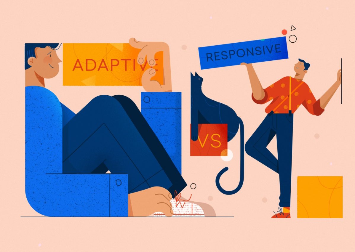
A pretty fair issue in the design of web resources nowadays is: should you go for responsive vs adaptive design when making a website? Let’s discuss what responsive web design is and the slight difference between adaptive web design and responsive web design for you to pick the right mobile app design services.
The terms “responsive” and “adaptive” have become buzzwords, each promising a tailored solution to the array of devices at our fingertips. But what sets them apart? How is responsive design different from adaptive design? How can they cater to the unique needs of your audience? Let’s compare responsive vs adaptive design and see.
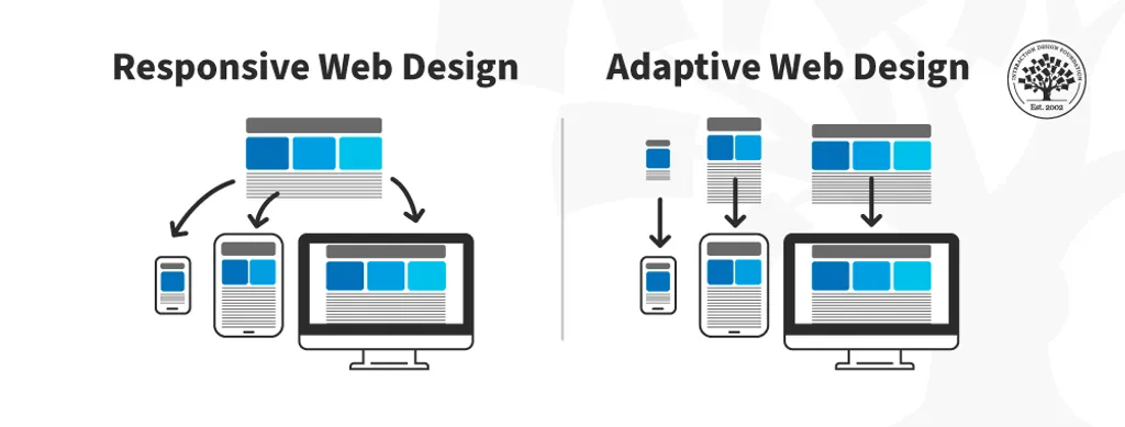
Adaptive design takes a strategic approach, creating distinct layouts for predefined device categories. Each layout is finely tuned to offer an optimized experience based on the characteristics of the device being used, browser, screen size, etc.
This means that the same site may be viewed on various gadgets, regardless of the screen resolution and format. These devices may be smartphones, tablets, or laptops. Browsing a website on these devices will be equally convenient for all formats. The adaptive design aims to display web page content matching the device they are viewed from.
Example: Imagine an e-learning platform employing adaptive design. On a desktop, the layout might showcase a comprehensive dashboard with multiple information panels. On a tablet, it adjusts to present a more streamlined version, focusing on core functionalities. Meanwhile, on a smartphone, the design could prioritize a simplified, mobile-friendly interface.
Technical side
Adaptive design involves creating specific layouts for predetermined device categories, often using a combination of server-side components and media queries. Here’s a breakdown:
Server-side components. The server detects the type of device making the request and serves a pre-designed layout crafted particularly for that device. Different HTML templates might be served for desktop, tablet, and mobile users.
Media queries. Similarly to responsive design, adaptive design can also use client-side media queries to make adjustments to the layout based on the device’s characteristics. It uses CSS to change the font size or rearrange content for different screen sizes.
Conditional loading is when adaptive design loads or does not load certain elements based on the device. This can enhance performance and optimize the user experience. For example, larger images or additional features might only be loaded for desktop users.
Pros
Fine-tuned — allows for meticulous optimization, tailoring content and features for specific devices.
Optimized — can enhance website performance by delivering content optimized for each device category.
Cons
Imperfect — may not adapt as gracefully to unforeseen or uncommon screen sizes without specific design adjustments.
Demanding — regular updates may be needed to accommodate new devices or changes in screen dimensions.
Responsive design is like a digital acrobat, skillfully adjusting website layout to fit any screen size or device. It achieves flexibility through the use of fluid grids and images that resize proportionally based on the screen dimensions.
Example: Consider a restaurant website designed responsively. Whether your potential customer views the menu on a desktop computer, tablet, or smartphone, the website content elegantly reorganizes itself. The navigation remains user-friendly, text is legible, and images resize proportionally to provide an optimal viewing experience.
Technical side
Responsive design combines flexible grids and media queries to create a dynamic and fluid layout. Here’s how it works:
Fluid grids. Grids are used to structure the layout of a webpage. In responsive design, these grids are fluid, meaning they are proportion-based rather than fixed. Elements are sized using relative units, such as percentages, to make them adjust seamlessly across various screen sizes. For example, if a container is set to 50% width, it will take up half the screen width regardless of the device.
Media queries are CSS techniques that allow the presentation of content to be tailored to different devices by checking features such as screen width, height, or resolution. In responsive design, a media query might specify different styling rules for screens larger than 768 pixels, optimizing the layout for tablets and desktops.
Flexible images, including logos, are set to scale dynamically within their containing elements, ensuring they don’t break the layout on different devices. An image might be set to max-width: 100%; to ensure it resizes proportionally to the screen width.
Pros
Universal — your website looks great on various devices, from the latest smartphones to traditional desktop computers.
Consistent — users enjoy a consistent look and feel, fostering familiarity and usability.
Cons
Complex — implementing responsive design can be more intricate, especially for websites with complex layouts or unique design requirements.
In 2010, the term was first used by the graphic designer and developer Ethan Marcotte. His book of the same name,Responsive Web Design, is still out there on Amazon, available for people who make web designs and more. You can check out our book onproduct design there, too.
NFT design from Fireart
What’s the difference between responsive and adaptive design?
With all the differences, there is one thing in common when it comes to responsive vs adaptive design. For both adaptive and responsive design, you will need tohire responsive web designers to make sure the design of web pages provides a great experience on various devices.
Design professionals often emphasize that creating responsive designs is much easier than adaptive designs. Plus, making responsive design versus adaptive design takes less time and design oversight. This approach uses percentage-based CSS rules to adjust the style according to the screen size. Besides, most CMS templates have responsive designs built in.
The primary difference between responsive and adaptive design is that responsive design rearranges all website design elements according to the device used to view it, whether it’s a laptop, tablet, desktop, or mobile phone. In contrast, adaptive design allows different fixed layouts to be created to fit the user’s screen size.
Designing for different devices
Today, folks use a wide variety of devices that may allow better access to Internetpage viewing. They may differ in screen size, resolution, and the way the website can be displayed on them. Therefore, it is essential that your site looks fine and displays correctly for any of the users, no matter what device they are using. Mobile-first design solves this issue to an extent, but not entirely.
Considerations for cross-platform design
With the growing popularity of smartphones, tablets, e-books, and netbooks, mobile platforms are becoming more and more relevant, from responsive website layouts to full-fledged applications. Thus, adaptive vs responsive design is always food for thought when considering cross-platform design solutions or building progressive apps.
Gestures
Gesture-driven apps also become a trend inmobile user interface design. Together, adaptive vs responsive design and a better understanding of their differences will help to find the best design solutions.
Hierarchy
Hierarchy is a visual design principle used to present the importance of the contents of each page or screen by tuning their characteristics. When you come up with responsive design vs adaptivedesign ideas, mind the future web page design hierarchy.
Navigation
Navigation is another issue to mind when choosing responsive vs adaptive web design. Navigation helps us move around the website, so make sure this function doesn’t suffer from the web design you chose for the page.
Menu icons
Another challenge of responsive website design and development is integrating menus with icons that are user-friendly and work equally well for mobile users on all types of devices. Creating a responsivenavigation menu with icons is practical for the users and helpful for business.
Tabs
Tabbed navigations are practical for organizing a large amount of side content. Tabs are considered as one of the widely used mobile UIs components. They may allow users to move quickly between a number of equally important blocks. Mind adaptive web design vs responsive web design pattern here, as well.
Responsive web design examples
Nike’s website is an excellent example of responsive design. Whether you visit it on a desktop, tablet, or smartphone, the layout seamlessly adjusts, maintaining a consistent brand experience.
The New York Times employs responsive design to ensure that readers have an optimal experience regardless of the device they use. The layout adjusts to different screen sizes while preserving the readability of articles.
Starbucks embraces responsive design to cater to customers accessing their website from various devices. The site’s layout smoothly adapts to different screen dimensions, ensuring a user-friendly experience for coffee enthusiasts on the go.
Other responsive web design examples include BBC, Hubspot, Time Magazine, The Guardian, and Microsoft.
Adaptive web design examples
Amazon utilizes adaptive design to tailor its website for different devices. On a desktop, users encounter a comprehensive interface with various features. At the same time, the mobile version offers a more streamlined experience focused on key functionalities.
Booking.com employs adaptive design to optimize the user experience based on device categories. The desktop version showcases detailed search filters and options, while the mobile version prioritizes a simplified interface for users making reservations on smaller screens.
Facebook is an example of adaptive design with a tailored experience for mobile and desktop users. The desktop version provides a comprehensive dashboard with various features, while the mobile app offers a more condensed and focused interface.
Responsive design tends to be more prevalent and widely adopted across the web. The flexibility it provides in adapting to an extensive range of devices makes it a go-to choice for many designers and developers. It simplifies maintenance, making it easier to manage updates and changes without the need for device-specific implementations.
However, the choice between responsive and adaptive design is often made based on the project requirements. Adaptive design might be favored when a more tailored experience is needed for specific device categories.
Choosing the right approach: factors to consider
The choice between responsive and adaptive design is easier if you consider your project’s unique characteristics and the audience’s behaviors. 1. Audience Behavior:
Responsive: Ideal for diverse audiences using a range of devices.
Adaptive: Suited for projects targeting specific audiences with known device preferences.
2. Project Complexity:
Responsive: Best for projects with straightforward design and content structures.
Adaptive: Suitable for projects with specific design requirements for each device.
3. Future-Proofing:
Responsive: Adapts well to new devices without significant modifications.
Adaptive: May require updates to accommodate emerging device sizes.
To implement either responsive or adaptive web design effectively, it is essential to have a clear understanding of the differences between these two approaches. This will help you create a better user experience by designing various UI elements, such as menus, icons, and footers, with the appropriate strategy in mind. Not sure how to redesign a website? We’ll help!
What is the fundamental difference between adaptive vs responsive web design?
Adaptive and responsive web design are two approaches to crafting websites that adapt to various devices. Responsive design uses media queries and flexible grids to adjust to different screen sizes dynamically, offering a consistent user experience. Adaptive design involves creating specific layouts for predetermined device categories, providing more targeted optimizations.
Adaptive vs responsive web design: which one is more future-proof?
Responsive design is often considered more future-proof as it tends to adapt more gracefully to emerging devices without significant modifications. Adaptive design may require updates to accommodate new devices or screen sizes.
Which is better for SEO: adaptive vs responsive web design?
Both responsive and adaptive designs can be SEO-friendly if implemented correctly. Search engines often favor responsive design because it provides a consistent URL structure and content across devices. Adaptive design can also be optimized for SEO by ensuring that content is appropriately served for different devices.
Adaptive web design vs responsive web design: which approach is more complex to implement?
Responsive design can be more complex to implement initially, especially for intricate layouts. However, adaptive design may require ongoing maintenance as new devices emerge, making it more complex in the long run.
Adaptive vs responsive web design: which one is better for e-commerce websites?
Both approaches can be suitable for e-commerce. Responsive design ensures a consistent shopping experience across devices, while adaptive design allows for more tailored layouts that can optimize the buying process for different devices.
Adaptive web design vs responsive web design: can a website be both?
While technically possible, it’s not a common practice. Combining both approaches might introduce complexity and potential conflicts. It’s generally more practical to choose one approach based on the project’s requirements and audience.
Passionate advocate for the good design of products and services, with a history of working in the various fields. Fully committed to delivering outstanding experiences and solving business needs.
Our guest shares her thoughts on the difference between managing product and UX teams, how to manage OKRs, and why transparency is key to building healthy organizations.

 Kotlin
  C++
C++  C#
C#  Ruby on Rails
  Java
Java  Firebase
  Python
  Vue.js
  HTML5
HTML5  CSS3
CSS3  Azure
Azure 


