

The financial sector manages trillions of dollars, yet many platforms still run on interfaces built two decades ago. Modern financial user experience requires behavioral engineering, regulatory compliance, and clear trust markers.
Selecting the right investment website examples means looking beyond visual polish. A minimalist layout fails if it violates FINRA rules or blocks institutional investors from accessing essential data. High-performing platforms compress complex workflows, ease financial anxiety, and guide users through demanding steps like identity verification.
Here is an analysis of ten outstanding platforms across the financial sector and how they solve demanding product challenges.
Table of contents
Build a custom platform that earns investor trust
Explore our Web Development servicesWhy top financial sites prioritize behavioral engineering
A poorly structured financial interface may create corporate risk and business liabilities. For the users, when identity verification and Know Your Customer (KYC) steps demand sensitive documents before demonstrating value, they leave. For the investors, if a platform fails to establish immediate credibility, they move capital to competitors.
Teams searching for good fintech UI/UX examples must avoid the gamification trap. Consumer mechanics like digital confetti or emoji notifications draw regulatory penalties.
Example: Massachusetts regulators fined Robinhood $7.5 million and ordered changes to its digital engagement practices after ruling that its interface nudged users into high-risk trades.
Compliance and clarity drive sustainable conversions. Finding the right balance in asset management web design requires matching the interface to the user’s data tolerance.
Across top financial sites, designers balance simplicity against analytical depth. Retail platforms benefit from progressive disclosure to keep beginners from facing complex order books. Yet applying that same minimalism to professional traders causes frustration.
Example: When Vanguard shifted to a simplified mobile layout, investors openly criticized the redesign for hiding vital data density.
Calibrating data density is the central challenge in UI design for a FinTech app.
Transparency in wealth management website design
Entrusting capital to an automated system causes acute user anxiety. Building financial advisor platforms or a robo-advisor interface requires easing that fear through transparent fee models and clear financial projections.
1. Facet Wealth

Researches in the Journal of Financial Planning consistently show that clear pricing and dependable service underpin advisory credibility. Facet Wealth addresses this directly by featuring flat-fee pricing on its homepage. Combining clear costs with interactive planning simulators and clean layouts reduces user hesitation during onboarding.
2. Wealthfront
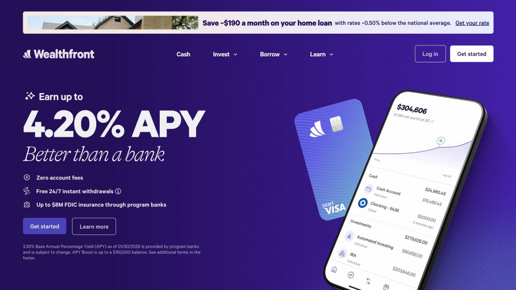
With most clients under 35, Wealthfront designs for investors who prefer automated Self-Driving Money to dense order books. Its wealth management website design highlights long-term modeling through an interactive net-worth projection dashboard on the account home screen. A unified multi-platform design system maintains consistent typography, spacing, and security indicators across mobile and web interfaces.
3. Betterment
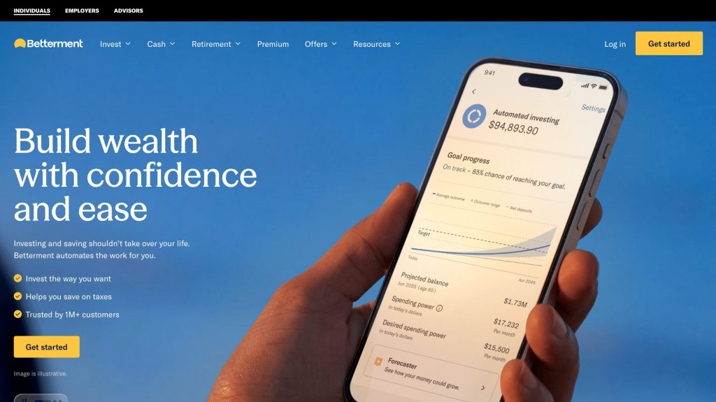
Automated platforms must overcome investor skepticism toward algorithmic decisions. Betterment establishes credibility through structured performance calculators and generous white space. Clear visual forecasts allow users to evaluate projected returns instantly, demonstrating operational discipline and speeding up account creation.
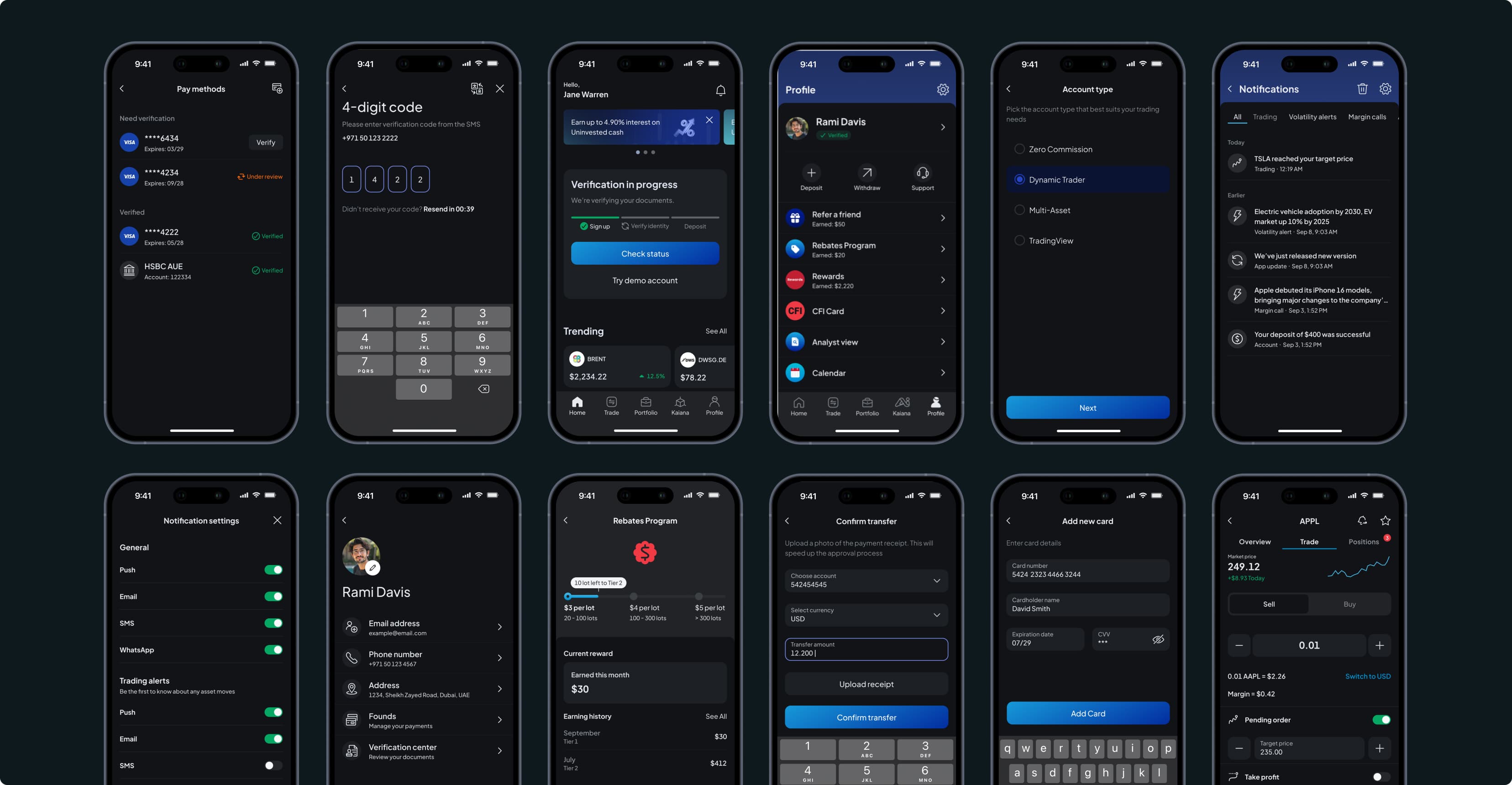
Want to see how Fireart handles complex financial projects? See our trading platform redesign
CFI Fintech Platform Redesign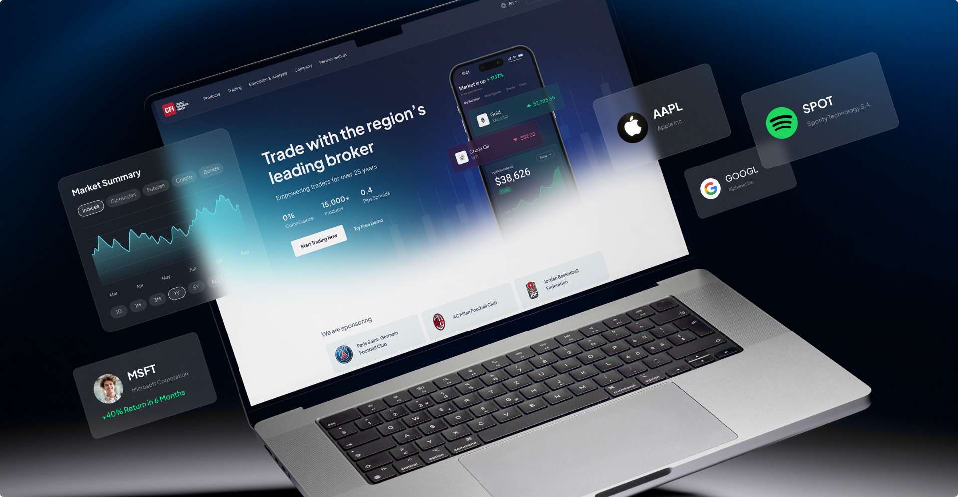
Private equity digital branding requires institutional storytelling
Private equity and venture capital firms sell reputation, historical returns, and strategic value rather than transactional tools. Private equity digital branding builds credibility with high-net-worth limited partners (LPs) and founders seeking institutional backing.
4. Sequoia Capital
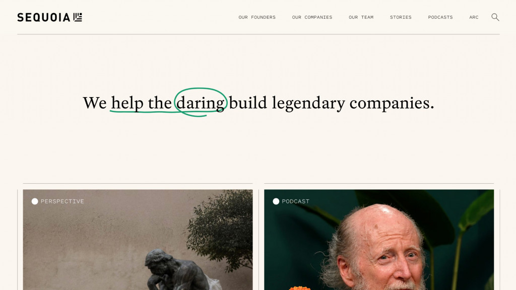
Sequoia Capital formats its website like an editorial journal. Because venture investing relies on relationships, Sequoia organizes its site around a people-first structure. High-contrast portrait photography and editorial essays emphasize the firm’s investment history and founder partnerships, projecting long-term stability.
5. Hustle Fund
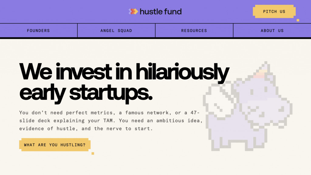
Hustle Fund rejects standard venture conventions. Its interface relies on high-contrast colors, direct copy, and prominent Pitch Us buttons. This energetic approach is deliberate: it attracts early-stage founders who find traditional institutional portals unapproachable.
Read more: Securing venture backing requires more than an effective website. If you’re a founder, master how to pitch a product idea to investors to close funding rounds.
Balancing robo-advisor interfaces with professional data density
Designing an investment platform requires clear decisions about user expertise. Research from the Nielsen Norman Group highlights the need to balance simplified guidance for retail users with rapid data access for professionals.
6. George Invest
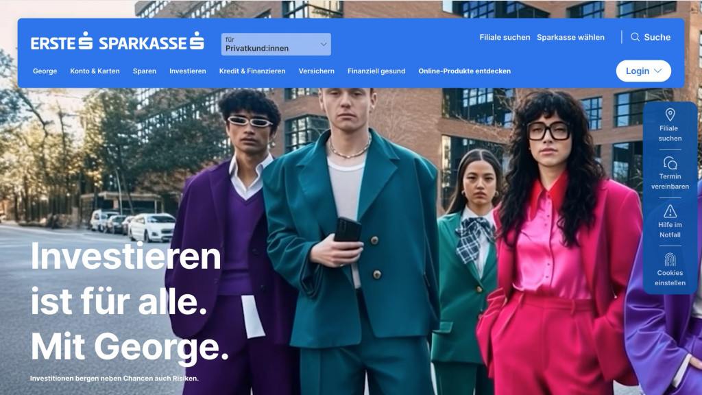
George Invest by Erste Bank focuses on retail accessibility. To reduce loss anxiety among new investors, the interface removes complex order books. It guides users through structured visual environments, educational stories, and fractional amount-based orders.
7. FactSet (Workstation)
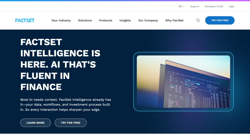
FactSet represents the exact opposite approach. Built for institutional analysts and asset managers, it completely rejects simplicity in favor of massive data density. Power users may hate overly simplified, Fisher-Price layouts because white space slows down their scanning speed. FactSet uses sticky spatial headers, high-density data matrices, and an AI-powered Mercury copilot to summarize complex market data and automate pitchbooks, compressing hours of professional workflow into seconds.
Need to make heavy data visually digestible without losing precision?
Explore the Sprightful Data Visualization

Escaping PDF hell in asset management web design
Alternative asset platforms covering real estate and private funds often struggle with administrative overhead. Modern asset management web design replaces static PDF reporting with structured, interactive portals.
8. Juniper Square
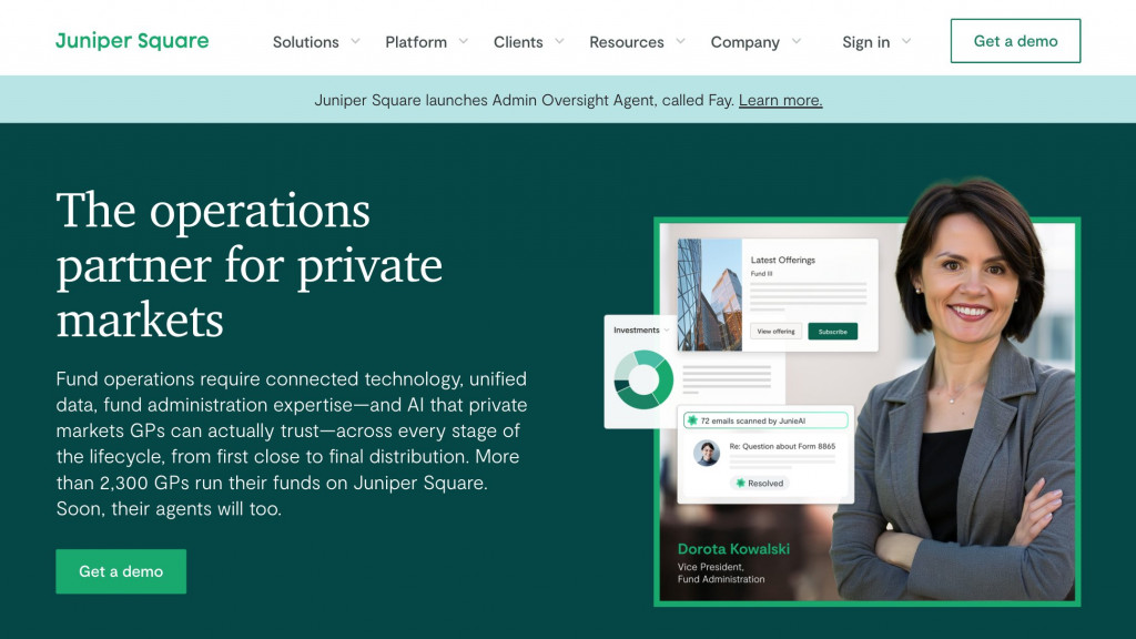
Juniper Square replaced static investor reports with an interactive LP portal. Private equity investors access protected document vaults, update anti-money laundering (AML) and KYC credentials, and review fund analytics directly. Visual feedback loops act as micro-contracts, giving LPs direct confirmation of account activity.
9. InvestNext

Real estate syndication platforms face steep abandonment rates during investor onboarding. InvestNext simplifies accreditation and identity checks, allowing investors to review dynamic capitalization tables and waterfall return schedules without manual paperwork delays.
10. Grayscale

Operating between traditional markets and digital assets, Grayscale balances SEC regulatory disclosures with the interface expectations of modern crypto investors. The site employs modular content blocks, filterable product tables, and milestone timelines to present regulated fund data clearly.
Managing alternative assets involves complex transaction and custody rules. Structuring backend services like Lending as a Service (LaaS) is as vital as the client interface.
Trust-building design patterns for financial portals
Interaction design establishes credibility better than security badges do. Implementing proven trust-building design patterns prevents user drop-off during sensitive transactions.
Progressive disclosure in onboarding
Fixing a high-friction client onboarding flow begins with deferring identity verification. Requesting tax identification numbers on the first screen makes users hesitate. Progressive disclosure allows them to review sample portfolios, model projections, or calibrate risk settings before submitting sensitive documents.
Strict numeric precision
Displaying portfolio performance metrics requires visual clarity. Bar charts and standard line graphs communicate comparative figures far more accurately than 3D charts or radial gauges. Front-end calculations must match ledger data down to the exact cent without rounding errors, as inconsistencies compromise investor confidence.
Semantic colors and dual encoding
Color carries immediate meaning in financial software. Using red for primary action buttons creates confusion, as users associate red with account losses or risk alerts.
Because roughly 8% of people experience color vision deficiency, relying solely on red and green indicators fails accessibility standards. Interfaces must use dual encoding, pairing color cues with distinct directional icons, such as downward arrows beside negative yields.
Incorporate these interface rules into your initial project specifications before calculating your website development costs.
How Fireart builds platforms for high-net-worth investors
High-Net-Worth (HNW) investors prioritize clear reporting, data privacy, and visual restraint over novelty.
When teams seek trading dashboard inspiration, we evaluate the underlying data infrastructure first.
Our team maps the specific operational workflows of your target users. When structuring an AUM (assets under management) display for wealth managers or building a secure client portal integration for private equity funds, we design interfaces that organize complex datasets without clutter.
We also align product usability with legal requirements, adding mandatory fiduciary disclosures to the interface through expandable drawers and contextual summaries to maintain compliance.
Outdated interfaces lose institutional capital. Partner with Fireart to design clear, compliant financial products.
Book a consultationFAQ: Common questions about financial web design
How can we reduce drop-off during the client onboarding flow?
Use progressive disclosure. Allow users to configure calculators or view sample portfolios before prompting them for identification documents. Dividing regulatory requirements into progressive steps reduces drop-off rates.
What is the best way to design heavy financial data tables for mobile devices?
Apply the card stack pattern instead of condensing multi-column tables. Convert rows into structured vertical cards, display primary metrics such as asset name and yield, and place secondary details behind expandable taps.
How do you integrate fiduciary disclosures without ruining the user experience?
Use layered disclosures. Present a concise plain-language summary in the main view, with expandable trays or tooltips containing the complete legal text required by regulatory bodies.
Do we need to rebuild our backend to get a better robo-advisor interface?
A front-end redesign often suffices if the underlying APIs and data feeds remain stable. We reorganize visual hierarchies, typography, and trust-building design patterns on the client side without disrupting existing transaction engines.




 Kotlin
  C++
C++  C#
C#  Ruby on Rails
  Java
Java  Firebase
  Python
  Vue.js
  HTML5
HTML5  CSS3
CSS3  Azure
Azure