

The Latest Hedge Fund Web Designs
Enjoy this collection of the highest quality hedge fund website designs for your own motivation. In this curated list of hedge fund website design examples, you’ll explore how leading teams approach structure, branding, and user experience.
Modern hedge fund websites are no longer just presentation pages. Today, the best hedge fund websites combine clear messaging, strong visual hierarchy, and intuitive UX to communicate value instantly. Whether you’re building from scratch or improving an existing hedge fund web design, these examples highlight what works in practice.
What Defines Effective Hedge Fund Website Design Today
A great website shows the world who you are, makes people remember you, and helps potential customers understand if they found what they were looking for.
Websites communicate all of that through color, shape, and other design elements. But in finance, this goes further — structure, readability, and trust signals are essential. That’s why the best hedge fund website designs focus not only on aesthetics but also on usability.
You’ll notice how American hedge fund website design often relies on minimalism, strong typography, and structured layouts. At the same time, many teams use a hedge fund website template or adaptable hedge fund templates to speed up development while maintaining consistency.
In more complex products, especially those involving analytics or dashboards, applying hedge fund screener UI best practices becomes critical for usability and clarity. This is particularly relevant for advanced hedge funds website design projects that include data-heavy interfaces.
Strong branding is another key pattern — from layout decisions to recognizable hedge fund logos that reinforce identity across all touchpoints.
-
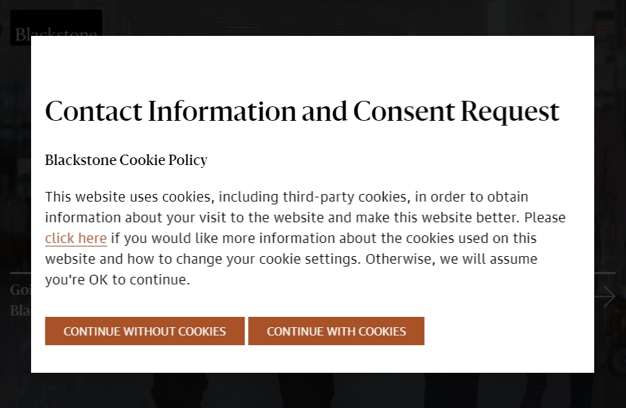
blackstone.com
-
hfr.com

-
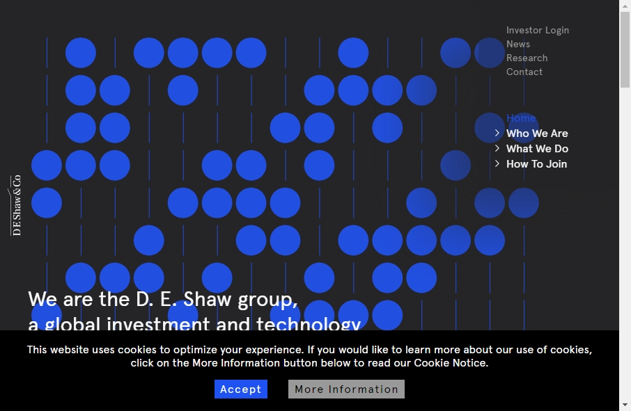
deshaw.com
-
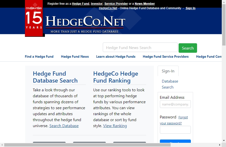
hedgeco.net
-
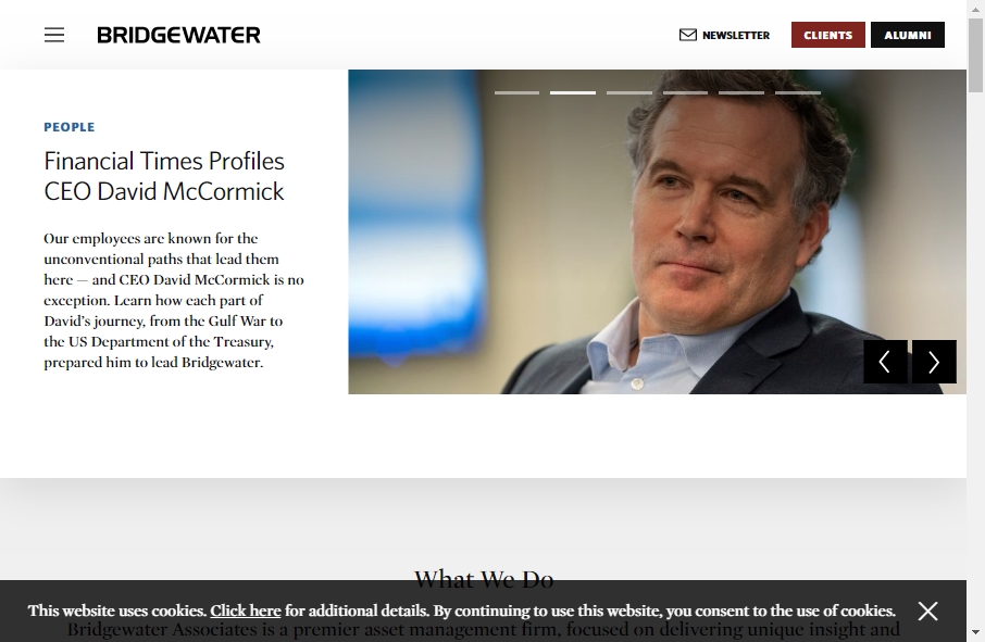
bridgewater.com
-
silverstonewm.com

-
aqr.com

-
valuewalk.com
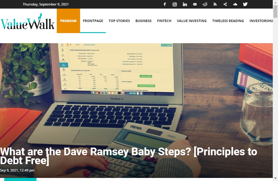
-
managedfunds.org
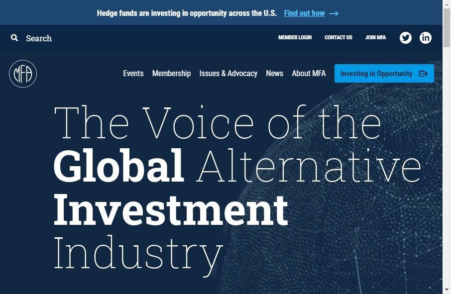
-
investinahedgefund.com
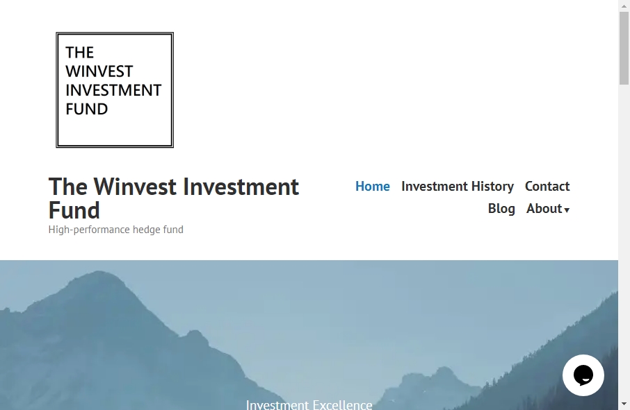
-
hedgefundmgr.blogspot.com
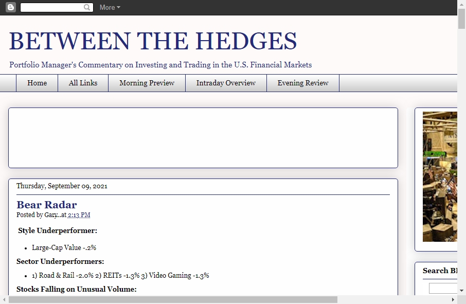
-
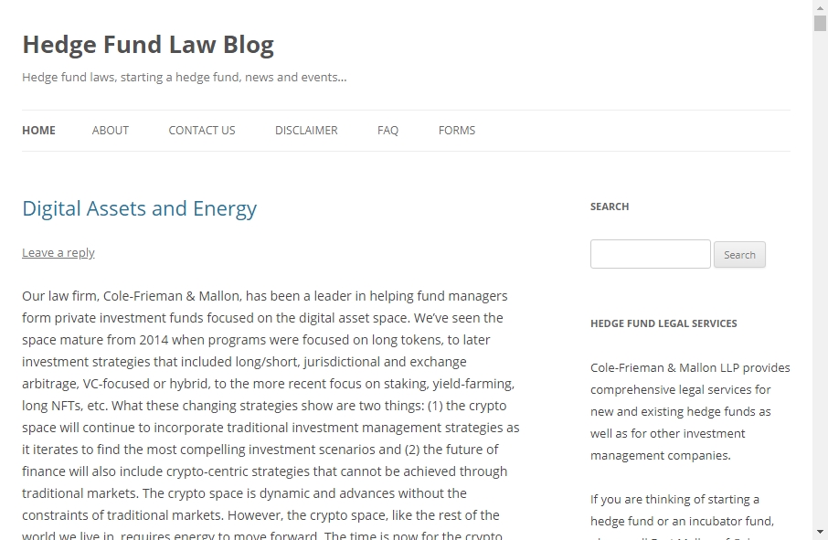
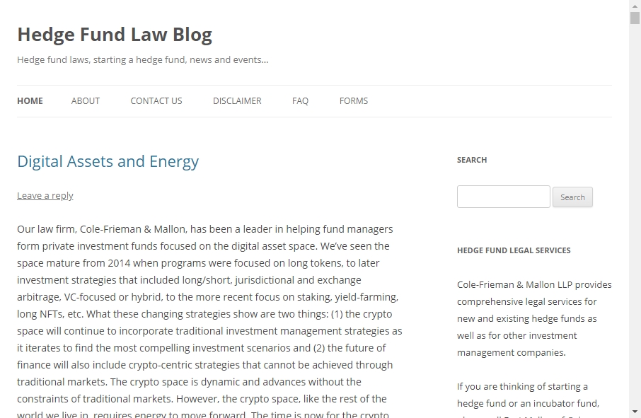
hedgefundlawblog.com
-
hedgeweek.com

-
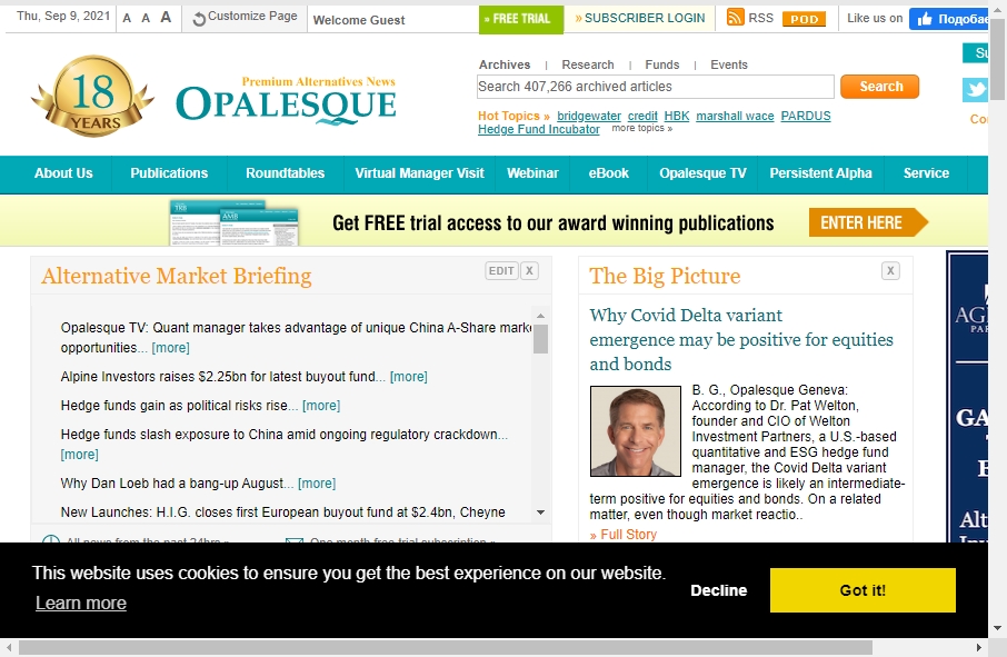
opalesque.com
-
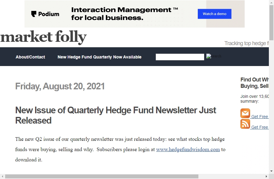
marketfolly.com
-
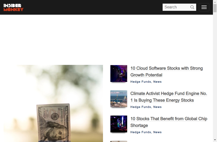
insidermonkey.com
-
hedgefundlawblog.com
Conclusions & Key Takeaways
The examples above show that successful hedge fund website design is not about complexity, but about clarity and execution.
First, effective solutions are built around user intent. The top hedge fund websites guide visitors naturally through the content, helping them quickly understand the value proposition.
Second, a strong fund manager website design balances visual appeal with usability. It should look premium while remaining easy to navigate and understand.
Third, scalability matters. Many high-performing projects rely on structured systems and reusable components, which is why hedge fund templates remain a practical approach for growing teams.
Finally, great hedge fund web design is about communication — aligning visuals, structure, and content into a cohesive experience that builds trust and supports decision-making.
Hedge Fund website not right for your company?
Check out one example of these:
Make Your Ideas Come to Life with Fireart
By looking at these examples, you can design your attractive hedge fund website design. It is essential to find your unique style and layout that makes your website look attractive.
Also, keep in mind to use one color scheme for all the pages and elements so that the website looks cohesive.
Changing the basic layout with every page confuses visitors and makes it harder for them to understand your practice.
And if you need to hire a dedicated web designer to help you with execution, here we are for you! Contact Fireart.







 Kotlin
  C++
C++  C#
C#  Ruby on Rails
  Java
Java  Firebase
  Python
  Vue.js
  HTML5
HTML5  CSS3
CSS3  Azure
Azure