


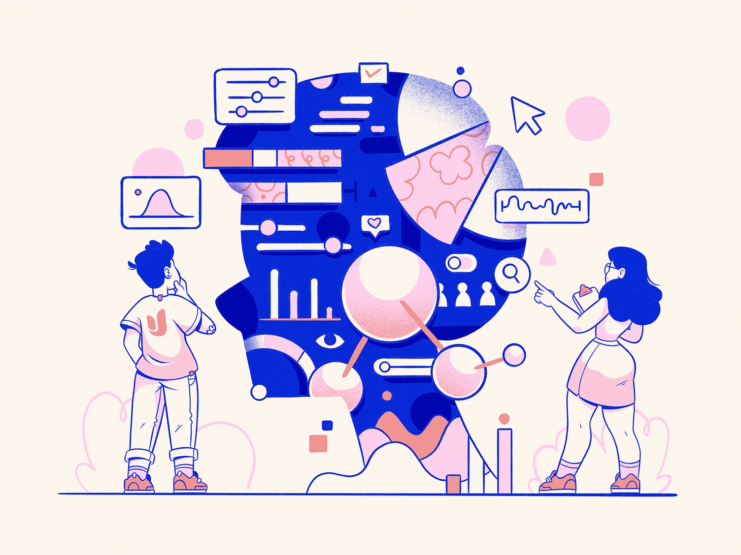
The mobile apps market is growing day by day. If you want your project to stand out from the crowd, you must ensure it is visually impressive, pleasant, and easy to use. Otherwise, the weight of the application will not last long on the user’s phone. Today, we will discuss how mobile application design is created, what elements of app design are important, and how to make them right.
The staples of the design process for applications
The beginning stage of the mobile application design process sometimes can take longer than the design itself. The reason is simple — you need to understand precisely what you are aiming to create and for whom. The user research becomes the first step in creating wireframes, branding treatment, and design concepts.
Having a clear picture in mind, designers can create UX artifacts that dictate style, coloristics, and design elements for the end product. Based on these, the team will execute the end design, fast and efficiently.
Wireframing
Wireframing helps to visualize the application’s design easily and imagine how its various elements will interact. And also — to identify potential UX problems.
It usually consists of interactive features that help to represent how users will interact with the application easily. If something is missing or there is still something to improve, designers can make changes to the application even before the start of the project.
Read more here: Tips to Create Effective Wireframes
Branding
Branding of mobile applications depends on how users perceive the application with which they interact, from the visual image to the overall reputation.
One of the key elements of branding is the logo. This is a visual symbol that represents your project.
One of the essential points when developing the design is the ratio of the logo to the application icon on the desktop. Usually, this icon contains the logo of the application. Since it is placed in a minimal space, you should not use visually complex images — in most cases, icons are limited to symbols or letter signs.
But you can also use a mascot or an abstract set of corporate colors. When your app represents a brand with a recognizable logo, designers need to adapt the logo that users know to the shape of the app icon — and still use the entire shape inside it.
Read more here: How to make an App Icon
Design concept
Before your designers sit down to design the application, ask yourself the following questions:
-
- Who is the target audience of your application — and why?
- What is the unique selling proposition of your product? Why should users choose it over others?
- What feelings should your application evoke in the user?
- What is the tone of voice of your application? Discreet or less formal? What are the communication channels between the application and users?
- What is the main message? How do your logo, colors, and other visuals help you convey it?
You must answer these questions before design and development begins. In this case, your designers will have a clear vision of what they need to create. This allows us to concentrate all efforts and get the brand image holistic and consistent.
Read more here: Concept Testing in UX
Must-have app design elements
Now, we’ll discuss mobile application design’s main elements, from color to navigation. They’re all significant — and getting them right can make or break your app.
Color scheme
Color is one of the most critical aspects of interface design. But how to choose the right one? Let’s highlight three methods that we use most often:
Analogous colors
You choose the primary color and assign the secondary colors next to it in the color wheel.
Monochrome colors
You may associate it with a black-and-white palette. However, this is not the case. A combination of the shades of the primary color is considered monochronous. They do not strain the eyes and are used in many popular services — for example, food delivery applications.
Additional colors
Here, you take a primary color and then check the color wheel to find the color opposite your chosen one—for example, this can be a yellow-purple or red-green combination.
Choosing the ideal option for your project will depend on several factors:
- The target audience — the age of your users, what they do, and what they like.
- The main content of your service — red and yellow are traditionally “food colors”, blue is preferred by financial applications, and so on.
- Convenience in perception and navigation — use colors to highlight more important objects on the screen and visually separate interactive and non-interactive elements.
- Your brand colors — the app’s design colors should match the logo and other brand palettes.
- Analysis of competitors — you can get good design ideas by learning what your competition does.
Typography
No application can exist without text.
Although visuals like pictures and videos take over the screens, people still need to get information from text. It is not for nothing that many Tik-Tok videos are subtitled — many people perceive information better in text form.
Text can convey things that other elements of app design cannot. Therefore, a good designer must understand the basics of mobile typography to reduce the burden on the user and make his interaction with the application more productive.
If the text elements in the interface are placed in a disorderly and chaotic manner, you will not be able to achieve the result you want.
Follow these tips to nail your app typography:
- Refrain from fancy fonts.
- Think in advance about possible scaling of the application and its localization into other languages.
- Use a different font for headings to separate them from the main text.
- Avoid headings more than three lines long.
- Stick to one limited color palette for text.
Read more here: Popular Serif Fonts
Navigation
Navigation is how users move from one interface point to another in the application. Navigation design for any product is one of the leading development points.
Some designers see the goal of navigation in moving users from point A to point B in the shortest possible time. Yet, remember— the user’s path should not only be fast but also logical and straightforward.
Navigation should be:
- Clear and intuitive
- Convenient
- With legible content
- With an orderly and visual hierarchy
Read more here: How to Design CTA Buttons
Onboarding screens
Usually, the first thing we see when we first launch an application are several training screens that introduce us to the product’s main functions. This screen sequence is called Onboarding.
Many developers don’t spend enough time on it, so onboarding too often becomes a slideshow you want to scroll through. Please don’t do this.
There are three main types of onboarding sequences:
- Describing the benefits and functions of the application.
- Personalizing information about the user (like in Tinder, where you immediately need to indicate your preferences and interests)
- Quick beginning: walking the user through the application’s functions.
Read more here: Mobile Apps Onboarding Designs
Popular app design elements
We have sorted out the most basic design elements. Now let’s move on to other ones, secondary but still important.
In-app Animation
Animation in mobile apps has a clear, logical purpose. It reduces the load on the user’s brain, prevents the user from missing any essential changes, and improves the efficiency of the spatial relationships of interface elements.
Among the main types of animation, there are:
- Visual feedback
In the physical world, objects respond to our interaction with them. People expect the same from app design elements. Visual feedback, as well as audio (sounds) and tactile (vibration) feedback, gives the user confidence. - Functional change
This type of animation in mobile apps shows how an element changes as the user interacts with it. It is best suited if you want to illustrate how the functions of elements change. - Navigation support
Most mobile applications have a complex structure. The designer’s task, in this case, is to simplify navigation as much as possible. Animation can be handy for it. Emphasize where the element is located, and it will be easier for the user to find it next time. - Visual cue
Animations in the mobile application suggest how to interact with elements. It’s essential to offer visual cues when your app has an unpredictable pattern of interactions between components.
Read more here: 7 Types of In-app Animation
Dark and light modes
Typically, apps have two themes: light and dark. The second one may seem a relatively new trend. But in fact, it was there before.
Dark is the original color scheme used on older computers, which used light text against a dark background to save power. But as computers became more consumer-friendly, developers began using black text on a white background to imitate the familiar black ink on white paper.
It’s only relatively recently that dark mode support has started to be added everywhere for both optical and aesthetic reasons.
Read more here: Dark Mode in UI Design, Light Mode vs Dark Mode
Micro-interactions
Micro-interactions are small animations or effects that occur when a user interacts with an interface. These small details can significantly improve the application’s usability and user experience.
Their other function is to give the user feedback. For example, when you click a button, a micro-interaction of a rotating wheel or loading bar can help you understand that the application is processing an action and you should wait for the result. This will reduce uncertainty and give the user a sense of control.
Read more here: How to Design App Micro Interactions, The Art of Micro Interactions in Mobile App UX
Emerging modern app design elements
The design does not stand still, and applications become more convenient and sophisticated yearly. In particular, thanks to the elements that we will talk about next.
Glassmorphism
Glassmorphism has been one of the main trends in application design in recent years. As the name suggests, it features a blurred background that imitates the effect of glass. It creates the effect of looking through objects.
Voice User Interfaces (VUI)
In design, it is important to use not only the visual component but also enhance communication. VUI helps users have a better user experience by not using the input keyboard. This is especially important for people with disabilities.
3D elements
More and more often, you can see 3D graphics in applications. This trend could completely replace the flat design that has become so popular recently. 3D elements help you see the content on the screen and make menu navigation easier.
App design elements in our case studies
Below are some of our application designs. Each design has been created with attention to detail, ensuring that every aspect of the user experience has been considered. From the layout and color scheme to the functionality and ease of use, our designs are a testament to our expertise in the field.
Swipex
Swipex is a dating app that helps you find your soulmates and new friends. While developing it, we studied what kind of design people need in such an application. Our goal was to make something functional — and at the same time pleasing to the eye. It surely worked.
Homely
Homely is a platform for renting luxury modern real estate in Europe and South America. Finding premium housing that suits you perfectly is difficult and takes time. We made the application not only premium-looking but also informative, with the ability to check any number of preferences when searching for housing.
App development with Fireart
These cases are only a portion of what we can do at Fireart.
Read more about the design and development of the app in our blog:
If you require further assistance or would like to hear about our mobile app development services, don’t hesitate to reach out. Our team is always happy to provide advice and guidance whenever you need it.


